Customizing and rebranding interfaces
IBM Business Process Manager provides tools that let you customize interfaces to reflect your specific company needs.
Customizing Process Portal
You can customize the appearance of the Process Portal in various ways, such as customizing the login page and the banner.
Process Portal supports the customization of these areas:
- Login page: You can make superficial changes to the appearance of the login page.
- Banner: You can modify the content, appearance, or behavior of the banner that appears at the top of Process Portal.
- Theme: Themes control the navigation, appearance, and layout of Process Portal. You can modify the appearance of the page, including the colors, fonts, and images.
The Web-based Distributed Authoring and Versioning (WebDAV) is used to store, and deploy the artifacts used for the Process Portal theme. If you customize the theme, deploy the updated artifacts using WebDAV. WebDAV is a set of extensions to the Hypertext Transfer Protocol (HTTP) which allows users to cooperatively edit and manage files on remote web servers. Most operating systems provide built-in support for WebDAV.
- Connect to the WebDav folder to customize Process Portal You can use web-based Distributed Authoring and Versioning (WebDAV) to make and deploy customized login pages and banners to Process Portal. WebDAV provides a network protocol for creating interoperable, collaborative applications.
- Customizing the login page for Process Portal You can customize the login page of Process Portal so that it has the logo and colors of your company.
- Customizing banners and footers in Process Portal Process Portal has a banner at the top of the window that contains tabs for navigating to the work and dashboard pages. The banner also contains links for setting user preferences, for accessing help documentation, and for logging out. In BPM Advanced, a link is also provided to link to business spaces. Process Portal has a footer at the bottom of the window with a logo.
- Customizing themes in Process Portal A theme defines the overall structure, appearance, and behavior of Process Portal. You can customize the standard theme provided with Process Portal.
- Building Process Portal spaces for participating in processes The Human Task Management widgets that are delivered with BPM Advanced provide a means for using Process Portal spaces to participate in business processes. When you build these spaces for different user groups, consider the roles and work patterns of these users, the type of process and tasks these users work with, and the data they need while completing their work.
Connect to the WebDav folder to customize Process Portal
You can use web-based Distributed Authoring and Versioning (WebDAV) to make and deploy customized login pages and banners to Process Portal. WebDAV provides a network protocol for creating interoperable, collaborative applications.
Various third-party clients are available that support the WebDAV protocol. Ensure that you have a recommended WebDAV client installed; other clients might not work in the environment. For more information about the recommended clients and the versions that are supported, see the  detailed system requirements for your IBM Business Process Manager configuration.
In the linked to page, select your IBM product, version, and operating system. In the generated page, select Prerequisites and then search for WebDAV Client to see the list of supported clients.
detailed system requirements for your IBM Business Process Manager configuration.
In the linked to page, select your IBM product, version, and operating system. In the generated page, select Prerequisites and then search for WebDAV Client to see the list of supported clients.
If customizing Process Portal with WebDAV does not work, you might need to adjust the following security configuration settings:
- On the administrative console, open the Global security page by clicking Security > Global security.
- Expand Web and SIP security and click General settings.
- Make sure that Default to basic authentication is selected. Then click OK and save the configuration.
- Restart the server to apply changes.
Because WebDAV works over HTTP, you get all the benefits of HTTP that FTP cannot provide, such as strong authentication, encryption, proxy support, and caching.
Regardless of the WebDav client that you use, ensure that you configure the client to use the HTTP/SSL protocol. In addition, include the following information in the configuration settings.
- The host name of the BPM server that hosts Process Portal.
- The SSL port of the BPM server, for example, 9443.
- The user name and password for the Process Portal administrator that was used during profile creation.
- The path to be used for the WebDav folder: /mum/mycontenthandler/mm/dav/filestore
Customizing the login page for Process Portal
You can customize the login page of Process Portal so that it has the logo and colors of your company.
You must have administrator privileges to complete this task.
Distributed Authoring and Versioning (WebDAV) provides a network protocol for creating interoperable, collaborative applications. You must have access rights to the WebDAV folder to design and customize Process Portal styles. In certain cases, you might need to restart the server.
For many changes, use a web development tool, such as Mozilla Firebug, that can edit cascading style sheet (CSS) files. For simple changes, such as replacing images with other images of the same size, a web development tool is not necessary. Process Portal uses image files to provide the elements for the login screen and a CSS file to control their usage and positioning. Process Portal uses the style settings in the login.css file as defaults. You customize the login page by overriding these settings in a different CSS file that you have modified.
You cannot move the IBM copyright statement or change its size or prominence. You cannot modify the IBM logo, but you can remove it.
- Connect to the WebDav folder and navigate to the /login directory.
- Make a local copy of the bspace folder and contents, and rename it. Your new folder contains an images directory.
- Add any new image files to the images folder that you want displayed on the login page.
- Modify your copy of the login.css file to change the appearance of your login page, such as the background color or images that are displayed.
- Copy your new folder to the webDAV login folder so that it contains both the original and new folders. Your WebDAV folder directory now contains the following folders:
WebDAV_folder/login/bspace

WebDAV_folder/login/folderName
where folderName is the name of your folder. - Locate the ConfigService.properties file.
For a stand-alone server:
- profile_root/BusinessSpace/node_name/server_name/mm.runtime.prof/config
For a cluster:
- dmgr_profile_root/BusinessSpace/cluster/mm.runtime.prof/config
- Change the value of folder name for the com.ibm.bspace.login.style property to the folder that contains the copy of the bspace folder, WebDAV_folder/login/folderName.
- Run the updatePropertyConfig command using the wsadmin scripting client to update the configuration.
- For a stand-alone server:
The following example uses Jython:
AdminTask.updatePropertyConfig('[-serverName server_name -nodeName node_name -propertyFileName "profile_root/BusinessSpace/node_name/server_name/mm.runtime.prof/config/ConfigService.properties" -prefix "Mashups_"]')

AdminConfig.save()
The following example uses Jacl:$AdminTask updatePropertyConfig {-serverName server_name -nodeName node_name -propertyFileName "profile_root/BusinessSpace/node_name/server_name/mm.runtime.prof/config/ConfigService.properties" -prefix "Mashups_"} $AdminConfig save - For a cluster:
The following example uses Jython:
AdminTask.updatePropertyConfig('[-clusterName cluster_name -propertyFileName "dmgr_profile_root/BusinessSpace/cluster_name/mm.runtime.prof/config/ConfigService.properties" -prefix "Mashups_"]')

AdminConfig.save()
The following example uses Jacl:$AdminTask updatePropertyConfig {-clusterName cluster_name -propertyFileName "dmgr_profile_root/BusinessSpace/cluster_name/mm.runtime.prof/config/ConfigService.properties" -prefix "Mashups_"} $AdminConfig save
- For a stand-alone server:
- Clear your browser cache, and then log in to Process Portal. You can now see the updated login page.
- Example: Login page customizations for Process Portal You can customize a number of different elements of the Process Portal login page, such as the graphics, background color, and login field labels.
Related tasks:
Connect to the WebDav folder to customize Process Portal
Example: Login page customizations for Process Portal
You can customize a number of different elements of the Process Portal login page, such as the graphics, background color, and login field labels.
The text boxes for the user name and password fields and the login button are not customizable. You cannot move the IBM copyright statement or change its size or prominence. You cannot modify the IBM logo, but you can remove it.
Login page styles
The following table provides descriptions of the styles that you can set for the login page.
| Style | Attribute | Description |
|---|---|---|
| .processPortal .login_background_image | background-image: url | Identifies the image used as the overall background that surrounds the login area. |
| .processPortal .login_content | The region that contains all the content that is displayed on the login screen. | |
| .processPortal .popup_window | Controls the appearance of the white box that contains the user ID and password text fields, and the login button. | |
| .processPortal .legal_textt | Sets the color and location of the copyright text. | |
| .processPortal .loginText | Sets the look of the labels for the user ID and password login fields. |
The appearance of the login page is controlled by the following section of the login.css file:
.processPortal .login_background_image{
 width:100%;
 height:100%;
 position absolute;
 top:0;
 left:0;
 z-index:-1;
 background-image: url(images/login_background.png);}
Login text
The text used to label the user name and password fields is controlled by the following CSS rule:
.processPortal .loginText{
 float: left;
 color:#2D2D2D;
 font-size:18px;
 padding-bottom:7px;}
The font type, size, and color can be modified by changing these properties.
Customizing banners and footers in Process Portal
Process Portal has a banner at the top of the window that contains tabs for navigating to the work and dashboard pages. The banner also contains links for setting user preferences, for accessing help documentation, and for logging out. In BPM Advanced, a link is also provided to link to business spaces. Process Portal has a footer at the bottom of the window with a logo.
You can customize a banner or a footer in many ways, including the following common changes:
- Modify the appearance.
- Remove elements.
- Modify the location, appearance, or content of the Help link in the banner.
- Modify the Logout link in the banner to load a custom web page or run custom code when a user logs out.
- Modify the logo in the footer.
To customize the appearance and function in the banner, edit the theme.css file. This is the style sheet that controls the appearance of the banner. If you plan to make style changes to the banner ( modifying icons, colors, or font, or changing the dimensions of various areas of the banner), edit this file using a WebDav client. After modifying the file, upload it to the server using the WebDav client.
- Hiding banner elements in Process Portal You can hide some or all of the Process Portal banner content without having to modify the entire theme.
Hiding banner elements in Process Portal
You can hide some or all of the Process Portal banner content without having to modify the entire theme.
You must have already created your own copy of the banner content files for customizing. An administrator might consider customizing the banner in the following ways:
- Hide or show the entire banner area.
- Customize the header area of the banner to hide or show elements at the top of page.
If the banner is hidden, the logout option is not available to the user. Hide the banner only when Process Portal is loaded inside a frame element as part of another page. This way the outside page can control the logout and redirect the frame content to the correct logout URL.
The theme.css file contains code that controls the display of different sections in the banner. The display of each element is controlled by a line of code that consists of .processPortal banner element. For example: the following line hides the Work page:
- .processPortal #processPortalWorkTab {display: none; }
This code is commented out by default so that all elements in all sections are shown in the banner.
- Open the theme.css file in your WebDav folder.
- To hide particular elements, uncomment the corresponding line of code.
- To hide all banner content, add display: none;
to the following line of code:
.processPortalBanner {
display: none;}
Example
For an example of a banner with some content hidden, see Example: Customizing CSS styles to hide existing banner content in Process Portal
- Example: Customizing CSS styles to hide existing banner content in Process Portal You can customize the banner in Process Portal so that all or part of it is hidden.
Related tasks:
Deploy a custom banner to Process Portal
Example: Customizing CSS styles to hide existing banner content in Process Portal
You can customize the banner in Process Portal so that all or part of it is hidden.
The theme.css file has a set of rules for hiding banner elements. These rules are commented out by default. When comment markers are deleted for a rule, the element is hidden.
The following example hides the name of the user that is currently logged on and the arrow used for the drop-down list of user actions by removing the comment markers from the following rules in the custom theme.css file.
/* -- Hide the user's name */
.processPortal .processPortalUserName {
display: none;}

/* -- Hide user dropdown arrow */
.processPortal .processPortalUserDropdown {
display: none;}
Customizing themes in Process Portal
A theme defines the overall structure, appearance, and behavior of Process Portal. You can customize the standard theme provided with Process Portal. The theme is a powerful set of programming artifacts that you can use to control how Process Portal is displayed. You can customize the theme, for example, to change the color or images that are used, by modifying the CSS rules.
Before you customize the theme, be aware of the following:
- Customizing a theme requires familiarity with HTML, CSS, JavaScript, the iWidget specification, and the Dojo widget library.
- If you customize a theme, any IBM updates to the default theme artifacts will not be applied during regular service or maintenance activities. You must update and maintain customized themes manually.
The Process Portal theme is designed so that it does not appear in Process Portal spaces. You should therefore make any updates directly in the Process Portal theme and not in a copy of the theme because it might cause problems within Process Portal. However, back up any files to modify so they can be restored if necessary.
The following files and folders define and control the theme for Process Portal.
| File or folder name | Description |
|---|---|
|
theme.css collaboration.css | The style sheets that control the appearance of the theme. If you plan to make style changes to the theme, you need to edit these files. |
| img | This folder contains the images used in the theme. |
|
menuDefinitions metaData | These folders are used internally and should not be modified. |
To make your changes to the theme available, restart the process server that hosts the Process Portal environment.
Building Process Portal spaces for participating in processes
The Human Task Management widgets that are delivered with BPM Advanced provide a means for using Process Portal spaces to participate in business processes. When you build these spaces for different user groups, consider the roles and work patterns of these users, the type of process and tasks these users work with, and the data they need while completing their work.
- Federation considerations for Process Portal spaces You can use Process Portal spaces to provide a single, federated user experience for participating in processes and tasks from multiple IBM Business Process Manager systems, or across multiple process servers.
- Enable BPDs and BPEL processes for use in Process Portal spaces The Human Task Management widgets can support business process definitions (BPDs) that were authored in Process Designer, and BPEL processes and human tasks that were authored in IBM Integration Designer. To ensure that you can use the widgets in a Process Portal space to work with BPDs and BPEL processes, certain requirements need to be met when you develop these artifacts.
- Building Process Portal spaces using the Human Task Management templates The Human Task Management templates contain widgets that are wired and configured for common user interaction patterns, for example, checking the status of an order, or approving a travel request. You can use these templates to create business spaces for managing and participating in processes.
- Building customized Process Portal spaces You can use the Human Task Management widgets to build your own customized spaces. You can configure each of the widgets and combine them with other widgets to build spaces that reflect the roles and user interactions in your organization.
Federation considerations for Process Portal spaces
You can use Process Portal spaces to provide a single, federated user experience for participating in processes and tasks from multiple IBM Business Process Manager systems, or across multiple process servers.
The spaces include widgets that participants can use to work with processes and tasks developed with Process Designer (BPDs and human services) and IBM Integration Designer (BPEL processes and human tasks). The federated user experience provides the following capabilities:
- View federated lists. You can view, filter, and sort tasks or processes in a single list, regardless of the process server where they are stored. You can also view and sort task, and process definitions in a single list.
- Perform bulk actions. You can select one or more items in lists of processes, tasks, or task definitions and perform various actions on the selected items. An action is allowed only if it is supported by all of the selected items.
- Work with multiple tasks and processes in parallel. You can work with multiple tasks and processes in a tabbed pane, regardless of the system or process server where they are stored.
- Interact with a task or process. When you interact with an individual task or process, the content that is shown and the actions that are available depend on the capabilities of the process server where the resource runs.
By default, Process Portal spaces are enabled for federation.
- Widget support for BPDs, BPEL processes, and human tasks IBM Business Process Manager provides a set of widgets for working with and managing processes and tasks in Process Portal spaces.
- Considerations when using the Human Tasks Management widgets in federated environments If you are using the Human Task Management widgets in a federated environment, you should be aware of the limitations in some of the widget functionality.
- Naming considerations for federating lists of processes and tasks in the Human Tasks Management widgets Federated lists combine the query results from all the configured systems in a domain. Queries in federated domains originate from saved searches and query tables in the configured systems. To federate query results, you must follow certain conventions when you saved searches and query tables.
Widget support for BPDs, BPEL processes, and human tasks
IBM Business Process Manager provides a set of widgets for working with and managing processes and tasks in Process Portal spaces.
These widgets belong to the Human Task Management category in the widget palette. The following types of widgets are available:
- Task-related widgets for working with and managing tasks, and escalations.
- Process-related widgets for working with and managing processes.
- Work-basket-related widgets that enable business administrators to configure and manage work baskets and business categories.
The following tables summarize the support for the different types of processes and tasks in the Human Task Management widgets.
Restriction: The availability of individual widgets and specific user interactions depend on the REST service that is configured for Business Space.
- Federated REST services. Widgets can support both business process definitions (BPDs) and Business Process Execution Language (BPEL) process and human tasks.
- Business process definition engine REST services. Widgets can support BPDs only.
- Business Process Choreographer REST services. Widgets can support BPEL processes and human tasks only.
| Widget | BPEL processes and human tasks | Business process definitions (BPDs) | Federated lists of processes and tasks |
|---|---|---|---|
| Tasks, My Team's Tasks | X | X | X |
| Task Information | X | X | X |
| Task Definitions | X | X | X |
| Escalations | X | X | |
| Send Widget | X | X | |
| My Work Organizer | X |
| Widget | BPEL processes and human tasks | Business process definitions (BPDs) | Federated lists of processes and tasks |
|---|---|---|---|
| Processes | X | X | X |
| Process Information | X | X | X |
| Process Definitions | X | X |
| Widget | BPEL processes and human tasks | Business process definitions (BPDs) | Federated lists of processes and tasks |
|---|---|---|---|
| Work Baskets | X | ||
| Work Basket Information | X | ||
| Business Categories | X | ||
| Business Category Information | X |
Related tasks:
Configure Business Space and registering REST endpoints on the administrative console
Considerations when using the Human Tasks Management widgets in federated environments
If you are using the Human Task Management widgets in a federated environment, you should be aware of the limitations in some of the widget functionality.
The Tasks, My Team's Tasks, and Inbox widgets all provide actions for working with BPEL-related human tasks and BPD-related human services.
You can configure which actions are available to the users of the widget. However, not all of the available actions are supported by both types of tasks and work items. The following table summarizes the supported actions.
| Action | BPEL-related human tasks | BPD-related human services |
|---|---|---|
| Edit | X | X |
| Accept | X | X |
| Accept | X | X |
| Transfer | X | |
| Return | X | X |
| Delete | X | |
| Escalate | X | |
| Postpone | X | |
| Resume | X | |
| Change Priority | X | |
| Change Due Date | X |
Naming considerations for federating lists of processes and tasks in the Human Tasks Management widgets
Federated lists combine the query results from all the configured systems in a domain. Queries in federated domains originate from saved searches and query tables in the configured systems. To federate query results, you must follow certain conventions when you saved searches and query tables.
Naming considerations for saved searches and query tables
To have the results of saved searches and query tables to be merged in federated environments, use the following naming conventions:
- The query table name and the saved search name must be the same.
The name must comply with the following rules:
- The name follows the prefix.name naming convention, the reserved prefix, IBM, must not be used.
- The name is in uppercase letters.
- The maximum length is 28 characters.
- The query table and the saved search must query the same kind
of artifact, either tasks or processes.
- For tasks, the primary query table is the TASK predefined database view, and the saved search must be flagged as Organized
by Task.
- For processes, the primary query table is the PROCESS_INSTANCE query table, and the saved search is not flagged as Organized by Task.
- For tasks, the primary query table is the TASK predefined database view, and the saved search must be flagged as Organized
by Task.
Naming considerations for process and task properties
In federated environments, process and task properties can also be federated. These properties correspond to the search columns specified in a saved search for a business BPD, and the attributes defined for BPEL processes and human tasks in a query table. To have the properties to be merged in federated environments, use the common attributes for process and task properties in the Query Table Builder.
Naming considerations for business data
You often need to include business data, such as customer information, in the information shown in the Human Task Management widgets. You can add business data to both the saved searches and the query tables that you use to create the list of processes and tasks that are shown in the widgets.
If you want business data attributes to be included in the federated results, you must know how the business data was defined in the saved search. Based on the search alias that was used for a property in the saved search, apply the following naming conventions to the corresponding property name in the query table.
- Use the search alias of the property in the saved search as the basis for the name of the property in the query table.
- Prefix underscores in the search alias with an underscore in the property name in the query table.
- Prefix uppercase letters in the search alias with an underscore in the property name in the query table.
- Convert lowercase letters in the search alias to uppercase letters in the property name in the query table.
- Prefix the property name in the query table with BD.
The following table shows examples of saved search names and their equivalent query table names.
| Search alias | Query table property name |
|---|---|
| customerName | BDCUSTOMER_NAME |
| CustomerName | BD_CUSTOMER_NAME |
| customer_name | BDCUSTOMER__NAME |
| customer_Name | BDCUSTOMER___NAME |
| CUSTOMERNAME | BD_C_U_S_T_O_M_E_R_N_A_M_E |
- Federated processes lists: Common process attributes In most cases, the names that are used for an attribute differ in saved searches and query tables. To ensure that query results can be federated, common process attributes provide a mapping of the saved search name to the query table name.
- Federated tasks lists: Common task attributes In most cases, the names that are used for an attribute differ in saved searches and query tables. To ensure that query results can be federated, common task attributes provide a mapping of the saved search name to the query table name.
- Federated task definitions lists: Common attributes for task definitions Saved searches do not support task definitions. However, in federated environments, federated tasks definitions lists can contain data from human services in BPDs. To ensure that query results can be federated, use the common attributes when you query tables for tasks definitions.
Related tasks:
Create saved searches for Human Task Management widgets
Create query tables for Human Task Management widgets
Federated processes lists: Common process attributes
In most cases, the names that are used for an attribute differ in saved searches and query tables. To ensure that query results can be federated, common process attributes provide a mapping of the saved search name to the query table name.
When you create a query table for a federated environment, use the common attribute name for a property instead of the column name of the predefined database view. The following table shows how the common attributes map to the corresponding saved search names and query table names.
| Common attribute name | Name used in Process Portal saved searches | Name in the PROCESS_INSTANCE database view |
|---|---|---|
| PI_NAME | Instance Name | NAME |
| PT_PTID | N/A (bpdId) | PTID |
| PI_PIID | Instance ID | PIID |
| PI_STATE | Instance Status (mapped) | STATE |
| PT_DISPLAY_NAME | Process Definition | DISPLAY_NAME |
| PT_NAME | Process Definition | TEMPLATE_NAME |
| PI_DISPLAY_NAME | Instance Name | DESCRIPTION |
| PROCESS_APP_ACRONYM | Process App | PROCESS_APP_ACRONYM |
| SNAPSHOT_ID | N/A (instanceSnapshotId) | SNAPSHOT_ID |
| SNAPSHOT_NAME | Snapshot | SNAPSHOT_NAME |
Related concepts:
Related reference:
Federated tasks lists: Common task attributes
In most cases, the names that are used for an attribute differ in saved searches and query tables. To ensure that query results can be federated, common task attributes provide a mapping of the saved search name to the query table name.
When you create a query table for a federated environment, use the common attribute name for a property instead of the column name of the predefined database view. The following tables show how the common attributes map to the corresponding saved search names and query table names.
| Common attribute name | Name used in Process Portal saved searches | Name in the TASK database view |
|---|---|---|
| ACTIVATED | Received Date | ACTIVATED |
| COMPLETED | Closed Date | COMPLETED |
| CONTAINMENT_CTX_ID | Instance ID | CONTAINMENT_CTX_ID |
| DUE | Task Due Date | DUE |
| KIND | N/A (derived from multiple columns) | KIND |
| NAME | Activity | NAME |
| ORIGINATOR | Sent From | ORIGINATOR |
| OWNER | Assigned to User | OWNER |
| PRIORITY | Task Priority | PRIORITY |
| STATE | Task Status (mapped) | STATE |
| TKIID | N/A (taskId) | TKIID |
| Common attribute name | Name used in Process Portal saved searches | Name in the TASK_DESC database view |
|---|---|---|
| TAD_DISPLAY_NAME | Task Subject | DISPLAY_NAME |
| TAD_DESCRIPTION | N/A (taskNarrative) | DESCRIPTION |
Related concepts:
Related reference:
Federated task definitions lists: Common attributes for task definitions
Saved searches do not support task definitions. However, in federated environments, federated tasks definitions lists can contain data from human services in BPDs. To ensure that query results can be federated, use the common attributes when you query tables for tasks definitions.
The following tables show how the common attributes map to the corresponding query table names. Because task definitions are not supported by business process definitions (BPDs), there is no equivalent saved search name.
| Common attribute name | Name in the TASK_TEMPL database view |
|---|---|
| TAT_NAME | NAME |
| TAT_APPLIC_NAME | APPLIC_NAME |
| TAT_TKIID | TKIID |
| TAT_WORK_BASKET | WORK_BASKET |
| PROCESS_APP_NAME | PROCESS_APP_NAME |
| PROCESS_APP_ACRONYM | PROCESS_APP_ACRONYM |
| SNAPSHOT_NAME | SNAPSHOT_NAME |
| SNAPSHOT_ID | SNAPSHOT_ID |
| TRACK_NAME | TRACK_NAME |
| TOP_LEVEL_TOOLKIT_NAME | TOP_LEVEL_TOOLKIT_NAME |
| TOP_LEVEL_TOOLKIT_ACRONYM | TOP_LEVEL_TOOLKIT_ACRONYM |
| IS_TIP | IS_TIP |
| TAT_VALID_FROM | VALID_FROM |
| TAT_KIND | KIND |
| TAT_STATE | STATE |
| TAT_TYPE | TYPE |
| Common attribute name | Name in the TASK_TEMPL_DESC database view |
|---|---|
| TATD_DISPLAY_NAME | DISPLAY_NAME |
| TATD_DESCRIPTION | DESCRIPTION |
| Common attribute name | Name in the PROCESS_TEMPLATE database view |
|---|---|
| PT_PTID | PTID |
| PT_STATE | STATE |
Related concepts:
Related reference:
Enable BPDs and BPEL processes for use in Process Portal spaces
The Human Task Management widgets can support business process definitions (BPDs) that were authored in Process Designer, and BPEL processes and human tasks that were authored in IBM Integration Designer. To ensure that you can use the widgets in a Process Portal space to work with BPDs and BPEL processes, certain requirements need to be met when you develop these artifacts.
- Enable BPDs for use in Process Portal spaces If using the Human Task Management widgets to participate in processes, you cannot directly start a process and wait for the first human service as in Process Portal. To start business process definitions (BPDs) from a widget, you must model a human service that uses an undercover agent to start the process. You can also use this human service to collect user input for the process.
- Enable BPEL processes and human tasks for use in Process Portal spaces When you model BPEL processes and human tasks in IBM Integration Designer, create an invocation task to start the process, include the business data that is required by the process and its tasks, and generate the forms for working with the tasks.
Enable BPDs for use in Process Portal spaces
If using the Human Task Management widgets to participate in processes, you cannot directly start a process and wait for the first human service as in Process Portal. To start business process definitions (BPDs) from a widget, you must model a human service that uses an undercover agent to start the process. You can also use this human service to collect user input for the process.
In the Human Task Management widgets, task definitions are used to start processes. To start a process, you can select a task definition in the Task Definitions widget, and provide the data that is needed to start the process. To provide a human service that implements a task definition in Process Designer.
- Create a general system service.
- Ensure the input and output type of the service match the input type of the BPD.
- Create a direct sequence flow from the start event to the end event.
- Create an undercover agent (UCA). Use the general system service that you created in step 1 as the attached service and select On Event as the schedule type.
- Create a business process definition.
- Include a start message event step in the BPD.
- On the Implementation tab, select the UCA that you created in step 2.
- Select Consume Message.
- Map the data provided by the UCA to the input message of the BPD.
Now you have a BPD that can be invoked using the UCA.
- Include a start message event step in the BPD.
- Create a human service that collects the user input and starts the process using the UCA. The name of the human service is shown in the Task Definitions widget.
- Expose the human service as a startable service and select the team that will see it and start it in Process Portal.
- Optional: Add a coach activity to the service that collects the input that you need for starting the process.
- Add an invoke UCA step to the service. On the Implementation tab, select the UCA that you created in step 2. If you are using a coach, make sure the data that it collects is mapped to the UCA input.
Optionally, create a snapshot of the process application that contains the BPD and the human service, and activate it in Process Center. If you intend to expose business data for the BPD, create a saved search to capture this data.
Related tasks:
Create saved searches for Human Task Management widgets
Enable BPEL processes and human tasks for use in Process Portal spaces
When you model BPEL processes and human tasks in IBM Integration Designer, create an invocation task to start the process, include the business data that is required by the process and its tasks, and generate the forms for working with the tasks.
- Create the invocation task to start the process.
- Ensure the BPEL process contains a receive activity to start the process.
- In the Authorization tab for the receive activity, specify the potential starters of the process.
When you participate in the process using a Process Portal space, the resulting task definition for starting the process is shown in the Task Definitions widget.
- Set the business data that is needed by the process and its tasks. The following table shows how you can specify business data, and how the data is made available.
How business data can be specified and made available
How business data can be specified How business data is made available Global variables for BPEL processes Define query properties for these variables. These properties are made available in the QUERY_PROPERTY database view. Scope-level variables for BPEL processes N/A Custom properties for BPEL processes Available by default in the PROCESS_ATTRIBUTE database view. Custom properties for inline human tasks or activities Available by default in the ACTIVITY_ATTRIBUTE and TASK_CPROP database views. Custom properties for stand-alone human tasks Available by default in the TASK_CPROP database view. - Generate the forms for working with the human tasks. In a Process Portal space, these forms are displayed in the Task Information widget. These forms can be either HTML-Dojo pages or IBM Forms.
You now have a BPEL process that you can deploy and start in a Process Portal space.
To ensure the generated form is available for the Task Information widget, deploy the form on the Business Space deployment target. To expose the business data, create and deploy a query table.
Related tasks:
Generating HTML-Dojo pages or IBM Forms for Business Space
Create query tables for Human Task Management widgets
Use custom form renderers for the Task Information widget
Building Process Portal spaces using the Human Task Management templates
The Human Task Management templates contain widgets that are wired and configured for common user interaction patterns, for example, checking the status of an order, or approving a travel request. You can use these templates to create business spaces for managing and participating in processes.
Before you begin this task, ensure the following prerequisites are met:
- You have enabled the processes and tasks for use in a Process Portal space.
- You have configured the REST
services required by Business Space so that your user groups can access the processes and tasks they need:
- Federated REST services. Use these services if your user groups participate in both business process definitions (BPDs) and Business Process Execution Language (BPEL) process and human tasks, or they use these resources on multiple systems.
- Business process definition engine REST services. Use these services if your user groups participate only in BPDs.
- Business Process Choreographer REST services. Use these services if your user groups participate only in BPEL processes and human tasks.
- Identify the common user interactions that your business users perform when they participate in business processes.
- Review the user interaction patterns supported by the Human Task Management widgets.
- Create a space using the appropriate template.
- User-interaction patterns for business process management The user interactions that your users perform depend on their individual roles and responsibilities. User interaction patterns describe typical ways in which business users interact with business processes to achieve their business goals. You can use patterns to identify the interactions that are relevant for the users of your business spaces.
- Customizing the content shown in the Human Task Management widgets The content that is shown in the widgets is provided by a query. Queries are known as lists in the widget configuration. You can configure widgets in a Process Portal space to use different lists so they contain the content that is needed by the users of the space.
Related concepts:
Templates for managing processes and tasks
Related tasks:
Configure the Business Space component and registering REST endpoints on the administrative console
Enable BPDs and BPEL processes for use in Process Portal spaces
User-interaction patterns for business process management
The user interactions that your users perform depend on their individual roles and responsibilities. User interaction patterns describe typical ways in which business users interact with business processes to achieve their business goals. You can use patterns to identify the interactions that are relevant for the users of your business spaces.
Common user-interaction patterns
The following list contains examples of common user-interaction patterns.
- Assigning work
- Work can be assigned in different ways, for example:
- Participants receive the tasks assigned to them in their personal inbox. They then choose a task to work on.
- Several participants share a list of tasks to be worked on. One participant takes a task to work on.
- A participant completes a task, and gets the next task assigned automatically (get-next style).
- Tasks can be assigned to work groups or participants automatically by the system based on rules, or delegated by a manager who selects and assigns the tasks from his or her inbox.
- Completing work
- A participant works on a task, fills out the form with the required information, and then completes the task. Work can be interrupted, and the current input is stored.
- Handling situations
- A situation might occur during the lifetime of a task that prevents a participant from completing the task. To handle these situations, participants can, for example, use a backlog, transfer work, reprioritize work, delegate, or escalate.
- Initiating a process or service
- A participant selects a process or service to start, enters the required data, and submits the task to start the process or service. For example, an employee starts a travel reimbursement service, or a call-center agent is called by a customer and the agent creates a new order.
- Checking status
- Participants and managers need to check the status and progress of processes.
- Performing actions on processes
- A process might allow specific participants and managers to perform selected actions on processes depending on the process status. For example, a call-center agent gets a call from a customer, and then cancels the customer's order before it is shipped to delivery.
- Assessing workload and assigning work
- Participants and managers assess the available tasks and the workload of groups based on the start date, due date, priority, business-specific data, and KPIs. For example, a tax consultant chooses the next task based on due date and priority.
- Assigning and transferring tasks
- Participants claim tasks, transfer claimed tasks to other participants, or release the tasks for others to claim. Managers assign tasks to their team members, or transfer the tasks from one team member to another.
- Notifying participants about work and status
- Alerts and notifications inform participants and managers about situations so they can take action.
Common social-BPM patterns
Social-BPM patterns describe typical patterns that business users adopt to work effectively together while participating in processes. The following list contains some common examples of these patterns.
- Sharing notes
- Participants share and view notes attached to tasks.
- Collaborating to complete work
- Participants assign to-dos to other participants to complete tasks.
- Organizing work
- Participants organize tasks and to-dos in to-do lists.
- User interaction patterns supported by the Human Task Management widgets The user interaction patterns supported by the Human Task Management widgets focus on the tasks that business users perform when they participate in business processes.
User interaction patterns supported by the Human Task Management widgets
The user interaction patterns supported by the Human Task Management widgets focus on the tasks that business users perform when they participate in business processes.
Use the information in the following table to help you configure the user interactions that are exposed for a widget in a business space:
- "Yes" indicates that this is the typical way in which the widgets support the user interaction.
- "Alternative" indicates that you can configure the widgets to also support the user interaction.
Restriction: The availability of individual widgets and specific user interactions depend on the REST service that is configured for Business Space.
- Federated REST services. Widgets can support both business process definitions (BPDs) and Business Process Execution Language (BPEL) process and human tasks.
- Business process definition engine REST services. Widgets can support BPDs only.
- Business Process Choreographer REST services. Widgets can support BPEL processes and human tasks only.
For more information on which widgets are supported for a specific REST configuration, see Widget support for BPDs, BPEL processes, and human tasks.
| User Interaction |
Tasks, My Team's Tasks | Task Information | Processes | Process Information | Task Definitions | Process Definitions | Escalations | Work Organizer |
|---|---|---|---|---|---|---|---|---|
| Get next task automatically | Yes | |||||||
| Work on and complete task | Yes | |||||||
| Release task | Yes
also bulk | Yes | ||||||
| Get next task from list | Yes
also bulk | |||||||
| Postpone task | Yes
also bulk | Yes | ||||||
| Browse backlog | Yes | |||||||
| Resume task | Yes
also bulk | Yes | ||||||
| Initiate process or service | Alternative | Yes | Yes | |||||
| Check status of process | Alternative | Alternative | Yes | Yes | Alternative | Alternative | ||
| Perform action on process | Yes | |||||||
| Assess workload | Yes | Alternative | Alternative | Alternative | Alternative | Alternative | ||
| Assign and transfer task | Yes
also bulk | Yes | ||||||
| Reprioritize | Yes
also bulk | Yes | ||||||
| Escalate task | Yes | Yes | Yes
also bulk | |||||
| Share notes | Yes | |||||||
| Create free-form tasks | Yes | Yes | ||||||
| Create and track subtasks | Yes | Yes | ||||||
| Organize your work | Yes |
Related concepts:
Considerations when using the Human Tasks Management widgets in federated environments
Customizing the content shown in the Human Task Management widgets
The content that is shown in the widgets is provided by a query. Queries are known as lists in the widget configuration. You can configure widgets in a Process Portal space to use different lists so they contain the content that is needed by the users of the space.
Before you begin:
- For lists that contain federated content from business process definitions (BPDs) and BPEL processes, ensure the domains are configured on the system, and the corresponding saved searches
and query tables exist and comply with the naming considerations for federated lists.
- For lists that contain BPD-related content, ensure that a saved search exists that reflects the content.
- For lists that contain content related to BPEL processes or human tasks, ensure that a query table that reflects the content exists on the configured domain.
- Open the Content settings for the widget. Open the widget menu and select Edit Settings to see the configuration tabs. When you configure a widget for the first time, the All default list is selected on the Content tab.
- Change the lists that users see. The lists that are available depend on how your system environment is configured.
- If the system environment is configured for federation mode, the list contains the lists that are available for the federated domains. If there are multiple domains, the domain name is added to the list name so that you can decide which list to use. The All list shows all the BPD and BPEL-related content for the list type from all the systems in the default domain; it does not contain any work-item-related content.
- If the system environment is configured for the business process definition engine, the list contains the saved searches for the list type. The All default list shows all the BPD-related content in the system environment for the list type.
- If the system environment is configured for Business Process Choreographer, the list contains the query tables deployed on the system for the list type. The All default list shows all the BPEL-related content in the system environment for the list type.
- Configure which properties are displayed in a specific list. You can use the same list for different user roles or user groups. In each case, you include only those properties needed by the role or group.
- Default queries for Human Task Management widgets Queries deliver the lists of artifacts, such as processes and tasks, that are displayed in the Human Task Management widgets in Process Portal spaces. A set of default queries is provided for use in the widgets.
- Create saved searches for Human Task Management widgets The Tasks and Processes widgets use saved searches to list business process definitions and their tasks. A default saved search is provided for each of these widgets. These searches do not include filter criteria or business data, but you can create and share your saved searches to include filters and process-specific business data.
- Create query tables for Human Task Management widgets The Human Task Management widgets use query tables to list BPEL processes and human tasks. A set of default query tables is provided. These query tables do not include filter criteria or solution-specific business data, but you can create and deploy your own query tables to include filters and solution-specific business data.
Related tasks:
Enable Business Space widgets for cross-cell environments
Default queries for Human Task Management widgets
Queries deliver the lists of artifacts, such as processes and tasks, that are displayed in the Human Task Management widgets in Process Portal spaces. A set of default queries is provided for use in the widgets.
The default queries, for example, IBM.DEFAULTALLTASKSLIST_75, IBM.DEFAULTALLPROCESSLIST_75 and IBM.DEFAULTALLTASKDEFLIST_75, are available on every process server in the BPM configuration. The queries include standard properties, such as the owner or the originator of a task, and the status of a process instance. They do not contain any modeled business data. The default queries provide the All lists in the Content tab of the widget configuration.
To include business data in queries, create a saved search or query table that includes this data.
If you migrated to BPM Advanced from a previous version of WebSphere Process Server, you can continue to use the previous version of the default queries, for example, IBM.DEFAULTALLTASKSLIST and IBM.DEFAULTALLPROCESSLIST. These default queries provide the V7 All lists in the Content tab of the widget configuration.
Related tasks:
Create saved searches for Human Task Management widgets
Create query tables for Human Task Management widgets
Create saved searches for Human Task Management widgets
The Tasks and Processes widgets use saved searches to list business process definitions and their tasks. A default saved search is provided for each of these widgets. These searches do not include filter criteria or business data, but you can create and share your saved searches to include filters and process-specific business data.
Before you begin this task, you must make your business data available for searching to use the data for saved searches.
- Log on to the Process Admin console.
- In the Server Admin area, click Saved Search Admin.
- In the Select Search: section, select Define New Search, click Select, and give the saved search a name. If you need to use the saved search in federated environments, ensure the name complies with the naming considerations for federated lists.
- Select the columns that represent the process-specific
business data to be displayed in the widget and the search conditions that apply to the columns.
The widgets do not support ordering criteria.
- To use the saved search in a Tasks or Processes widget, organize the search results.
- To use the saved search for lists of tasks in the Tasks widget, select Task from the Search Organized By list.
- To use the saved search for lists of processes in the Processes widget, select ProcessInstance from the Search Organized By list.
If you selected columns of type Task in step 4 and you organize the results by process instance, the task columns are not shown in the widgets.
- Configure the widgets in a Process Portal space to use the saved search. For example, if you created a saved search for the Tasks widget.to configure the widget.
- Open the widget menu, select Edit Settings, and then the Content tab.
- Click Add to open the Add Lists window. Your saved search should be available in this list.
Save changes to the widget configuration.
Related concepts:
Related tasks:
Create and maintain saved searches for Process Portal
Making business data available in searches and views
Related reference:
Default queries for Human Task Management widgets
Create query tables for Human Task Management widgets
The Human Task Management widgets use query tables to list BPEL processes and human tasks. A set of default query tables is provided. These query tables do not include filter criteria or solution-specific business data, but you can create and deploy your own query tables to include filters and solution-specific business data.
To query tables, you need the Query Table Builder. This Eclipse plug-in is available as SupportPac PA 71 from the WebSphere Business Process Management SupportPacs site. Before you begin this task, ensure that you download and install the Query Table Builder.
- In the Query Table Builder, right-click your project, and then click New > Composite
Query Definition for Business Space. Follow the wizard instructions to create a query table definition.
The new query table definition consists of the predefined properties. You can add more properties to the query table definition. For example, you can add query table properties for custom properties of human tasks and BPEL processes, or query properties for BPEL process variables that contain your solution-specific business data.
The names you give the properties in the Query Table Builder are used as the names for the properties in the widgets. If you need to use the query table in federated environments, ensure the names comply with the naming considerations for federated lists. If the widgets are made available to your users in different languages, you can also specify the translations of the property names in the Query Table Builder.
- Deploy the query table definition file on a process server.
- Configure the widgets in a Process Portal space to use the query table definitions. For example, if you deployed a query table definition file for the Tasks widget.to configure the widget.
- Open the widget menu, select Edit Settings, and then the Content tab.
- Click Add to open the Add Lists window. The query table definition that you deployed in step 2 should be available in this list for selection.
Save changes to the widget configuration.
If the query table definition is not available, go back to the Query Table Builder and check whether the definition file was correctly defined and deployed.
Related concepts:
Related tasks:
Deploy composite and supplemental query tables
Related reference:
Default queries for Human Task Management widgets
 WebSphere Business Process Management SupportPacs
Building customized Process Portal spaces
You can use the Human Task Management widgets to build your own customized spaces. You can configure each of the widgets and combine them with other widgets to build spaces that reflect the roles and user interactions in your organization.
- Add support for custom actions in the Human Task Management widgets You can add actions to your user interface that are not directly supported by the Human Task Management widgets.
- Use custom form renderers for the Task Information widget The Task Information widget is one of the widgets provided with BPM Advanced for working on tasks in Process Portal spaces. This widget contains a form where users enter the information that is required for the task. You can also develop your own forms and rendering logic.
Add support for custom actions in the Human Task Management widgets
You can add actions to your user interface that are not directly supported by the Human Task Management widgets.
When a custom action is triggered, an ActionRequested event is generated. The payload for the event contains the action ID, the selected items, and their types. You need to specify these properties in the settings for the widget.
- Open the widget menu and select Edit Settings to see the configuration tabs.
- Select the User Interaction tab, and on the Views pane create a custom action. Provide the following information for the custom action.
- A name for the action. This is the name the users of the widget see in the Actions list.
- A description of the action. The description is shown in the widget as the tooltip for the action.
- An action ID. This ID is passed as an event action in the event that is emitted by the widget. The ID must start with an underscore (_).
- When the action is enabled.
- Wire the event for the custom action to the widget that is triggered by the action.
Use custom form renderers for the Task Information widget
The Task Information widget is one of the widgets provided with BPM Advanced for working on tasks in Process Portal spaces. This widget contains a form where users enter the information that is required for the task. You can also develop your own forms and rendering logic. By default, the Task Information widget supports HTML-Dojo forms and IBM Forms for human tasks, and coach-based forms for human services. The widget supports a custom extension service so that you can use alternative forms and rendering logic for the widget.
You can provide a custom form renderer either for all task templates that do not match any custom or default form renderer, or only for task templates that support your custom user interface client types. To use alternative forms, create and deploy a web application, which includes both the rendering implementation and the configuration information for the custom extension service, and register the web application as a custom extension service endpoint.
- Developing custom form renderers for the Task Information widget By default, the forms that are used in the Task Information widget are Dojo-HTML forms, IBM Forms, or coach-based forms. To customize the widget to use other types of form rendering for some or all of your tasks, also develop a custom form renderer.
- Enable the Task Information widget to use custom form renderers The Task Information widget supports a custom extension service. You can use this service to implementalternative forms and rendering technologies for the form content.
Developing custom form renderers for the Task Information widget
By default, the forms that are used in the Task Information widget are Dojo-HTML forms, IBM Forms, or coach-based forms. To customize the widget to use other types of form rendering for some or all of your tasks, also develop a custom form renderer. To use existing form technologies and form implementations, you can create a custom form renderer to provide a wrapper that implements the integration and communication with the Task Information widget. For example, you might have an existing web application that uses JavaServer Pages (JSP) technology to provide the task forms. In this case, the custom form renderer provides the logic to derive the URL for the task form from the task details and adds an HTML <iframe> element to the JSP form.
A custom form renderer is a Dojo class that is derived from the com.ibm.task.form.Renderer interface and made available in a custom extension service.
When a task is opened in the Task Information widget, the widget determines which form renderer to use, based on the user interface client type specified for the task in Integration Designer. A new instance of the custom form renderer is created for each form.
- Create a Dojo class for the custom form renderer that implements the com.ibm.task.form.Renderer interface.
- Implement the methods for the lifecycle operations of the renderer. The widget calls these methods, for example, when the widget is loaded, unloaded, or resized.
- Provide for the appropriate callbacks from the renderer to the widget. The callbacks provide the widget with information about the form and its state, for example, when an action in the form is enabled or disabled.
Configure the endpoint for the custom extension service so the Task Information widget can use the custom form renderer.
Enable the Task Information widget to use custom form renderers
The Task Information widget supports a custom extension service. You can use this service to implementalternative forms and rendering technologies for the form content.
You have created a custom form renderer based on the com.ibm.task.form.Renderer interface.
To make a custom form renderer available to the Task Information widget, you must include the rendering implementation and its configuration information in a web application. You can have only one web application that is configured for custom form renderers; however multiple form renderers can be registered in this web application. You can replace the default renderer for the entire system, or only for certain clusters.
- Set the configuration information for the custom extension service in the config.json file. This file provides a mapping between the client types and the form renderer
that is to be used for a specific client type.
The following code sample shows the schema description of the config.json file.
{ "type" : "object", "description" : "Form renderer package information", "properties" : { "renderers" : { "optional": "true", "type": "array", "items": { "properties": { "clientType" : { "type": "string", "optional": "true", "description": "Unique identifier for this form renderer registration. If omitted, this renderer is used for the task template if no client type matches."}, "location" : { "type": "string", "description": "The path to the root for the renderer module, relative to the registered REST root URI."}, "className" : { "type": "string", "description": "The Dojo class name of the renderer."},} } } } }Where:- clientType
- The clientType is the schema equivalent of the user interface client type specified for the task in Integration Designer. The client type can be any string except for the following reserved types:
- Dojo
- Used for HTML-Dojo forms
- Lotus Forms
- Used for forms based on IBM Forms
- LeanTask
- Used for free-form tasks where users create the form together with the task
- IBM_WLE_Coach
- Used for coach-based forms
- className
- The Dojo class name of the custom form renderer; the name must be unique.
{ "renderers":[ { "clientType": "Acme JSP Renderer", "location": "/script", "className": "com.acme.JspRenderer" } ]} - Deploy the web application that contains the custom form renderer and the config.json file. For example, the web module contains both the /script/com/acme/JspRenderer.js and the config.json files.
- Create an endpoint description XML file to define the endpoint for the custom extension service. The name of the endpoint must be {com.ibm.bpm}CustomExtension. The following example shows a sample endpoint.xml file.
<?xml version="1.0" encoding="UTF-8"?>

<tns:BusinessSpaceRegistry
     xmlns:tns="http://com.ibm.bspace/BusinessSpaceRegistry"
     xmlns:xsi="http://www.w3.org/2001/XMLSchema-instance"
     xsi:schemaLocation="http://com.ibm.bspace/BusinessSpaceRegistry/BusinessSpaceRegistry.xsd"
  <tns:Endpoint>
    <tns:id>{com.ibm.bpm}CustomExtension</tns:id>
    <tns:type>{com.ibm.bpm}CustomExtension</tns:type>
    <tns:version>7.5.0.0</tns:version>
    <tns:url>/MyCustomExtensionService</tns:url>
    <tns:description>Location of the custom extension service</tns:description>
   </tns:Endpoint>
</tns:BusinessSpaceRegistry
The URL is the URL for the web application that you deployed in step 2.
A sample endpoint.xml file is provided with BPM:
- install_root/BusinessSpace/registryData/BPM/endpoints/CustomExtensionServiceEndpoint.xml
- Register the endpoints for the web application using the updateBusinessSpaceWidgets wsadmin command.
$AdminTask updateBusinessSpaceWidgets {
   -nodeName node_name    -serverName server_name    -endpoints path_to_endpoint.xml
   }
The Task Information widget can use the custom form renderer for the form content.
Related reference:
updateBusinessSpaceWidgets command
Customizing Process Portal spaces
You can customize the behavior and the appearance of your spaces in various ways, from small changes like modifying default link text to large-scale changes like customizing the entire theme.
You can customize your spaces in the following ways:
- Login page: You can make superficial changes to the appearance of the login page.
- Space styles: You can make superficial changes to a page style, which determines the color and appearance of a space.
- Banner: You can modify the content, appearance, or behavior of the banner that appears at the top of each space.
- Theme: You can fully customize the structure and content of a page. Themes control the navigation, appearance, and layout of your space, including colors, fonts, and images that surround the widgets on the page.
The Web-based Distributed Authoring and Versioning (WebDAV) is used to store, and deploy the artifacts used for the login page, styles, banners, and themes. If you customize any of these artifacts, deploy them using WebDAV. WebDAV is a set of extensions to the Hypertext Transfer Protocol (HTTP) which allows users to cooperatively edit and manage files on remote web servers. Most operating systems provide built-in support for WebDAV.
-
 Connect to the WebDav folder to customize Process Portal spaces
You can use web-based Distributed Authoring and Versioning
(WebDAV) to make and deploy custom theme changes to pages in Process Portal spaces. WebDAV
provides a network protocol for creating interoperable, collaborative applications.
Connect to the WebDav folder to customize Process Portal spaces
You can use web-based Distributed Authoring and Versioning
(WebDAV) to make and deploy custom theme changes to pages in Process Portal spaces. WebDAV
provides a network protocol for creating interoperable, collaborative applications.
- Customizing the login page
You can customize the login page of Process Portal so that it has the logo and colors of your company.
- Set the home space for Process Portal spaces
If you have the appropriate role, you can set a space to be the home space.
- Customizing banners in Process Portal spaces
By default, each space in a theme has a banner at the top, containing the name of the current space, and menus and links that your users can click to perform various tasks. You can customize a banner to meet the needs of your solution or your users.
- Create and customizing styles for Process Portal spaces
A style determines the color and appearance of a space by applying colors and images according to the layout defined in the theme. A theme can contain many styles. You can use a particular style,
for example, to indicate the purpose of the space. You can also choose an icon to represent the space.
- Customizing page layouts for Process Portal spaces
A set of page layouts for you to use in your spaces. If the exact page layout that you need is not included in this set, you can create custom page layouts by making a copy of an existing set of layout files and customizing them.
- Customizing themes in a Process Portal space
A theme defines the overall structure, appearance, and behavior of a space. By default, all spaces use the standard theme
provided with BPM. You can create one or more custom themes to replace or augment this default theme.
Connect to the WebDav folder to customize Process Portal spaces
You can use web-based Distributed Authoring and Versioning (WebDAV) to make and deploy custom theme changes to pages in Process Portal spaces. WebDAV provides a network protocol for creating interoperable, collaborative applications.
Various third-party clients are available that support the WebDAV protocol. Ensure that you have a WebDAV client installed; other clients might not work in the environment. For more information about the recommended clients and the versions that are supported, see the detailed system requirements for BPM Advanced.
Because WebDAV works over HTTP, you get all the benefits of HTTP that FTP cannot provide, such as strong authentication, encryption, proxy support, and caching.
Regardless of the WebDav client that you use, ensure that you configure the client to use the HTTP/SSL protocol. In addition, include the following information in the configuration settings.
- The host name of the BPM server that hosts the Process Portal spaces.
- The SSL port of the BPM server, for example, 9443.
- The administrator user name and password that were used during profile creation.
- The path to be used for the WebDav folder: /mum/mycontenthandler/mm/dav/filestore
Customizing the login page
You can customize the login page of Process Portal so that it has the logo and colors of your company.
You must have administrator privileges to complete this task.
Distributed Authoring and Versioning (WebDAV) provides a network protocol for creating interoperable, collaborative applications. You must have access rights to the WebDAV folder to design and customize styles. In certain cases, you might need to restart the server.
For many changes, use a web development tool, such as Mozilla Firebug, that can edit cascading style sheet (CSS) files. For simple changes, such as replacing images with other images of the same size, a web development tool is not necessary. Image files provide the elements for the login screen and a CSS file controls their usage and positioning. The default style settings are in the login.css file. You customize the login page by overriding these settings in a different CSS file that you have modified.
- Connect to the WebDav folder and navigate to the /login directory.
- Make a local copy of the bspace folder and contents, and rename it.
- Your new folder contains an images directory. Add any new image files to this folder that you want displayed on the login page.
- Modify your copy of the login.css file to change the appearance of your login page, such as the background color or images that are displayed. For examples of the types of changes you can make to the login.css, see the customization examples for the login page..
- Copy your new folder to the webDAV login folder so that it contains both the original and new folders. Your WebDAV folder directory now contains the following folders:
WebDAV_folder/login/bspace

WebDAV_folder/login/folderName
where folderName is the name of your folder. - Locate the ConfigService.properties file.
For a stand-alone server:
- profile_root/BusinessSpace/node_name/server_name/mm.runtime.prof/config
For a cluster:
- dmgr_profile_root/BusinessSpace/cluster/mm.runtime.prof/config
- Change the value of folder name for the com.ibm.bspace.login.style property to the folder that contains the copy of the bspace folder, WebDAV_folder/login/folderName.
- Run the updatePropertyConfig command using the wsadmin scripting client to update the configuration.
- For a stand-alone server:
The following example uses Jython:
AdminTask.updatePropertyConfig('[-serverName server_name -nodeName node_name -propertyFileName "profile_root/BusinessSpace/node_name/server_name/mm.runtime.prof/config/ConfigService.properties" -prefix "Mashups_"]')

AdminConfig.save()
The following example uses Jacl:$AdminTask updatePropertyConfig {-serverName server_name -nodeName node_name -propertyFileName "profile_root/BusinessSpace/node_name/server_name/mm.runtime.prof/config/ConfigService.properties" -prefix "Mashups_"} $AdminConfig save - For a cluster:
The following example uses Jython:
AdminTask.updatePropertyConfig('[-clusterName cluster_name -propertyFileName "dmgr_profile_root/BusinessSpace/cluster_name/mm.runtime.prof/config/ConfigService.properties" -prefix "Mashups_"]')

AdminConfig.save()
The following example uses Jacl:$AdminTask updatePropertyConfig {-clusterName cluster_name -propertyFileName "dmgr_profile_root/BusinessSpace/cluster_name/mm.runtime.prof/config/ConfigService.properties" -prefix "Mashups_"} $AdminConfig save
- For a stand-alone server:
- Clear your browser cache, and then log in to Process Portal. You can now see the updated login page.
- Example: Login page customizations for Process Portal
You can customize a number of different elements of the login page, such as the graphics, background color and login field labels.
Related tasks:
Create styles for Process Portal spaces
Example: Login page customizations for Process Portal
You can customize a number of different elements of the login page, such as the graphics, background color and login field labels.
Login page styles
The following table provides descriptions of the styles that you can set for the login page.
| Style | Attribute | Description |
|---|---|---|
| .topDiv | background-image: url | Identifies the image used as the overall background that surrounds the login area |
| .login-bg or mumrtl .login-bg | background-image: url | Identifies the image used as the background for the login area that contains the login fields. If you do change their size, you might must adjust the login.css file accordingly. The mumrtl .login-bg setting is for right to left languages such as Arabic and Hebrew. |
| .login-top-spacer | Sets the minimum space above the login fields | |
| .login-copyright | Sets the color and location of the copyright text | |
| .loginText | Sets the look of the labels for the User ID and Password login fields |
The appearance of the login page is controlled by the following section of the login.css file:
.topDiv {height: 100%;font: 300 11px Arial, Verdana, Geneva, Helvetica, sans-serif;
color: #ffffff;
background-image: url(images/login-page-bg.jpg);
background-position: center;}
The following examples describe how you can customize the background for your own spaces.
Login page splash image
The splash image is the image behind the username and password text fields that uses default styling. This is controlled by the following rule in the login.css file:
.login-bg {
background-image: url(images/login-bg.png);
background-repeat: no-repeat;height: 428px;width: 579px;}
You can add a new image to the images folder and update the background-image rule to point to this new image instead.
If the browser is set to use a locale for a right-to-left language such as Arabic or Hebrew, a different rule is applied which aligns the name and logo to the right side of the page. To display a right-aligned version of your custom login page, provide an alternative image and update the following background image rule to point to this new image.
.mumrtl .login-bg {
background-image: url(images/login-bg-bidi.png);}
To display the same image regardless of browser language,
delete the .mumrtl .login-bg rule altogether.
Browser shortcut icon
The icon that is displayed in the browser tab and in the browser favorite or bookmark for the login page is the image file /images/WBS.ico. You can replace this icon file in your custom folder to provide your own icon. For a consistent experience, you might also want to change the favicon.ico in webDAV_folder/public/themes/bspaceTheme/images/favicon.ico since this icon is used for all pages when the user is logged in to Process Portal.
Login text
The text used to label the username and password fields is controlled by the following CSS rule:
 .loginText {
color: #FFFFFF;font-family: Arial,Verdana,Helvetica,sans-serif;font-size: 12px;font-weight: bold;}
The font type, size and color can be modified by changing these properties.
The text boxes for the username and password fields and the login button are not customizable. For legal reasons, copyright information and the IBM logo should not be customized or hidden.
Set the home space for Process Portal spaces
If you have the appropriate role, you can set a space to be the home space.
The ID that you use to log into Process Portal must be assigned the superuser role.
To set the home space. Note that if you do not share the space with all users as described in Step 2, you are prompted to make the space public (available to all users). You must share the space before you can use it as the home space.
- Click Manage Spaces. The Space Manager opens.
- Share the space with all users:
- In the row for the space you want to share, click Actions > Share. The Share window opens.
- Click
 and then select Group Search.
- In the search field, type an asterisk (*) or All Authenticated Users and then click
 .
.
- Select the check box for All Authenticated Users and then click Add to View.
- Click Save.
- In the row for the space to specify as a home space, click Actions > Set as Home. A confirmation window opens.
- Click OK in the confirmation window. Click Done in the Space Manager to save your changes.
The space you specified becomes the home space for all users.
Related tasks:
Create styles for Process Portal spaces
Customizing banners in Process Portal spaces
By default, each space in a theme has a banner at the top, containing the name of the current space, and menus and links that your users can click to perform various tasks. You can customize a banner to meet the needs of your solution or your users.
You can customize a banner in many ways, including these common changes:
- Modify the banner appearance.
- Hide part or all of the banner, depending on user role.
- Remove elements from the banner.
- Modify the location, appearance, or content of the Help link.
To customize the appearance and function in the banner, edit one or both of the following files.
| File name | Description |
|---|---|
| Banner.html | This file contains the HTML used to create the banner area in the space.
If you plan to make structural changes to the banner ( adding or removing sections), you need to edit this file. |
| Banner.css | The style sheet that controls the appearance
of the banner.
If you plan to make style changes to the banner ( modifying icons, colors, or font, or changing the dimensions of various areas of the banner), you need to edit this file. |
If you are modifying ConfigService.properties and you change the com.ibm.mashups.user.displayName for the banner, you must restart the server or cluster.
- Create custom banner files for Process Portal spaces
Before you customize the banner for a space, create your own copy of the existing banner files and make modifications to the new set of files.
- Customizing banner elements and appearance in Process Portal spaces
By default, each space in a theme has a banner at the top,
containing the name of the current space, and menus and links that your users can click to perform various tasks.
- Deploy a custom banner to a Process Portal space
After you have modify banner files, you must deploy the banner so the customization appears in a space.
Create custom banner files for Process Portal spaces
Before you customize the banner for a space, create your own copy of the existing banner files and make modifications to the new set of files.
The original banner.htmland banner.css files that you need to customize are stored in your WebDAV folder. Before you make any customizations to the banner files, create a local copy of the files in the WebDAV directory and make your modifications there. After making your modifications, you can move the modified files back into the WebDAV directory.
- Create a copy of the folder in the WebDAV directory that contains the banner files, and save it locally. Be sure to rename the folder in the copy. You can find this folder in the following directory: webDAV_folder/public/themes/bspaceTheme/banner/bspace
- Edit the banner.html file to update the relative path of the CSS file.
- Find the following line in the file:
- linkElement.href = ibmCfg.themeConfig.themeRootURI + "/banner/bspace/banner.css"'
- Change the path to point to the CSS file in the local copy of the directory. In the example below, folderName is the name you used in Step 1.
- linkElement.href = ibmCfg.themeConfig.themeRootURI + "/banner/folderName/banner.css"'
- Find the following line in the file:
You can now modify the contents of these banner files to customize the appearance of the banner.
Related tasks:
Customizing the Help link in Process Portal spaces
Hiding banner elements in Process Portal spaces
Deploy a custom banner to a Process Portal space
Enable banner customization in a custom theme for Process Portal spaces
Related reference:
Example: Customizing CSS styles to hide existing banner content in a Process Portal space
Customizing banner elements and appearance in Process Portal spaces
By default, each space in a theme has a banner at the top, containing the name of the current space, and menus and links that your users can click to perform various tasks.
Create a new copy of the banner files before you modify them. You can customize the banner in many ways, including the following common changes:
- Hide or show the entire banner area, based on user access rights.
- Customize the header area of the banner to hide or show the action at the top of page, based on user access rights.
- Customize the main banner area to hide or show the space icon and title, based on user access rights.
The banner has the following types of content:
| Section | Content |
|---|---|
| Banner action links | Links for navigations and managing spaces |
| Common actions | Help link, logout link, current user name display |
| Space title | Current space title and icon |
The appearance of these sections is controlled by content that is grouped by <div> tags in the banner.html file. For example, the content of this file that controls the appearance of the space title and icon begins with <div class="titleBannerRepeat">. By updating or removing the content between these <div> tags, you can change the appearance of the space title and icon in your space.
- Open your new copy of the banner.html file in an editor.
- Customize the banner according to your needs by removing or replacing the content for a given banner section or element.
After you have made changes to the banner content, you must deploy the banner files before your customization is visible in the space.
- Hiding banner elements in Process Portal spaces
Some or all of the banner content can be hidden without modifying the entire theme.
- Customizing the Help link in Process Portal spaces
The banner contains a link to access the online help. By default, it opens the documentation delivered with BPM. You can modify this link so that it opens different documentation instead.
- Create custom logout behavior in Process Portal spaces
You can customize the behavior of the Logout link in the banner of a space to load a custom web page, or to run custom code when a user logs out.
- Example: Customizing CSS styles to hide existing banner content in a Process Portal space
To enable dynamically tailored content and available actions that are based on user roles, you can customize the banner so that all or part of it is hidden from certain users.
- Example: Customizing the appearance of the banner in a Process Portal space
By default, a banner includes the title of the space and the icon associated with the space. If screen space is limited, you might want to remove this portion of the banner to save space. You can also change the color of the banner and the background image.
Hiding banner elements in Process Portal spaces
Some or all of the banner content can be hidden without modifying the entire theme.
You must have already created a copy of the banner content files for customizing. Tip: If the header area of the banner is hidden, the logout option is not available to the user. Use this option only when the space is loaded inside a frame element as part of another page. This way the outside page can control the logout and redirect the frame content to the correct logout URL.
Even when the correct logout URL is used, widgets are not unloaded and the cleanup normally performed during an unload call is not executed.
The banner.css file contains code that controls the display of different sections in the banner. The display of each element is controlled by a line of code that consists of:
- user access type + banner section + banner element
For example, the following line of code hides the Manage spaces link next to the Actions menu from users with viewer access:
- .bspace-viewer .bannerActionLinksDiv #manageSpacesLink {display: none; }
This code is commented out by default so that all elements in all sections are shown in the banner.
- To hide particular elements, uncomment the corresponding line of code.
- To modify the code to apply to a particular set of users only, modify the user access type for the corresponding line of code. For example, to hide the Manage Spaces link from users with viewer access, uncomment the following line of code:
- .bspace-viewer .bannerActionLinksDiv #manageSpacesLink {display: none; }
If you delete the user access type, the specified element is hidden from all users. In the previous example, if you delete the .bspace-viewer from the line of code, the Manage Spaces link is hidden from all users.
Example
For an example of a banner with some content hidden, see Example: Customizing CSS styles to hide existing banner content in a Process Portal space
Related tasks:
Create custom banner files for Process Portal spaces
Deploy a custom banner to a Process Portal space
Related reference:
Example: Customizing CSS styles to hide existing banner content in a Process Portal space
Customizing the Help link in Process Portal spaces
The banner contains a link to access the online help. By default, it opens the documentation delivered with BPM. You can modify this link so that it opens different documentation instead.
Ensure that you have created a copy of the banner content files for customizing.
The location, appearance, and content of the Help link is controlled by the banner.html file. By default, this link is mapped to /BusinessSpaceHelp/index.jsp?topic=/com.ibm.wbpm.bspace.help.main.doc/welcome/bspace_welcome.html.
- Open the banner.html file in the copy of the folder that you created.
- Update the following markup, replacing the help_URL placeholder with the new URL for the Help link
Before update:
<div class="iw-iWidget iw-Standalone">
<a class="iw-Definition" href="../topic/com.ibm.wbpm.admin.doc/customizing//BusinessSpace/iWidget/widgets/system/commonActions/commonActions.xml"></a>
</div>
After update:
<div class="iw-iWidget iw-Standalone">
<a class="iw-Definition" href="../topic/com.ibm.wbpm.admin.doc/customizing//BusinessSpace/iWidget/widgets/system/commonActions/commonActions.xml"></a>
<span class="iw-ItemSet"  style="visibility: hidden;
display: none;">
<a class="iw-Item" style="visibility: hidden; display: none;"href="../topic/com.ibm.wbpm.admin.doc/customizing/#helpurl">help_URL</a>
</span></div>
To set the URL to point to a resource on the server, use a relative path where possible, because relative paths are easier to maintain. Otherwise, you need to use a fully qualified path, for example, beginning with http://.
Save the banner.html file.
Related tasks:
Create custom banner files for Process Portal spaces
Deploy a custom banner to a Process Portal space
Create custom logout behavior in Process Portal spaces
You can customize the behavior of the Logout link in the banner of a space to load a custom web page, or to run custom code when a user logs out.
Ensure you have configured WebDAV so you can deploy your customized content. By default, when a user clicks Logout the following events occur.
- If the page has unsaved changes, the user is prompted to save the changes, discard them, or cancel the logout action.
- The widgets on the page are unloaded.
- The browser is redirected to the location specified in the properties for the Mashups_ConfigService resource environment provider (by default, /mum/logout).
You can change the logout behavior in one of the following ways:
- If perform tasks that occur after the widgets are unloaded from the page, such as cleaning up browser cookies, use the custom web page option.
- If perform tasks that occur before the widgets are unloaded from the page, use the custom code option.
- Loading a custom web page in a Process Portal space at logout
V8.5.0.0
does not support loading a custom web page in a Process Portal space at logout.
 V8.5.0.1 supports loading
custom logout pages in all BPM clients.
Configuring custom logout pages is described in Configure third-party authentication products.
V8.5.0.1 supports loading
custom logout pages in all BPM clients.
Configuring custom logout pages is described in Configure third-party authentication products.
- Run custom code in a Process Portal space at logout
To run custom code after the user clicks the Logout link but before the widgets are unloaded from the page, you can add the function customLogoutFunction to the JavaScript section in the banner.html file.
Loading a custom web page in a Process Portal space at logout
V8.5.0.0
does not support loading a custom web page in a Process Portal space at logout. V8.5.0.1 supports loading
custom logout pages in all BPM clients.
Configuring custom logout pages is described in Configure third-party authentication products.
Run custom code in a Process Portal space at logout
To run custom code after the user clicks the Logout link but before the widgets are unloaded from the page, you can add the function customLogoutFunction to the JavaScript section in the banner.html file.
This procedure assumes you have already created the code for the custom logout behavior, and the code uses only declared public APIs (available in the Lotus Mashup Center documentation).
- Create a copy of the banner content file folder.
- Open the banner.html file in the copy of the folder that you created.
- In the JavaScript section, add the global customLogoutFunction to define the new logout behavior.
<script type="text/javascript">
//programmatically add a link element to load css
var linkElement = document.createElement("link");
linkElement.rel = "stylesheet";
linkElement.type = "text/css";
linkElement.href = ibmCfg.themConfig.themRootURI + "/banner/bspace/banner.css";
var headElement = document.getElementsByTagName("head")[0];
headElement.appendChild(linkElement);

customLogoutFunction = function() {
// add custom logic here}
</script>
Save the banner.html file.
Deploy the banner files so the customization is visible in the space.
Related tasks:
Deploy a custom banner to a Process Portal space
Example: Customizing CSS styles to hide existing banner content in a Process Portal space
To enable dynamically tailored content and available actions that are based on user roles, you can customize the banner so that all or part of it is hidden from certain users.
The banner.css file has a set of rules for hiding banner elements. These rules are commented out by default. When comment markers are deleted for a rule, the element is hidden. If a user access level is specified, then the element is only hidden from that set of users.
For example, to hide the Manage Spaces link and Actions menu from users with viewer access, the comment markers have been removed from the following rules in the custom banner.css:
.bspace-viewer .bannerActionLinksDiv #gotoSpacesLink {
 display: none;}
.bspace-viewer .bannerActionLinksDiv #gotoSpacesLinkSeparator {
 display: none;}.bspace-viewer .bannerActionLinksDiv #manageSpacesLink {
 display: none;}
.bspace-viewer .bannerActionLinksDiv #manageSpacesLinkSeparator {
 display: none;}
.bspace-viewer .bannerActionLinksDiv .actionsDropDown {
 display: none;}
The following graphic shows the banner before and after the customization.
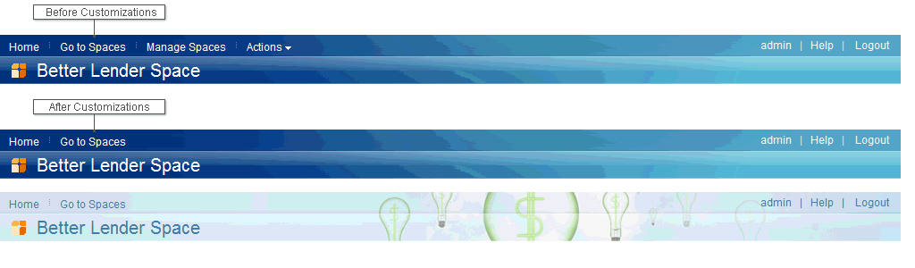
Related tasks:
Hiding banner elements in Process Portal spaces
Deploy a custom banner to a Process Portal space
Create custom banner files for Process Portal spaces
Example: Customizing the appearance of the banner in a Process Portal space
By default, a banner includes the title of the space and the icon associated with the space. If screen space is limited, you might want to remove this portion of the banner to save space. You can also change the color of the banner and the background image.
Remove the space title and the icon
To remove the banner title and icon, remove the following section from the banner.html file:
<div class="titleBannerRepeat">
<div class="titleBanner">
table class="bannerTable cellpadding=0 cellspacing=0>
<tr>
<td>
<div class="iw-iWidget iw-Standalone" id="spaceTitle">
<a class="iw-Definition" href="../topic/com.ibm.wbpm.admin.doc/customizing/BusinessSpace/iWidget/widgets/system/spaceTitle/spaceTitle.xml" style="display:none;"></a>
</div>
<div id="bspacePerformanceMetrics" class="navigationPanel" style="float:right; padding-right:20px">
</div>
</td>
</tr>
</table>
</div>
</div>
Change the color and the background image
The banner.html file retrieves certain style specifications by means of the class attribute. For example, the following section calls a set of specifications for the banner appearance:
- <div class="headerDivRepeat">
You can override these styles by adding rules to the banner.css file the banner.html points to.
For example, you can override the <div> tag that controls banner action links, replacing the gradient image with a solid background color, by adding the following rule to the banner.css file.
.headerDivRepeat {

background: #215d98 !important;
}
To add a custom image to the banner, add the following rule to the banner.css file to override the <div> tag that controls the common actions. The image path includes a subfolder called /images that has been added to the noSpaceTitle directory and that contains a graphic called smallBanner.png.
.mashups .headerDiv {

background-image: url("/mum/mycontenthandler/mm/dav/filestore/public/themes/bspaceTheme/banner/noSpaceTitle/images/smallBanner.png.") !important;

background-position: right !important;
Deploy a custom banner to a Process Portal space
After you have modify banner files, you must deploy the banner so the customization appears in a space.
You must have administrator privileges to complete this task.
Ensure made your changes on a local copy of the banner files.
- After you complete your edits to the banner content, ensure the directory containing the edited banner files is part of the WebDAV folder. This directory must appear as a peer to the original bspace folder.
If necessary, copy and paste the directory to the necessary location. Your WebDAV folder now contains the following folders:
WebDAV_folder/themes/bspaceTheme/banner/bspace

WebDAV_folder/themes/bspaceTheme/banner/folderName
where folderName is the name of your folder. - Locate the Mashups_DynamicSpotMapping file.
For a stand-alone server:
- profile_root/BusinessSpace/node_name/server_name/mm.runtime.prof/config
For a cluster:
- dmgr_profile_root/BusinessSpace/cluster/mm.runtime.prof/config
- Change the value of the BannerHtml property to res:/mum/mycontenthandler/mm/dav/filestore/public/themes/bspaceTheme/banner/folderName/banner.html,
where folderName is the folder name you assigned in Step 1.
- Run the updatePropertyConfig command using the wsadmin scripting client to update the configuration.
- For a stand-alone server:
The following example uses Jython:
AdminTask.updatePropertyConfig('[-serverName server_name -nodeName node_name -propertyFileName "profile_root/BusinessSpace/node_name/server_name/mm.runtime.prof/config/DynamicSpotMapping.properties" -prefix "Mashups_"]')

AdminConfig.save()
The following example uses Jacl:$AdminTask updatePropertyConfig {-serverName server_name -nodeName node_name -propertyFileName "profile_root/BusinessSpace/node_name/server_name/mm.runtime.prof/config/DynamicSpotMapping.properties" -prefix "Mashups_"} $AdminConfig save - For a cluster:
The following example uses Jython:
AdminTask.updatePropertyConfig('[-clusterName cluster_name -propertyFileName "dmgr_profile_root/BusinessSpace/cluster_name/mm.runtime.prof/config/DynamicSpotMapping.properties" -prefix "Mashups_"]')

AdminConfig.save()
The following example uses Jacl:$AdminTask updatePropertyConfig {-clusterName cluster_name -propertyFileName "dmgr_profile_root/BusinessSpace/cluster_name/mm.runtime.prof/config/DynamicSpotMapping.properties" -prefix "Mashups_"} $AdminConfig save
- For a stand-alone server:
- Clear your browser cache, and then log in to in a Process Portal space. You can now see the updated banner.
Related tasks:
Customizing the Help link in Process Portal spaces
Hiding banner elements in Process Portal spaces
Run custom code in a Process Portal space at logout
Create custom banner files for Process Portal spaces
Related reference:
Example: Customizing CSS styles to hide existing banner content in a Process Portal space
Create and customizing styles for Process Portal spaces
A style determines the color and appearance of a space by applying colors and images according to the layout defined in the theme. A theme can contain many styles. You can use a particular style, for example, to indicate the purpose of the space. You can also choose an icon to represent the space.
- Create styles for Process Portal spaces
You can customize styles and use them to change the color
and appearance of a space.
- Create custom images for Process Portal spaces
You can create custom images to customize the appearance
of controls, backgrounds, and borders in your space.
Create styles for Process Portal spaces
You can customize styles and use them to change the color and appearance of a space.
You must be an administrator, and be able to restart the server.
You must have access rights to the WebDAV folder to design and customize space styles.
You might need a web development tool, such as Mozilla Firebug, to edit cascading style sheet (CSS) files. A style uses images to provide the background and overall color. A style also uses a CSS file to identify these images and additional color specifications. To minimize the work involved in creating astyle, review the existing styles, copy the one that is closest to the style to create, and customize that copy.
- Copying existing styles for Process Portal spaces
Find a folder that contains a style that closely matches the style to create, and then copy it.
- Customizing styles for Process Portal spaces
After you create a copy of an existing style, you can customize the copy by specifying details such as name, location, and preview image.
- Customizing dialog boxes for Process Portal spaces
You can customize the appearance of dialog boxes in a space by adding rules to the cascading style sheet (CSS) file of your customstyle.
- Customizing menus for Process Portal spaces
Spaces include menus that present users with options. These menus are based on a standard dijitMenu implementation provided by the Dojo toolkit. You can customize the appearance of these menus
by modifying rules in the cascading style sheet (CSS) file of your custom style.
- Customizing the footer for a Process Portal space
You can customize the footer that is usually found at the bottom of every page in a space. By default, the footer contains an IBM logo.
- Customizing tab navigation for Process Portal spaces
You can customize tabs, displayed at the top of the content area and below the banner, that are used for page navigation.
- Customizing widget toolbars for Process Portal spaces
The widget toolbar is the part of a widget that contains the title, the context menu icon (down arrow), and the minimize and maximize icons. You can customize widget toolbars to change the icon images used in your spaces.
- Uploading custom styles for Process Portal spaces
To make a customized style available for use in a space, upload it so that users can see it in a list of styles.
Related tasks:
Set the home space for Process Portal spaces
Copying existing styles for Process Portal spaces
Find a folder that contains a style that closely matches the style to create, and then copy it.
In this procedure, you copy an existing style to use as a base for a customized style.
- Connect to the WebDAV folder and go to public/themes/bspaceTheme/spaceStyles.
- Find a folder that contains a style that resembles thestyle to create.
- Copy the folder, including the files it contains, and save the copy locally. For example, if you copied the banking folder, you might rename your local copy of the folder to custom.
- In your local copy of the public/themes/bspaceTheme/spaceStyles folder, rename the JavaScript file. For example, if you copied the banking folder and renamed it locally to custom, then also rename the banking.js file in your local folder tocustom.js.
You are now ready to customize your style by revising the JavaScript file and the content of the newly created folder.
Customizing styles for Process Portal spaces
After you create a copy of an existing style, you can customize the copy by specifying details such as name, location, and preview image.
You must have a local, renamed copy of an existing style folder and a copy of the corresponding JavaScript file.
The example in this procedure assumes that you copied a WebDAVstyles folder named banking and its corresponding JavaScript file locally, and that you renamed your local copy of both the styles folder and the JavaScript file to custom.
- Open your local, renamed copy of the JavaScript file that you copied and renamed.
For example, if you copied a style folder called banking, then the corresponding JavaScript file banking.js might look like the following example script.
{
"cp1": "Licensed Materials - Property of IBM",
"cp2": "5724-M22, 5724-M23, 5724-M24, 5724-L01, 5724-R31",
"cp4": "US Government Users Restricted Rights- Use, duplication or disclosure",
"cp5": "restricted by GSA ADP Schedule Contract with IBM Corp.",

"id": "banking",
"name": "Banking",
"preview": "banking/Banking_thumb_202x152.png",
"className": "bankingStyle",
"css": "banking/bankingStyle.css"}
Lines cp1 through cp5 are for copyright information and must not be changed.
- In your local JavaScript file, change the value of the id field to a unique name, such as custom.
- Change the value of the name field to the name that you want users to see in the Create Space and Edit Space dialogs. In this example, the value of the name is custom.
- Change the value of the preview field to the path of the preview image that you want users to see in the Spacestyle selector control. The dimensions of the preview image must be 202 X 152 pixels to match the other preview images. Because the JavaScript file is at the same level in the hierarchy as the folder that you copied and renamed, you must modify the path to reference the correct folder, for example, custom/Custom_thumb_202x152.png.
- Put your preview image in your local custom folder. You can then remove the existing preview image.
- Change the value of the className field. The CSS class name modifies the style of certain interface elements within this style only, and leaves unmodified any spaces that are assigned a different style. By convention, the CSS class name that is associated with a style is the name of the style followed by the word "Style". This example uses customStyle.
- Change the value of the css field to the CSS file name that is to be used to control the appearance for this style. Because the path is relative to the location of the JavaScript file, rename the path to point to your custom folder.
Also, the name of the CSS file must match the className variable.
For example, set css to custom/customStyle.css.
Your modified JavaScript file should look similar to the following script.
{ "cp1": "Licensed Materials - Property of IBM", "cp2": "5724-M22, 5724-M23, 5724-M24, 5724-L01, 5724-R31", "cp4": "US Government Users Restricted Rights- Use, duplication or disclosure", "cp5": "restricted by GSA ADP Schedule Contract with IBM Corp.", "id": "custom", "name": "Custom", "preview": "custom/Custom_thumb_202x152.png", "className": "customStyle", "css": "custom/customStyle.css"} - Rename the .css file. For example, in the custom folder, rename bankingStyle.css to match the name specified in the JavaScript file, customStyle.css.
- Use your text editor to search for all instances of bankingStyle and replace them with customStyle. This change ensures that all the existing rules apply only to the new custom style.
The renamed customStyle.css file still contains the className of the original style, in this example bankingStyle. Use your text editor to search for all instances of bankingStyle in the CSS file and replace them with customStyle. This change ensures that all the existing rules apply only to the new custom style.
- Optional: Provide translations for the name of your style.
The webDAV_folder\public\themes\bspaceTheme\spaceStyles\nls folder contains the translated resources files provided with Process Portal spaces. The resources file at the root of this directory, styleResources.js, is used for English locales. Translated versions of this resources file are contained in separate directories that correspond to each supported locale.
- Create your own file for your style resources, for example, customStyleResources.js. This file contains an entry for each style; the format of the entries is: "style ID": "display
name". The following example shows an entry for a style named "custom" and a display name "Custom":
{ "custom" ; "Custom" } - Copy your style resources file into the webDAV_folder\public\themes\bspaceTheme\spaceStyles\nls folder. This file is used for the English locale, which is also the default locale.
- For each language to support, open the corresponding locale folder and add an entry for your style. For example, to display the style name in German for users in a German locale, open the de folder and add an entry as follows:
- "custom": "German_string"
where German_string is the translatedstyle name.
- Repeat the previous step for any additional languages to support. If no translations are provided for a locale, it defaults to the English name.
- When the translated resources are in place, modify the JavaScript file for your custom style, for example, customStyle.js,
to refer to the new style resources file:
{
"id": "custom",
"name": "Custom",
"preview": "custom/Custom_thumb_202x152.png",
"className": "customStyle",
"css": "custom/customStyle.css",
"resourceFile": "customStyleResources"}
You can use the same resources file for multiple spacestyles by including an entry for each space style, separated by commas. For an example of a resources file that includes resources for multiple space styles, see the styleResources.js file.
- Test to make sure that your translated resources are displaying properly by clearing your browser cache and editing your space properties. When you view your space properties under different locale settings, the appropriate translated style label should be displayed.
- Create your own file for your style resources, for example, customStyleResources.js. This file contains an entry for each style; the format of the entries is: "style ID": "display
name". The following example shows an entry for a style named "custom" and a display name "Custom":
Customizing dialog boxes for Process Portal spaces
You can customize the appearance of dialog boxes in a space by adding rules to the cascading style sheet (CSS) file of your customstyle.
You can customize the appearance of dialog boxes. If you modify an existing dialog box, such as Go To Spaces, Space Manager, or Create Page, all dialog boxes with the same name in your site are modified in the same way. If using the .customStyle tag, the dialog boxes are not modified at all.
- Review the existing rules for background color and background images in the CSS file.
- Modify or add rules to the CSS file of your custom style to control the style of the dialog box.
Examples
These examples show rules that control the appearance of the following dialog box that uses a simple background color and no background image.

Every CSS rule must begin with the class selector corresponding to the name of the space style, for example "customStyle".
The following code is an example of rules for the color of the title bar on the dialog box. In this case, the dialog header will appear as a solid red color.
.customStyle .dialog_titlebar,
.customStyle .dialog_titlebar_notitle {
 background-color: #CC0000;
 background-image: none;
 color: #FFFFFF;}
The following code is an example of rules for the footer of the dialog boxes that contain the OK and Cancel buttons.
.customStyle .lotusDialog .lotusDialogFooter,
.customStyle .mmDialogBottomArea,
.customStyle .spaceDialogBottomArea,
.customStyle .spaceDialogBottomArea .spaceDialogBottomItems {
 background-color: #CC0000;
 background-image: none;
 color: #FFFFFF;}
The following code is an example of the rules for the close and close hover icons. You can include a close and a close hover icon in the root folder of your custom style. The icon names must match the names of your actual icons.
.customStyle .dialog_titlebar_close:hover {
 background-image: url(close_hover.png);}

.customStyle .dialog_titlebar_close{
 background-image: url(close.png);}
The close and close hover icons are in the upper right corner of the dialog box, as shown in the following illustration. A close hover icon is an icon that appears when the mouse is moved over the icon.

Customizing menus for Process Portal spaces
Spaces include menus that present users with options. These menus are based on a standard dijitMenu implementation provided by the Dojo toolkit. You can customize the appearance of these menus by modifying rules in the cascading style sheet (CSS) file of your custom style.
You must have a local, renamed copy of an existing style folder. The CSS file that you modify to customize your menu is contained within this new folder.
By default, the menus in a space look similar to the one shown in the following example:

You can customize the color of the borders, text, and background for menus in your spaces by updating specific rules that govern the appearance of different elements.
The following diagram and list highlight the different elements that can be customized, and the related attributes in the existing CSS rules.

- Menu border - Governed by dijitMenu
- Cleared menu item - Governed by dijitMenuItem
- Menu item separator for the top of an item - Governed by dijitMenuSeparatorTop
- Menu item separator - Governed by dijitMenuSeparator
- Menu item separator for the bottom of an item - Governed by dijitMenuSeparatorBottom
- Selected menu item - Governed by dijitMenuItemSelected
Example
The following example code demonstrates how the menus can be restyled to provide a different color scheme. In the example a dark gray color scheme is used instead of the default white color scheme.

/* Menus */
.customStyle .dijitReset .dijitMenuItem {
background: none repeat scroll 0 0 #555555;}

.customStyle.dijitReset .dijitMenuItem .dijitMenuItemLabel {
color: #EEEEEE;}

.customStyle.dijitMenu .dijitReset .dijitMenuSeparator{
background-color: #444444;}

.customStyle.dijitMenu .dijitReset .dijitMenuSeparator .dijitMenuSeparatorTop{margin: 0px 0px 0px 0px;
border-bottom: #444444 1px solid;}

.customStyle.dijitMenu .dijitReset .dijitMenuSeparator .dijitMenuSeparatorBottom{margin: 0px 0px 0px 0px;
border-bottom: #555555 1px solid;
border-top: #404040 1px solid;}

.customStyle.dijitPopup .dijitMenu {
border: 1px solid #444444 !important;}

.customStyle.dijitMenu .dijitMenuItemSelected {
background-color: #ffdda8 !important;}

.customStyle.dijitMenu .dijitMenuItemSelected .dijitMenuItemLabel{
color: #333333 !important;}
Upload the customizedstyle to the WebDav folder.
Customizing the footer for a Process Portal space
You can customize the footer that is usually found at the bottom of every page in a space. By default, the footer contains an IBM logo.
You can hide the default logo, or even the entire footer. You can replace the logo with your own logo, and you can change the background color and image of the footer.
The cascading style sheet (CSS) contains the code that controls the appearance and contents of the footer.
- To hide the IBM logo,
which by default appears at the left of the footer, use the following code in the CSS file:
.customStyle .bspaceFooterIBMLogo {
display: none;}
To replace the IBM logo, replace the background-image tag with an image of your own.
- To change the background color or image of the footer,
use the following code in the CSS file:
.customStyle .bspaceFooter {
background-image: none;
background-color: #00CC00;margin-bottom: 0;margin-top: 0;}
To replace the background image, replace the background-image tag with an image of your own. To hide the entire footer completely, use the display: none; style.
Customizing tab navigation for Process Portal spaces
You can customize tabs, displayed at the top of the content area and below the banner, that are used for page navigation. Tabs are made up of a number of images, which are combined into a "sprite" to improve performance. A default sprite named Sprite_01.gif is provided and is found in the WebDAV folder at public/themes/bspaceTheme/images. The most efficient way to customize tabs is to modify or create images in the default sprite.
The following diagram shows the image elements in the default sprite, Sprite_01.gif.
The following list describes some of the image elements in the default sprite.
- Tabs
-
Each tab is made up of a left, middle, and right image. These images create the rounded tab look of the currently selected tab. The nonselected tabs still have a left, middle, and right image, but by default they are given a flatter style to deemphasize them. The following rules contain the styling for these three images.
.tabbedNav .tabLeft
.tabbedNav .tabMiddle
.tabbedNav .tabRight
For the tab that is currently selected, the rules are slightly modified to include the tabSelected class name in the middle.
.tabbedNav .tabSelected .tabLeft
.tabbedNav .tabSelected .tabMiddle
.tabbedNav .tabSelected .tabRight
- New Page
-
The morePagesButton is the plus sign icon to the right of the tabs; clicking it adds more pages. It is made up of an image and a hover image. The following styles control the more pages buttons.
.tabbedNav .newPageIcon
.tabbedNav .newPageIcon:hover
- combinedTabBarAndEditPageButton
-
The combinedTabBarAndEditPageButton is the class name of the table that contains all of the tabs, the new page button, and the mode selector. The part of the image that is covered up by the other items shows through.
- combinedTabBarAndEditPageButton
- Mode Selector
-
The mode selector is the button that lets the user enter and exit edit mode. It is made up of a number of images that are controlled by the following rules.
.editPageButtonWrapper .editPageButtonLeft
.editPageButtonWrapper .editPageButtonMiddle
.editPageButtonWrapper .editPageButtonArrowBackground
.editPageButtonWrapper .editPageButtonRight
In view mode the page has an Edit Page button and a downward-pointing arrow, and in edit mode it has a Finish Editing button and an upward-pointing arrow.editPageButtonWrapper .editPageButtonArrowDown .editPageButtonWrapper .editPageButtonArrowUp
- Copy the Sprite_01.gif file to the root directory of your custom style folder, for example, the same folder that contains the customStyle.css file, and then rename it. The steps in these instructions use customTabSprite.gif as the name of the new sprite.
- Customize your copy of the sprite.
- Update the rules in your copy of the CSS file for your customization. Ensure that every CSS rule begins with the class selector corresponding to the name of the space style; in this example, the name is customStyle.
- Modify the URL value of the CSS background-image tag so that it refers to the customized sprite. For example:
.customStyle .tabbedNav .tabLeft {
background-image: url("customTabSprite.gif");}
Example
This example shows how to modify the CSS rules to achieve the customized tabbed navigation as shown in the following illustration. The example uses the modified sprite, CustomTabSprite.gif.
The presence of the customStyle class name at the beginning of each rule means the tab style is limited to the custom style.
.customStyle .tabbedNav .tabLeft {
background-image: url(CustomTabSprite.gif);
background-position: 0px -900px;
float:left;height:25px;width:2px;}

.customStyle .tabbedNav .tabRight {
background-image: url(CustomTabSprite.gif);
background-position: 0px -900px;
float:left;height:25px;width:2px;}

.customStyle .bspaceTheme .combinedTabBarAndEditPageButton {
background-image: url("CustomTabSprite.gif");
background-position: 0 -450px;height: 25px;}

.customStyle .editPageButtonWrapper .editPageButtonLeft,
.customStyle .editPageButtonWrapper .editPageButtonRight,
.customStyle .editPageButtonWrapper .editPageButtonMiddle {
background-image: url("CustomTabSprite.gif");}

.customStyle .editPageButtonWrapper .editPageButtonLeft {
background-image: url("CustomTabSprite.gif");
background-position: 0 -100px;
background-repeat: no-repeat;height: 25px;width: 5px;}
Related tasks:
Create custom images for Process Portal spaces
Customizing widget toolbars for Process Portal spaces
The widget toolbar is the part of a widget that contains the title, the context menu icon (down arrow), and the minimize and maximize icons. You can customize widget toolbars to change the icon images used in your spaces.
Here is an example of a basic widget toolbar:

When you hover over the toolbar, a different image is displayed. When you hover over an icon in the toolbar, yet another toolbar image is displayed. The default and hover variations of the icons and toolbars are found in Sprite_01.png. (For more information about sprites and their uses see Create custom images.)
The toolbar icons consist of an arrow for the context menu, a separator, a minimize and a maximize icon. When minimized or maximized, the icon for the current mode is replaced with a restore icon. Each icon has three images:
- An image that is displayed when the toolbar is not in focus
- A darker image that is displayed when you hover over the toolbar
- An orange image that is displayed when you hover over the icon
The toolbar icons are controlled by CSS rules that you can modify to hide icons or provide different icons for these parts of the toolbar. A number of CSS rules for the minimize, maximize, restore, and menu icons and their hover states are contained in the webDAV_folder/public/themes/bspaceTheme/theme.css file. These rules refer to the relative path, webDAV_folder/public/themes/bspaceTheme/images/Sprite_01.png.
To customize your toolbar:
- Follow the steps to create your own style, copying an existingstyle folder and renaming it, for example, to customStyle.
- Put a copy of Sprite_01.png in your customstyle folder. You can make updates to this sprite following the steps for creating your own images.
- Open the customStyle.css file and modify the rules to customize your widget toolbar.
The following list includes common rules that you can customize.
- Maximize icon appearance
-
The following rule controls the normal appearance of the maximize icon:
.customStyle .bspaceMaxIcon {
background-image: url(./Sprite_01.gif);
background-position: 0px -1300px; }
The addition of bspaceOverEditBar to the bspaceMaxIcon class name controls the icon used when you hover over the toolbar..customStyle .bspaceOverEditBar .bspaceMaxIcon { background-image: url(./Sprite_01.gif); background-position: 0px -1250px; }The hover modifier is used to control the orange icon used when you hover over the maximize icon.
.customStyle .bspaceMaxIcon:hover {
background-image: url(./Sprite_01.gif);
background-position: 0px -1350px; }
- Minimize icon appearance
-
The following rules control the appearance of the minimize icon in normal, toolbar hover, and icon hover states:
 .customStyle .bspaceMinIcon {
background-image: url(./Sprite_01.png);
background-position: 0px -1450px; }
.customStyle .bspaceOverEditBar .bspaceMinIcon {
background-image: url(./Sprite_01.png);
background-position: 0px -1400px; }
.customStyle .bspaceMinIcon:hover {
background-image: url(./Sprite_01.png);
background-position: 0px -1500px; }
- Restore icon appearance
-
The following rules control the appearance of the restore icon in normal, toolbar hover, and icon hover states:
 .customStyle .bspaceRestoreIcon {
background-image: url(./Sprite_01.png);
background-position: 0px -1600px; }
.customStyle .bspaceOverEditBar .bspaceRestoreIcon {
background-image: url(./Sprite_01.png);
background-position: 0px -1550px; }
.customStyle .bspaceRestoreIcon:hover {
background-image: url(./Sprite_01.png);
background-position: 0px -1700px; }
- Separator appearance
-
The following rules control the appearance of the separator graphic in normal and toolbar hover states:
 .customStyle .bspaceSeparatorIcon {
background-image: url(./Sprite_01.png);
background-position: 0px -1900px; }

.customStyle .bspaceOverEditBar .bspaceSeparatorIcon {
background-image: url(./Sprite_01.png);
background-position: 0px -1850px; }
- Context menu down-arrow icon appearance
-
The following rules control the appearance of the context menu down-arrow icon in normal, toolbar hover, and icon hover states:
 .customStyle .bspaceTheme .lotusWidget2 a.lotusActionMenu {
background-image: url(./Sprite_01.png);
background-position: 0px -1100px; }

.customStyle .bspaceTheme .bspaceOverEditBar a.lotusActionMenu {
background-image: url(./Sprite_01.png);
background-position: 0px -1050px; }

.customStyle .bspaceTheme .lotusWidget2 a.lotusActionMenu:hover {
background-image: url(./Sprite_01.png);
background-position: 0px -1150px; }
- Widget toolbar title color
-
For readability, you might also want to modify the color of the widget title displayed in the widget title bar.
.customStyle .decoration-titlebar {
color: #FFFFFF; }
After you have modified the customStyle.css file, save it, and upload your customstyle to the WebDav folder.
After making all of the modifications in the example, the widget toolbar has the following appearance depending on the state:
- Normal state

- Toolbar hover

- Icon hover

Uploading custom styles for Process Portal spaces
To make a customized style available for use in a space, upload it so that users can see it in a list of styles.
To upload a custom style, you must connect to the WebDav folder. The following procedure and example assume that you created or customized a style called "custom."
- Verify the custom.js file that contains the details of the custom style is saved in the custom folder.
- Upload the customized folder and the custom.js file to the spaceStyle folder in WebDAV.
- When the upload is finished, clear your cache and restart the server.
The next time that you create a space, your customized style will be available as a choice in the Create Space dialog box.
Create custom images for Process Portal spaces
You can create custom images to customize the appearance of controls, backgrounds, and borders in your space. Many of the images that are used for controls, borders, and backgrounds are combined into a sprite. Grouping the images together in a sprite reduces the number of server requests required to populate the page with images. The default sprite, Sprite_01.png, is provided and is found in the WebDAV folder at public/themes/bspaceTheme/images.
The images in a sprite can be related to each other, dependent upon each other, or independent of each other. When you customize a sprite, you do not need to update all the images that are related to each other. However, dependent images must be updated together. For example, a scalable button might consist of three parts (left, right, and center) all of which must be updated together.
The Sprite_01.png file contains images for tabbed navigation and widget toolbar icons. This file contains a number of images that are part of the space theme. Any modifications made to this file will apply to all spaces and styles across the space. To create modify the look of all spaces, create a theme rather than directly modifying any of the elements of the theme.
To create custom images to use in your spaces,
it is advisable to keep them together in a sprite. The simplest method is to copy the source for an existing sprite, such as Sprite_01.psd,
modify it, and save the modified file in .png format.
The .psd source for the default set of sprites
is available for download on the support site. After you have the new sprite
in place, modify the CSS rules for that part of the user interface to ensure the changes apply only to the related style.
The following table describes the images in the Sprite_01.png file. Images that are dependent upon or related to other images are noted in the description.
| Image | Description |
|---|---|
|
|
01 - Mode tab chevron - down - [Related to image 02] |
|
|
02 - Mode tab chevron - up - [Related to image 01] |
|
|
03 - Mode tab left (bidi LTR) - [Dependency on image 04, 05, 06, 07] |
|
|
04 - Mode tab right (bidi LTR) - [Dependency on image 03, 05, 06, 07] |
|
|
05 - Mode tab center, repeating - [Dependency on image 03, 04, 06, 07] |
|
|
06 - Mode tab right (bidi RTL) - [Dependency on image 03, 04, 05, 07] |
|
|
07 - Mode tab left (bidi RTL) - [Dependency on image 03, 04, 05, 06, 07] |
|
|
08 - Add page icon - normal - [Related to image 09] |
|
|
09 - Add page icon - hover - [Related to image 08] |
|
|
10 - Page tab section background |
|
|
11 - Page tab dropdown - hover - [Related to image 12] |
|
|
12 - Page tab dropdown - normal - [Related to image 11] |
|
|
13 - Selected page tab - left (bidi LTR) - [Dependency on image 15, 17] |
|
|
14 - Selected temporary page tab - left (bidi LTR) - [Dependency on image 16, 17] |
|
|
15 - Selected page tab - center, repeating - [Dependency on image 13, 16] |
|
|
16 - Selected temporary page tab - center, repeating - [Dependency on image 14, 18] |
|
|
17 - Selected page tab - right (bidi LTR) - [Dependency on image 15, 13] |
|
|
18 - Selected temporary page tab - right (bidi LTR) - [Dependency on image 16, 14] |
|
|
19 - Page tab divider |
|
|
20 - Actions menu dropdown twistie - normal - [Related to image 21] |
|
|
21 - Actions menu dropdown twistie - hover - [Related to image 20] |
|
|
22 - Widget menu dropdown twistie - widget border focused - [Related to image 23, 24, 25] |
|
|
23 - Widget menu dropdown twistie - normal - [Related to image 22, 24, 25] |
|
|
24 - Widget menu dropdown twistie - hover - [Related to image 22, 23, 25] |
|
|
25 - Widget menu dropdown twistie - pressed - [Related to image 22, 23, 24] |
|
|
26 - Maximize Widget - widget border focused - [Related to image 27, 28] |
|
|
27 - Maximize Widget - normal - [Related to image 26, 28] |
|
|
28 - Maximize Widget - hover - [Related to image 26, 27] |
|
|
29 - Minimize Widget - widget border focused - [Related to image 30, 31] |
|
|
30 - Minimize Widget - normal - [Related to image 29, 31] |
|
|
31 - Minimize Widget - hover - [Related to image 29, 30] |
|
|
32 - Restore Widget - widget border focused - [Related to image 33, 34, 35, 36, 37] |
|
|
33 - Restore Widget - normal - [Related to image 32, 34, 35, 36, 37] |
|
|
34 - Restore Widget - normal (bidi RTL) - [Related to image 32, 33, 35, 36, 37] |
|
|
35 - Restore Widget - hover - [Related to image 32, 33, 34, 36, 37] |
|
|
36 - Restore Widget - hover (bidi RTL) - [Related to image 32, 33, 34, 35, 37] |
|
|
37 - Restore Widget - widget border focused (bidi RTL) - [Related to image 32, 33, 34, 35, 36] |
|
|
38 - Widget control divider - widget border focused - [Related to image 39] |
|
|
39 - Widget control divider - normal - [Related to image 38] |
|
|
40 - Blank page button - left - hover - [Dependency on image 41, 42, 43, 44, 45, 46, 47, 48] |
|
|
41 - Blank page button - left - normal - [Dependency on image 40, 42, 43, 44, 45, 46, 47, 48] |
|
|
42 - Blank page button - left - pressed - [Dependency on image 40, 41, 43, 44, 45, 46, 47, 48] |
|
|
43 - Blank page button - center - hover - [Dependency on image 40, 41, 42, 44, 45, 46, 47, 48] |
|
|
44 - Blank page button - center - normal - [Dependency on image 40, 41, 42, 43, 45, 46, 47, 48] |
|
|
45 - Blank page button - center - pressed - [Dependency on image 40, 41, 42, 43, 44, 46, 47, 48] |
|
|
46 - Blank page button - right- hover - [Dependency on image 40, 41, 42, 43, 44, 45, 47, 48] |
|
|
47 - Blank page button - right- normal - [Dependency on image 40, 41, 42, 43, 44, 45, 46, 48] |
|
|
48 - Blank page button - right- pressed - [Dependency on image 40, 41, 42, 43, 44, 45, 46, 47] |
The following table describes the images in the Sprite_Style.png file. This file contains images for the banner area, widget toolbar, and horizontal portions of the widget border.
| Image | Description |
|---|---|
|
|
01 - Footer |
|
|
02 - Banner action link separator |
|
|
03 - Repeating banner image - lower left banner section |
|
|
04 - Non-repeating image - lower right banner section |
|
|
05 - Repeating banner image - upper left banner section |
|
|
06 - Non-repeating image - upper right banner section |
|
|
07 - Widget border - lower left corner |
|
|
08 - Widget border - lower horizontal |
|
|
09 - Widget border - lower right corner |
|
|
10 - Widget border - header - focus/hover state |
|
|
11 - Widget border - upper left corner |
|
|
12 - Widget border - header - normal state |
|
|
13 - Widget border - upper right corner |
The following table describes the images in the Sprite_Style_vertical.png file. This file contains images for vertical portions of the widget border.
| Image | Description |
|---|---|
|
|
01 - Widget border Vertical Left |
|
|
02 - Widget border Vertical Right |
Sprite_Style.png and Sprite_Style_vertical.png are specific to a space theme, and should be modified for each style. Styles are found in the WebDAV folder at /public/themes/bspaceTheme/spaceStyles. By convention, the name of the style is included in the name of the sprite. For example, in the banking style folder, the sprite files are called Sprite_Banking.png and Sprite_Banking_vertical.png.
Related tasks:
Customizing tab navigation for Process Portal spaces
Customizing page layouts for Process Portal spaces
A set of page layouts for you to use in your spaces. If the exact page layout that you need is not included in this set, you can create custom page layouts by making a copy of an existing set of layout files and customizing them.
Each page layout consists of the following set of files which are stored under a single directory. The name of the directory is used as a unique identifier for the layout.
- layout.html
- metadata.properties
- icon.gif
- metadata\localized_language.properties
The purpose and content of each of these files is described below.
layout.html
The layout.html file defines the core structure of the page layout. At the top of each page layout file is the following required text:
<span style="display:none" class="decoration">
com.ibm.pb.decorations.LayoutResizers</span>

<span style="display:none" class="decoration">
com.ibm.pb.decorations.LayoutFilters</span>

<div class="hiddenWidgetsDiv">

 <!--widgets in this container are hidden in the UI by default -->

 <div class="component-container hiddenWidgetsContainer ibmDndRow"
name="ibmHiddenWidgets">*/div>

 <div style="clear:both"></div>

</div>
After the required heading section, the body of the layout is specified. Each layout consists of a set of containers that are used to hold widgets. Row and column containers are supported. A row is used to arrange widgets horizontally. A row must occupy the entire width of the page. A column is used to arrange widgets vertically. Columns can occupy the entire width of a page or they can be arranged side-by-side with other columns. Each container (row or column) is specified in the file as an HTML <div> element with a class name of component-container.
The container <div> element can have the following additional class names:
| Class name | Description |
|---|---|
| ibmDndRow and ibmRow | Used together to indicate the container is a row container with widgets arranged side-by-side |
| ibmDndColumn | Indicates the container is a column container with widgets arranged vertically. |
| ibm1Col | Indicates the container is a column that is the full width of the page. |
| ibm2Col | Indicates the container is a column that is side-by-side with another column. |
| ibm3Col | Indicates the container is a column that is side-by-side with two other columns. |
| ibmRightColumn | Indicates the container is the last column in a group of side-by-side columns. |
Each container should also have a name. The first container on the page must be named ibmMainContainer.
The following example shows the content for a page with four containers: a row container across the top, a column container that spans the entire page width, and two column containers arranged side-by-side:
<div class="component-container ibm1Col ibmDndColumn" name="middle"></div>

<div class="component-container ibm2Col ibmDndColumn" name="left"></div>

<div class="component-container ibm2Col ibmRightCol ibmDndColumn" name="right">
</div>
metadata.properties
This file specifies the path name for the icon to display in the layout selection menu. Your icon graphic file should go into the layout folder that you created, as follows:
- thumbnailPath=layout-templates/mylayout/icon.gif
icon.gif
This file contains the image used within the layout selection menu. The image should be 22x22 pixels in size.
metadata\localized_language.properties
The metadata subdirectory contains a set of properties files that specify the title and description of the layout for each supported locale. For example, if you are using an English locale, then you would have a file named localized_en.properties within the metadata subdirectory.
The following is an example of the contents of one of these properties files:
# NLS_ENCODING=UNICODE
# NLS_MESSAGEFORMAT_NONE
title=My Layout
description=This is my custom layout.
After creating a new custom layout, you can use it to lay out pages in your spaces.
Customizing themes in a Process Portal space
A theme defines the overall structure, appearance, and behavior of a space. By default, all spaces use the standard theme provided with BPM. You can create one or more custom themes to replace or augment this default theme. The theme is a powerful set of programming artifacts that you can use to control every aspect of how a page is displayed in a space. However, for most customization purposes, for example, changing the color or images used within a space, consider customizing the style of the space rather than creating a new theme. Customizing the theme of a space is a much more complex undertaking, and has implications for space maintenance, migration, and upgrades to later product versions.
Before you customize the theme, be aware of the following:
- Customizing a theme requires familiarity with HTML, CSS, JavaScript, the iWidget specification, and the Dojo widget library.
- If you customize a theme, any IBM updates to the default theme artifacts will not be applied during regular service or maintenance activities. Customized themes must be updated and maintained manually.
The following files and folders define and control the theme for a space.
| File or folder name | Description |
|---|---|
| theme.html |
The theme is primarily defined by the theme.html file. This file contains four types of elements:
|
| embed.html | A simplified version of theme.html, this file contains the main lotusFrame markup with the widgets and is used to display the content area when a page is embedded on another web page. |
| metadata.properties | The properties file that contains identifying information for the theme. |
| theme.css and bspaceCustom.css | The style sheets that control the appearance
of the theme.
If you plan to make style changes to the theme, you need to either edit these files or create an additional CSS file as a peer of theme.css and bspaceCustom.css. |
| banner | This folder contains the dynamic content needed for banner customization. |
| images | This folder contains the images used in the theme. |
| menuDefinitions | This folder contains JavaScript Object Notation (JSON) files used to customize the content in context menus. |
| metaData | This folder contains the localized_en.properties file, which defines the name of theme shown in the Choose a theme for this space drop-down menu. |
| spaceStyles | This folder contains JavaScript files and subfolders used to apply different styles to the interface. |
| Standard | This folder contains the standard skin for widgets. This skin has a border around each widget and a toolbar on top with a context menu and icons for minimizing, maximizing, and restoring widget size. |
| Thin | This folder contains a widget skin that hides the border and the toolbar. |
- Create themes in a Process Portal space
For most of your space customization needs, you do not need to create a new theme. Instead, you can customize your spaces using custom color, images, banners, and so on without having to deal
with the complexity of themes. If you do need to create a custom theme,
you can customize the default theme to achieve the behavior and appearance
that you want.
- Elements in the theme for Process Portal spaces
Before you begin to customize the theme for a space, you need to
understand what each element is responsible for and whether you can
modify it.
- Enable banner customization in a custom theme for Process Portal spaces
The default theme allows for the customization of the banner
that appears at the top of a space. You can allow the same banner
customization in spaces that make use of your custom theme by providing your own dynamic content spot for your banner.
To make your changes to the theme available, restart the server that hosts the Process Portal space.
Create themes in a Process Portal space
For most of your space customization needs, you do not need to create a new theme. Instead, you can customize your spaces using custom color, images, banners, and so on without having to deal with the complexity of themes. If you do need to create a custom theme, you can customize the default theme to achieve the behavior and appearance that you want.
Before you customize the theme, be aware of the following considerations:
- Customizing a theme requires familiarity with HTML, CSS, JavaScript, the iWidget specification, and the Dojo widget library. You should review the details about the contents of the theme.html so that you understand which elements can be customized and which cannot.
- If you customize a theme, any IBM updates to the default theme artifacts will not be applied during regular service or maintenance activities. Customized themes must be updated and maintained manually.
To create a theme.
- Connect to the WebDAV folder, then navigate to webDAV_folder/public/themes/bspaceTheme
- Make a local copy of the bspaceTheme folder and rename it. (These instructions use the folder name customCompanyTheme in the steps and examples.)
- Edit the theme.html file to make the necessary modifications.
- From the local copy of customCompanyTheme, open the theme.html file in a text editor.
- Modify the bspaceTheme division
markup to allow your CSS rules to be scoped with the .customCompanyTheme rule.
Any existing rules scoped to .bspaceTheme are kept in place.
The following example shows the original value.
<body class="lotusui tundra mashups bspace">
<div class="themeContent">
<div class=bspaceTheme">
Change the original value, as follows. If you used a name other than customCompanyTheme for the folder, use your folder name instead.<body class="lotusui tundra mashups bspace"> <div class="themeContent"> <div class=customCompanyTheme">
- Modify the path of the loading curtain image so that it is relative to your new theme folder.
In the theme.html file, modify the following markup to point to your custom folder instead of the default bspaceTheme folder:
- "/mum/mycontenthandler/mm/dav/filestore//public/themes/customCompanyTheme/images/loading32.gif"
- Make any other edits that you need ( adding
markup for new widgets or deleting widgets). For more information on system widgets, including which ones are safe to replace or remove,
see the documentation for theme
elements.
For information on how to make allow banner customization within your theme, see Enable banner customization in a custom theme for Process Portal spaces.
Save and close the theme.html file.
- Modify the metadata.properties files to specify the theme name and set the developer mode.
- From the local copy of customCompanyTheme, open the metadata.properties file in a text editor.
- Modify the following entries in the file:
- unique-name: Replace the default value with a unique theme name. This name is used by the database to identify the theme for spaces and pages.
- com.ibm.bspace.theme.uniqueId: Replace the default value with a unique ID.
- developer-mode: If this entry does not exist, add it. Set the value to true.
Save and close the metadata.properties file.
- Modify the localized_en.properties file to specify the theme name that will appear in the Create Space dialog
box.
- From the local copy of customCompanyTheme/metaData,
open the localized_en.properties file in a text editor.
- Update the title entry to use the theme name to see when selecting a theme in the Create Space window. In the following example, the name My Company
Theme is used.
- title=My Company Theme
Save and close the localized_en.properties file.
- From the local copy of customCompanyTheme/metaData,
open the localized_en.properties file in a text editor.
- Upload your custom theme folder to the following WebDAV
folder:
http://hostName:Bspace_Port/mum/mycontenthandler/mm/dav/filestore/public/themes
- Restart the server.
- Clear the browser cache and then log in to the Process Portal space.
The custom theme that you created is now available in the Create Space window.
Although you now have a custom theme to use for your space, the steps in this task did not change the appearance of the theme.
To make significant customizations to the new theme, you will need a firm understanding of HTML, CSS, JavaScript, the iWidget specification, and the Dojo widget library.
Remember that you must upload any additional modifications, and that you need to clear the cache before you log in to the Process Portal space to use the customized artifacts.
Related concepts:
Support and compatibility information for Process Portal spaces
Related reference:
Elements in the theme for Process Portal spaces
Elements in the theme for Process Portal spaces
Before you begin to customize the theme for a space, you need to understand what each element is responsible for and whether you can modify it.
You can find the elements that control the function and appearance of a theme in the theme.html file. The following table contains a description of each element in the theme.html file, and whether you can remove or replace it.
| Component | Type | Layer | Remove | Replace | Details |
|---|---|---|---|---|---|
| head | dynamic content spot | IBM Mashup Center | N | N | Adds required JavaScript. |
| config | dynamic content spot | IBM Mashup Center | N | N | Adds required JavaScript. |
| bspaceConfig | dynamic content spot | Business Space | N | N | Adds required JavaScript. |
| loadingCurtain | system widget | Business Space | N * | Y | Displays a loading message while the user interface is constructed.
* Not recommended. Removing the feature will affect the user experience when page loads. |
| debugConsole | system widget | Business Space | N | N | Sends client side error message to the server for logging and improved serviceability. |
| bannerHtml | dynamic content spot | Business Space | Y | Y | Creates the banner area of the page. |
| tabbedNavigationWidget | system widget | Business Space | N * | Y ** | Provides page tabs to navigate between pages of a space.
* Removing this widget is not recommended due to complex even handling. Instead you can hide this widget. ** It is not recommended that you replace this widget because the implementation is complex. Instead you can hide this widget and provide a simplified navigation widget. |
| mode selector | system widget | Business Space/IBM Mashup Center | Y | Y | Button allows editors to switch between page view and edit mode. |
| status | dynamic content spot | IBM Mashup Center | Y | Y | Status area used to display messages. |
| customizeShelfContainer | system widget | Business Space/IBM Mashup Center | N * | N ** | Used by the palette to access required functionality.
* The palette depends on this widget so it cannot be removed if the palette is required. ** Replacing this widget is not recommended because the implementation is complex. |
| palette | system widget | Business Space | N | N ** |
Widget palette. ** Replacing this widget is not recommended because the implementation is complex. |
| layout | dynamic content spot | IBM Mashup Center | N * | N * | Creates and organizes all of the user's widgets on the page.
* Critical to overall function. |
| newPage | system widget | IBM Mashup Center | Y | Y | Dialog used to create a new page. |
| sharePage | system widget | IBM Mashup Center | Y | Y | Dialog used to change access control for a page or space. |
| reorderPage | system widget | IBM Mashup Center | Y | Y | Dialog used to reorder pages within a space. |
| StatusBarLogHandle | system widget | IBM Mashup Center | Y | Y | Handles logging of error and warning messages on the page. |
| editPage | system widget | IBM Mashup Center | Y | y | Dialog used to edit page properties. |
| copySpace | system widget | IBM Mashup Center | Y | Y | Dialog used to create a new space based on another space. |
| createSpace | system widget | Business Space/IBM Mashup Center | Y | Y | Dialog used to create a new space. |
| editSpace | system widget | Business Space/IBM Mashup Center | Y | Y | Dialog used to create an edit space properties. |
| spaceManager | system widget | Business Space | N * | N ** | Dialog used to administer spaces and pages in the system.
* Critical to overall function. ** Replacing this widget is not recommended because the implementation is complex. |
| templateManager | system widget | Business Space | Y | N ** | Dialog used to add templates.
** Replacing this widget is not recommended because the implementation is complex. |
| embedWidget | system widget | IBM Mashup Center | Y | N ** | Dialog used to generate the markup required to display widgets in an arbitrary HTML context.
** Replacing this widget is not recommended because the implementation is complex. |
| embedPage | system widget | IBM Mashup Center | Y | N ** | Dialog used to generate the markup required to display a page or widgets in an arbitrary HTML context.
** Replacing this widget is not recommended because the implementation is complex. |
| publishWidget | system widget | IBM Mashup Center | Y | N ** | Dialog used to publish a widget to the Information Center Hub.
** Replacing this widget is not recommended due to complexity of implementation. |
| renameWidget | system widget | IBM Mashup Center | Y | Y | Dialog used to rename a widget. |
| importWidget | system widget | IBM Mashup Center | Y | Y | Dialog used to import a widget from the Information Center Hub. |
| pageCreate | system widget | Business Space | Y | Y | Dialog used to create a new page. |
| spaceChangeOwnerWidget | system widget | IBM Mashup Center | Y | Y | Dialog used to assign a new owner for a space. |
| spaceEditorWidget | system widget | IBM Mashup Center | Y | Y | Dialog used to assign edit properties for a space. |
| changeOwner | system widget | IBM Mashup Center | Y | Y | Dialog used to assign a new owner for a page. |
| showLink | system widget | Business Space | Y | Y | Dialog used to generate a URL that can address the current page and navigation state. |
| styleManager | system widget | Business Space | Y | Y | Manages the style. |
| wireInterface | system widget | Business Space | Y | N ** | Dialog used to manage the wiring between widgets on a page.
** Replacing this widget is not recommended because the implementation is complex. |
| dialogDisplayer | system widget | Business Space | N * | Y | Controls how dialogs are displayed and positioned.
* This is a required function. |
| asa | dynamic content spot | IBM Mashup Center | Y | Y | Provides hooks for analytics capability. |
Many of the widget names clearly communicate the function of the widget. However, some system widgets handle important event processing and should not be removed. Elements with an 'N' in the Remove or Replace column should not be removed or replaced, but they can be hidden.
For example, the tabbedNavigationWidget is marked with an "N" for Remove because it handles events for showing and removing the loading curtain. (The loading curtain displays a white screen with a Loading... message when pages and widgets are loading.)
The loadingCurtain widget is marked with a "Y" for Replace because you can add display:none to the style attribute of the relevant <div> section and provide an alternate navigation iWidget as shown in the following example.
Example: Replacing the tabbedNavigationWidget
The tabbedNavigationWidget system widget controls how page tabs are displayed at the top of a space. Within the widget, handlers for the com.ibm.mashups.builder.switchPage and com.ibm.mashups.builder.pageSwitched events broadcast the com.ibm.bspace.removeLoadingCurtain event to hide the loading curtain.
- com.ibm.mashups.iwidget.services.ServiceManager.getService("eventService").broadcastEvent("com.ibm.bspace.removeLoadingCurtain", "true");
If you plan to update theme.html file to remove the tabbedNavigationWidget system widget and replace it with your own navigation widget, your custom widget must handle the com.ibm.mashups.builder.switchPage and com.ibm.mashups.builder.pageSwitched events, and broadcast the com.ibm.bspace.removeLoadingCurtain event to hide the loading curtain. Use the following code to handle and broadcast these events in your navigation widget.
<div class="iw-iWidget iw-Standalone" id="tabbedNavigationWidget" style="width: 100%;">
<a class="iw-Definition" href="../topic/com.ibm.wbpm.admin.doc/customizing//BusinessSpace/iWidget/widgets/system/tabbedNavigation/tabbedNavigation.xml"> </a>
<span class="iw-ItemSet"  style="visibility: hidden; display: none;">
<a class="iw-Item" style="visibility: hidden; display: none;" href="../topic/com.ibm.wbpm.admin.doc/customizing/#isBSpaceMode">true</a>
<a class="iw-Item" style="visibility: hidden; display: none;" href="../topic/com.ibm.wbpm.admin.doc/customizing/#isBSpaceGlobalMode">false</a>
</span>
</div>
This code leaves the loading curtain in place.
Related tasks:
Create themes in a Process Portal space
Enable banner customization in a custom theme for Process Portal spaces
The default theme allows for the customization of the banner that appears at the top of a space. You can allow the same banner customization in spaces that make use of your custom theme by providing your own dynamic content spot for your banner.
You must have administrator privileges to complete this task.
Follow the steps for creating the artifacts for a new custom theme.
- Open the theme.html file in your custom theme folder.
- Edit the following section of the file to refer to your own banner content, as shown below.
Before:
- <a rel="dynamic-content" href="../topic/com.ibm.wbpm.admin.doc/customizing/dyn-cs:id:bannerHtml@tl:oid:csa2.theme"></a>
After:
- <a rel="dynamic-content" href="../topic/com.ibm.wbpm.admin.doc/customizing/dyn-cs:id:customBannerHtml@tl:oid:csa2.theme"></a>
- Define your own dynamic content spot for your theme as follows:
- Locate the Mashups_DynamicSpotMapping file.
For a stand-alone server:
- profile_root/BusinessSpace/node_name/server_name/mm.runtime.prof/config
For a cluster:
- dmgr_profile_root/BusinessSpace/cluster/mm.runtime.prof/config
- Add a new property, such as customBannerHtml, with a value of the path to the banner file in your custom theme, including the WebDAV directory. For example,
- res:/mum/mycontenthandler/mm/dav/filestore/public/themes/customTheme/banner/customBanner/banner.html
- Run the updatePropertyConfig command using the wsadmin scripting client to update the configuration.
- For a stand-alone server:
The following example uses Jython:
AdminTask.updatePropertyConfig('[-serverName server_name -nodeName node_name -propertyFileName "profile_root/BusinessSpace/node_name/server_name/mm.runtime.prof/config/DynamicSpotMapping.properties" -prefix "Mashups_"]')

AdminConfig.save()
The following example uses Jacl:$AdminTask updatePropertyConfig {-serverName server_name -nodeName node_name -propertyFileName "profile_root/BusinessSpace/node_name/server_name/mm.runtime.prof/config/DynamicSpotMapping.properties" -prefix "Mashups_"} $AdminConfig save - For a cluster:
The following example uses Jython:
AdminTask.updatePropertyConfig('[-clusterName cluster_name -propertyFileName "dmgr_profile_root/BusinessSpace/cluster_name/mm.runtime.prof/config/DynamicSpotMapping.properties" -prefix "Mashups_"]')

AdminConfig.save()
The following example uses Jacl:$AdminTask updatePropertyConfig {-clusterName cluster_name -propertyFileName "dmgr_profile_root/BusinessSpace/cluster_name/mm.runtime.prof/config/DynamicSpotMapping.properties" -prefix "Mashups_"} $AdminConfig save
- For a stand-alone server:
- Locate the Mashups_DynamicSpotMapping file.
By defining your own content spot, you ensure that your theme functions independently from the default theme and only depends on resources from within your custom theme.
To make your changes to the theme available, restart the server that hosts the Process Portal space.
Related tasks:
Create custom banner files for Process Portal spaces
Customizing the BPM dashboards
You can customize the dashboards that IBM Business Process Manager provides or create your own custom dashboards. The Process Portal BPM system application (TWP) contains content to support the out-of-the box Process Portal. It contains exposed dashboards that show up within the Process Portal web application.
IBM Business Process Manager provides the following dashboards:
- Team Performance
- Process Performance
In addition to these dashboards, IBM Business Process Manager also has a Work page. However, in addition to customizing and rebranding Process Portal itself, you can customize the BPM dashboards by performing the following actions:
- Create custom dashboards. For information, see Create a custom dashboard and Example: Creating a dashboard.
- Remove the Work page that IBM Business Process Manager provides. Remove this page only if users do not complete their tasks by using the BPM Work page. To remove the Work page, open the BPM_WORK human service in the Process Portal app and set its Exposed As field to Not Exposed. For information about changing the exposure of a human service, see Exposing a human service.
- To hide dashboards from Process Portal users, change the Exposed As field to Not Exposed. You might want to hide dashboards if all Process Portal users have Internet Explorer 8, which is not supported for the dashboards. Or, you might want to remove the users with Internet Explorer 8 from the Exposed To list.
- Customize the Process Performance and Team Performance dashboards that IBM Business Process Manager provides. For information, see Customizing the Process Performance and Team Performance dashboards.
- Set the default start page for a user or user group. For information, see Reset the Process Portal start page for a user. However, for the value, specify the page that you want as the default.
- Set the tab order for a user or user group. For information, see Set the Process Portal tab order for a user group.
- Switch to a different dashboard by using URL addressability. The format of the URL is /ProcessPortal/dashboards/APP/Service/Snapshot?tw.local.param1=val1
- Customizing the Process Performance and Team Performance dashboards You can customize the Process Performance and Team Performance dashboards to fit your business needs.
- Create a custom dashboard To show the business information that you are interested in, you can create custom dashboards.
- Example: Creating a dashboard This example shows you how to create a dashboard and how it functions in Process Portal.
Customizing the Process Performance and Team Performance dashboards
You can customize the Process Performance and Team Performance dashboards to fit your business needs.
To customize the Process Performance and Team Performance dashboards, clone the most recent snapshot of the Process Portal application. You can then modify the Process Performance and Team Performance dashboards in your copy. If you apply a product update that contains changes to the Process Portal application, clone the updated Process Portal application, and then reapply your customization changes to the new copy. For information about creating a snapshot, see Create snapshots in the Process Center console.
- Change the name of the dashboard by creating a key in a resource bundle and then assigning the label of the human service to that name. For information, see Globalizing dashboard names.
- Edit the .css files in the copy of the Process Portal application to modify the styles the dashboard Coach Views use. Alternatively, override specific styles in these .css files by adding inline CSS rules. The primary file that contains the CSS rules is PerformanceDashboard.css.
- In your copy of the Process Portal application, change the contents of the Coaches themselves or the Coach Views they contain.
Related tasks:
Cloning process applications in the Process Center console
Developing reusable Coach Views
Create a custom dashboard
To show the business information that you are interested in, you can create custom dashboards.
You can add a custom dashboard to Process Portal by creating a human service that you then expose as a dashboard. The human service can be in any process application. Using the dashboard, users can look at the business data that is related to the business process. The users can then use the dashboard to react to that business data or another item, such as a message.
- Add a dependency on the Dashboard toolkit and other toolkits that contain resources that your dashboard uses. For information, see Create a toolkit dependency in the Designer view. The Dashboard toolkit contains Coach Views and other resources that you can use to create a dashboard.
- Create the human service that users monitor and interact with through a dashboard. For information, see Building a human service.
- In the Overview page of the human service, set the Expose To field to a team whose members can view and use the dashboard. Set the Exposed As field to Dashboard. For information, see Exposing a human service.
- Optional: Set the label that Process Portal displays for the dashboard name. If you do not set the label, Process Portal uses the name of the human service as the label. For information, see Globalizing dashboard names.
- Create the user interface for the dashboard by using one or more Coaches. For information, see Building
Coaches. The Coaches typically contain one of more Coach Views.
These Coach Views can be stock controls, controls from the Dashboard toolkit, or custom Coach Views. For information about creating Coach Views, see Developing reusable Coach Views..
Process Portal has a control that you can use to set the current page as the start page in the upper-left corner of its contents area.
 When you are designing the layout to the Coach, ensure that you compensate for the location of this control.
For example, move a Coach View so that it is not overlapped by the control by using a CSS rule to create a margin or add padding.
When you are designing the layout to the Coach, ensure that you compensate for the location of this control.
For example, move a Coach View so that it is not overlapped by the control by using a CSS rule to create a margin or add padding.
- Within your custom dashboard, if you want the controls in the Dashboard toolkit to navigate to within your custom dashboard,
create a custom Navigation Controller. Add the custom Navigation Controller
to your custom dashboard.
Some of the controls require the Navigation Controller control is available in the dashboard. For information, see the documentation for individual controls in the Dashboard controls section. To create a custom Navigation Controller:
- Copy the Navigation Controller in the Dashboards toolkit to your process application or to a toolkit that your process application has a dependency on.
- Open the Behavior page of the copy and select the load event handler.
- Edit the topic.subscribe callback function so that it constructs the correct URL for the target dashboard. You can accomplish this goal by using utilities.generateCustomDashboardURL
= function(/*string*/type, /*string*/appName, /*string*/serviceName,
/*object*/params, /*string, optional*/ snapshotName). For example,
var urlType = null;
if ((!!(window.parent)) &&(window != window.parent)) {
 // In Process Portal
 urlType = utilities.constants.PORTAL_DASHBOARD_URL_TYPE; } else {
 // Not in Process Portal
 urlType = utilities.constants.SERVICE_URL_TYPE; }
var targetLocation = utilities.generateCustomDashboardURL(urlType, "MyApp", MyHumanService", params)
console.log(targetLocation);
The params can be constructed from the published event. It has the following format:params = { "tw.local.param01":"data" "tw.local.param02":"data2"}The URL created for navigation differs depending on where the user sees the dashboard:
- If the user sees the dashboard in Process Portal, the format of the URL is /dashboards/{PROCESS_APP_NAME}/{HUMAN_SERVICE_NAME} followed by additional parameters to pass to the human service of the dashboard. For example, to pass the process application ID, the URL is /dashboards/{PROCESS_APP_NAME}/{HUMAN_SERVICE_NAME}?tw.local.processAppId=myProcessID.
- If the user sees the dashboard in Process Designer or in a custom portal, the format of the URL is /teamworks/executeServiceByName?processApp={PROCESS_APP_NAME}&serviceName={HUMAN_SERVICE_NAME} followed by additional parameters to pass to the human service of the dashboard.
- Copy the Navigation Controller in the Dashboards toolkit to your process application or to a toolkit that your process application has a dependency on.
- In any custom Coach View that needs to perform dashboard
navigation, publish the event to the topic the Navigation Controller
subscribes to. The callback function constructs the payload for the event. For example, the Process Summary Coach View in the Dashboards toolkit has the following callback:
this.doNavigationCallback = function _doNavigationCallback_ProcessSummary(evt){
 try{
  var data = (!! this.context.binding) ?  this.context.binding.get("value") : null;
 if(data!=null && typeof(data.processId)!="undefined" && data.processId!=""){
   var params = {};
   params[dutils.constants.DASHBOARD_NAVIGATION_SOURCE] = "ProcessSummary";
   params[dutils.constants.DASHBOARD_NAVIGATION_DESTINATION] = dutils.constants.PROCESS_PERFORMANCE_SERVICE;
   params[dutils.constants.PROCESS_ID_PARAMETER] = data.processId;
   topic.publish(dutils.constants.DASHBOARD_NAVIGATION_TOPIC, params);
  }
 } catch (e) {
  console.error(e);
 }};
In this case, the payload is:"sourceControl":"ProcessSummary", "destinationService":"Process+Performance", "tw.local.processAppId":"myProcessID"
For more examples, see the Navigation Controller and the Coach Views in the Dashboards toolkit.
Related tasks:
Customizing the Process Performance and Team Performance dashboards
Example: Creating a dashboard
This example shows you how to create a dashboard and how it functions in Process Portal. The dashboard in this example contains a task list and a chart. The task list shows the currently active tasks. The chart shows the number of these tasks and their current states.
For a demonstration on how to create this dashboard, watch "Creating
IBM Process Portal Version 8.5 dashboards", available on YouTube or the IBM Education Assistant information center.
A transcript of the video is available.
- In your process application, add a dependency to the Dashboards 8.5.0 toolkit. For information about adding a dependency to a toolkit, see Create a toolkit dependency in the Designer view.
- Create a human service called MyTaskPage. For information, see Building a human service.
- In the Variables page of MyTaskPage,
add the following private variables:
Variable name Type (location of the type) chartdata ChartData (Dashboards 8.5.0) tasklistdata TaskListData (Dashboards 8.5.0) chartdisplayoptions ChartDisplayOptions (Dashboards 8.5.0) The Variables page of MyTaskPage looks something like this screen capture:

- In the MyTaskPage diagram, add a server script and a Coach to the layout. Connect the start node to the script and the script to the Coach.

- Select the server script and add the following JavaScript code in the implementation properties. This code initializes
the variables the dashboard uses.
var tlProps = new tw.object.TaskListProperties();
tlProps.includeRiskStateSummary = true;

tw.local.chartdata = new tw.object.ChartData();
tw.local.chartdata.plots = new tw.object.listOf.ChartDataPlot();
tw.local.chartdata.plots[0] = new tw.object.ChartDataPlot();
tw.local.chartdata.plots[0].series = new tw.object.listOf.ChartDataSeries();
tw.local.chartdata.plots[0].series[0] = new tw.object.ChartDataSeries();
tw.local.chartdata.plots[0].series[0].label = "Task risk states for current user";
tw.local.chartdata.plots[0].series[0].data = new tw.object.listOf.ChartDataPoint();

var tld = tw.system.retrieveTaskList(tlProps, 0, 0);
tw.local.tasklistdata = tld;
var riskstatesKeys = tld.riskStateSummary.keyArray();
for (var i=riskstatesKeys.length;i--;) {
 var dataPoint = new tw.object.ChartDataPoint();
 dataPoint.name = tld.riskStateSummary.keyArray()[i];
 dataPoint.value = tld.riskStateSummary.valueArray()[i];
 tw.local.chartdata.plots[0].series[0].data.insertIntoList(0, dataPoint);}

//Setting the configuration options for the chart by script instead of the UI
tw.local.chartdisplayoptions = new tw.object.ChartDisplayOptions();
tw.local.chartdisplayoptions.plots = new tw.object.listOf.ChartPlotDisplayOptions();
tw.local.chartdisplayoptions.plots[0] = new tw.object.ChartPlotDisplayOptions();
tw.local.chartdisplayoptions.plots[0].plotType = "Columns";
tw.local.chartdisplayoptions.plots[0].displayHorizontalAxis = true;
tw.local.chartdisplayoptions.plots[0].displayVerticalAxis = true;
If you see warning icons, check the spelling of your variables.
- In the Coach, create the layout for the dashboard:
- In the palette filter, select Dashboards to put the Dashboard controls onto the palette.
- Add a Custom HTML advanced item. In its properties, paste the following code:
<style>
.DashboardTitle {
 background-color: rgb(222,231,239);
 text-indent: 50px;
 font-size: 24px; }
</style>
The code indents the title so that it is not overlapped by the feature that sets the landing page for Process Portal. - To add the title to the dashboard, add an Output Text control and set its label to My Tasks. Clear its binding because the binding is not needed. In its HTML attributes, add the DashboardTitle class. This class is the class set the CSS rule for in the custom HTML.
- To contain the visual elements of the dashboard, add a Horizontal Section control. In the general properties of the section, set its label visibility to Hide.
- To add the task list to the dashboard, add a Task List control that is bound to the tasklistdata private variable to the horizontal section.
- To add the chart to the dashboard, add a Chart control that is bound to the chartdata private variable to the horizontal section.
- To set the look of the chart, configure the Chart control by setting the following configuration properties:
Configuration property Value Title Tasks by Risk State Width 600 Height 300 Theme At risk or overdue Display options chartdisplayoptions variable - Add a Navigation Controller to the layout. The Navigation Controller provides the navigation from the dashboard to the Work page.
- Remove the OK button the Coach provided by default. The button is not required because there is no other Coach to transition to.
The layout for the Coach looks something like this screen capture:
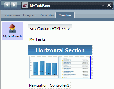
- In the palette filter, select Dashboards to put the Dashboard controls onto the palette.
- In the Overview page of the MyTaskPage
human service, set the exposure settings:
- For Exposed To, select the Approvers team.
- For Expose As, select Dashboard.
Save your dashboard.
- For Exposed To, select the Approvers team.
When you log in to Process Portal, the example dashboard is in the task list. When you select the example dashboard you can then see its contents: the task list and chart. The task list might contain tasks as shown in the following screen capture:
 If the task list does not contain tasks, you can use the Hiring Sample to populate the task list if the sample is available. In the Work page, select Standard HR Open New Position. This action creates a submit requisition
task. Do not complete and submit the task because that action moves the task to a different step in the task flow. If you return to the MyTaskPage dashboard, the task list contains this task.
If the task list does not contain tasks, you can use the Hiring Sample to populate the task list if the sample is available. In the Work page, select Standard HR Open New Position. This action creates a submit requisition
task. Do not complete and submit the task because that action moves the task to a different step in the task flow. If you return to the MyTaskPage dashboard, the task list contains this task.
When you select a task from the list, the Work page opens to display the task details. If you do not complete the task, and return to the example dashboard, the task list still contains the task. If you then select the new task, the Work page shows the new task. When you return to the previous task, data that was in the form when you clicked Next or Submit is preserved.
Related tasks:
Customizing Business Process Choreographer Explorer or Business Process Archive Explorer
Business Process Choreographer Explorer provides a user interface for administrators to manage BPEL processes and human tasks, and for business users to work with their assigned tasks. Business Process Archive Explorer provides a similar user interface for browsing and deleting instances that have been moved to an archive database. Because they provide generic interfaces, an administrator might want to customize the interface of a specific Business Process Choreographer Explorer or Business Process Archive Explorer instance to address the business needs of the user groups that are assigned to each instance.
The Business Process Choreographer Explorer reporting functionality is deprecated. To monitor and report on BPEL processes, use IBM Business Monitor.
Because the Business Process Archive Explorer is based on the Business Process Choreographer Explorer, the same customization options apply to both user interfaces.
-
 Customizing
the Business Process Choreographer Explorer or Business Process Archive Explorer navigation pane and default login view
The default client user interface contains a set of predefined views. It also has a default view that is shown after users log in. For Business Process Choreographer Explorer this is the My To-dos view, and for Business Process Archive Explorer it is the Process Instances Administered
By Me view. If you have one of the system administrator roles, you can change the views that are shown to your users in the navigation pane, and the default view they see when they log in.
Customizing
the Business Process Choreographer Explorer or Business Process Archive Explorer navigation pane and default login view
The default client user interface contains a set of predefined views. It also has a default view that is shown after users log in. For Business Process Choreographer Explorer this is the My To-dos view, and for Business Process Archive Explorer it is the Process Instances Administered
By Me view. If you have one of the system administrator roles, you can change the views that are shown to your users in the navigation pane, and the default view they see when they log in.
- Create customized views for Business Process Choreographer Explorer or Business Process Archive Explorer
Create customized views to extend the set of views that are available to users of a client instance so the user interface meets the workflow patters of these users.
- Create personalized views for Business Process Choreographer Explorer or Business Process Archive Explorer
The navigation pane in the default user interface contains a set of links to predefined views and views that are defined by your system administrator. Independent of your roles, you can add your own views to your navigation pane. For example, you can add a new view to monitor the progress of a specific task or process. You can specify the information shown, the filter and sort criteria, and also the actions provided in the view.
- Reusing Business Process Choreographer Explorer or Business Process Archive Explorer views
Customized and personalized views are available only on the instance of Business Process Choreographer Explorer or Business Process Archive Explorer on which they were created. However, you can reuse these views in other client instances by exporting them from the current instance, and then importing them into another instance of Business Process Choreographer Explorer or Business Process Archive Explorer.
- Delete Business Process Choreographer Explorer or Business Process Archive Explorer views
Over time, views that have been created on an instance of Business Process Choreographer Explorer or Business Process Archive Explorer might no longer be needed. For example, when employees leave the company, you might want clean up the database to remove their personalized views.
- Change the appearance of the default Business Process Choreographer or Business Process Archive Explorer user interface
Both Business Process Choreographer Explorer and Business Process Archive Explorer have ready-to-use web user interfaces based on JavaServer Pages (JSP) files and JavaServer Faces (JSF) components.
A cascading style sheet (CSS) controls how the web interface is rendered.
You can modify the style sheet to adapt the user interface without writing any new code.
Related tasks:
Developing Web applications using JSF components Business Process Archive Explorer navigation pane and default login view
Customizing the Business Process Choreographer Explorer or Business Process Archive Explorer navigation pane and default login view
The default client user interface contains a set of predefined views. It also has a default view that is shown after users log in. For Business Process Choreographer Explorer this is the My To-dos view, and for Business Process Archive Explorer it is the Process Instances Administered By Me view. If you have one of the system administrator roles, you can change the views that are shown to your users in the navigation pane, and the default view they see when they log in. For example, you might have BPEL processes that are based on state machines. Because the default user interface does not include views for working with state machines, you can add views for process templates and process instances that are based on state machines.
To customize the navigation pane and the default login view.
- Click Customize in the taskbar.
- In the Customize Navigation Tree and Login View page, select the views to include in and clear the views to remove from the navigation pane.
- Select the view that your users see when they log into the instance of the client.
The list contains the views that you selected in the previous step and any customized views that you created or imported from the Manage Views page.
- To save your changes, click Save. The predefined views appear with icons in front of them in the navigation pane. You can change the position of these views in the list.
- To return the views for this instance to the default views, click Restore defaults.
This action resets the navigation pane to the list of predefined views. Customized views in the navigation pane are not affected by this action.
Create customized views for Business Process Choreographer Explorer or Business Process Archive Explorer
Create customized views to extend the set of views that are available to users of a client instance so the user interface meets the workflow patters of these users. If you have one of the system administrator roles, you can customized views for a client instance. To customized views for this instance.
- Click Manage Views in the taskbar.
- In the Manage Views page, expand the Define Customized Views section, and select the type of view to create.
- In the Search For ... And Define Customized Views page, where ... is the type of view, for example Process Templates, select a query table for your view.
A default query table is set for your view definition. You can either select a different query table, or choose not to use query tables in your view definition.
If you use a query table, you cannot specify additional search criteria here for the view. All the search criteria must be defined in the query table definition.
If you are not using a query table, specify search criteria. Use the Process Criteria tab, the Task Criteria tab, and the Property Filters tab to limit the search results, for example, to a specific process template. When defining instance views, you can also use the User Roles tab to limit the search results to users, groups, or roles.
- If you are using query tables and the query table definition has parameters, specify the query parameters needed on the Query Properties tab.
The parameter names specified must match the names in the query table definition. You can also provide default values for the parameters, and specify whether a default value can be overwritten when the query for the view is run.
- In the View Properties tab, select the list columns, list properties, such as ordering properties and the results threshold, and action bar actions to include in the view.
If this is a task, process, or activity instance view, you can use the View Settings pane to specify which items are shown to users in the system administrators and system monitors role.
- To show all items that match the search criteria in the view, select All Instances.
- To show only the items the logged-on user is assigned for a specific role, select Personal Instances.
- Enter a display name for the view in the View Name field, and click Check and Save.
The search is run to check for errors. If it runs without errors, the view is saved. Use the Summary tab to check the settings that are currently set for the view.
If you are using a query table and you have specified query parameters that can be overwritten, the Specify Query Parameters page for the new view is displayed after you click Check and Save. Enter a value for each of the query parameters, and click Check and Save again.
The new view appears in your navigation pane. Your users see this view the next time they log in to the instance of the client that you added the view to. Do not prompt for the parameter values when using the view
- Create
customized views in Business Process Choreographer Explorer or Business Process Archive Explorer for process templates for state machines
Although a predefined view is provided for the process templates for state machines, you might want to define your own views for this type of template.
- Create
customized views in Business Process Choreographer Explorer or Business Process Archive Explorer for process instances for state machines
Although a predefined view is provided for the process instances for state machines, you might want to define your own views for this type of process instance.
Related concepts:
Authorization roles for business processes
Authorization roles for human tasks
Related tasks:
Create query tables for Business Process Choreographer Explorer Explorer or Business Process Archive Explorer for process templates for state machines
Create customized views in Business Process Choreographer Explorer or Business Process Archive Explorer for process templates for state machines
Although a predefined view is provided for the process templates for state machines, you might want to define your own views for this type of template.
To customized views, you must have one of the system administrator roles.
To process template views for state machines.
- Click Manage Views in the taskbar.
- In the Manage Views page, select Search For Process Templates And Define Customized Views.
- Click Property Filters > Custom Property Filters.
- Add a custom property with the following settings:
- In the Property Name field, type generatedBy.
- In the Property Value field, type BusinessStateMachine.
- Click Add.
- Add other custom properties as needed.
- Add a custom property with the following settings:
- Click View Properties > List Columns.
- In the List Columns for Custom Properties, add a custom property with the following settings:
- In the Property Name field, type generatedBy.
- In the Display Name field, type a display name for the column, and click Add.
- Add other columns to or remove columns from the list of selected columns.
- In the List Columns for Custom Properties, add a custom property with the following settings:
- Type a display name for the query in the View Name field, and click Check and Save.
The search is run to check for errors. If it runs without errors, the view is saved.
By default, a link to the new view is added to the Process Templates group in the navigation pane. Your users see this view the next time they log in to the instance of the client that you added the view to.
Explorer or Business Process Archive Explorer for process instances for state machines
Create customized views in Business Process Choreographer Explorer or Business Process Archive Explorer for process instances for state machines
Although a predefined view is provided for the process instances for state machines, you might want to define your own views for this type of process instance.
To customized views, you must have one of the system administrator roles.
To process instance views for state machines.
- Click Manage Views in the taskbar.
- In the Manage Views page, select Search For Process Instances And Define Customized Views.
- Click Custom Property Filters > Custom Property Filter.
- Add a custom property with the following settings:
- In the Property Name field, type generatedBy.
- In the Property Value field, type BusinessStateMachine.
- Click Add.
- Add other custom properties as needed.
- Add a custom property with the following settings:
- Click View Properties > List Columns.
- In the List Columns for Query Properties, add the following query properties.
- To add business state information to the view, type name in the Property Name field, DisplayState in the Variable Name field, and tns in the Namespace field, where tns is the target namespace of the business state machine suffixed by -process. Also specify a display name for the column in the Display Name field, and click Add.
- To add correlation information to the view, provide the appropriate information in the Property Name field, the Variable
Name field, and the Namespace field.
These values are derived from the definition of the state machine.
Also provide a display name for the column in the Display Name field.
- Property Name
- The name of the correlation property that you defined for the state machine.
- Variable Name
- If the correlation set is initiated by incoming parameters, the variable name has the following format:
- operation_name_Input_operation_parameter_name
where operation_name is the name of the operation for the transition out of the initial state.
If the correlation set is initiated by outgoing parameters, the variable name has the following format:
- operation_name_Output_operation_parameter_name
- Namespace
- The namespace of the query property, where tns is the target namespace of the state machine suffixed by -process.
- Add other custom properties or query properties, or add columns to or remove columns from the list of selected columns.
- In the List Columns for Query Properties, add the following query properties.
- name for the query in the View Name field, and click Check and Save.
The search is run to check for errors. If it runs without errors, the view is saved.
By default, a link to the new view is added to the Process Instances group in the navigation pane. Your users see this view the next time they log in to the instance of the client that you added the view to.
Create personalized views for Business Process Choreographer Explorer or Business Process Archive Explorer
The navigation pane in the default user interface contains a set of links to predefined views and views that are defined by your system administrator. Independent of your roles, you can add your own views to your navigation pane. For example, you can add a new view to monitor the progress of a specific task or process. You can specify the information shown, the filter and sort criteria, and also the actions provided in the view. To create personalized views.
- In the section of the Views tab navigation pane, for example, Process Templates, where you want to define the new view, click the New search icon (
 ).
).
- In the Search For ... And Define Customized Views page, where ... is the type of view, for example Process Templates, select a query table for your view.
A default query table is set for your view definition. You can either select a different query table, or choose not to use query tables in your view definition.
If you use a query table, you cannot specify additional search criteria here for the view. All the search criteria must be defined in the query table definition.
If you are not using a query table, specify search criteria. Use the Process Criteria tab, the Task Criteria tab, and the Property Filters tab to limit the search results, for example, to a specific process template. When defining instance views, you can also use the User Roles tab to limit the search results to users, groups, or roles.
- If you are using query tables and the query table definition has parameters, specify the query parameters needed on the Query Properties tab.
The parameter names specified must match the names in the query table definition. You can also provide default values for the parameters, and specify whether a default value can be overwritten when the query for the view is run.
- In the View Properties tab, select the list columns, list properties, such as ordering properties and the results threshold, and action bar actions to include in the view.
- Enter a display name for the view in the View Name field, and click Check and Save.
The search is run to check for errors. If it runs without errors, the view is saved. Use the Summary tab to check the settings that are currently set for the view.
The new view appears in your navigation pane.
Related tasks:
Create query tables for Business Process Choreographer Explorer
Reusing Business Process Choreographer Explorer or Business Process Archive Explorer views
Customized and personalized views are available only on the instance of Business Process Choreographer Explorer or Business Process Archive Explorer on which they were created. However, you can reuse these views in other client instances by exporting them from the current instance, and then importing them into another instance of Business Process Choreographer Explorer or Business Process Archive Explorer. Often the same views are needed in both Business Process Choreographer Explorer and Business Process Archive Explorer. To transfer these views from one client instance to the other, you can export the views from Business Process Choreographer Explorer and then import them into Business Process Archive Explorer.
You also might want to ensure the views you have defined for an instance of Business Process Choreographer Explorer running in a test environment are also available to the clients running in the production environment after successful completion of the tests. To avoid redefining these views manually, you can export the views from the client in the test environment and then import them to client instances in the production environment.
If you have the system administrator role, you can import and export views by completing the following steps.
- Click Manage Views in the taskbar.
- Export views from a client instance. In the Manage
Views page:
- Expand the Export and Delete Views section.
- Select the view type. To create export a view that belongs to a specific user, enter the user ID for the user. Click Refresh.
- In the list of views, select one or more views, and click Export.
If the view contains any of the following columns, you can only export the view to a Version 7.5 client instance.
- Process App Acronym
- Process App Name
- Snapshot ID
- Snapshot Name
- Toolkit Acronym
- Toolkit Name
- Top-Level Toolkit Acronym
- Top-Level Toolkit Name
- Workspace Name
The views are saved as an XML file.
If you cannot save the exported view, check the security settings of your browser.
- Import views into a client instance. In the Manage
Views page:
- Expand the Import Views section.
- Click Browse to find the XML file that contains the views that you exported from another client instance, and click Import.
If you cannot import a view, check the security settings of your browser.
Imported views appear in your navigation pane. Users see these views when they next log into this instance of the client. Imported personalized views appear in the navigation pane of the owner of the views the next time they log into the client instance.
Delete Business Process Choreographer Explorer or Business Process Archive Explorer views
Over time, views that have been created on an instance of Business Process Choreographer Explorer or Business Process Archive Explorer might no longer be needed. For example, when employees leave the company, you might want clean up the database to remove their personalized views. If you have the system administrator role, you can delete customized views and personalized views owned by other users by completing the following steps.
- Click Manage Views in the taskbar.
- In the Manage Views page, expand the Export and Delete Views section.
- Select the view type. To delete a view that belongs to a specific user, enter the user ID for the user. Click Refresh.
- In the list of views, select one or more views, and click Delete. The views are removed from your navigation pane. For other users, the view is not removed until the next time they log into the instance of the client.
Change the appearance of the default Business Process Choreographer or Business Process Archive Explorer user interface
Both Business Process Choreographer Explorer and Business Process Archive Explorer have ready-to-use web user interfaces based on JavaServer Pages (JSP) files and JavaServer Faces (JSF) components. A cascading style sheet (CSS) controls how the web interface is rendered. You can modify the style sheet to adapt the user interface without writing any new code.
Style sheet modification requires profound knowledge about cascading style sheets. You can change the CSS, for example, so the default interface conforms to guidelines for corporate identity.
Modify the style sheet. The default style sheet, style.css, contains styles for the elements in the header, the navigation pane, and the content pane.
- Styles used in the Business Process Choreographer Explorer and Business Process Archive Explorer interfaces
The stylesheet files contain styles that you can modify to change the default user interface.
Styles used in the Business Process Choreographer Explorer and Business Process Archive Explorer interfaces
The stylesheet files contain styles that you can modify to change the default user interface.
The Business Process Choreographer stylesheet file, style.css containsstyles for the following elements of the default user interface:
- Banner
- Footer
- Menu bar
- Login page
- Navigator
- Content panels
- Command bar
- Lists
- Details panel
- Message data
- Tabbed panes
- Search pages
- Error details
The stylesheet file for Business Process Choreographer Explorer is in the following directory:
- profile_root\installedApps\node_name\explorer_instance\bpcexplorer.war\theme
The Business Process Archive Explorer stylesheet file, archive-style.css inherits the styles from the style.css file with some exceptions. These exceptions are called out in the following sections. The stylesheet file for Business Process Archive Explorer is in the following directory:
- profile_root\installedApps\node_name\archive_explorer_instance\bpcarchiveexplorer.war\theme
Banner
| Style name | Description |
|---|---|
| .banner | The division for the banner. |
| .banner_left | A division in the banner. It is used to embed the title image of the application.
The Business Process Archive Explorer stylesheet overrides this style. |
| .banner_right | A division in the banner. You can use it, for example, to display further logos. |
Footer
| Style name | Description |
|---|---|
| .footer | The division for the footer. |
| .footer_left | A division in the footer, for example, you can use it to display the company logo for the application. |
| .footer_right | A division in the footer, for example, you can use it to display further logos. |
Menu bar
| Style name | Description |
|---|---|
| .menubar | The JSF subview.
The Business Process Archive Explorer stylesheet overrides this style. |
| .menuContainer | The container panel including the menu items, for example, labels, and links. |
| .menuItem | An item on the menu bar. |
Login page
| Style name | Description |
|---|---|
| .loginPanel | The panel containing the login form. |
| .loginTitle | The title on the form. |
| .loginText | The instructional text. |
| .loginForm | The form that contains the input controls. |
| .loginValues | The table that determines the layout of the controls. |
| .loginField | The labels used for the logon fields, for example, Name or Password. |
| .loginValue | The text input field. |
Navigator
| Style name | Description |
|---|---|
| .pageBodyNavigator | The area that contains the navigator. |
| .navigator | JSF subview for navigator which contains the links to the lists. |
| .navigatorTitle | The title for each navigator box. |
| .taskNavigatorTitle | A class of titles for navigation boxes. They are used to distinguish between links to lists of BPEL process objects and human task objects. |
| .navigatorFrame | The division for each navigator box, for example, to draw a border. |
| .navigatorLink | A link in the navigator box. |
| .expanded | Used when the navigator boxes are expanded. |
| .collapsed | Used when the navigator boxes are collapsed. |
Content panels
| Style name | Description |
|---|---|
| .pageBodyContent | The area that contains the content. |
| .panelContainer | The division panel that contains the list, details or messages. |
| .panelTitle | The title for the displayed content, for example, My To-dos. |
| .panelHelp | The division container that contains the help text and the icon. |
| .panelGroup | The division container that contains the command bar and list, details or message. |
Command bar
| Style name | Description |
|---|---|
| .commandbar | The division container around the command-bar area. |
| .button | The style used for buttons in the command bar. |
Lists
| Style name | Description |
|---|---|
| .list | The table that contains the rows. |
| .listHeader | The style used in the header row of the list. |
| .ascending | Style for the list header class when the list is sorted by this column in ascending order. |
| .descending | Style for the list header class when the list is sorted by this column in descending order. |
| .unsorted | Style for the list header class when the list is not sorted by this column. |
Details panel
| Style name | Description |
|---|---|
| .details | The division container around a details panel. |
| .detailsProperty | The label for a property name. |
| .detailsValue | The text for a property value. |
Message data
| Style name | Description |
|---|---|
| .messageData | The division container around a message. |
| .messageDataButton | Button style for Add and Remove buttons in the message form. |
| .messageDataOutput | For rendering read-only text. |
| .messageDataValidInput | For message values that are valid. |
| .messageDataInvalidInput | For message values that are not valid. |
Tabbed panes
| Style name | Description |
|---|---|
| .tabbedPane | The division container around all of the tabbed panes. |
| .tabHeader | The tab header of a tabbed pane. |
| .selectedTab | The active tab header. |
| .tab | The inactive tab headers. |
| .tabPane | The division container that encloses a tabbed pane. |
| .tabbedPaneNested | The division container around nested tabbed panes used on the search pages. |
| .tabHeaderSimple | The tab header of a nested tabbed pane. |
| tabHeaderProcess | The tab header of a nested tabbed pane for process filters. |
| .tabHeaderTask | The tab header of a nested tabbed pane for task filters. |
| .tabPaneSimple | The division container that encloses a nested tabbed pane. |
Search pages
| Style name | Description |
|---|---|
| .searchPane | The tabbed pane for a search panel. See also tabbed panes. |
| .searchPanelFilter | The table container for a search form. |
| .searchLabel | The label for a search form control. |
| .summary | The container that encloses the search summary pane. |
| .summaryTitle | The common style for all titles on the search summary pane. |
| .summaryTitleProcess | A style for the title of process related sections on the search summary pane. |
| .summaryTitleTask | A style for the title of task related sections on the search summary pane. |
Error details
| Style name | Description |
|---|---|
| .errorPage | The tabbed pane for an error page. |
| .errorLink | Styles uses to render the button links on a page. |
| .errorDetails | Tabbed pane with error details. |
| .errorDetailsStack | Tabbed pane with an exception stack. |
| .errorDetailsMessage | Text style for error message. |