Component and widget descriptions and settings
HATS provides host components and widgets that are used to convert elements of a host screen to objects that can be displayed on a Web page. Some component and widget settings can be modified using the wizards and editors in the HATS Studio. This appendix describes HATS host components and widgets and the settings you can modify.
You can also create your own custom components and widgets by using the HATS wizard. To launch the wizard, select HATS > New > Component or HATS > New > Widget from the HATS menu. You can also launch the wizard by selecting File > New > Other which opens the wizard selection window. Expand the HATS folder and then select either the HATS Component or the HATS Widget wizard. For more information, see the HATS Programmer's Guide
Component and widget settings
The components and widgets supplied by HATS have default settings that you can modify, either for an entire project using the project editor, or for an individual transformation using the Insert Host Component wizard. Not all components and widgets have customizable settings.
Host component settings
The settings for a host component specify how that component is to be recognized on the host screen.
Some host components have more complicated settings. For example, several settings are used to recognize a function key or a selection list. These settings will be described under each host component.
HATS provides the following host components:
Command line
The Command Line component is responsible for recognizing input fields which have a specific string of characters (the token) preceding the input field.
A recognized command line can be rendered by the following widgets:
The following is an example of how a command line component might appear on your host screen:

- Field caption (extracted)
The following settings can be configured for this component:
- Token
- The string of characters which must precede the input field.
- Extract field caption
- Check this box if you want available captions extracted for the selected
input fields.
- Trim caption
- See the Input Field component section for more information.
- Clip to selected region
- See the Input Field component section for more information.
Dialog
The Dialog component is used to aid default rendering in recognizing modal frames (popups) on the host screen. To configure this component, go to the Project Settings of your HATS project, select the Rendering tab and click Rendering Sets.
The settings for this component will ask you to sometimes specify attributed strings.
- Field attribute shorthand :
- protected field character "p"
- hidden field character "h"
- numeric only field character "no"
- high intensity field character "hi"
- foreground color of a field character, post-indicated by hex character, example "f_7"
- reversed video field character "rv"
- underlined field character "ul"
- blinking field character "b"
- Column separator field character "c"
- starts with "{" and ends with "}"
- each item is separated by a space " "
- indicate a negative (NOT)
- prepend a "!"
Example: "{!p hi no}" is an unprotected highlighted numeric only character.
The following settings can be configured for this component:
- Horizontal characters
- Specifies the attributed string which contains the choice characters of the top and bottom of the dialog.
- Vertical characters
- Specifies the attributed string which contains the choice characters of the side of the dialog.
- Minimum rows
- The minimum number of rows the specified region must contain for the region to be recognized as a dialog. The default is 3.
- Minimum columns
- The minimum number of columns the specified region must contain for the region to be recognized as a dialog. The default is 3.
- Allow external interaction
- Specifies whether or not the area outside of the border should be disabled.
- Validate cursor
- Specifies whether the cursor has to be inside of the dialog.
ENPTUI
Enhanced Non-Programmable Terminal User Interface (ENPTUI) enables an enhanced user interface on non-programmable terminals (NPT) and programmable work stations (PWS) over the 5250 full screen menu-driven interface, taking advantage of 5250 display data stream extensions. HATS supports a subset of the ENPTUI feature which includes graphical interface constructs. These constructs are represented by three HATS components: Selection Fields, Scrollbars, and Windows
You can add ENPTUI support during the creation of a new HATS project from the HATS toolbar by selecting HATS > New > Project to launch the Create a Project wizard. When you get to the Connection Settings window and select 5250 for your connection Type, simply place a check mark in the Use graphical interface DDS keywords (ENPTUI) to enable support.
If the check box is selected, the default rendering set the in the application.hap file will include standard ENPTUI rendering items and the component and widget registry (ComponentWidget.xml) will include the ENPTUI components and widgets for inclusion in either default rendering or custom transformations. Also, the default transformation connection object created will have ENPTUI=true added to the advanced connection properties, which is required for HATS to receive the ENPTUI data from the host.
If the check box remains cleared, the Create a Project wizard will edit the component and widget registry and the application.hap file and remove ENPTUI rendering items, components, and widgets from the files laid down by the wizard in the new project.
To support any of the graphical interface constructs, add ENPTUI support to a your HATS connection definition:
- Open the Connection Editor by clicking your main HATS connection in the HATS Project View.
- Select the Advanced tab and click the Add button to configure an advanced connection setting.
- Select 'ENPTUI' for Name from the dropdown list and type in 'true' in the Value field.
- Click OK.
The following is a list of ENPTUI components and their settings.
Scrollbar field (ENPTUI)
The Scrollbar field (ENPTUI) component is responsible for recognizing ENPTUI scrollbar fields from the 5250 data stream. This component will recognize any selected host screen region and this component can be rendered using the Scrollbar (ENPTUI) widget. There are no customizable settings for this component.
Selection field (ENPTUI)
A recognized ENPTUI selection field can be rendered by the following widgets:
The following settings can be configured for this component:
- Selection Field Type Recognition
- The selection field types that you want to match for any given instance
of the component
- Push Buttons
- Select this box if you want to recognize push button ENPTUI selection fields
- Single Choice Fields
- Select this box if you want to recognize single choice ENPTUI selection field
- Multiple Choice Fields
- Select this box if you want to recognize multiple choice ENPTUI selection fields
- Menu Bars
- Select this box if you want to recognize menu bar ENPTUI selection fields
- Selection Field Attribute Recognition
- The selection field attribute you want to match for any given instance
of the component
- Recognize fields having auto-enter
- Select from the drop down list whether you want to recognize ENPTUI selection fields with auto-enter enabled, disabled or both
Field
The Field component is responsible for recognizing protected text and input fields. This component will recognize any selected host screen region and this component can be rendered using the Field widget. There are no customizable settings for this component.
The following is an example of how a field component might appear on your host screen:

Field table
The Field Table component is responsible for recognizing logical columns of vertically aligned fields. For a region to be recognized as a field table, the left and right boundaries of each field contained within the selected region (including partial fields) must be the same as the left and right boundaries of the field directly above (if the field in question is not on the first row) and directly below (unless the field in question is not on the last row).
A recognized table can be rendered by the following widgets:
The following is an example of how a field table component might appear on your host screen:

- Rows
- Columns
The following settings can be configured for this component:
- Include empty rows
- If true, empty rows (rows without any visible text or input fields)
will be included in the rendered table or graph.
- Rows to exclude
- The comma-separated or ranged set of rows to exclude from the recognized table. This setting is useful for hiding specific rows of data on a table or graph. The rows represented by this value are based on the recognized table, not on the actual host screen. Example values: "1,2,3....", "1,2-4", "3-5".
- Columns to exclude
- The comma-separated or ranged set of logical columns to exclude from the recognized table. The columns represented by this value are based on the recognized table, not on the actual host screen. Example values: "1,2,3....", "1,2-4", "3-5".
- Minimum row count
- The minimum number of rows the specified region must contain for the region to be recognized as a table. Note: The number of recognized rows is evaluated before the specified rows are excluded (see "Rows to exclude").
- Minimum column count
- The minimum number of logical columns (not host screen columns) the specified region must contain for the region to be recognized as a table. Note: The number of recognized columns is evaluated before the specified columns are excluded (see "Columns to exclude").
- Line above table is in title
- Check this box if you want the text from the line above the table to be used as the table title.
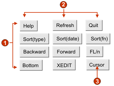
Function key
The Function Key component is responsible for recognizing function (PF) keys. This component is used to transform static text on the host screen representing a function key into a button or link which your end user can click. Because function keys appear differently on different host systems, HATS gives you flexibility in configuring the different parts. For example, a host screen could contain the following function keys:
| F3: Exit | F4: Back | F5: Fwd |
A function key can be rendered by the following widgets:
The following is an example of how a function key component might appear on your host screen:

- String before leading token (a space)
- Start delimiter (#, signifying a number)
- Delimiter (an equal sign (=))
- String after description (a space)
The following settings can be configured for this component:
- String before the leading token
- Optional. The string that must precede the start delimiter. You can specify more than one value, separated by the "|" (vertical bar) character. For a function key candidate to be recognized, it must be preceded by this value.
- Start delimiter
- Required. The string that marks the beginning of the potential function key. You can specify more than one value, separated by the "|" (vertical bar) character. Any of the values will be recognized as beginning a function key. This value can contains a "#" (pound sign) - which will be evaluated as "a number" during recognition.
- Delimiter
- Optional. The string that separates the start delimiter from the description. You can specify more than one value, separated by the "|" (vertical bar) character.
- String after the description
- Optional. The string that must immediately follow the description.
When using function key component settings, there are a few things you should keep in mind. Suppose your host screen had the following functions keys defined on it:
- F1=Help F2=Open F3=Exit
By default, HATS will recognize this as a single function key because the default value for the "String after the description" setting is " | " (two spaces OR a single space). Because the function key component looks for the end delimiter in the order it is specified in the setting, " " (two spaces) is detected to the right of the word "Exit", and thus this set of three function keys is recognized as a single function key.
To avoid this problem, specify " F| " (single space plus "F" OR two spaces) as the value of your "String after the description" setting for the Function Key component.
HTML DDS keyword
Using the HTML DDS keyword in iSeries display files allows the sending of HTML fragments along with the 5250 data stream. This feature is not intended for display with standard emulation programs; it is only sent to 5250 Workstation Gateway devices, and host access products such as HATS, that have been enhanced to show this HTML data in a browser
HTML DDS is available as a component when the host type is specified as 5250. The use of this component is not part of the default rendering and must be added to either the default rendering or custom transformations, if needed.
The HTML DDS Keyword component is responsible for recognizing this HTML data, if it is present in the 5250 data stream
This component can be rendered using the Label widget.
The following settings can be configured for this component:
- Ignore DDS data using filter
- Click this button if you want to recognize the DDS data as it was sent
in the 5250 data stream, or as it was sent except for those tags which are
specified by these "ignore" filters.
- Ignore these tags
- Enter any tags (without the < and > characters) that you want to ignore. The data between the tag and its end tag is kept. For example, specify a <b>b</b> if you wanted to keep some data surrounded by the bold tags, but not the tag itself.
- Ignore all DDS data in these tags
- Enter any tags (without the < and > characters) for which you want to ignore the data between the tag and its end tag.
- Accept DDS data using filter
- Click this button if you want to recognize, from the HTML DDS data in
the 5250 data stream, only the HTML tags which pass these "accept" filters.
HTML DDS data which doesn't pass these filters is ignored.
- Accept these tags
- Enter any tags (without the < and > characters) that you want to keep. The data between the tag and its end tag is ignored
- Accept all DDS data in these tags
- Enter any tags (without the < and > characters) for which you want to keep the data between the tag and its end tag.
You can include a keyword, HTML, which will allow you to embed raw HTML data into the datastream for interpretation only by browser-like recipients. This support in HATS will enable data that is sent from a host application in the HTML DDS keyword to be used in either default rendering or custom transformation.
To enable HTML DDS keyword support to a connection definition, do the following:
- Open the Connection Editor by clicking your main HATS connection in the HATS Project View.
- Select the Advanced tab and click the Add button to configure an advanced connection setting.
- Select 'HTMLDDS' for Name from the drop-down list and type in 'true' in the Value field.
- Click OK.
Input field
The Input Field component is for recognizing input fields (non-protected fields). This component, besides recognizing input fields, can also extract the field's accompanying caption. To find the field's caption, this component looks for protected text directly preceding the input field (on the same row) first. If the algorithm cannot find a caption, it will look directly above the field for protected text.
A recognized input field can be rendered by the following widgets:
The following is an example of how an input field component might appear on your host screen:

- Field caption (extracted from component)
The following settings can be configured for this component:
- Extract field caption
- If true, a caption for the recognized input field is extracted (see
the description above for more information on this algorithm). This extracted
caption can be used by the widget.
- Strip end of caption
- If true, the end of the caption is stripped after (and including) the
first occurrence of any value specified in the "Strip after" setting. This
setting is useful for cleaning up extracted captions.
- Strip after
- Required. The string (or set of strings) that is used to strip the extracted caption. For example, if the extracted caption is "Command ==>" and the value for this setting is "=", everything after (and including) the first "=" is stripped off.
- Replace with
- Optional. The string to replace the stripped off portion (if applicable) of the caption with.
- Trim caption
- If true, white space (spaces, tabs, etc) is removed from both ends of the extracted (and stripped) caption.
- Clip to selected region
- If true, only the part of the input field inside of the selected region is recognized and rendered. If false, if any part of an input field is inside the selected region, the entire input field is recognized and rendered. This setting is useful if you need to break a large host screen input field into multiple, smaller Web page input fields.
Input field with hints
The Input Field with hints component is for recognizing input fields (non-protected fields) which have accompanying "hints" (text immediately following the input field on the same row). This component is functionally similar to the Input Field component, except that hints must be found next to the candidate input. For example, suppose your host screen had the following input field:
Product code: [ ] (Valid codes: A, B, C, D)
In this example, the start of the hints is "Valid codes:", the end of the hints is ")", the separator is ", ", and the leading token type is "None".
A recognized input field can be rendered by the following widgets:
The input field also uses valid value hints. By default, the input field does not recognize hints so you will have to modify the component settings in order to pass these along to the rendering widget.
The following is an example of how an input field with hints component might appear on your host screen:

- Delimiter (position of delimiter, but leading token type was set to 'None.')
- Start of hints (left parenthesis ( )
- Separator (or)
- End of hints (left parenthesis ( )
Leading token type is not marked. In this example, the leading token type is NONE. No letter or digit precedes the hints.
The following settings can be configured for this component:
- Extract field caption
- If true, a caption for the recognized input field is extracted (see
the description above for more information on this algorithm). This extracted
caption can be used by the widget.
- Strip end of caption
- If true, the end of the caption is stripped after (and including) the
first occurrence of any value specified in the "Strip after" setting. This
setting is useful for cleaning up extracted captions.
- Strip after
- Required. The string (or set of strings) that is used to strip the extracted caption. For example, if the extracted caption is "Command ==>" and the value for this setting is "=", everything after (and including) the first "=" is stripped off.
- Replace with
- Optional. The string to replace the stripped off portion (if applicable) of the caption with.
- Trim caption
- If true, white space (spaces, tabs, etc) is removed from both ends of the extracted (and stripped) caption.
- Clip to selected region
- If true, only the part of the input field inside of the selected region is recognized and rendered. If false, if any part of an input field is inside the selected region, the entire input field is recognized and rendered. This setting is useful if you need to break a large host screen input field into multiple, smaller Web page input fields.
- Start of hints
- Optional. The string of characters which identifies where the set of hints starts. Multiple values can be specified for this setting; separate with the "|" (pipe character).
- End of hints
- Optional. The string of characters which identifies where the set of hint ends. Multiple values can be specified for this setting; separate with the "|" (pipe character).
- Separator
- Required. The string of characters which separates each hint in the hint set. Multiple values can be specified for this setting; separate with the "|" (pipe character).
- Leading token type
- Specifies what each hint is. For example, if the hint set was "A=Apple,O=Orange,G=Grape", you would set this value to "Letter" (or "Letter or Digit") because "A", "O", and "G" are all letters. You would set the delimiter to "=".
- Delimiter
- Required. The string of characters which separates the leading token from the hint description. This setting only applies when the leading token type is not "None".
- Minimum required hints
- The minimum number of hints that must be found for this input field to be recognized by this component. This setting is useful for avoiding errant recognition.
Item Selection
The Item Selection component is responsible for recognizing screens with list of items, where the interaction is to select a character next to the item.
The Item Selection component can be rendered by the following widgets:
- Check box
- Drop-down (data entry)
- Link (item selection)
- Popup
- Radio button (item selection)
- Text input
The following settings can be configured for this component:
- Extract field caption
- Check this box if you want available captions extracted for the selected
input fields.
- Strip end of caption
- Enabled only if "Extract field caption" is checked. Check this box to delete the ending text of a caption. Specify where to begin the deletion in Strip after, and any characters with which to replace the deleted caption text in Replace with.
- Trim spaces on caption
- Enabled only if "Extract field caption" is checked. Check this box to remove any extra spaces on either end of the captions.
- Captions are after input fields
- Enabled only if "Extract field caption" is checked. Check this box if the captions to be extracted are on the right of the input fields. Clear this box if captions are on the left of the input fields.
- Input fields must have a caption
- Check this box of you only want input fields with captions to be recognized on the host screen.
- Clip to selected region
- Check this box if you want to render only the selected part of an input field. Clear this box if you want to render the entire field if any part of the field is selected.
Selection list
The Selection List component is responsible for recognizing selection lists. Selection lists are like menus, but they are presented as a list of options, each of which is preceded by a leading token and a delimiter, such as in the following example:
| Option 1. Prepare form |
| Option 2. Work with forms you submitted |
| Option 3. Work with forms requiring action |
In this example, "Option" is the string before the leading token, "1", "2", "3" are the leading tokens, and the delimiter is "." (period space).
Once a list item has been selected (either clicked or selected depending on the widget), its leading token is placed in the targeted host input field.
A recognized selection list can be rendered by the following widgets:
The following is an example of how a selection list component might appear on your host screen:

- String before the leading token (a space)
- Leading token type (digit)
- Delimiter (a period (.))
- End delimiter (a space)
- List options (or items)
The following settings can be configured for this component:
- String before the leading token
- Optional. The string which precedes the leading token of each list item.
- Leading token type
- Specifies whether each list item starts with letters, digits, or both letters and digits.
- Maximum length of leading token
- Specifies the maximum length of the leading token. The default is 4.
- Delimiter
- Required. The string of characters between the leading token and the description. You can specify more than one value, separated by the "|" (vertical bar) character.
- End delimiter
- Optional. The string of characters which must follow each list item.
- Minimum required options
- The minimum number of list items that must be found in order for the selected region to be recognized as a selection list.
- Group Items Individually
- Select this box if you want to group items individually.
- Selection target
- Specifies which input field receives the selection. Options: First on
screen, Last on screen, Previous field, Next field, Cursor position, or User
defined.
- Row
- Specifies the row of the input field which should receive the selection. Note: This setting only applies if "User defined" is selected as the selection target.
- Column
- Specifies the column of the input field which should receive the selection. Note: This setting only applies if "User defined" is selected as the selection target.
- Action key
- Optional. Specifies the host aid key that should be pressed after the target input field has been updated with the end user's selection. The default value is "[enter]" meaning that the enter key will be pressed once the user makes a selection.
- Sort list options
- If true, list items are sorted according to either their leading token
or description (see below for more information on other settings).
- Sort by
- Specifies whether to sort the set of list options by their leading token or description.
- Sort order
- Specifies whether to sort the set of list options in ascending or descending order. Note: The locale-sensitive sorting methods, built into Java, are used to perform this operation.
- Convert action number
- If your host displays full-width characters for the list items' leading token, but it expects the item to be entered into the target input field as single-byte characters, then this parameter must be enabled. This will cause HATS to convert the DBCS item into a SBCS item before it is sent to the host. This setting does not apply for items which are displayed as single-byte characters on the host.
- Placeholder options
- Specifies whether to embed placeholder list items when gaps (such as empty space) exist between list items. Options "Actual", "None" or "Single".
Subfile
The Subfile component is responsible for recognizing 5250 subfiles.
The recognized subfile can be rendered by the Subfile widget.
The following is an example of how a subfile component might appear on your host screen:

- Action region
- Header region
- Data region
- Marker region
Action settings
- String before the leading token (a space)
- Leading token type (digit)
- Delimiter (an equal sign (=))
Header setting
- Beginning text for header (Opt)
Data setting
- Column delimiter (a space)
Marker setting
- Marker text (More...)
To launch Subfile Settings,...
- Go to the HATS Project View and click on your Project Settings.
- Select the Rendering tab.
- In the Rendering tab, expand the Components tree and select the Subfile component.
- Click on the Settings button to the right to display the Subfile Settings window.

The Subfile Settings consists of four tabs. Each recognition tab is described below.
Action
Select the screen you want to use from the drop-down list. You can also specify the region of the Selection area on the host screen by either using your mouse, or by entering the coordinates of the region in the following boxes:
- Start row:
- The first row to look for the subfile action. The default is 3
- End row:
- The last row to look for the subfile action. The default is 12
- Start column
- The first column to look for the subfile action. The default is 1
- End column
- The last column to look for the subfile action. The default is 80
You can highlight certain fields on your host screen by selecting the different options beside Highlight fields. If you want to see where the input fields are defined on the screen, select the Input check box. If you want to see what fields are protected, select the Protected check box. If you want to highlight any hidden fields, select the Hidden check box. To modify the colors of the input, protected or hidden fields highlighting, see Using HATS preferences.
The additional Action Recognition criteria can be configured by selecting the following individual settings:
- String before leading token
- String. This value specifies the string before the leading token. The default value is " ".
- Leading token type
- String. This value is the type of token this host application uses for the host command. In the example where "1=Edit", the '1' token is the host command, and its type is a digit. In the example where "A=Edit", the 'A' token is the host command, and its type is a letter. The allowable values are "Digit", "Letter", "Show both". The default is "Show both"
- Maximum length of leading token
- The maximum length of the leading token. The default is "4".
- Delimiter
- String. This value is the token used in the subfile action to delimit the host command from the description of the host command. In the example where "1=Edit", '1' is the host command, the "=" token is the delimiter, and "Edit" is the description of the host command. The allowable value is one or more strings concatenated by the pipe token, "|". The default is "=". Example: "=| = |-| - |:".
- End delimiter
- String. This is used to recognize the end of a subfile action item description. Separate multiple character with a pipe token "|".
- Must be specified color
- Boolean. This value is used in conjunction with previous setting to designate that the subfile action's host command must be of a specific type and the subfile action must be a specific color. For example, the subfile action must be a digit, and must be blue. The allowable values are "true" or "false". The default is "false".
- Color
- See description for the previous setting.
- High intensity
- String. This value specifies whether the subfile action uses the high intensity field attribute. The allowable values are "Yes", "No", "Don't care". The default is "Don't care".
- Actions not required
- Check this box if you want the subfile to be recognized even if it does not have any actions. The subfile header, data, and marker are still recognized and rendered.
Header
Specify the region of the Selection area on the host screen by either using your mouse, or by entering the coordinates of the region in the following boxes:
- Start row:
- The first row to look for the subfile header. The default is 3
- End row:
- The last row to look for the subfile header. The default is 16
- Start column
- The first column to look for the subfile header. The default is 1
- End column
- The last column to look for the subfile header. The default is 80
You can highlight certain fields on your host screen by selecting the different options beside Highlight fields. If you want to see where the input fields are defined on the screen, select the Input check box. If you want to see what fields are protected, select the Protected check box. If you want to highlight any hidden fields, select the Hidden check box. To modify the colors of the input, protected or hidden fields highlighting, see Using HATS preferences.
The additional Header Recognition criteria can be configured by selecting the following individual settings:
- Recognize by text
- Boolean. This value specifies whether the subfile header could be recognized based on strings. The allowable values are "true" or "false". The default is "true".
- Begins with
- String. Strings that can be used to identify subfile headers; use "\n" to define multi-row headers. The allowable values should be concatenated with the pipe character, "|" More specific headers should be listed first. For example, if "Option", "Opt ", and "Opt" are all possible headers, they should be ordered so that the most specific header is listed first, "Option|Opt |Opt" The default is "true". Example: "Description\nof Record|Option|Opt |?".
- Must be specified color
- Boolean. This value is used in conjunction with the "Text" setting to designate that the subfile headers must have a specific string and must be a specific color. For example, the subfile header must contain the word "Opt." and it must be blue. The allowable values are "true" or "false". The default is "false".
- Color
- Specifies the color of the subfile header.
- High intensity
- Boolean. This specifies whether or not the Subfile Header could be recognized by text at the top of a table of data, which uses the high intensity field attribute. The allowable values are "true" or "false". The default is "false".
- Specified color
- Boolean. This specifies if the subfile header could be recognized by text of a specific color at the top of a table of data. The allowable values are "true" or "false". The default is "false".
- Color
- Specifies the color of the subfile header.
Data
Specify the region of the Selection area on the host screen by either using your mouse, or by entering the coordinates of the region in the following boxes:
- Start row:
- The first row to look for the subfile data. The default is 4
- End row:
- The last row to look for the subfile data. The default is 22
- Start column
- The first column to look for the subfile data. The default is 1
- End column
- The last column to look for the subfile data. The default is 80
You can highlight certain fields on your host screen by selecting the different options beside Highlight fields. If you want to see where the input fields are defined on the screen, select the Input check box. If you want to see what fields are protected, select the Protected check box. If you want to highlight any hidden fields, select the Hidden check box. To modify the colors of the input, protected or hidden fields highlighting, see Using HATS preferences.
The additional Data Recognition criteria can be configured by selecting the following individual settings:
- Recognition Option:
- String. This specifies if the subfile is recognized by hints (visual table), field information (field table), or each record row by row. The values can be "Visual Table", "Field Table" and Field" (Users can use their own table component for recognition).
- Column delimiter:
- String. The string of characters which must exist in every row of the selected region for the host screen column to be marked as a table column. If consecutive columns are each marked as a delimiting column, only the last column is actually rendered as the delimiting column of the generated table. Enabled only if the Recognition Option: is set to "Visual Table". The default is " ".
- Override action input field start column
- Boolean. If true, you can override the starting column of the action input field to prevent other input fields from being rendered incorrectly as drop-down lists. The default value is "false".
- Column Start
- Start column of the action input field. The default value is 1.
- Override action input field length
- Boolean. If true, you can override the length of the action input field to prevent other input fields from being rendered incorrectly as drop-down lists. The default value is "false".
- Field Length
- Field length of the action input field. The default value is 1.
- Data not required
- Check this box if you want the subfile to be recognized even if it does not have any data. If any subfile actions are detected, they are still rendered as drop-down lists.
Marker
Specify the region of the Selection area on the host screen by either using your mouse, or by entering the coordinates of the region in the following boxes:
- Start row:
- The first row to look for the subfile marker. The default is 4
- End row:
- The last row to look for the subfile marker. The default is 22
- Start column
- The first column to look for the subfile marker. The default is 1
- End column
- The last column to look for the subfile marker. The default is 80
You can highlight certain fields on your host screen by selecting the different options beside Highlight fields. If you want to see where the input fields are defined on the screen, select the Input check box. If you want to see what fields are protected, select the Protected check box. If you want to highlight any hidden fields, select the Hidden check box. To modify the colors of the input, protected or hidden fields highlighting, see Using HATS preferences.
The additional Marker Recognition criteria can be configured by selecting the following individual settings:
- Recognize by text
- Boolean. If true, the end marker of the subfile should be recognized by the specified string. The default value is "true".
- Text
- String. This can be used to identify the subfile end marker. Multiple values are allowed. Example: "More...|Bottom|End|+". The default value is "More...|Bottom|+".
- High intensity
- Boolean. If true, the end marker of the subfile could be recognized by a high intensity field below the data table. The default value is "false".
- Empty row
- Boolean. If true, the end marker of the subfile could be recognized by an empty row within the specified region below the data table. The default value is "false".
Text
The Text component is responsible for recognizing visible text, including text within an input field.
This component can be rendered using the Label widget.
The following is an example of how a text component might appear on your host screen:

- Line break (preserved)
The following settings can be configured for this component:
- Preserve line break
- If true, multiple selected rows will be rendered as multiple rows on the resulting Web page. If false, the text from each row will be concatenated together into a single string.
URL
The URL component is responsible for recognizing links. This component can be rendered using the Link widget.
The following settings can be configured for this component:
- Start Indicators
- Specify one or more character strings to recognize the beginning of an URL on the host screen
Visual table
The Visual Table component is responsible for recognizing tables. The Visual Table component is different from the Field Table component in that it does not require that the underlying host screen fields line up vertically. It simply looks for columns in the selected region which contain the column delimiter for each row in the selection. Rule of thumb: If a region looks (to the eye) like a table, the Visual Table component should be able to recognize it.
A recognized table can be rendered by the following widgets:
The following is an example of how a visual table component might appear on your host screen:

- Rows (minimum row count = 1)
- Columns (minimum column count = 1)
- Column delimiter (a space)
The following settings can be configured for this component:
- Column delimiter
- Required. The string of characters which must exist in every row of the selected region for the host screen column to be marked as a table column. If consecutive columns are each marked as a delimiting column, only the last column is actually rendered as the delimiting column of the generated table.
- Include empty rows
- If true, empty rows (rows without any visible text or input fields) will be included in the rendered table or graph.
- Rows to exclude
- The comma-separated or ranged set of rows to exclude from the recognized table. This setting is useful for hiding specific rows of data on a table or graph. The rows represented by this value are based on the recognized table, not on the actual host screen. Example values: "1,2,3....", "1,2-4", "3-5".
- Columns to exclude
- The comma-separated or ranged set of logical columns to exclude from the recognized table. The columns represented by this value are based on the recognized table, not on the actual host screen. Example values: "1,2,3....", "1,2-4", "3-5".
- Minimum row count
- The minimum number of rows the specified region must contain for the region to be recognized as a table. Note: The number of recognized rows is evaluated before the specified rows are excluded (see "Rows to exclude").
- Minimum column count
- The minimum number of logical columns (not host screen columns) the specified region must contain for the region to be recognized as a table. Note: The number of recognized columns is evaluated before the specified columns are excluded (see "Columns to exclude").
- Line above table is in title
- Check this box if you want the text from the line above the table to be used as the table title.
Some HATS Version 4 applications that used graph widgets to render visual table components require a change after being migrated to HATS Version 6. This happens if your HATS application renders a host screen containing tabular data with an empty column, like this:
| Col1 | Col2 | Col3 |
| aaa | bbb | |
| ccc | ddd | |
| eee | fff | |
| ggg | hhh |
The HATS V4 visual table component recognized this host screen region as containing three columns. To display it as a bar chart with two rows, you had to specify that the data for row 2 is taken from column 3 of the host screen region. The HATS V5 and V6 visual table component recognizes this host screen region as containing two columns. Since there is no third column, there is no data displayed in the second row of the chart widget. To fix this problem, modify the bar chart settings to say that the data for the second row is taken from column 2 of the host screen region.
Widget settings
When you customize a host component, you are specifying how it will be recognized. When you customize a widget, you specify how the widget will appear on the Web page.
You can customize the settings of the following widgets:
Button
The Button widget is responsible for rendering HTML buttons. Clicking one of these buttons will generally cause a host-specific action to occur (for example, an aid key will be sent to the host or an input field will be updated).
This widget renders data supplied by the following components:
The following is an example of how a button widget appears on a Web page, using the data from the Function key component example as input:
- Rows
- Columns (3 per row)
- Caption type (show description)
The following settings can be configured for this widget:
- Caption type
- Specifies how the caption for each button is determined. The value of the leading token and the description are derived from the component; you can choose what appears on the button caption. For example, if the host screen had a menu item that read "4. Mail", you can have the caption display "4", or "Mail", or "4. Mail".
- Layout
- Specifies how the buttons will be arranged on the HTML page. Options:
"Table", "Separated"
- Number of columns per row
- The number of buttons to display horizontally before wrapping to the next line. Tweaking this setting can cause your buttons to appear vertically (if this value is 1) or horizontally (if this value is equal to or greater than the number of buttons to be rendered).
- Separator
- Specifies what separator you want to use to separate the rendered buttons on the HTML page. You can select from the drop-down list or type in your own in the entry field.
- Button style class
- Optional. The CSS style class associated with each generated button. The value of the "class" attribute of the HTML button tag will be set to this value. The default value is "HATSBUTTON". See Using style sheets for more information.
- Style
- Optional. Any CSS properties that you want to override. For example, you could specify 'font-color: red; font-size: 18pt;' in this field to change the font color and size for this widget. The properties you enter apply to each element of this widget. See Using style sheets for more information.
Button table
The Button Table widget is responsible for rendering a table of vertically arranged HTML buttons.
This widget renders data supplied by the following components:
The following is an example of how a button table widget appears on a Web page, using the data from the Function key component example as input:

- Rows
- Number of columns per row (2)
- Caption
The following settings can be configured for this widget:
- Number of columns per row
- The number of buttons to display horizontally before wrapping to the next line.
- Button style class
- Optional. The CSS style class associated with each generated button. The value of the "class" attribute of the HTML button tag will be set to this value. The default value is "HATSBUTTON". See Using style sheets for more information.
- Caption style class
- Optional. The CSS style class associated with each item description (to the right of the generated button). The default value is "HATSCAPTION". See Using style sheets for more information.
- Table style class
- Optional. The CSS style class associated with the generated table. The value of the "class" attribute of the HTML table tag will be set to this value. The default is "HATSTABLE". See Using style sheets for more information.
- Style
- Optional. Any CSS properties that you want to override. For example, you could specify 'font-color: red; font-size: 18pt;' in this field to change the font color and size for this widget. The properties you enter apply to each element of this widget. See Using style sheets for more information.
Calendar
The Calendar widget is responsible for rendering an input field with an associated launcher button, link, or image. This launcher opens a popup calendar which your end user can use to select a date; this date is then inserted into the associated input field.
The following is an example of how a calendar widget appears on a Web page, using the data from the Input field component example as input:

- Number of columns per row (1)
- Caption (from component)
- Launcher type (image)
The example has no caption for the launcher because the launcher is an image. If the launcher was a button or a link, the launcher caption would be shown on the button or in the link.
The following settings can be configured for this widget:
- Pattern
- Required. Specifies the date pattern expected by the host. If multiple
host screen input fields have been selected, you can spread the selected date
amongst multiple consecutive fields by separating pattern elements with a
"~" (tilde). For example, suppose you have the following input fields on your
host screen:
Month: [ ] Day: [ ] Year: [ ]
If you specify a pattern of "MM~dd~yyyy", a single launcher will be created. Once your end user has selected a date, it will be spread over your three input fields: the 2-digit month will be placed in the first input field, the 2-digit day will be placed in the second input field, and the 4-digit year will be placed in the third input field.
- Pattern locale
- Specifies the locale of the pattern. This setting is useful if you have
entered a pattern segment which should output a day name (example: "Wednesday").
Options: "Use server locale", "Use browser locale", or "Use specified locale".
- Locale
- If you specified "Use specified locale", select the locale for which to format the date specified by the ebd user.
- Restrict earliest selectable date
- If true, the value specified will be the earliest date an end user can
select from the calendar popup.
Note:A user is not prevented from manually entering an earlier date directly into the associated input field based on this setting.
- Restrict latest selectable date
- If true, the value specified will be the latest date an end user can
select from the calendar popup.
Note:A user is not prevented from manually entering a later date directly into the associated input field based on this setting.
- Default value
- Optional. The default selection in the calendar popup if no date or an invalid date is entered. If no value is specified, today's date (based on the server's date) is automatically selected.
- Caption
- Specifies how the caption for the generated input field is determined.
Options: "From component" (use the extracted caption from the component) or
"Custom" (use the specified caption).
- Custom caption
- Optional. Specifies the caption for the input field.
Note:Leave this setting blank to not generate a caption for the input field.
- Number of columns per row
- Specifies how many instances of this widget should appear in each row in the rendered Web page.
- Launcher type
- Specifies the style of the launcher. The launcher is used to open the
calendar popup. Options "Button", "Link", or "Image".
- Caption
- The caption of the launcher button or link.
- Button style class
- Optional. The CSS style class associated with the generated launcher button. The value of the "class" attribute of the HTML button tag will be set to this value. The default value is "HATSBUTTON" . See Using style sheets for more information.
- Link style class
- Optional. The CSS style class associated with the generated launcher link. The value of the "class" attribute of the HTML link tag will be set to this value. The default value is "HATSLINK". See Using style sheets for more information.
- Strip underscores on input field
- Check this box if you want to strip the underscores from text when it is rendered.
- Trim spaces on input field
- Checking this trims leading and trailing spaces from the input field.
- Input field style class
- Optional. The CSS style class associated with the generated input field. The value of the "class" attribute of the HTML input tag will be set to this value. The default value is "HATSINPUT". See Using style sheets for more information.
- Caption style class
- Optional. The CSS style class associated with the generated input field's caption. The default value is "HATSCAPTION". See Using style sheets for more information.
- Table style class
- Optional. The CSS style class associated with the generated table. If more than one set of input fields is rendered, an HTML table will be generated to enclose these input fields. The value of the "class" attribute of the HTML table tag will be set to this value. The default value is "HATSTABLE". See Using style sheets for more information.
- Style
- Optional. Any CSS properties that you want to override. For example, you could specify 'font-color: red; font-size: 18pt;' in this field to change the font color and size for this widget. The properties you enter apply to each element of this widget. See Using style sheets for more information.
Check box
The Check box widget is responsible for rendering HTML check boxes.
This widget renders data supplied by the following components:
The following is an example of how a check box widget appears on a Web page, using the data from the input field of the Input field component example as input:
Figure 18. Check box widget example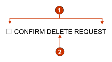
- Number of columns per row (1)
- Caption (from component)
The following settings can be configured for this widget:
- Selected value
- Required. The string that is inserted in the host screen input field when the check box is selected. This value is also used to set the initial state of the check box when the Web page is loaded.
- Deselected value
- Required. The string that is inserted in the host screen input field when the check box is deselected. This value is also used to set the initial state of the check box when the Web page is loaded.
- Caption soucre
- Specifies how the caption for the generated check box is determined.
Options: "From component" (use the extracted caption from the component) or
"Custom" (use the specified caption).
- Custom caption
- Optional. Specifies the caption for the check box.
Note:Leave this setting blank to not generate a caption for the check box.
- Number of columns per row
- The number of check boxes to display horizontally before wrapping to the next line.
- Check box style class
- Optional. The CSS style class associated with the generated check box. The value of the "class" attribute of the HTML input tag will be set to this value. The default value is "HATSCHECKBOX". See Using style sheets for more information.
- Table style class
- Optional. The CSS style class associated with the generated table. If more than one check box is rendered, an HTML table will be generated to enclose these check boxes. The value of the "class" attribute of the HTML table tag will be set to this value. The default value is "HATSTABLE". See Using style sheets for more information.
- Style
- Optional. Any CSS properties that you want to override. For example, you could specify 'font-color: red; font-size: 18pt;' in this field to change the font color and size for this widget. The properties you enter apply to each element of this widget. See Using style sheets for more information.
Dialog
The Dialog widget is responsible for rendering HTML dialog boxes. It renders data supplied by the Dialog component.
The following settings can be configured for this widget:
- Remove disabled area
- Specifies whether or not to show the area outside of the dialog.
- Disabled area style class
- Specifies the CSS style class to use for the disabled area.
- Use Specialized borders
- Specifies whether or not to use specialized borders instead of the original text.
- Remove border characters
- Specifies whether or not to show the original border characters.
- Border style class
- Specifies the CSS style class to use for the border.
- Left border style
- Specifies the CSS style class to use for the left border.
- Right border style
- Specifies the CSS style class to use for the right border.
- Footer style
- Specifies the CSS style class to use for the bottom border.
- Header style
- Specifies the CSS style class to use for the top border.
- Top left corner style
- Specifies the CSS style class to use for the top left border corner.
- Top right corner style
- Specifies the CSS style class to use for the top right border corner.
- Bottom left corner style
- Specifies the CSS style class to use for the bottom left border corner.
- Bottom right corner style
- Specifies the CSS style class to use for the bottom right border corner.
Drop-down (data entry)
The Drop-down (data entry) widget is responsible for rendering HTML drop-downs.
This widget renders data supplied by the following components:
The following is an example of how a data entry drop-down list widget appears on a Web page, using the data from the Input field with hints component example as input:
Figure 19. Data entry drop-down list widget example
- Caption (from component)
- Number of columns per row (1)
- Fill (from hints)
The following settings can be configured for this widget:
- Fill from global variable
- If true, fill the drop-down from the specified global variables.
- Global variable containing list values
- Specifies the name of the indexed global variable containing the set of values. An item for each index in the global variable will be created in the drop-down.
- Global variable containing list captions
- Optional. Specifies the name of the indexed global variable containing the set of captions. The size of the global variable specified by this value should be greater than or equal to the size specified in the preceding setting. The indices in this indexed global variable should also match up with the indices in the values global variable (so that the actual value and caption shown to the end user are in sync). If this value is not specified, the caption for each item in the drop-down will be its value.
- Fill from string
- If true, fill the drop-down from the specified string.
- List items
- Optional. Specifies the string of items to include in the drop-down. Items should be separated with a ";" (semicolon). To have the list item caption be different than the list item value, enter a "=" (equal sign) then specify a caption. For example, a value of "A=Apple,G=Grape" would render a drop-down with two items "Apple" and "Grape". Selecting the first item, would cause an "A" to be inserted in the associated host screen input field.
- Fill from hints
- If true, fill the drop-down from hints recognized by the component (only applicable when the Input Field with Hints component is used).
- Caption source
- Specifies how the caption for the generated drop-down is determined.
Options: "From component" (use the extracted caption from the component) or
"Custom" (use the specified caption).
- Custom caption
- Optional. Specifies the caption for the drop-down.
Note:Leave this setting blank to not generate a caption for the drop-down.
- Number of columns per row
- The number of drop-downs to display horizontally before wrapping to the next line.
- Auto submit on select
- If true, once a selection is made in the drop-down, the Web page form is submitted. If the drop-down contains function keys, the selected list item's key is sent to the host. If the drop contains selection list items, the selected item's value is inserted into the target field and the specified action key is sent to the host.
- Show submit button
- If true, an HTML submit button is rendered next to the drop-down. Does
not apply when using this widget with the function key component.
- Submit button caption
- Optional. Specifies the caption of the submit button.
- Drop-down style class
- Optional. The CSS style class associated with the generated drop-down. The value of the "class" attribute of the HTML drop-down tag will be set to this value. The default value is "HATSDROPDOWN". See Using style sheets for more information.
- List option style class
- Optional. The CSS style class associated with each option in the drop-down. The default value is "HATSOPTION". See Using style sheets for more information.
- Caption style class
- Optional. The CSS style class associated with the generated drop-down's caption. The default value is "HATSCAPTION". See Using style sheets for more information.
- Table style class
- Optional. The CSS style class associated with the generated table. If more than one drop-down is rendered, an HTML table will be generated to enclose these drop-downs. The value of the "class" attribute of the HTML table tag will be set to this value. The default value is "HATSTABLE". See Using style sheets for more information.
- Style
- Optional. Any CSS properties that you want to override. For example, you could specify 'font-color: red; font-size: 18pt;' in this field to change the font color and size for this widget. The properties you enter apply to each element of this widget. See Using style sheets for more information.
Drop-down (selection)
The Drop-down (selection) widget is responsible for rendering HTML drop-downs.
This widget renders data supplied by the following components:
The following is an example of how a selection list drop-down list widget appears on a Web page, using the data from the Selection list component example as input:
Figure 20. Selection list drop-down list widget example
- Caption type (show both)
- Leading token (show both)
- Description (show both)
- Submit button (show submit button)
- Submit button caption (submit)
The following settings can be configured for this widget:
- Caption type
- Specifies how the leading token of the list item is displayed. The value of the leading token and the description are derived from the component; you can choose what appears in the drop-down. For example, if the host screen had a menu item that read "4. Mail", you can have the caption display "4", or "Mail", or "4. Mail".
- Auto submit on select
- If true, once a selection is made in the drop-down, the Web page form is submitted. If the drop-down contains function keys, the selected list item's key is sent to the host. If the drop contains selection list items, the selected item's value is inserted into the target field and the specified action key is sent to the host.
- Show submit button
- If true, an HTML submit button is rendered next to the drop-down. Does
not apply when using this widget with the function key component.
- Submit button caption
- Optional. Specifies the caption of the submit button.
- Button style class
- Optional. The CSS style class associated with the generated submit button. The value of the "class" attribute of the HTML button tag will be set to this value. The default value is "HATSBUTTON". See Using style sheets for more information.
- Dropdown style class
- Optional. The CSS style class associated with the generated drop-down. The value of the "class" attribute of the HTML drop-down tag will be set to this value. The default value is "HATSDROPDOWN". See Using style sheets for more information.
- List option style class
- Optional. The CSS style class associated with each option in the drop-down. The default value is "HATSOPTION". See Using style sheets for more information.
- Caption style class
- Optional. The CSS style class associated with the generated drop-down's caption. The default value is "HATSCAPTION". See Using style sheets for more information.
- Table style class
- Optional. The CSS style class associated with the generated table. If more than one drop-down is rendered, an HTML table will be generated to enclose these drop-downs. The value of the "class" attribute of the HTML table tag will be set to this value. The default value is "HATSTABLE". See Using style sheets for more information.
- Style
- Optional. Any CSS properties that you want to override. For example, you could specify 'font-color: red; font-size: 18pt;' in this field to change the font color and size for this widget. The properties you enter apply to each element of this widget. See Using style sheets for more information.
Field
The Field widget is responsible for rendering input fields and text recognized by the Field component.
The following is an example of how a field widget appears on a Web page, using the data from the Field component example as input:
Figure 21. Field widget example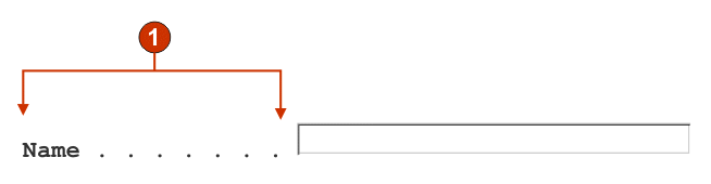
- Protected text
The following settings can be configured for this widget:
- Alignment
- Indicate whether you want HATS to map text characters into table cells in order to improve their alignment
- Read only
- If true, input fields are not rendered. If an input field contained text (and was not password protected) that text is displayed instead. This setting is handy if you want to show a user a page of information, but you do not want them editing it.
- Allowing positioning on protected text
- If true, all protected text is rendered as HTML links. Clicking one
of these links causes the host cursor position to be set to that specific
position. This setting is handy if your host application is cursor position-sensitive
and needs for your end user to position the cursor on protected text.
- Action key
- Optional. Specifies the host aid key mnemonic that should be sent to the host when a protected text link is selected. Typical value: "[enter]" - this causes the cursor to be set to the specified location and for enter to be sent.
- Trim spaces on links
- If true, white space (extra space) is trimmed from both ends of the protected text links. This setting is handy for reducing the amount of text that is rendered as links.
- Link style class
- Optional. The CSS style class associated with each generated link. The value of the "class" attribute of the HTML link tag will be set to this value. The default value is "HATSPROTLINK". See Using style sheets for more information.
- Enable foreground colors
- If true, host screen foreground colors are mapped to CSS style sheet classes representing that color. For example, if a host screen field is marked as "RED", the Field widget will enclose the generated HTML for that field in a tag whose class name attribute is set to "HRED". This allows for you to remap host screen colors on your generated Web page. Note: blacktheme.css directly maps host screen field foreground colors (i.e. red text on the host screen will appear as red text on the generated Web page). However, other style sheet files like monochrome.css, map field colors differently in an attempt to create a consistent, modern style.
- Enable extended attributes
- If true, extended field attributes (blink, reverse video, underline, and column separator) will be rendered with the specified style. Also, for 3270, extended field colors will be mapped (see the preceding setting for more information). See Using style sheets for more information.
- Strip underscores on input field
- Check this box if you want to strip the underscores from text when it is rendered.
- Trim spaces on input field
- Checking this trims leading and trailing spaces from the input field.
- Table style class
- Optional. The CSS style class associated with the generated table. The value of the "class" attribute of the HTML table tag will be set to this value. The default value is "HATSFIELDTABLE". See Using style sheets for more information.
- Style
- Optional. See the section on style sheets for more information. Note: Because of the large number of tags generated by this widget, you may considerably increase the download time of your page if you specify a value for this setting. Specify style overrides in the enclosing transformation or the included style sheet file.
Graphs (Horizontal bar, Line, Vertical bar)
The graph widgets are responsible for rendering JPEG graph images
This widget renders data supplied by the following components:
The following are examples of how the horizontal bar graph, line graph, and vertical bar graphs appear on a Web page, using the data from the Visual table component example as input:
Figure 22. Horizontal bar graph widget exampleFigure 23. Line graph widget exampleFigure 24. Vertical bar graph widget example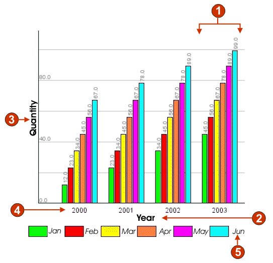
- Data sets (6)
- X-axis title (Year; Quantity on horizontal bar graph)
- Y-axis title (Quantity; Year on horizontal bar graph)
- Data point label (extract)
- Data set label (extract)
The following settings can be configured for this widget:
- Number of data sets
- Specifies the number of data sets to be depicted in the graph. This setting is only displayed in the Insert Host Component wizard.
- Data set source
- Specifies how to obtain values for the data set(s). Options: "Row" (each row of the table constitutes one set of data to be graphed) or "Column" (each column of the table constitutes one set of data to be graphed).
- Width (pixels)
- Width, in pixels, of the graph.
- Height (pixels)
- Height, in pixels, of the graph.
- Background color
- Specifies the color to use as the background of the graph. Click the color selector button to display a color palette.
- Background image
- Enter the name of the image to use for the background of the graph (relative to the project's Web Content\Common\Images folder). Click the Browse button to import an image from your system.
- Default Font
- Specify the font, type and font size.
- X-axis title
- Optional. String specifying the X-axis label of the graph.
- Y-axis title
- Optional. String specifying the Y-axis label of the graph.
- Axis color
- Specifies the color to draw the axises of the graph in. Click the color selector button to display a color palette.
- Label color
- Specifies the color to draw the labels of the graph in. Click the color selector button to display a color palette.
- Text antialiasing
- If true, text antialiasing will be used to smooth the edges of the
drawn text
- Alternate text
- Optional. Specifies the text that appears if the rendered graph image cannot be loaded by the end user's client browser.
As with the Number of data sets settings, the following settings are only displayed in the Insert Host Component wizard.
- Extract data point labels
- If true, extract row or column labels to show as labels on the X-axis.
- Row (or Column)
- Specify the number of the rows or columns to use as labels on the X-axis. The label for this entry field is dependent upon the value specified for the Data set source setting. The entry field label matches the value specified for the Data set source setting.
- Data sets
- Click this button to display the Data Source Settings dialog, which enables you to specify the following additional settings for the data sources:
- Data set 'n', 'row' or 'column'
- The number ('n') of these fields matches the value specified in the Data set source setting. Enter the number of any row or column of data you want to use for the data set. This enables you to reorder or duplicate sets of data in the graph. The last part of the label for this entry field is dependent upon the value specified for the Data set source setting. The entry field label matches the value specified for the Data set source setting.
- Color
- There is a color button for each of the Data set 'n', 'row' or 'column' settings. The buttons show the color to use for the data set in the graph. Click the button to display a color palette if you want to change the data set color.
Label
The Label widget is responsible for rendering text.
This widget renders data supplied by the following components:
The following is an example of how a label widget appears on a Web page, using the data from the Text component example as input:
Figure 25. Label widget example
- Label
The following settings can be configured for this widget:
- Trim spaces on label
- If true, white space (extra spaces) is removed from both ends of the selected text.
- Style class
- Optional. The CSS style class associated with the generated text. The default value is "HATSCAPTION". See Using style sheets for more information.
- Style
- Optional. See the section on style sheets for more information. Note: Because of the large number of tags generated by this widget, you may considerably increase the download time of your page if you specify a value for this setting. Specify style overrides in the enclosing transformation or the included style sheet file.
Link
The Link widget is responsible for rendering HTML links.
This widget renders data supplied by the following components:
The following is an example of how a link widget appears on a Web page, using the data from the Selection list component example as input:
Figure 26. Link widget example
- Rows
- Number of columns per row (1)
- Leading token (show both)
- Description (show both)
The following settings can be configured for this widget:
- Caption type
- Specifies how the caption for each link is determined. The value of the leading token and the description are derived from the component; you can choose what appears as the text for the link. For example, if the host screen had a menu item that read "4. Mail", you can have the text display "4", or "Mail", or "4. Mail".
- Layout
- Specifies how the links will be arranged on the HTML page. Options:
"Table", "Separated"
- Number of columns per row
- The number of links to display horizontally before wrapping to the next line.
- Separator
- Specifies what separator you want to use to separate the rendered links on the HTML page. You can select from the drop-down list or type in your own in the entry field.
- Target
- Select from the drop-down list the target where you want to display the contents of the linked URL; the same, new, parent, or top window.
- Link style class
- Optional. The CSS style class associated with each generated link. The value of the "class" attribute of the HTML link tag will be set to this value. The default value is "HATSLINK". See Using style sheets for more information.
- Menu bar class
- Optional. The CSS style class associated with each generated link. The value of the "class" attribute of the HTML link tag will be set to this value. The default value is "HATSMENUBAR". See Using style sheets for more information.
- Style
- Optional. See the section on style sheets for more information. Note: Because of the large number of tags generated by this widget, you may considerably increase the download time of your page if you specify a value for this setting. Specify style overrides in the enclosing transformation or the included style sheet file.
Link (item selection)
The Link (item selection) widget is responsible for rendering the Item Selection component as links.
The following setting can be configured for this widget:
- Layout
- Specifies how the links will be arranged on the HTML page. Options:
"Table", "Separated"
- Number of columns per row
- Specifies how many instances of this widget should appear on each row of the rendered HTML page.
- Separator
- Specifies what separator you want to use to separate the rendered links on the HTML page. You can select from the drop-down list or type in your own in the entry field.
- Show Input Field
- Specifies whether to display an input field for each link, and the location of the input field (to the left/right of the links). Options: "No", "Left of captions", "Right of captions".
- Selection Value
- Specifies characters to place to the left of the input field.
- Key to Automatically Press
- Specifies which AID key to send to the host, or none.
- Link style class
- Optional. The CSS style class associated with the generated launcher link. The value of the "class" attribute of the HTML link tag will be set to this value. The default value is "HATSPROTLINK HBLANK". See Using style sheets for more information.
- Style
- Optional. See the section on style sheets for more information. Note: Because of the large number of tags generated by this widget, you may considerably increase the download time of your page if you specify a value for this setting. Specify style overrides in the enclosing transformation or the included style sheet file.
Popup
The Popup widget is responsible for rendering an input field with an associated launcher button, link, or image. This launcher opens a popup which your end user can use to select a valid value for the associated input field.
This widget renders data supplied by the following components:
The following is an example of how a popup widget appears on a Web page, using the data from the Input field with hints component example as input:
Figure 27. Popup widget example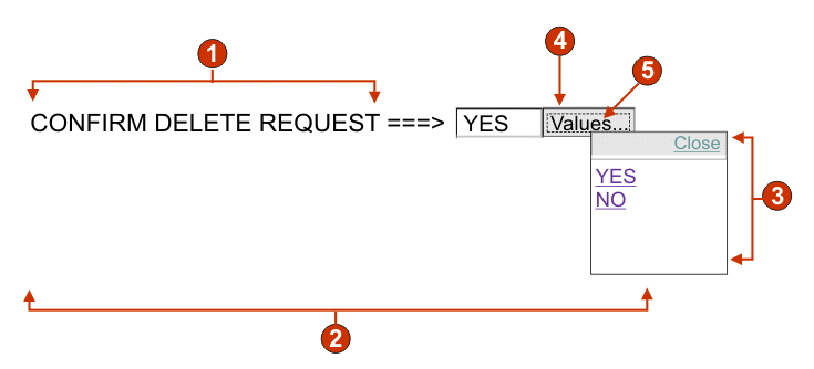
- Caption (from component)
- Number of columns per row (1)
- Fill (from hints)
- Launcher type (button)
- Launcher caption (Values)
The following settings can be configured for this widget:
- Fill from global variable
- If true, fill the popup list from the specified global variables.
- Global variable containing list values
- Specifies the name of the indexed global variable containing the set of values. A link for each index in the global variable will be created in the popup window.
- Shared
- HATS local and shared global variables can have the same name. Check this box if you want to use the shared global variable to populate the list items. When this box is cleared, the local global variable is used.
- Global variable containing list captions
- Optional. Specifies the name of the indexed global variable containing the set of captions. The size of the global variable specified by this value should be greater than or equal to the size specified in the preceding setting. The indices in this indexed global variable should also match up with the indices in the values global variable (so that the actual value and caption shown to the end user are in sync). If this value is not specified, the text for each link will be its value.
- Fill from string
- If true, fill the popup list from the specified string.
- List items
- Optional. Specifies the string of items to include on the popup window. Items should be separated with a ";" (semicolon). To have the list item caption be different than the list item value, enter a "=" (equal sign) then specify a caption. For example, a value of "A=Apple;G=Grape" would render a popup with two items "Apple" and "Grape". Selecting the first item, would cause an "A" to be inserted in the associated host screen input field.
- Fill from hints
- If true, populate the popup from hints recognized by the component (only applicable when the Input Field with Hints component is used).
- Caption source
- Specifies how the caption for the generated input field is determined.
Options: "From component" (use the extracted caption from the component) or
"Custom" (use the specified caption).
- Custom caption
- Optional. Specifies the caption for the input field. Note: Leave this setting blank to not generate a caption for the associated input field.
- Number of columns per row
- The number of input fields to display horizontally before wrapping to the next line.
- Launcher type
- Specifies the style of the launcher. The launcher is used to open the
popup. Options "Button", "Link", or "Image".
- Image filename
- The name of the image filename. This is only enabled if launcher type is an Image
- Caption
- The caption of the launcher button or link. This is only enabled if launcher type is either Link or Button.
- Link style class
- Optional. The CSS style class associated with the generated launcher link. The value of the "class" attribute of the HTML link tag will be set to this value. The default value is "HATSLINK". See Using style sheets for more information.
- Button style class
- Optional. The CSS style class associated with the generated launcher button. The value of the "class" attribute of the HTML button tag will be set to this value. The default value is "HATSBUTTON". See Using style sheets for more information.
- Close caption
- The caption to appear for the Close action.
- Input field style class
- Optional. The CSS style class associated with the generated input field. The value of the "class" attribute of the HTML input tag will be set to this value. The default value is "HATSINPUT". See Using style sheets for more information.
- Caption style class
- Optional. The CSS style class associated with the generated input field's caption. The default value is "HATSCAPTION". See Using style sheets for more information.
- Table style class
- Optional. The CSS style class associated with the generated table. If more than one set of input fields is rendered, an HTML table will be generated to enclose these input fields. The value of the "class" attribute of the HTML table tag will be set to this value. The default value is "HATSTABLE". See Using style sheets for more information.
- Window style class
- Optional. The CSS style class associated with the generated popup window. The default value is "HATSPOPUP". See Using style sheets for more information.
- Close link style class
- Optional. The CSS style class associated with the link used to close the popup window. The default value is "HATSLINK". See Using style sheets for more information.
- Item link style class
- Optional. The CSS style class associated with the links used to select an item from the popup. The default value is "HATSPOPUPITEMLINK". See Using style sheets for more information.
- Style
- Optional. See the section on style sheets for more information. Note: Because of the large number of tags generated by this widget, you may considerably increase the download time of your page if you specify a value for this setting. Specify style overrides in the enclosing transformation or the included style sheet file.
Note:There are times with the popup widget may appear too translucent. If you want to make the widget more opaque, you will need to modify the cascading style sheet (CSS) that your template is using by doing the following:- Open the CSS your template is using.
- Under the DIV.HATSPOPUP class, search for: filter: alpha (opacity=40, style=0)
- Changing the opacity value will adjust the transparency of the popup widget. Where 0 is transparent, and 100 is completely opaque.
Radio button (data entry)
The Radio button (data entry) widget is responsible for rendering a set of HTML radio buttons.
This widget renders data supplied by the following components:
The following is an example of how a data entry radio button widget appears on a Web page, using the data from the Input field with hints component example as input:
Figure 28. Data entry radio button widget example
- Caption (from component)
- Number of columns per row (1)
- Fill (from hints)
The following settings can be configured for this widget:
- Fill from global variable
- If true, populate the set of radio buttons from the specified global
variables.
- Global variable containing list values
- Specifies the name of the indexed global variable containing the set of values. A radio button for each index in the global variable will be created.
- Shared
- HATS local and shared global variables can have the same name. Check this box if you want to use the shared global variable to populate the list items. When this box is cleared, the local global variable is used.
- Global variable containing list captions
- Optional. Specifies the name of the indexed global variable containing the set of captions. The size of the global variable specified by this value should be greater than or equal to the size specified in the preceding setting. The indices in this indexed global variable should also match up with the indices in the values global variable (so that the actual value and caption shown to the end user are in sync). If this value is not specified, the caption for each radio button will be its value.
- Fill from string
- If true, populate the set of radio buttons from the specified string.
- List items
- Optional. Specifies the string of items to populate the set of radio buttons with. Items should be separated with a ";" (semicolon). To have the list item caption be different than the list item value, enter a "=" (equal sign) then specify a caption. For example, a value of "A=Apple;G=Grape" would render two radio buttons with captions "Apple" and "Grape". Selecting the first item, would cause an "A" to be inserted in the associated host screen input field.
- Fill from hints
- If true, populate the set of radio buttons from hints recognized by the component (only applicable when the Input Field with Hints component is used).
- Caption source
- Specifies how the caption for the generated set of radio buttons is
determined. Options: "From component" (use the extracted caption from the
component) or "Custom" (use the specified caption).
- Custom caption
- Optional. Specifies the caption for the set. Note: Leave this setting blank to not generate a caption for set.
- Number of columns per row
- The number of radio buttons to display horizontally before wrapping to the next line.
- Label style class
- Optional. The CSS style class associated with the generated caption for the set of radio buttons. The default value is "HATSCAPTION". See Using style sheets for more information.
- Radio button style class
- Optional. The CSS style class associated with each radio button. The default value is "HATSRADIOBUTTON". See Using style sheets for more information.
- Radio button description style class
- Optional. The CSS style class associated with each radio button description. The default value is "HATSTEXT". See Using style sheets for more information.
- Table style class
- Optional. The CSS style class associated with the generated table. If more than one radio button is rendered, an HTML table will be generated to enclose these options. The value of the "class" attribute of the HTML table tag will be set to this value. The default value is "HATSTABLE". See Using style sheets for more information.
- Style
- Optional. See the section on style sheets for more information. Note: Because of the large number of tags generated by this widget, you may considerably increase the download time of your page if you specify a value for this setting. Specify style overrides in the enclosing transformation or the included style sheet file.
Radio button (item selection)
The Radio button (item selection) widget is responsible for rendering a set of HTML radio buttons.
This widget renders data supplied by the following component:
The following settings can be configured for this widget:
- Caption
- Specifies how the caption for the generated input field is determined.
Options: "From component" (use the extracted caption from the component) or
"Custom" (use the specified caption).
- Custom caption
- Optional. Specifies the caption for the input field. Note: Leave this setting blank to not generate a caption for the check box.
- Number of columns per row
- The number of input fields to display horizontally before wrapping to the next line.
- Selection value
- The value to be entered in the input field of the host screen when the value is selected. Options: "/", "S", or "1".
- Auto submit on select
- If true, once a radio button is selected, the Web page form is submitted. If the radio button was generated from a function key, the selected item's key is sent to the host.
- Show submit button
- If true, an HTML submit button is rendered below the set of radio buttons.
Does not apply when using this widget with the function key component.
- Submit button caption
- Optional. Specifies the caption of the submit button.
- Button style class
- Optional. The CSS style class associated with the generated submit button. The value of the "class" attribute of the HTML button tag will be set to this value. The default value is "HATSBUTTON". See Using style sheets for more information.
- Radio button style class
- Optional. The CSS style class associated with each radio button. The default value is "HATSRADIOBUTTON". See Using style sheets for more information.
- Radio button description style class
- Optional. The CSS style class associated with each radio button description. The default value is "HATSTEXT". See Using style sheets for more information.
- Label style class
- Optional. The CSS style class associated with the generated caption for the set of radio buttons. The default value is "HATSCAPTION". See Using style sheets for more information.
- Table style class
- Optional. The CSS style class associated with the generated table. If more than one drop-down is rendered, an HTML table will be generated to enclose these drop-downs. The value of the "class" attribute of the HTML table tag will be set to this value. The default value is "HATSTABLE". See Using style sheets for more information.
- Style
- Optional. See the section on style sheets for more information. Note: Because of the large number of tags generated by this widget, you may considerably increase the download time of your page if you specify a value for this setting. Specify style overrides in the enclosing transformation or the included style sheet file.
Radio button (selection)
The Radio button (selection) widget is responsible for rendering a set of HTML radio buttons.
This widget renders data supplied by the following components:
The following is an example of how a selection list radio button widget appears on a Web page, using the data from the Selection list component example as input:
Figure 29. Selection list radio button widget example
- Caption type (show both)
- Number of columns per row (1)
- Leading token (show both)
- Description (show both)
- Submit button (show submit button)
- Submit button caption (submit)
The following settings can be configured for this widget:
- Caption type
- Specifies how the caption for each button is determined. The value of the leading token and the description are derived from the component; you can choose what appears on the button caption. For example, if the host screen had a menu item that read "4. Mail", you can have the caption display "4", or "Mail", or "4. Mail".
- Number of columns per row
- The number of radio buttons to display horizontally before wrapping to the next line.
- Auto submit on select
- If true, once a radio button is selected, the Web page form is submitted. If the radio button was generated from a function key, the selected item's key is sent to the host. If the radio button was generated from a selection list, the selected item's value is inserted into the target field and the specified action key is sent to the host.
- Show submit button
- If true, an HTML submit button is rendered below the set of radio buttons.
Does not apply when using this widget with the function key component.
- Submit button caption
- Optional. Specifies the caption of the submit button.
- Button style class
- Optional. The CSS style class associated with the generated submit button. The value of the "class" attribute of the HTML button tag will be set to this value. The default value is "HATSBUTTON". See Using style sheets for more information.
- Radio button style class
- Optional. The CSS style class associated with each radio button. The default value is "HATSRADIOBUTTON". See Using style sheets for more information.
- Radio button description style class
- Optional. The CSS style class associated with each radio button description. The default value is "HATSTEXT". See Using style sheets for more information.
- Label style class
- Optional. The CSS style class associated with the generated caption for the set of radio buttons. The default value is "HATSCAPTION". See Using style sheets for more information.
- Table style class
- Optional. The CSS style class associated with the generated table. If more than one drop-down is rendered, an HTML table will be generated to enclose these drop-downs. The value of the "class" attribute of the HTML table tag will be set to this value. The default value is "HATSTABLE". See Using style sheets for more information.
- Style
- Optional. See the section on style sheets for more information. Note: Because of the large number of tags generated by this widget, you may considerably increase the download time of your page if you specify a value for this setting. Specify style overrides in the enclosing transformation or the included style sheet file.
Scrollbar (ENPTUI)
The scrollbar (ENPTUI) widget renders data supplied from the Scrollbar field (ENPTUI) component.
The following settings can be configured for this widget:
- Scrollbar style
- Optional. The CSS style class associated with the scrollbar appearance. The default value is "HATSESCROLL". See Using style sheets for more information.
- Scrollbar button style
- Optional. The CSS style class associated with the scrollbar buttons. The default value is "HATSESCROLLBUTTON". See Using style sheets for more information.
- Style
- Optional. Any CSS properties that you want to override. For example, you could specify 'font-color: red; font-size: 18pt;' in this field to change the font color and size for this widget. The properties you enter apply to each element of this widget. See Using style sheets for more information.
- Scrollbar button arrow color
- The color of the button arrow. The default value is "Black".
Subfile
The Subfile widget is responsible for rendering a 5250 subfile.
This widget renders data supplied by the Subfile component.
The following is an example of how a subfile widget appears on a Web page, using the data from the Subfile component example as input:
Figure 30. Subfile widget example
- Caption type (show both)
- Leading token (show both)
- Description (show both)
- Submit button (show submit button)
- Submit button caption (submit)
The following settings can be configured for this widget:
- Caption type:
- Specifies how the caption for each item in the drop-down is determined.
The value of the leading token and the description are derived from the component;
you can choose what appears as the caption. For example, if the host screen
had an action that read "5. Display", you can have the caption display "5",
or "Display", or "5. Display".
- Show subfile actions
- Check this box if you want to display the descriptive text of the subfile actions, such as 2=Add, with the rendered subfile in addition to the drop-down list. The check box is not enabled when you select 'Show description'
- Auto submit on select
- If true, once a selection is made in the drop-down, the Web page form
is submitted.
- Show submit button
- If true, an HTML submit button is rendered below the subfile.
- Submit button caption
- Optional. Specifies the caption of the submit button.
- Button style class
- Optional. The CSS style class associated with the generated submit button. The value of the "class" attribute of the HTML button tag will be set to this value. The default value is "HATSBUTTON". See Using style sheets for more information.
- Button row style class
- Optional. The CSS style class associated with the generated table row which contains the submit button. The default value is "HATSTABLEHEADER". See Using style sheets for more information.
- Rows per record
-
- Number of rows
- Specify the fixed number of rows per record in your subfiles.
- Enable foreground colors
- If true, host screen foreground colors are mapped to CSS style sheet classes representing that color. For example, if a host screen field is marked as "RED", the Subfile widget will enclose the generated HTML for that field in a tag whose class name attribute is set to "HRED". This allows for you to remap host screen colors on your generated Web page.
- Enable extended attributes
- If true, extended field attributes (blink, reverse video, underline,
and column separator) will be rendered with the specified style. See Using style sheets for more information.
- Blink style
- The CSS style setting you want to use to render blinking text from the host screen.
- Reverse video style
- The CSS style setting you want to use to render reverse video text from the host screen.
- Underline style
- The CSS style setting you want to use to render underlined text from the host screen.
- Column separator style
- The CSS style setting you want to use to render column separators from the host screen.
- Strip underscores on input field
- Check this box if you want to strip the underscores from text when it is rendered.
- Trim spaces on input field
- Checking this trims leading and trailing spaces from the input field.
- Drop-down style class
- Optional. The CSS style class associated with the generated drop-down. The value of the "class" attribute of the HTML drop-down tag will be set to this value. The default value is "HATSDROPDOWN". See Using style sheets for more information.
- List option style class
- Optional. The CSS style class associated with each option in the drop-down. The default value is "HATSOPTION". See Using style sheets for more information.
- Table cell style class
- Optional. The CSS style class associated with the generated table. The value of the "class" attribute of the HTML table tag will be set to this value. The default value is "HATSTABLE". See Using style sheets for more information.
- Table cell style class
- Optional. The CSS style class associated with each cell in the generated table. The value of the "class" attribute of the HTML table cell (td) tag will be set to this value. The default value is "HATSTABLECELL". See Using style sheets for more information.
- Header row style class
- Optional. The CSS style class associated with each header row or column in the generated table. The value of the "class" attribute of the HTML table row or cell tag will be set to this value. The default value is "HATSTABLEHEADER". See Using style sheets for more information.
- Odd row style class
- Optional. The CSS style class associated with each odd numbered row in the table. The value of the "class" attribute of the each HTML table row tag in an odd row number will be set to this value. The default value is "HATSTABLEODDROW". See Using style sheets for more information.
- Even row style class
- Optional. The CSS style class associated with each even numbered row in the table. The value of the "class" attribute of the each HTML table row tag in an even row number will be set to this value. The default value is "HATSTABLEEVENROW". See Using style sheets for more information.
- Style
- Optional. See the section on style sheets for more information. Note: Because of the large number of tags generated by this widget, you may considerably increase the download time of your page if you specify a value for this setting. Specify style overrides in the enclosing transformation or the included style sheet file.
Table
The Table widget is responsible for rendering an HTML table
This widget renders data supplied by the following components:
The following is an example of how a table widget appears on a Web page, using the data from the Field table component example as input:
Figure 31. Table widget example
- Header row (1)
- Header column (not specified)
The following settings can be configured for this widget:
- Header row
- Optional. The comma-separated or ranged set of rows which should be rendered as a table header. This setting is handy for highlighting important rows in the generated table. The rows represented by this value are based on the recognized table, not on the actual host screen. Example values: "1,2,3....", "1,2-4", "3-5". See the setting on header row style below.
- Trim spaces on headers
- If true, the text inside of cells of a header row (see preceding setting) is trimmed of whitespace (extra spaces) from both ends.
- Header column
- Optional. The comma-separated or ranged set of table columns which should be rendered as a header. This setting is handy for highlighting important columns (generally the first column) in the generated table. The columns represented by this value are based on the recognized table, not on the actual host screen. Example values: "1,2,3....", "1,2-4", "3-5". See the setting on header row style below.
- Disable input
- If true, input fields are not rendered. If an input field contained text (and was not password protected) that text is displayed instead. The setting is similar to the "Read only" setting of the Field widget.
- Strip underscores on input field
- Check this box if you want to strip the underscores from text when it is rendered.
- Trim spaces on input field
- Check this box if you want any extra space on either end of the input to be deleted.
- Table style class
- Optional. The CSS style class associated with the generated table. The value of the "class" attribute of the HTML table tag will be set to this value. The default value is "HATSTABLE". See Using style sheets for more information.
- Table cell style class
- Optional. The CSS style class associated with each cell in the generated table. The value of the "class" attribute of the HTML table cell (td) tag will be set to this value. The default value is "HATSTABLECELL". See Using style sheets for more information.
- Header row style class
- Optional. The CSS style class associated with each header row or column in the generated table. The value of the "class" attribute of the HTML table row or cell tag will be set to this value. The default value is "HATSTABLEHEADER". See Using style sheets for more information.
- Odd row style class
- Optional. The CSS style class associated with each odd numbered row in the table. The value of the "class" attribute of the each HTML table row tag in an odd row number will be set to this value. The default value is "HATSTABLEODDROW". See Using style sheets for more information.
- Even row style class
- Optional. The CSS style class associated with each even numbered row in the table. The value of the "class" attribute of the each HTML table row tag in an even row number will be set to this value. The default value is "HATSTABLEEVENROW". See Using style sheets for more information.
- Style
- Optional. See the section on style sheets for more information. Note: Because of the large number of tags generated by this widget, you may considerably increase the download time of your page if you specify a value for this setting. Specify style overrides in the enclosing transformation or the included style sheet file.
Text input
The Text input widget is responsible for rendering HTML input fields.
This widget renders data supplied by the following components:
The following is an example of how a text input widget appears on a Web page, using the data from the Command line component example as input:
Figure 32. Text input widget example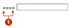
- Caption (from component)
The following settings can be configured for this widget:
- Override size
- If true, the specified size value will be set on each generate input
field. This setting is handy for visually changing the size of a large host
input field.
- Size
- The size of each input field.
Note:This value is interpreted by the browser - no guarantee is made as to how an input field will be rendered on different browsers. If false, the size of the input field is determined by the recognizing component.
- Override maximum length
- If true, the specified maximum length value will be set on each generate
input field. This setting is handy for manually restricting the number of
characters that can be entered into an input field. If false, the maximum
number of allowable characters is determined by the recognizing component.
- Maximum length
- The maximum number of characters that can be entered into each input field.
- Caption source
- Specifies how the caption for the generated input field is determined.
Options: "From component" (use the extracted caption from the component) or
"Custom" (use the specified caption).
- Custom caption
- Optional. Specifies the caption for the input field. Note: Leave this setting blank to not generate a caption for the check box.
- Number of columns per row
- The number of input fields to display horizontally before wrapping to the next line.
- Strip underscores on input field
- Check this box if you want to strip the underscores from text when it is rendered.
- Trim spaces on input field
- Checking this trims leading and trailing spaces from the input field.
- Input field style class
- Optional. The CSS style class associated with the generated input field. The value of the "class" attribute of the HTML input tag will be set to this value. The default value is "HATSINPUT". See Using style sheets for more information.
- Caption style class
- Optional. The CSS style class associated with the generated input field's caption. The default value is "HATSCAPTION". See Using style sheets for more information.
- Table style class
- Optional. The CSS style class associated with the generated table. If more than one input field is rendered, an HTML table will be generated to enclose these fields. The value of the "class" attribute of the HTML table tag will be set to this value. The default value is "HATSTABLE". See Using style sheets for more information.
- Style
- Optional. See the section on style sheets for more information. Note: Because of the large number of tags generated by this widget, you may considerably increase the download time of your page if you specify a value for this setting. Specify style overrides in the enclosing transformation or the included style sheet file.
Component and widget mapping
The widgets supplied in HATS Studio for use in displaying host components on a Web page are mapped to those components. The following table lists the existing HATS host components and their corresponding widgets.
Table 1. HATS V6 host components and their corresponding widgets Host component Widget Command line
Drop-down (data entry)
Popup
Radio buttons (data entry)
Text input
Dialog
Dialog
Field
Field
Field table
Horizontal bar graph
Line graph
Table
Vertical bar graph
Function key
Button
Button table
Drop-down (selection)
Link
Radio buttons (selection)
HTML DDS keyword
Label
Input field
Calendar
Check box
Drop-down (data entry)
Popup
Radio buttons (data entry)
Text input
Input field with hints
Drop-down (data entry)
Popup
Radio buttons (data entry)
Item selection
Check box
Drop-down (data entry)
Link (item selection)
Popup
Radio button (item selection)
Text input
Scrollbar field (ENPTUI)
Scrollbar (ENPTUI)
Selection field (ENPTUI)
Button
Check box
Link
Radio buttons (selection)
Selection list
Button
Button table
Drop-down (selection)
Link
Radio buttons (selection)
Subfile
Subfile
Text
Label
URL
Link
Visual table
Horizontal bar graph
Line graph
Table
Vertical bar graph

