Themes
For most requests, the portal page is rendered starting with Default.jsp in the /themes directory. The only exception is when the request has been modified by a newWindow="true" parameter. In this case, the page is rendered using Plain.jsp. Plain.jsp is normally used to render portlet help and portlets using the iFrame skin.
The following diagram depicts how the default portal theme is rendered in HTML after installation. The borders in this diagram show a simplified form of the table markup that is used by the default theme.
|
You can add your own elements to the HTML portal page and rearrange the layout by creating your own theme and changing the layout in Default.jsp and the JSPs that are included. The following sections illustrate the order and layout in which the portal page theme is built using the JSPs that are provided after installation. Use this information to learn how to include some of these components as you build your own themes.
Head
Head.jsp provides the necessary header information to correctly render the portal page. This file is used to link the style sheets and set the page title and the text direction.
Toolbar
The toolbar is rendered by ToolBarInclude.jsp and includes navigation to the My Portal and Administration pages. These links are built using the <wps:URLGeneration/> tag. This JSP also includes links for selecting the screen.
| Company logo | Banner image | Level 1 nodes | Show tools | Screen selectors | |||
|---|---|---|---|---|---|---|---|
|
 |
My Portal | Administration |
|
Edit my profile |  |
Log out |
The banner in the toolbar is rendered by the wpsToolbarBannerBackground class in the style sheet.
Administration link bar
AdminLinkBarInclude.jsp provides context-sensitive links for the page. For the current node, the user can create a child page, edit the current node, or assign access permissions. These links are created using the <wps:URLGeneration/> tag. See Adding custom links to the toolbar for more information.
| Custom links created by<URLGeneration/> | |||
|---|---|---|---|
| New Page | Edit Page | Assign Permissions | |
Place bar
PlaceBarInclude.jsp creates level 2 navigation using <wps:navigationLoop/> and <wps:navigation/> tags and provides the drop-down list that is used to access bookmarked pages.
| Tab scroll icons |
Unselected tabs | Selected tab | Favorites link | ||||
|---|---|---|---|---|---|---|---|

 |
Welcome | Documents | Content Publishing | My Work |
|
||
Because the place bar is the first occurrence of the <wps:navigation/> tag, the startLevel="2" attribute must be used to force the navigation to start with the level 2 nodes. The stopLevel="2" attribute is used to limit the navigation to level 2 nodes. See Work with portal navigation for more information.
Page bar
PageBarInclude.jsp creates level 2 navigation using <wps:navigationLoop/> and <wps:navigation/> tags.
| Productivity | Developers Area |
This is the second occurrence of the <wps:navigation/> tag. The startLevel attribute is not used, so navigation starts on the next level (3). The stopLevel="3" attribute is used to limit the navigation to level 3 nodes. See Work with portal navigation for more information.
Screen
The selected screen is rendered by the <wps:screenRender/> tag. See Screens for information about how the rest of the portal page is composed.
Default themes
For HTML, the following themes are provided by WebSphere Portal.
DefaultTheme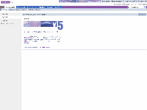 |
ScienceTheme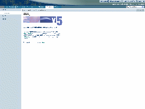 |
EngineeringTheme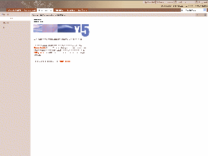 |
FinanceTheme |
YourcoFinancialTheme |
CorporateTheme |
See also