Mobile navigation
The HCL WebSphere Portal 8.5 ready-to-use theme provides two new responsive page navigation designs for mobile devices. One is aimed at smartphones, while the other is designed for tablets. The user agent for a device is parsed to determine which navigation to render on the portal page.
Smartphone navigation design
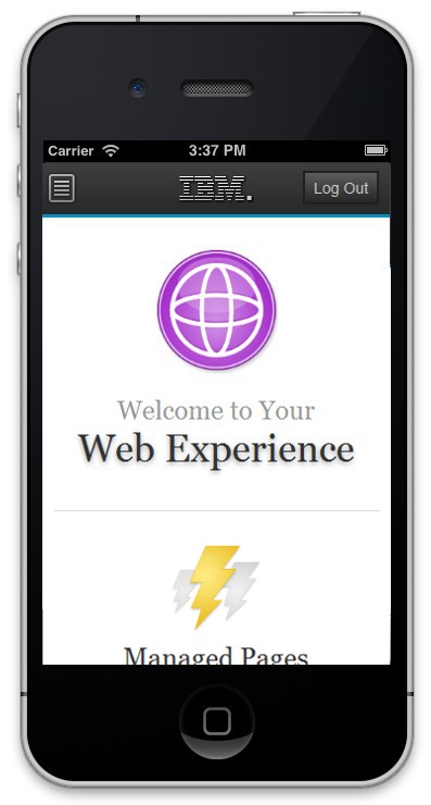
Welcome page displayed on a smartphone

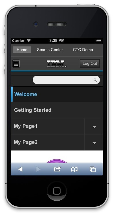
Mobile navigation displayed on a smartphone.

- Scroll up to display the navigation toggle: When the portal loads, this level of navigation is hidden to maximize the limited real estate
on a smartphone.
- Tap the navigation button to show the navigation for the portal.
- Tap this link to return to the portal home page.
- Tap the name of the page to load a specific page.
- Tap the arrow near the page name to display the child pages for that page.
Tablet navigation design
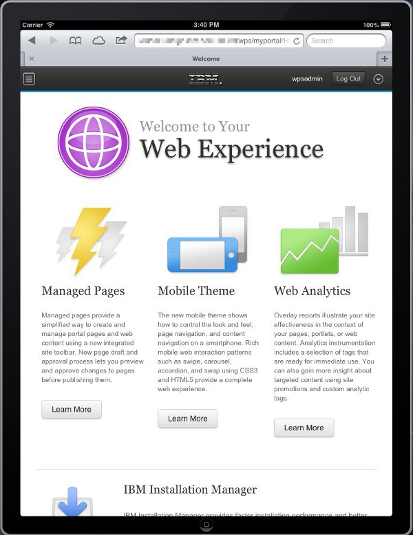
Figure 3. Welcome page displayed on a tablet.

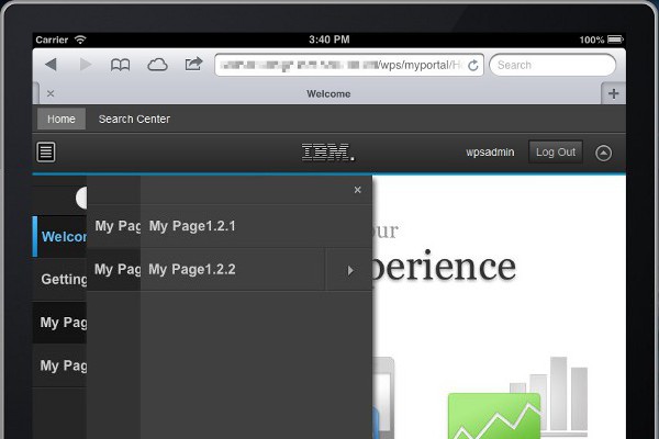
Figure 4. Mobile navigation displayed on a tablet.

- Tap the navigation button to show the navigation for the portal.
- Tap this link to return to the portal home page.
- Tap the arrow button to show the navigation.
- Tap the name of the page to open a specific page.
- Tap the arrow near the page name to display the child pages for that page.
Mobile navigation markup
The mobile navigation markup for both smartphone and tablet is created by...
-
PortalServer_root/theme/wp.theme.themes/default80/installedApps/DefaultTheme80.ear/DefaultTheme80.war/themes/html/dynamicSpots/mobileNavigation.jsp
The mobileNavigation.jsp file is controlled by the mobile navigation dynamic spot in theme.html:
-
dyn-cs:id:80theme_mobileNavigation
Some behaviors of the navigation can be controlled using URL parameters on the dynamic spot. The dynamic spot can be updated through the WP DynamicContentSpotMapping Resource Environment Provider.
mobileNavigation.jsp parameters:
| startLevel | Start level of page navigation to be displayed in this spot. This parameter uses a zero-based index where 0 is the highest level, excluding the content root. The default value is 1. |
| levelsDisplayed | Number of navigation levels to be displayed. If not specified, defaults to 10. If is set to 0, and levelsDisplayed parameter is set to 3, the navigation levels 0, 1, 2 would be displayed. |
| rootClass | Style class name to apply to the root <div> of the navigation. The default style class is wpthemeMobileNav. |
| hasSearch | Set true if the first item in the navigation is the search field. Default is true. |
The navigation on mobile devices is rendered by the mobileNavigation.jsp file. Therefore, the primary, secondary, breadcrumb, and side navigation used on the desktop do not produce any output for a mobile device. The navigation is rendered for mobile, but is hidden when the page loads. On a tablet, the arrow button in the banner can be tapped to reveal the navigation. On a smartphone, the user can scroll up to see the first-level navigation pages. Since smartphones have little real estate, site designers might want to hide certain first-level pages, such as Administration, for these devices. Add the com.ibm.portal.mobile.Hidden metadata to the page to hide certain first-level pages. By default, the Administration, Application, and Tag Center pages are hidden.
If the expanded navigation for the Portal site ends up being long on a smartphone, it is possible part of the navigation can get cut off. This cut off happens because a maximum height is required to be set on the navigation in order for the CSS3 animations to work correctly. If the navigation does not fit into this maximum height, it can be adjusted by editing
-
dav:fs-type1/themes/myCustomTheme/css/mobilenav.css
Look for the following style declaration, increase the max-height, and save.
.wpthemeMobileNav ul.wpthemeExpandNav {
   /* navigation lists */
   max-height: 100em;
}
Parent Responsive Web Design
Related concepts:
Customize navigation
Work with dynamic content spots