Test report preferences
Overview
The preference settings for test reports control such preferences as...- typeface
- color
- graph style of reports
- whether a Compare report is automatically launched when a staged run completes
- display a warning when changing Percentile report options will cause data to be lost.
Preference settings
Preference settings can be accessed using...
-
Window | Preferences | Test | Performance Test Reports
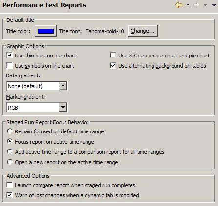
You can set the following preferences for test reports:
| Title color | Click the color button to set the color of the report titles. |
| Title font | Click Change to set the typeface and the size for the report titles. |
| Use thin bars on bar chart | Select to display graph bars that do not touch; clear to display graph bars that touch. |
| Use 3D bars on bar chart and pie chart | Select to display three-dimensional bars. |
| Use symbols on line chart | If report is long with many data points, you typically clear this box. When there are many data points, the symbols obscure the trends and make the data hard to interpret. |
| Use alternating background on tables | Select to give each other table row a gray background. The alternating background helps make the tables easy to read. |
| Data gradient | The default of None displays reports in neutral colors, which generally will suit needs. You can also select a brown, gray, or red-green-blue color scheme. Select 256 color supported only if you have problems with the other data gradients. |
| Marker gradient | When you are modeling a workload over time, select a contrasting color palette for markers to distinguish them from the data gradient that you have selected. Markers separate the time ranges displayed on line charts. |
| Remain focused on default time range | Select to show all data from time 0 to the end of run in a staged run report. |
| Focus report on active time range | Select to show all data aggregated in real-time relative to the start of a user-load plateau and not relative to the beginning of the run in staged run report (default). |
| Add active time range to a comparison report for all time ranges | Select to add a user-load plateau to a real-time comparison report of all smart-load time ranges in a staged run report. |
| Open a new report on the active time range | Select to open a new staged run report when a user-load plateau becomes active. |
| Launch compare report when staged run completes | When you are running a schedule containing multiple stages, time ranges are automatically created for each stage. Click to display a Compare report, which compares the time ranges of each stage, automatically after the run completes. |
| Warn of lost changes when a dynamic tab is modified | Most common example of losing changes occurs in the Percentile report. If you generate a report on a run, and then regenerate it with different percentiles, the data from the original percentiles will be overwritten. Display a warning when you modify a report. |