Mobile Preview
Use the Mobile Preview simulator to view the presentation of Digital Experience site page components on select mobile devices.
Note: The Mobile Preview simulator is provided with HCL WebSphere Portal CF19 release as a sample and is not yet supported for production use. The support policy for this HCL DX component will be updated in a future CF update release.
Mobile Preview Simulator Installation and Usage
This section provides information related to the usage of the Mobile Preview Simulator in websites developed using HCL WebSphere Portal software.
Installation
The Mobile Preview Simulator is enabled by default in HCL WebSphere Portal 9.5 CF19 and higher release and deployed along with the Practitioner Studio and Woodburn Studio demo site.
Access the Mobile Preview Simulator
After verifying access to Practitioner Studio, the Mobile Preview Simulator can be accessed using the following URL:
/wps/mobilepreview/MobileBrowserSimulator/index.html
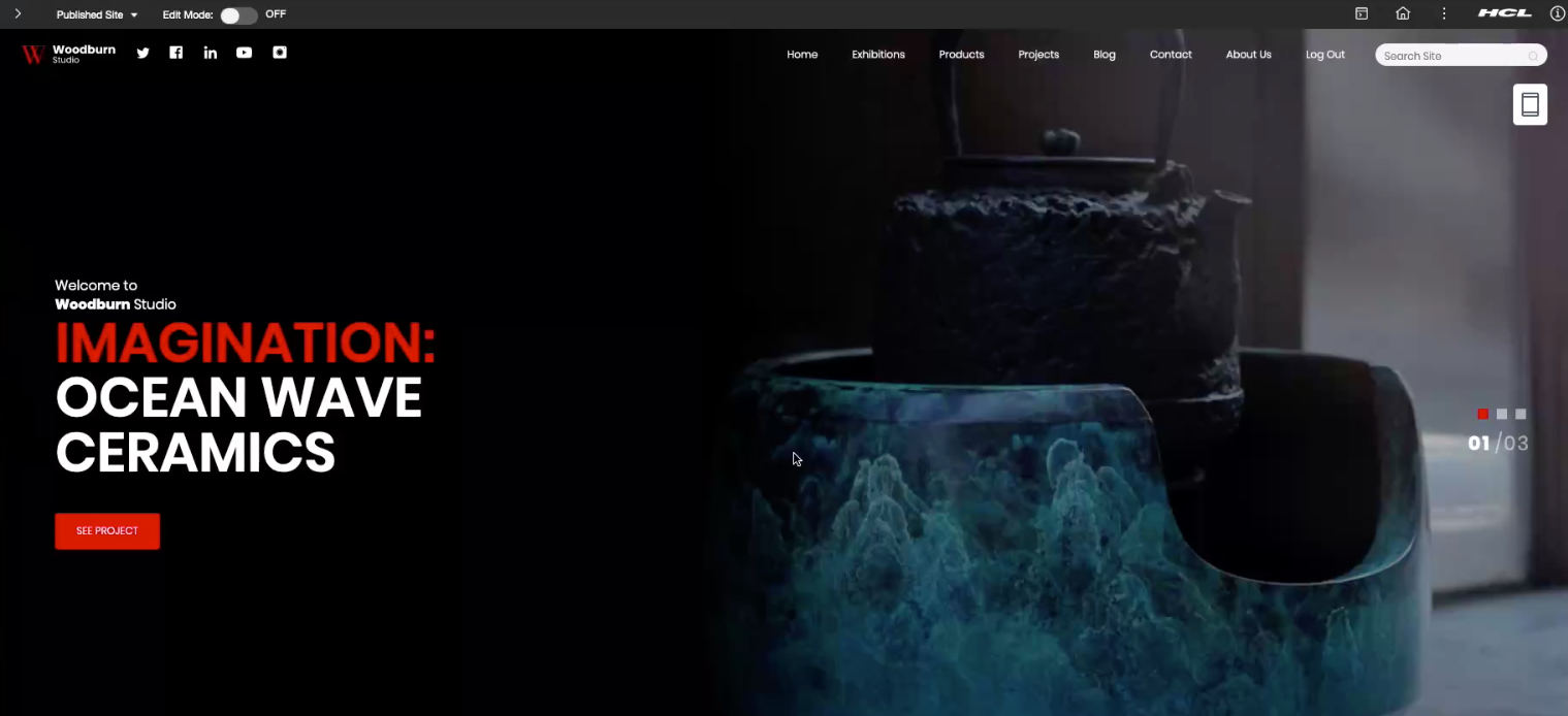
The Mobile Preview image and action appears on the top right, just below the Woodburn
Studio site menu as shown in the figure below.
Append the following query to the URL below to set the HCL WebSphere Portal page to display initially:
?webpage=<URL-to-page>
For example, this URL example shows a specific page URL request to present using the Mobile Preview Simulator:
/wps/mobilepreview/MobileBrowserSimulator/index.html?webpage=<URL-to-page>
Usage
There are multiple ways to apply and use the Mobile Preview Simulator on HCL Digital Experience sites. Options that have been created for use are listed below.
Option 1: Add an icon to a content or page template to launch the Mobile Preview simulator An icon can be used in a DX Content or Page template to launch the Mobile Preview simulator:
- Create a new Content Item (reference the Create Content Items topic for additional
information) for use with the designated Authoring Template or Page
Template, that renders the following HTML:
[IfEditMode]
<h2>Mobile Preview Icon</h2>
[/IfEditMode]

[IfNotEditMode]
[Plugin:ifNotDevice class="smartphone" class="tablet"]
<link rel="stylesheet" type="text/css" href="https://cdnjs.cloudflare.com/ajax/libs/font-awesome/4.7.0/css/font-awesome.min.css">

<style>
#mobile-preview-[Property field="id" type="content" context="current"] {
    position: fixed;
    bottom: 10px;
    left: 10px;
    width: 36px;
    height: 36px;
    background-color: #eeeeee;
    text-align: center;
    border: 0px solid transparent;
    border-radius: 5px;
}
#mobile-preview-[Property field="id" type="content" context="current"] a {
    background-color: transparent;
    border: none;
    color: #272727;
}
</style>

<div id" type="content" context="current"]" class="stBannerIcon stLeft visible-lg">
    <a href="#" onclick="javascript:void(window.open('/wps/mobilepreview/MobileBrowserSimulator/index.html?webpage='+window.location.pathname,'_blank'))" >
        <i class="fa fa-3x fa-mobile"></i>
    </a>
</div>
[/Plugin:ifNotDevice]
[/IfNotEditMode]
- In the specified Content or Page template, include the Content item created
in Step 1 above as a Content Item that will launch the Mobile Preview
simulator as a button directly on a page (by using Specified Content on the Web Content Viewer).
Figure 2. Mobile Preview simulator button JSP <c:set var="mobilePreview" value="${pageContext.request.contextPath}/mobilepreview/MobileBrowserSimulator/index.html?webpage=${fn:escapeXml(wp.selectionModel.selected.urlGeneration.noNavigationalState.allowRelativeURL)}"/> <portal-logic:if loggedIn="yes"> <div class="wb-mobile-preview-container"> <a href="${mobilePreview}" target="_blank"> <img src="mobile.svg"/> </a> </div> </portal-logic:if>
Note: Option 2 requires the content item created in Option 1 as shown above.
- As shown in the following example, the Mobile Preview simulator can be
referenced for launch in a Simple Theme, using the st_wcm_content Dynamic Content
spot:
<a rel="dynamic-content" href="dyn-cs:id:st_wcm_content?path=myLibrary/mySiteArea/mobilePreview.html"></a>
Option 3: Access the Mobile Preview simulator from a Dynamic Content Spot
configured to the Woodburn Studio demonstration site
In Woodburn Studio demonstration site delivered in HCL DX 9.5 CF19 and higher
releases, the Mobile Preview Simulator is added as a Dynamic Content Spot in the default theme.html. This serves to make the simulator
capability available to all of the Woodburn Studio demonstration site pages by
default. The code example below shows how the Dynamic Content Spot is added to the Woodburn Studio demonstration site:
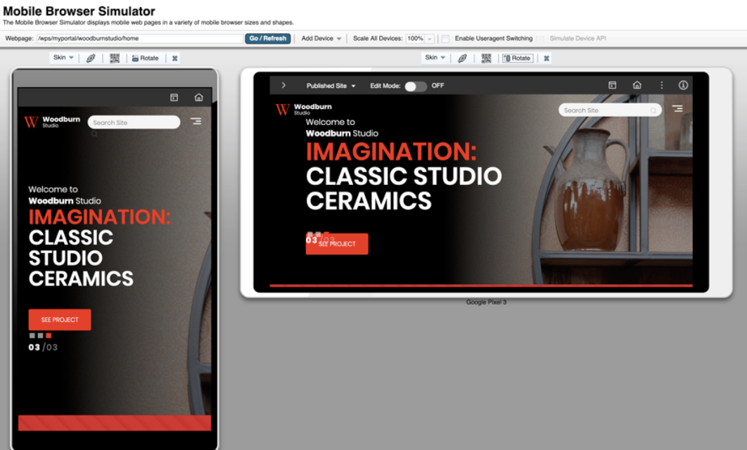
The following examples demonstrate use of the Mobile Preview simulator to view display of the Woodburn Studio demonstration site on mobile device
displays. <c:set var="mobilePreview" value="${pageContext.request.contextPath}/mobilepreview/MobileBrowserSimulator/index.html?webpage=${fn:escapeXml(wp.selectionModel.selected.urlGeneration.noNavigationalState.allowRelativeURL)}"/>
<portal-logic:if loggedIn="yes">
<div class="wb-mobile-preview-container">
<a href="${mobilePreview}" target="_blank">
<img src="mobile.svg"/>
</a>
</div>
</portal-logic:if>
<!-- mobile preview button -->
<a rel="dynamic-content" href="dyn-cs:id:MP_button"></a>
Parent topic: Develop websites