Forms Editor
The forms editor is used to customize the connection parameters form for a component. This can only be applied to components in the Resources folder (except properties files).
To customize a form, open the component with the Forms Editor.
Context menu - Forms Editor choice
Note that when us choose a different editor for a file than the default, the CE will remember your choice, so that the next time we double click on the file it will open the file with the editor we used last. To open the component with the default editor, simply choose the appropriate editor in this menu (typically the top most editor).
If the component we open has no custom form, we will be prompted to populate the form with the default form:

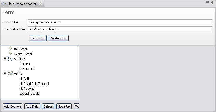
Choosing Yes will create an initial form definition based on the default form for the component. In this case the FileSystem connector is uesed in the example, which results in the following screen:
Default Forms Editor screen for FileSystem Connector
The various elements we see in this form have the following function:
- Form Title
- This is the main title of the component form (leave blank for no title). This is what the user sees at the top of the custom form.
- Translation file
- This is the file used to translate the labels and tooltips in the form. All labels and tooltips are attempted translated if you define a translation file. If we create a label with "file_name" as the text, the translation will try to retrieve a string from the translation file using "file_name" as the key. The translation files themselves are simple property files with "key=value on each line.
To localize a form create files with the locale identifier. So, for a French translation you would create a file called base-name_fr.properties.
- Test Form
- This button will show a dialog window with the current form definition.
- Delete Form
- This button will delete the form from the component. You must close and choose save for this to have permanent effect.
- Init Script
- The init script is executed when the form is loaded. This is where you place code to initialize the state of the form and any global script variables for the form.
- Events Script
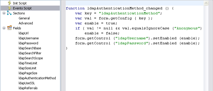
- When a field value changes, the Form will execute an event handler defined in this script. Every field has an internal name the component uses. For example, the FileConnector uses “filePath” as its internal name for the File path parameter. We can see all the component parameter names when us choose to populate your form with the default form in the Fields section. To react to changes in the form, you write event handlers in the events script editor using the internal name suffixed by “_changed” as the script function name. Below we see an example from the LDAP connector that disables two fields based on the authentication method:
Forms Editor, Events Script in LDAP Connector

- Sections and Fields
- Sections and fields are what make up the form. You manage the sections and fields by adding, removing and rearranging the order of them using the toolbar below the tree.

- Add Section - adds a new and empty section to the form
- Add Field - adds a new field to the form. Field names must be unique.
- Delete - removes a section or field from the form.
- Move Up/Down - rearranges the order of sections and forms. When we have sections defined, the order of fields is defined by the section and not the list of fields. When no sections are defined, the order in this tree determines the field order in the form.
- Sections
- This part is optional. If we don't specify sections then the form will have all fields displayed in its form, all at once.
Sections are used to arrange fields in the form. Sections are like folders the user can expand and collapse to display/hide its contents. When you define a section you specify whether the section is initially expanded and which fields are to be displayed in it. In the FileSystem connector example, there are two sections.
Forms Editor - General section

The first section is the General section. This section has no title, which means that there will be no section header the user can click to expand or collapse contents. This makes it a static section since the section cannot be collapsed or expanded. We can add, remove and reorder the fields in the list of fields using the toolbar at the bottom of the panel:

The second section is the Advanced section:
Forms Editor - Advanced section

This section does have a title, but it is not initially expanded. This will cause the form to display the form with this section title collapsed and the fields within are hidden until the user expands the section.
- Fields
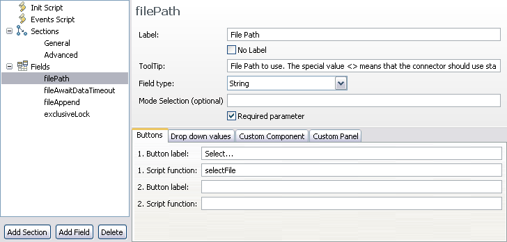
- Fields are the parameters for the component. If you reuse a component like the FileSystem connector we should either provide the required parameters in the form, or set the parameter in the “Init Script” section so that the component can function properly. Every field has its definition shown when we select it.
Forms Editor - field definitions

In this panel we see the definition for the connector parameter “filePath”. In the order of appearance:
Table 1. Forms Editor - parameter definition
Field Description Label The label that the form will show ToolTip The tooltip displayed when the user mouses over the input field Field Type The type of input field: - String for single line text input
- Drop down (editable) for an editable drop down input field
- Drop down (non-editable) for a drop down with a fixed set of selections
- Boolean for a checkbox
- Text Area for a multi line text input field
- Static Text for simple text display (that is, no input)
- Password for a single line password protected input field
- Script Editor for editing scripts
- Custom Component for a user defined SWT/JFace control
Mode Selection This optional field can specify component modes where the field is excluded or included. Specify modes separated by a comma with a minus sign to exclude. “Iterator” - only show in Iterator mode
“-Iterator” - Do not show in Iterator mode
“Iterator,Lookup” - only show in Iterator and Lookup modeThe three tabs at the bottom let you specify buttons, drop down values for Drop-down lists and the Java class name for the custom component.
Parent topic: The User Interface