Rich Page Editor
Use Rich Page Editor to are edit HTML files, add Dojo widgets to HTML pages, and create and edit web pages for mobile devices. Rich Page Editor is a multi-tabbed editor that provides multiple views to show different representations of the page.
Views
Use the Source, Design, and Split views in Rich Page Editor to view and work with the files or pages. Each view in Rich Page Editor works with several other views and tools that are included in the web perspective, including the following interface elements:
- Mobile Navigation, Outline, and Properties views
- Toolbar buttons
- Menu bar options
- Pop-up (right-click) menus
- Palette components
Since IBM Worklight v6.0, the jQuery Mobile widget of MobileFirst Studio might be not visible in the palette of the Rich Page Editor if you are using jQuery V1.3.2. To resolve this issue, use jQuery Mobile V1.3.1 instead of jQuery Mobile V1.3.2.
| Editor view | Description |
|---|---|
| Source | The Source view helps you to view and work directly with the source code of a file. The Mobile Navigation, Palette, Outline, Page Data, and Properties views have features that supplement the Source view. |
| Split | The Split view combines the Source and Design views in a split screen view. Changes that you make in one part of the split screen are automatically updated in the other part. We can split the view horizontally or vertically.
|
| Design |
The Design view is a WYSIWYG environment. This view helps you to create and work with a file while viewing how the web page and dynamic content might look on a mobile device. We can use this view to visually edit files. For example, the Design view includes features we can use to complete the following tasks:
|
Design Mode editing
Use the Design Mode editing features of Rich Page Editor to add and edit widgets in the Design view. To enable the Design Mode editing features, click the Design Mode icon. ![]()
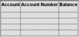
The following screen capture shows what a table looks like in the Design view of Rich Page Editor when Design Mode is enabled.

The following screen capture shows what the same table looks like in the Design view of Rich Page Editor when Design Mode is not enabled.

The Design Mode editing features guide the placement of code when you drop a widget on a container widget. Visual cues highlight the possible drop locations and pop-up cues indicate the editing function available for the selected widget. Design Mode also adds dashed borders to empty table cells. For example, dragging a tag from the Palette to a table provides a visual cue for placement:

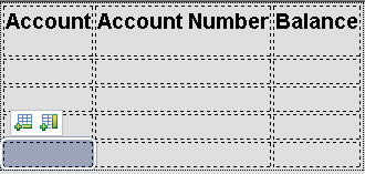
Select a cell in a table opens a pop-up cue we can use to add a column or row:

- Browser requirements for Rich Page Editor
Rich Page Editor uses embedded browsers to produce a visual representation of a web page in the Design view. The browsers available in Rich Page Editor and their installation requirements vary according to the platform. - Embedded browsers for Linux
On Linux systems, to ensure that product features, such as the Rich Page Editor use an appropriate embedded web browser, additional steps to configure the browser are necessary. - Set the Rich Page Editor preferences
We can customize the display of Rich Page Editor by setting the preferences for view shortcuts, pane visibility and layout, design mode, and web browser. - Create web pages in Rich Page Editor
We can create interactive web pages in Rich Page Editor. - Create web pages for mobile devices
We can create interactive web pages that are optimized for mobile devices. - Mobile patterns
Mobile patterns provide templates we can use to develop pages that are associated with a jQuery or Dojo mobile application. Using mobile patterns accelerates development of the mobile application by providing views common to many mobile applications. - Add elements to web pages from the palette
We can populate a web page with content by dragging elements from the Palette view to the web page in Rich Page Editor. - HTML5 tags in palette
HTML5 tags are available to use in the Rich Page Editor palette when you are creating an HTML5 web page. - Properties view associated with Rich Page Editor
The Properties view that is associated with Rich Page Editor displays specific information for the currently selected tag in a web page. Use the Properties view to edit properties related to the appearance of tags in a web browser. For example, we can change CSS style information, default attribute values, Dojo properties, and jQuery properties, as required. - Mobile Navigation view
Use the Mobile Navigation view to manage Dojo mobile view widgets and jQuery mobile web page widgets.
Parent topic: Develop user interface of hybrid applications
