The visual editor design palette
The visual editor for Java includes a palette of components and other selection tools for you to use in the Design view.
By default, the design palette displays to the left of the Design view in the visual editor for Java. You can resize the palette, collapse it, and choose whether you want the palette collapsed by default. For more information, see Customizing the appearance of the visual editor.
 toolbar button.
The design palette includes the following selection tools:
- Selection - the default cursor tool, used for selecting existing components in the Design view. You can select multiple components in both the Java Beans view and the Design view by holding down the Ctrl key.
- Marquee - a selection tool that you use to drag a rectangular selection area. All components that lie completely within the selection rectangle are selected.
- Choose bean - opens the Choose a bean selection dialog where you can search for the component that you want to drop onto the Design view. The component that you select becomes the active element for the cursor.
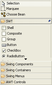
The design palette also includes common components, containers, menus, and controls for SWT, Swing, and AWT. The components are organized by type using drawers that you can expand, collapse, and pin open.
When you select a tool or a component from the design palette, it becomes the active behavior for your cursor. For example, if you select a Swing JButton on the design palette and then move your cursor over the Design view, the visual editor will give visual cues about the availability and location of placement. When you click in a valid position, the JButton will be dropped onto the design. After you drop the component, your cursor reverts to the default selection cursor.