WebSphere Lombardi Edition 7.2 > Create reports
Create a more advanced custom report
The following example explains how to create a tracking group and then use the data captured for that group to create a more advanced query and report, building each required component in the Designer in Lombardi Authoring Environment.
When querying the Performance Data Warehouse, you should query the views
Create a tracking group
Let's say that you have developed a Business Process Definition (BPD) in Lombardi Authoring Environment that collects data for incoming leads. This process enables your Inside Sales team to quickly capture details about each lead that they identify. Process participants downstream will use the collected data in a nested process to qualify and assign leads. Because the tracked data needs to span multiple BPDs, you decide to create a tracking group to capture the variable values.
The data collected from the Inside Sales team is represented by several variables in the BPD. A variable exists for each field of data that the Inside Sales team provides, including: district, region, branch, division, and temperature (temperature is used to indicate whether the lead is hot or cold). Your entire Sales team realizes early on that they want to be able to capture information from this business process and report on it. For example, they will need to know how many leads came in for each district, region, and branch.
-
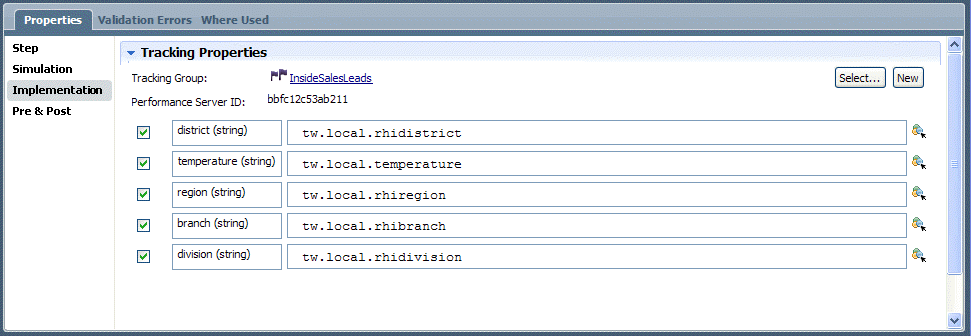
To be able to report on this data for this process and the related nested processes, you create a Tracking Group in the library called InsideSalesLeads and then add a field to the group for each process variable that you want to track:

-
Add a Tracking Event to your BPD diagram, select it, and in the Implementation tab, add the process variables to associate with each tracked field :
-
Save the BPD and then send these newly defined tracking requirements to the Performance Data Warehouse by selecting File > Send Definitions to Performance Data Warehouse.
When you view the Performance Data Warehouse database, you can see that sending the definitions caused the Performance Data Warehouse to create a view for your tracking group. The view name matches the name of the tracking group, with the schema name of the database (teamworks) prepended. When you access the view created for the tracking group, you can see that a column exists for each variable that you included (district, temperature, region, branch, and division) along with the standard system-generated columns:

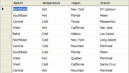
When you run instances of the process, the tracked data for each variable is stored in the appropriate column. Each row in a Tracking Group table or view represents a discrete unit of tracked data. When instances of the process run and some leads have actually been entered by the team, we can see the data in the InsideSalesLeads tracking group view in the Performance Data Warehouse:
You are able to verify that Lombardi is properly capturing the data by checking the Performance Data Warehouse. To build a custom report that takes advantage of this data, see the following sample.
Steps to create a more advanced custom report
To create a report by building each component in the Designer in
Lombardi Authoring Environment, the following are the basic steps to follow:
- Create an Integration service that contains a query.
- Create a new report and: a) specify a data source for the report (the Integration service from the preceding step); b) add a chart to the report and bind the chart to the data source; c) create a report page, make it the default page for the report, and then save the report.
- Create a scoreboard, add the report to the scoreboard, and then enable the scoreboard.
- Grant access to the end users who want to view this scoreboard by setting the Expose to option for the scoreboard.
The following sections cover the preceding steps in more detail and also include some optional steps like adding a filter to the report. Let's use the InsideSalesLeads tracking group discussed in the preceding section to create a more advanced query and report. We've already created the business process to collect data from the Inside Sales team and we've also created a field in the InsideSalesLeads tracking group for each process variable that we want to track. Using this data, we'll create a report that compares the leads by region. We'll use a stacked bar chart to illustrate the break-down of hot and cold leads per region.
Create an Integration service that contains a query
- To create the Integration service for our bar chart in the Designer, we click the plus sign next to the Implementation category in the library and select Integration Service from the list of components.
- In the New Integration Service dialog, type a name in the appropriate field (for this sample, the name is Bar Chart Example) and then click Finish.
- Click the Variables tab and add the following private variables for this service: sql of type String, returnType of type String, and dataSourceNameof type String.
- Click the returnType variable to select it, enable the Has Default checkbox, and type "XMLElement" in the text box.
- Click the dataSourceName variable to select it, enable the Has Default checkbox, and type "jdbc/PerformanceDB" in the text box. This directs the Integration service to the Performance Data Warehouse database.
- Add an output variable named results of type XMLElement.
- Click the Diagram tab and drag a Server Scriptlet component from the palette to the service diagram.
- While the Server Scriptlet component is still selected, click the Step option in the properties and type SQL Query in the Name text box.
-
Click the Implementation option in the properties, click the Select button next to the Binding option, and choose the sql variable created in an earlier step.
-
Enter the following query in the text box. Notice that we're performing a Union of SQL statements to retrieve counts of Hot and Cold leads per region:
SELECT
  district, 'Hot' as name, count(*) as var
FROM
  InsideSalesLeads
WHERE
  temperature = 'Hot'
GROUP BY
  district
UNION
SELECT
  district, 'Cold' as name, count(*) as var
FROM
  InsideSalesLeads
WHERE
  temperature = 'Cold'
GROUP BY
  district
- Drag the SQL Execute Statement Integration service from the System Data toolkit to the service diagram so that it follows the Server Scriptlet component added in the preceding steps.
- While the SQL Execute Statement Integration service is still selected, click the Step option in the properties and type Execute SQL in the Name text box.
- Click the Data Mapping option in the properties.
-
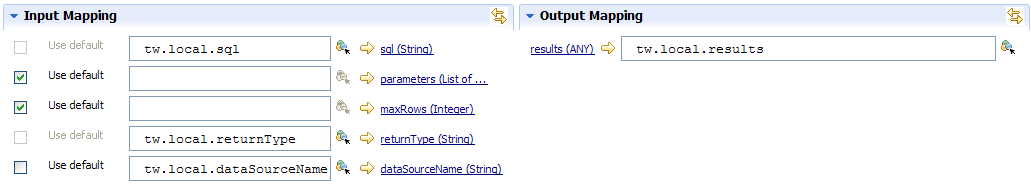
For Input Mappings, click the variable selector icon next to sql(String) and choose the local sql variable created in an earlier step.
Do the same for returnType(String) and dataSourceName(String), choosing the corresponding local variables created in an earlier step.
-
For Output Mappings, click the variable selector icon next to results(Any) and choose the local output results variable created in an earlier step...
- Use the Sequence Flow tool to connect the Start component, SQL Query server scriptlet, Execute SQL Integration service, and End component.
-
Save the Integration service so that you can specify it as the data source for the report created in the following section.
You can test the Integration service to ensure that it returns the data that you want by clicking the Debug icon in the upper right corner of the Designer. Click the Step button in the debugger until the query results are displayed.
Create the report
- To create the report itself, we click the plus sign next to the Performance category in the library and select Report from the list of components. In the New Report dialog, we enter a name (Sample Report - Bar Chart) in the appropriate field and click Finish.
-
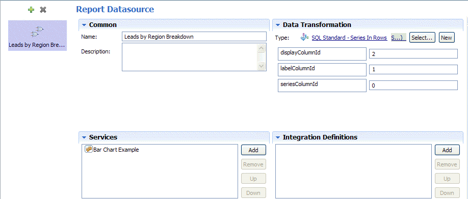
In the report that we've created, we click the Datasources tab, click the green plus sign in the upper left corner of the dialog, click the Add button under Services, find the Bar Chart Example Integration service, click it so that it is added to the report, and then type a name for the datasource in the Name field as illustrated in the following image:

As you can see in the preceding image, we select the SQL Standard - Series in Rows Data Transformation for our bar chart because we want to display stacked bars that include both hot and cold leads for each region. (A Data Transformation is a script that executes the associated Integration service and adds series to our charts.) To control how the data is displayed, we enter the values shown for displayColumnId, labelColumnId, and seriesColumnId. Later, when we test our report page using the Playback option, we'll show how changing these values changes our report.
-
To add a chart to the report, we click the Charts tab and then click the green plus sign in the upper left corner of the dialog. We provide a name for the chart under the Common heading, and then click the Select button next to the Layout field under the Chart heading to select Stock Bar Chart from the System > Chart Types folder. To bind data to the chart, we click the green plus sign next to the Data Binding heading, select bar from the first drop-down menu and Leads by Region Breakdown from the second menu :

We enable the Override title checkbox to override the default chart title and provide our own title of Leads by Region. Notice that the same is true for the Y-Axis label and X-Axis label.
-
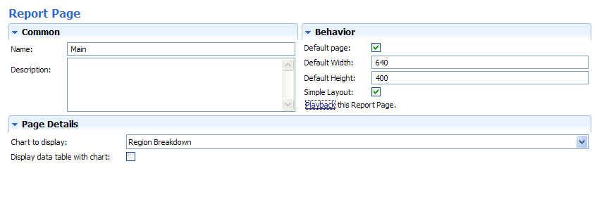
To create a page for the report, we click the Pages tab, click the green plus sign in the upper left corner of the dialog, and name the page Main. Under Page Details, we use the drop-down menu to select the chart to display and under the Behavior heading, we click the Default Page checkbox and the Simple Layout checkbox :
-
Click the Save icon on the toolbar to save the report. To test our page, we click Playback. Lombardi displays the report page in our browser:
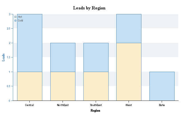
But, what if we want to display the data differently? Suppose we want two bars in our chart: one to show all hot leads and one to show all cold leads? We can alter the final chart by changing the values that we provide for labelColumnId and seriesColumnId in the Datasources tab of the report. For example, if we change those values :
When we click Playback on the Pages tab, the chart displays as follows:

To understand why changing the column ID values has such an effect, let's take a look at the results of the query in our Integration service. To test and view the results of the query, go to the Integration service and click Debug icon in the upper right corner. Click the Step button in the debugger until the query results are displayed :
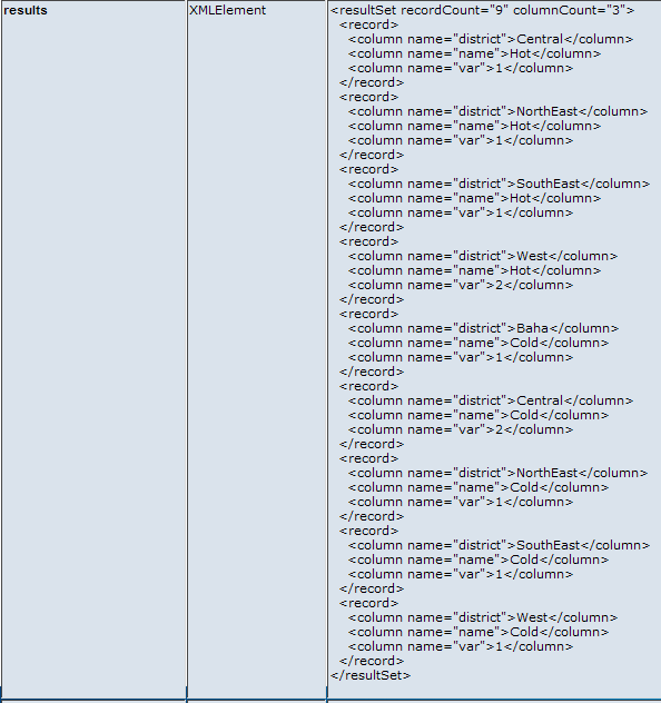
There are three columns of returned data as shown in the following example:
[Column 0]      [Column 1]      [Column 2]
 Central         Hot                1
 NorthEast       Hot                1
 SouthEast       Hot                1
So, if we set:
labelColumnId to 0 We get a separate bar for each district, which are the values stored in Column 0. seriesColumnId to 1 labelColumnId The series displayed in each bar is Hot and Cold, which are the values stored in Column 1. And, if we set:
labelColumnId to 1 We get a separate bar for Hot and Cold, which are the values stored in Column 1. seriesColumnId to 0 The series displayed in each bar is each district, which are the values stored in Column 0.
Create the scoreboard
-
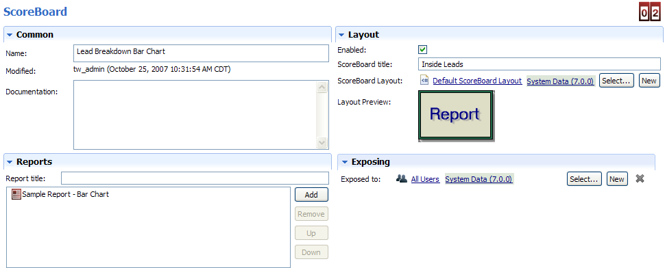
To display this report in Lombardi Process Portal, we need to create a scoreboard and add our report to that scoreboard. Click the plus sign next to the Performance category in the library and select Scoreboard from the list of components. In the New Scoreboard dialog, we name the scoreboard Lead Breakdown Bar Chart and leave the default layout setting (Default Scoreboard Layout).
In the scoreboard we've created, under the Reports heading, we click the Add button, find our report, and click it to add it to the scoreboard. Then, under the Layout heading, click the Enabled check box and provide a title for the scoreboard. Also click the Select button next to the Exposed to option and pick the participant group whose members can view this scoreboard in Lombardi Process Portal...
-
Now when we access Lombardi Process Portal, we can see the title of the scoreboard (Inside Leads) in My Scoreboards on the left of the portal. When we click Inside Leads, Lombardi Process Portal displays the report:
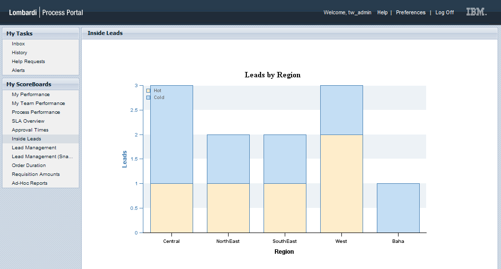
-
To control access to the scoreboard in different environments:
Environment Required configuration Development (on Process Center Server) In the Designer in Lombardi Authoring Environment, create a new participant group or adjust the members of the existing participant group to whom the scoreboard is exposed. See Create a participant group. Runtime (Process Server in test, staging, or production environment) After installing a process application snapshot that includes the scoreboard, adjust the members of the participant group to whom the scoreboard is exposed as
Add a filter
Optionally, we can add a filter to our report. For example, let's say that we want to filter our report results by a certain number of days. The following sample shows how to add a filter to a report.
Before you begin, consider taking a snapshot of the process
application that contains the Integration service and other items created in
the preceding sections since we will be altering some of those items in this
section. With snapshots, you can view and run each version you save which
ensures that you can access these completed samples when you need them.
-
Go to the Lombardi library and open the Bar Chart Example Integration service.
-
Click the Variables tab and add an Input variable named filters of type Map.
Click the Has Default checkbox to enable it and type the following in the text box to initialize the variable: new tw.object.Map()
-
To add a filter, let's change the SQL statement in the Integration service so that it includes a where clause that limits the hot leads shown to those with a timestamp within the timeframe (number of days) that we specify.
To do so, first we add javascript to define the leadDays variable as shown in the following sample:
<#
var leadDays = tw.local.filters.get("leadDays");
if(leadDays == null) {
leadDays = "30";
}
#>

SELECT
  district, count(*)
FROM
  InsideSalesLeads
WHERE
  temperature = 'Hot'
  and time_stamp_days > (GETDATE()- <#= leadDays #>)
GROUP BY
  district
The and statement that we added to the where clause limits the results to those entries with time_stamp_days within a particular value as specified in the leadDays variable. The default value of leadDays is 30. In the following steps, we'll specify leadDays as the name of our filter.
- Open the Sample Report - Bar Chart report and go to the Datasources tab.
- Change the Data Transformation to SQL Standard - Series in Columns to work with the new query.
- Under the Filters heading, click Add and select the Simple Number Replacement filter from the System Data toolkit.
-
Under the Filter Details heading, enter leadDays for the Filter Name, Lead Days for the Filter Label, and 30 for the default value...

- Click the Save icon on the toolbar.
-
Go to the Overview tab for the report and click Playback. Lombardi displays the report page in a browser window:
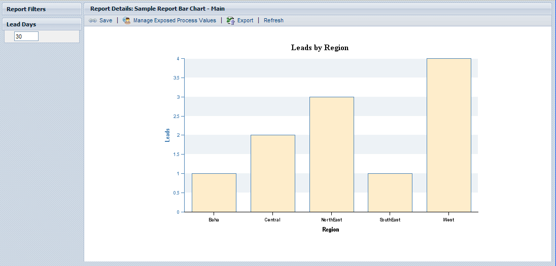
Notice the Lead Days filter in the upper left. Currently the report is showing the hot leads by region entered within the last 30 days.
-
Change the value in the Lead Days filter to 7 and click Refresh.

Now the report shows the hot leads entered within the last 7 days. With the filter, users can configure the report to analyze the incoming leads for the specific timeframes that they want.
Parent topic: Create reports