Skins
Skins represent the border rendering around components, such as row containers, column containers, or portlets. The skin is loaded in the portal page by the <wps:compositionRender/> tag. Skins can use the theme name to select the graphics that match the theme colors. Skins are installed independently from themes. However, a skin can be associated with a theme.
Note: You can configure some skins to compile faster than other skins. See Use high-performance skins for more information.
Skins define more than the look and feel of portlets; they define the look and feel of components. These components include the navigation, containers, and controls. This hierarchical structure is depicted in the following diagram.
Underlying composition of the home screen
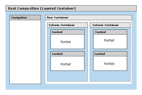
The components of the skin are called in the following order.
-
The <wps:compositionRender/> tag in Home.jsp
displays the root composition using a layered container JSP (LayeredContainer-V.jsp).
-
LayeredContainer-V.jsp displays a vertical navigation using the
<wps:navigation/> element.
The startLevel and stopLevel attributes are not used, so the navigation starts with the levels following
the portal theme levels and continues until all remaining navigation nodes are provided.
See Work with portal navigation for more information
about navigation levels.
-
After the navigation is rendered, LayeredContainer-V.jsp uses the <wps:compositionRender/> tag again to
display the nested components for the selected node to the side of the navigation.
The nested components are implemented as row containers, column containers, and controls depending upon
the portal layout that is defined in portal page customization.
Row and column containers are displayed using an unlayered container JSP
(UnLayeredContainer-H.jsp or UnLayeredContainer-V.jsp).
Controls are displayed using Control.jsp.
The figure in Underlying composition of the home screen
depicts one row container that has two column containers, each containing two portlets.
-
UnLayeredContainer-H.jsp and UnLayeredContainer-V.jsp display their nested components using
either Java code or the <wps:componentLoop/> and
<wps:componentRender/> elements.
- Each portlet is rendered by the <wps:portletRender/> tag within the Control.jsp. file. The control also builds the border and title bar around the portlet output.
Default skins
The following skins are provided by WebSphere Portal for rendering portlets.
Album: |
Clear: |
Diamonds: |
Corner: |
Echo: |
Fade: |
Hint: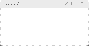 |
Noborder: |
Noskin: |
Outline: |
Pinstripe: |
Shadow: |
Wave: |
IFrame: |
The IFrame skin that is provided has a more practical purpose than the other skins. It renders the portlet content in an HTML iframe on the page. Iframes are treated as separate browser windows. The IFrame skin is especially useful for portlets that are slow to render, allowing the rest of the portal page to render without waiting on the content from the portlet within the iframe.
The width of this skin is set to 100% and height is set to 250 pixels. To change this setting, follow these steps:
- Locate the /IFrame subdirectory in the ../skins/html directory.
- Edit the file Control.jsp.
- Locate the markup for the iframe:
<iframe src='<%wpsURL.write(out);%>' SCROLLING="auto" FRAMEBORDER="0" Width="100%" height="250">
- Change the width and height attributes of this tag.
- Save and close the file.
See also