Designing a User Interface for a Web Application With the HTML Layout Painter
Describes how to create a user interface in the local development environment using the HTML Layout Painter.
The HTML Layout Painter allows you to graphically create an HTML page that incorporates forms, reports, graphs, and Web objects. You can also directly edit HTML code in the HTML Editor or a third party editor. The HTML Layout Painter is fully integrated with JavaScript™ and Cascading Style Sheets (CSS).
- The HTML Layout Painter does not support OLAP-enabled reports.
- The HTML Layout Painter is accessible only through the DB2® Web Query Developer Workbench.
Parent topic:
IBM DB2 Web Query for System i Overview
Uses for the HTML Layout Painter
You can do the following when creating an HTML layout:
- Build an HTML launch page. The HTML Layout Painter allows you to add push buttons,
hyperlinks, and other objects that launch other DB2 Web Query reports in your application.
- Create a launch page for one or more reports that contain parameters.
- Create a complete report by adding multiple reports and graphs into a single HTML formatted report.
- Create an advanced report layout by including images, frames, and other Web elements.
You can change the location, size, and properties of all objects in your layout.
- Directly edit an HTML page in the HTML Editor or in a third party editor.
- Set background, font, and other properties in the Style Composer tool.
Getting Started With the HTML Layout Painter
The HTML Layout Painter does not support OLAP-enabled reports. If you execute a report from the HTML Layout Painter with this option, the output window will not display the OLAP controls and you will receive a scripting error. In order to execute this type of report, use a frame. For more information, see Adding a Frame to the Layout.
Access the HTML Layout Painter
- Required: Create a new HTML file by completing one of these actions:
The Add HTML File dialog box opens.

- Enter a name for the new procedure in the File name field.
- Select HTML Layout Painter from the Create with drop-down list.
- Click Open.
The HTML Layout Painter opens.
HTML Layout Painter Windows® and Toolbars
When you open the HTML Layout Painter, it appears as shown in the following image.
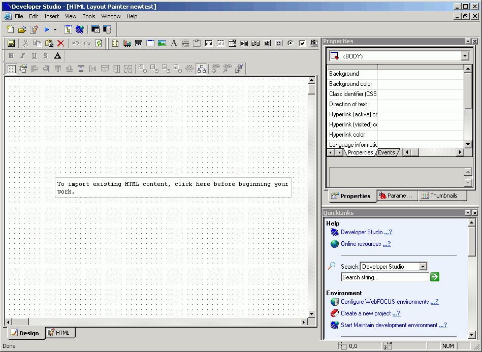
The main elements of the HTML Layout Painter are:
- Menu Bar
-
Displays pull-down menus for the HTML Layout Painter.
- Developer Workbench
-
Displays tool buttons such as Open and Run.
- Standard Toolbar
-
Displays buttons such as Cut and Paste that allow you edit the layout.
- Components Toolbar
-
Contains buttons that add objects and form controls to the layout.
- Positioning Toolbar
-
Contains buttons that control the appearance of the layout. For details, see Positioning Toolbar.
- Properties Window
-
Displays the properties and events of objects in the layout. For details, see Working With the Properties Window.
- Events Tab
-
Displays the events associated with objects in the layout. For details, see Working With the Properties Window.
- QuickLinks Window
-
Displays links to information on Help, configuration options, metadata creation, and reports and procedures.
- Parameters Tab
-
Displays information about the parameters in your report or graph. For details, see Working With the Parameters Tab in the Properties Window.
- Thumbnails Tab
-
Select an image from the Thumbnails tab to jump to the selected object in the HTML layout.
Standard Toolbar
The Standard toolbar contains the following buttons:


Components Toolbar
The Components toolbar contains the following buttons:


Creating a Report Page Layout
You can use the HTML Layout Painter to create an HTML page that launches and displays your report or graph. You can add elements to the HTML page including a report or graph, text, form controls, and so on.
You can also set properties for the HTML page in the HTML Layout Painter. For details, see Setting HTML Page Properties.
Adding a Report or Graph to the HTML Layout
You can add a report or graph to the HTML Layout that will display when you run the procedure. You can add an existing report or graph that resides on an available server.
You can also include parameters in a report whose values can be assigned with forms that are added with the HTML Layout Painter. For information, see Using Form Controls to Supply Parameter Values.
You can set the graphic used as a placeholder for a report or graph in the layout using the Settings dialog box. For details, see Set Page Properties.
Add an Existing Report or Graph to a Layout
- Insert a report or graph object by doing one of the following:
- Click the Report or Graph button from the Components toolbar.
The cursor changes into a crosshair. Click and drag the crosshair to create a report or graph object and adjust it to the size you want.
A report or graph object is created in the layout and assigned the name reportn or graphn where n is a number. The object will appear in gray and white to indicate that the placeholder does not have a report or graph associated with it. Once a report or graph is associated with the object, the object displays the contents of the report or graph.
- From the Insert menu, select Import Existing Procedure.
If you want to access the Manage Layout dialog box, choose this method.
- Click the Report or Graph button from the Components toolbar.
- Do one of the following:
For a report:
Right-click the report object and select Import existing report.
For a graph:
Right-click the graph object and select Import existing graph.
The Get source file dialog box opens.
Enter the name of the procedure you want to add to the layout.
- Click Open.
The report or graph object appears in the Design View of the HTML Layout Painter.
- Optionally, change the properties by adjusting the properties displayed in the Properties tab of the Properties window. For details, see Report Properties in the Properties Window.
Report Properties in the Properties Window
When a report is selected, the Properties tab in the Properties window contains options that control the properties of your report.

Click a property to display a description of the selected property at the bottom of the Properties window.
Graph Properties in the Properties Window
When a graph is selected, the Properties tab in the Properties window contains options that control the properties of your graph.
Click a property to display a description of the selected property at the bottom of the Properties window.
Selecting Components to Import Into a Procedure
You can select to include or exclude components to be imported into your procedure with the Manage Layout dialog box. The Manage Layout dialog box allows you to select from components of your request such as TABLE, SET, and GRAPH.
If you have several requests in one procedure, you can use the Manage Layout dialog box to suppress the display of individual TABLE, SET, and GRAPH components (for example, temporary HOLD files). By default, the last TABLE is set to display.
Select Components to Import Into a Procedure
- Select Import Existing Procedure from the Insert menu.
The Get source file dialog box opens.
- Select a File name and click Open.
The Manage Layout dialog box opens. For details, see Manage Layout Dialog Box.
Manage Layout Dialog Box
The following image is the Manage Layout dialog box.

The Manage Layout dialog box contains the following fields/options:
- Components
-
Displays all the components (SET, DEFINE, etc.) in the request.
- Data
-
Displays the contents of the selected component.
- Component Legend
- Determines whether the request is included in the procedure, outside of the procedure, or in the procedure and layout.
- In focexec and layout
-
Activates the component and displays the component in the layout.
- In focexec only
-
Deactivates the component and does not display the component in the layout. This is a good method for hiding report requests that produce temporary files.
- Not in focexec
-
Removes the component from the procedure.
- Show layout items only (reports and graphs)
-
Displays the layout's reports and graphs in the Data field.
This check box only displays when you access the Manage Layout dialog box from the Insert menu. When accessing it from the pop-up menu, only the report or graph component displays, and the check box does not apply.
Adding a Frame to the Layout
You can use a frame to embed additional Web sources or run reports. You can also use a frame as the output location or target for a drill-down report. You can also use a frame to run a table of contents report, an OLAP report, a PDF report, or an Excel report.
Add a Frame to the Layout
- Required: Insert a frame by doing one of the following:
The cursor changes into a crosshair.
- Click and drag the crosshair to create a frame and adjust it to the size you want.
A frame is created in the layout and assigned the name iframen, where n is a number.
- Optionally, change the frame's properties by adjusting the properties displayed in the Properties tab of the Properties window. For details, see Frame Properties in the Properties Window.
Assign a URL, HTML Form, or Report to a Frame
- Insert a frame by doing one of the following:
The cursor changes into a crosshair.
- Click and drag the crosshair to create a frame and adjust it to the size you want.
A frame is created in the layout and assigned the name iframen, where n is a number.
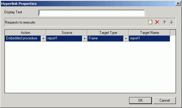
- Right-click the frame, and select Frame Properties from the pop-up menu.
The Hyperlink Properties dialog box opens.

- Click the New icon to create a new action. From the drop down list in the Action field you can select:
- URL: To assign a URL address to the frame,
select URL and enter the fully qualified URL in the Source field.
- HTML File: To assign an HTML file to the frame,
click select HTML File and enter the file's location in the Source field, or click the browse (...)
button to browse to the location. An HTML file refers to the HTML files in your application.
- Embedded Procedure: To assign an embedded procedure to the frame, select Embedded Procedure and enter the procedure's location in the Source field,
or click the browse (...)
button to browse to the location.
- External Procedure: To assign an external procedure to the frame, select External Procedure and enter the procedure's location in the Source field, or click the browse (...) button to browse to the location.
- URL: To assign a URL address to the frame,
select URL and enter the fully qualified URL in the Source field.
- Click OK.
- Optionally, change the frame's properties by adjusting the properties displayed in the Properties tab of the Properties window. For details, see Frame Properties in the Properties Window.
Show/Hide a Frame in the Layout
- From the HTML Layout Painter, use form controls to supply parameter values for a report.
A report with parameters requires that you to select values (at run time) in order to generate the output.
- Click the frame (report object) and select False from the Auto Execute drop-down list in the Properties tab of the Properties window.

False is the default Auto Execute option for reports with parameters.
- Right-click the frame (report object) in the Design View and select Style from the context menu.

The Style Composer opens.
- Select Layout from the left-side of the Style Composer to view the layout options for the selected frame.
- From the Flow control area, select Do not display from the Display drop-down list.

This option hides the frame at run time until the values are selected.
- Click OK to close the Style Composer.
- Run the HTML page. In the example below, the frame is not shown before the values are selected.

In the same example below, parameter values have been selected and the frame appears showing the output results.

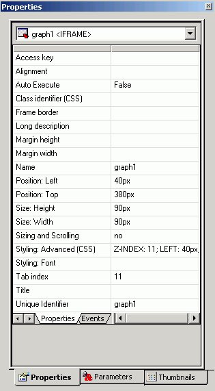
Frame Properties in the Properties Window
When a frame is selected, the Properties tab in the Properties window contains options that control the properties of your frame.

Click a property to display a description of the selected property at the bottom of the Properties window.
Adding a Line to the Layout
You can add a horizontal or vertical line to the layout. This is useful for distinguishing between sections of your launch or display page.
Add a Line to the Layout
- Do one of the following:
The cursor changes into a crosshair.
- Click and drag the crosshair to create a horizontal or vertical line.
A line is created in the layout.
- Optionally, change the line's properties by adjusting the properties displayed in the Properties tab of the Properties window. For details, see Line Properties in the Properties Window.
Line Properties in the Properties Window
When a line is selected, the Properties tab in the Properties window contains options that control the properties of lines.

To view a description of a property at the bottom of the Properties window, click the desired property.
Adding an Image to the Layout
You can add an image to the layout. This is useful for including graphics such as a company logo.
You can insert an image into your report layout and add a hyperlink to it. After you run your report and click the image you can launch a URL or run a report the same way you can by clicking a hyperlink or push button. For more information, see Add a Hyperlink to a Push Button or an Image.
When inserting images, images must be referenced from a specific directory location. Links to images are not supported.
Add an Image to a Layout
- Do one of the following:
The Get source file dialog box opens.
- Navigate to the directory where the image is located using the Look in menu, then select the image you want to add to the layout.
- Click Open.
- Optionally, change the image's properties by adjusting the properties displayed in the Properties tab of the Properties window. For details, see Image Properties in the Properties Window.
You can always return an image to its original size by right-clicking the image and selecting Image properties from the pop-up menu, then selecting Restore size.
Image Properties in the Properties Window
When an image is selected, the Properties tab in the Properties contains options that control the properties of images.

Click a property to display a description of the selected property at the bottom of the Properties window.
Adding Text to the Layout
You can add text to the layout. This is useful for including headings for your Web page, or adding directions or explanation for your report or graph.
Add Text to a Layout
- Insert text to the layout by doing one of the following:
A text object appears.
- Replace the text with the text you want to appear in the layout.
- Optionally, change the text's properties by adjusting the properties displayed in the Properties tab of the Properties window. For details, see Text Properties in the Properties Window.
Text Properties in the Properties Window
When text is selected, the Properties tab in the Properties window contains options that control the properties of text in your report.

Adding a Hyperlink to the Layout
You can create a hyperlink for your HTML page. A hyperlink can execute a report, link to a URL, or open an HTML page. You can create a hyperlink in two ways:
- Insert a hyperlink. For details, see Create a Hyperlink.
- Add a hyperlink to a push button or image. For details, see Add a Hyperlink to a Push Button or an Image.
Create a Hyperlink
- Do one of the following:
The Hyperlink Properties dialog box opens.

- Enter the text you want to display as the hyperlink in the Display Text field.
- Required: Set the action of the hyperlink:
- To link to a URL, select URL in the Action section, and enter the URL in the Source field.
- To open an HTML page, click select HTML in the Action section, and enter the HTML page in the Source field.
- To execute an embedded procedure, select Embedded procedure and enter the procedure name in the Source field, or click the browse (...)
button to browse to the procedure.
- To execute an external procedure, select External procedure and enter the procedure name in the Source field, or click the browse (...) button to browse to the procedure.
- To link to a URL, select URL in the Action section, and enter the URL in the Source field.
- Optionally, direct the output to a specific location by selecting Window or Frame in the Target Type field.
- Specify a name for the target window or frame by selecting one of the default values from the Target Name drop-down list or by typing the name of a new or existing window or frame in the Target Name field. If you enter the name of a new frame, a frame object will be added to the layout.
- Click OK.
- Execute the request and click the image to launch the web page of the URL Address you typed in the Source field.
Add a Hyperlink to a Push Button or an Image
To add a hyperlink to a push button or image, complete the following steps.
- Right-click the push button or image, and select Create hyperlink.
The Hyperlink Properties dialog box opens.
- Click the New icon to generate a new request and select URL from the Action drop-down list.
- Type a URL in the Source field.
- Optionally, in the Target Type field, direct the output to a specific location by selecting Window or Frame from the drop-down list.
- In the Target Name field, specify a target window or frame by selecting one of the default values from the drop-down list or by typing the name of a new or existing window or frame. If you enter the name of a new frame, a frame object will be added to the layout.
- Click OK.
- Execute the request and click the image to launch the web page of the URL Address you typed in the Source field.
Adding a Group Box to the Layout
A group box can be used to create a border around a group of objects, for example, forms or reports and graphs.
Add a Group Box
- Insert a group box by doing one of the following:
The cursor changes into a crosshair.
- Click and drag the crosshair to create a group box and adjust it to the size you want.
A group box is created in the layout and assigned the name groupboxn, where n is a number.
- Optionally, change the group box's properties by adjusting the properties displayed in the Properties tab of the Properties window. For details, see Group Box Properties in the Properties Window.
Group Box Properties in the Properties Window
When a group box is selected, the Properties tab in the Properties window contains options that control the properties of a group box.

Click a property to display a description of the selected property at the bottom of the Properties window.
Adding a Push Button to the Layout
You can add a push button to the layout. A push button enables you to execute a report, or link to a URL or HTML form. This behavior is similar to a hyperlink.
For information on adding a hyperlink to a push button, see Add a Hyperlink to a Push Button or an Image.
Create a Submit Button
- If the submit button is deleted from the layout, a push button can be used to replace the button. Insert a push button by doing one of the following:
The cursor changes into a crosshair.
- Click and drag the crosshair to create a push button and adjust it to the size you want.
A push button is created in the layout and assigned the name button where n is a number.
- Assign an action to the push button by using the Hyperlink Properties dialog box. Right click on the push button and select Hyperlink properties from the context menu.
The Hyperlink Properties dialog box opens. Use the Hyperlink Properties dialog box to assign a target and action to the push button.
- Click OK to close the Hyperlink Properties dialog box.
- Run the HTML page.
- Click the push button to submit your request.
Run Multiple Reports with One Submit Button
- Right click on the submit button, or the frame for the whole control, and select Hyperlink properties from the context menu.
The following image is an example of the submit button selected.

The following image is an example of the whole control selected.

The Hyperlink Properties dialog box opens.
- Required: Click the New icon and use the drop-down lists to add the second report request to be executed with the submit button.
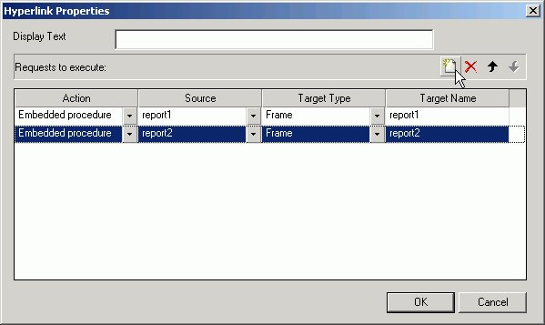
Repeat these steps for multiple procedures.
Push Button Properties in the Properties Window
When a push button is selected, the Properties tab in the Properties window contains options that control the properties of your buttons.

Click a property to display a description of the selected property at the bottom of the Properties window.
Adding a Reset Button to the Layout
You can add a reset button to the layout. A reset button enables you to reset the form back to its initial settings.
Create a Reset Button
- If the reset button is deleted from the layout, you may create a new reset button. Insert a reset button by doing one of the following:
The cursor changes into a crosshair.
- Click and drag the crosshair to create a reset button and adjust it to the size you want.
A reset button is created in the layout and assigned the name button where n is a number.
- Run the HTML page.
- When selecting criteria to submit a report, click the reset button to reset the form back to its initial settings.
Reset Button Properties in the Properties Window
When a Reset button is selected, the Properties tab in the Properties window contains options that control the properties of your buttons.
Click a property to display a description of the selected property at the bottom of the Properties window.
Using Form Controls to Supply Parameter Values
Form controls allow you to prompt users for a parameter value. When you create a parameter as part of a report or graph, the HTML Layout Painter automatically adds a form control, Submit button, and Reset button for the parameter to your layout, and the parameter appears in the parameters box. You can also add a form control and then associate it with a parameter.
When you delete a parameter in the Report that was assigned a form control in the HTML Layout Painter, delete the associated controls individually.
Form controls, with the exception of a text box which does not supply a list of possible values, can supply values to the user with a dynamic or static list of values:
- A dynamic list retrieves values from a specified data source when the request is run.
- A static list consists of a list of values you supply. These values do not change unless you change them.
The properties of a form control, as well as the parameters associated with each form control, can be controlled with the Properties tab and Parameters tab of the Properties window. For details, see Working With the Properties Window and Working With the Parameters Tab in the Properties Window, respectively.
Types of Form Controls
Form controls can be single or multi-select.
Examples of single-select form controls are:
- A text box. For details, see Using a Text Box.
- A drop-down list. For details, see Using a Drop-Down List.
- Radio buttons. For details, see Using Radio Buttons.
- A text area. For details, see Using a Text Area.
Examples of multi-select form controls are:
- A list box. For details, see Using a List Box.
- Check boxes. For details, see Add a List Box.
- A tree control. For details, see Using Tree Controls.
The default control type for all single select parameters is a drop down list. The default control type for all multi-select parameters is a list box.
You can change the type of form control using the Parameters tab. For details, see Change the Type of Form Control Associated With a Parameter.
Individual multi-select parameters must be designated as multi-select in the Report Assistant in order to process multiple values.
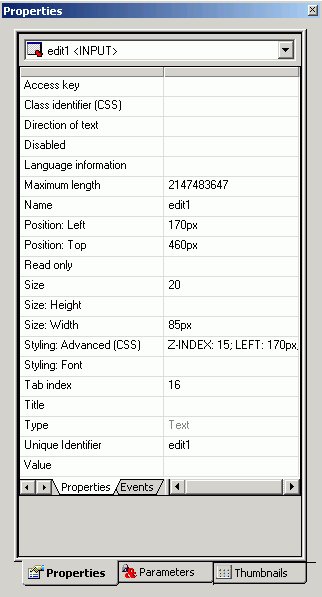
Using a Text Box
A text box enables the user to enter a parameter's value in a text entry field.
Create a Text Box
- Add a text box by doing one of the following:
The cursor changes to a crosshair.
- Click and drag the crosshair to create a text box and adjust it to the size you want.
A text box is created in the layout and assigned the name editn, where n is a number.
- To associate an existing parameter with the text box, click the Parameters tab of the Properties window, find the row with the name of the text box (editn), click the Parameter field in that row,
click the down arrow to the right of Unassigned at the edge of the Parameter field, and select the parameter you want to associate with the text box.
- Optionally, enter a value for the text box.
- Optionally, change the text box's properties by adjusting the properties displayed in the Properties tab of the Properties window. For details, see Text Box Properties in the Properties Window.
Text Box Properties in the Properties Window
When a text box is selected, the Properties tab in the Properties window contains options that control the properties of your text box.
Click a property to display a description of the selected property at the bottom of the Properties window.
Using a Text Area
A text area is a single-select form control that enables you to enter multiple lines of text that can be assigned to a single variable. The behavior is similar to a text box, but a user is not restricted to entering just one line of text. For example, if you want to assign a paragraph (multiple lines of text) to a variable that can be referenced by a procedure, you can add the paragraph to a text area from the Parameters tab of the Properties window.
The following image shows the HTML Layout Painter, where you can access the text area option in the Components toolbar.

Create a Text Area
- Click the Text Area
 button.
or
From the Insert menu, select Text Area.
The cursor changes to a crosshair.
- Click a location on the layout page, drag the crosshair to create a rectangular text area, release the left mouse button,
and adjust the text area to the desired size.
A text area is created in the layout and assigned the name textarean, where n is a number.
- To associate values from an existing parameter with the text area, click the Parameters tab in the Properties window, find the row with the name of the text area (textarean), click the Parameter field in that row,
click the down arrow to the right of Unassigned at the edge of the Parameter field, and select the parameter you want to associate with the text area.
- To associate static text values or dynamically retrieved data source values, select the Static or Dynamic option in the Control Values section of the Parameters tab.
- Static - To add one or more lines of text as static values, type or paste text in the area below the Static values label in the Parameters tab.
- Dynamic - To add dynamic values, select the Data source option to retrieve values from a data source, or select the Procedure option to retrieve values from a procedure. Click the browse (...) button, select a source file from the Get source file dialog box, and click Open. For the Data source option only, select a data field from the tree structure displayed at the bottom of the Parameters tab.
- Static - To add one or more lines of text as static values, type or paste text in the area below the Static values label in the Parameters tab.
- Optionally, you can change the text area's properties in the Properties tab of the Properties window.
Text Area Properties and Events in the Properties Window
When a text area is selected on the layout page and the Properties tab is selected in the Properties window, properties are listed in the left column that can be controlled from the right column. Selecting an option in the left column displays a description at the bottom of the Properties window.
A text area is associated with the following properties:
- Access key
- Class identifier
- Columns
- Direction of text
- Disabled
- break style
- Language information
- Name
- Read only
- Rows
- Tab index
- Title
- Unique identifier
When a text area is selected on the layout page and the Events tab is selected within the Properties tab in the Properties window, events are listed in the left column that can be assigned an action from the right column.
A text area is associated with the following events:
- onblur
- onchange
- onclick
- ondblclick
- onfocus
- onkeydown
- onkeypress
- onkeyup
- onmousedown
- onmousemove
- onmouseout
- onmouseover
- onmouseup
- onselect
Optionally, you can change the text area's properties and parameters. For details, see Working With the Properties Window and Working With the Parameters Tab in the Properties Window.
Using a Drop-Down List
A drop-down list allows a user to select a single value from a list of supplied values. You can use either a dynamic drop-down list, or a static drop-down list.
Add a Drop-Down List
- Add a drop-down list by doing one of the following:
The cursor changes to a crosshair.
- Click and drag the crosshair to create a drop-down list, and adjust it to the size you want.
A drop-down is created in the layout and assigned the name comboboxn, where n is a number.
- To associate an existing parameter with the drop-down list, click the Parameters tab of the Properties window, find the row with the name of the drop-down list (comboboxn), click the Parameter field in that row, click the down arrow to the right of Unassigned at the edge of the Parameter field, and select the parameter you want to associate with the drop-down list.
- In the Control Values section of the Parameters tab, select static or dynamic values for the drop-down list. For details,
see Associating Form Controls With Parameters.
- Optionally, change the drop-down list's properties by adjusting the properties displayed in the Properties tab of the Properties window. For details, see Drop-Down List Properties in the Properties Window.
Drop-Down List Properties in the Properties Window
When a drop-down List is selected, the Properties tab in the Properties window contains options that control the properties of your drop-down list.

Click a property to display a description of the selected property at the bottom of the Properties window.
Using a List Box
A list box allows a user to select single or multiple values at one time:
- A single select list allows the user to select only one value for each time a request is run.
- A multi-select list allows the user to select multiple values by using the Ctrl key while selecting values. In order to provide multiple values, the procedure must be set up to accept multiple values.
List box values can be dynamic or static.
Add a List Box
- Add a list box by doing one of the following:
The cursor changes to a crosshair.
- Click and drag the crosshair to create a list box, and adjust it to the size you want.
A list box is created in the layout and assigned the name listboxn, where n is a number.
- To associate an existing parameter with the list box, click the Parameters tab of the Properties window, find the row with the name of the list box (listboxn), click the Parameter field in that row,
click the down arrow to the right of Unassigned at the edge of the Parameter field, and select the parameter you want to associate with the list box.
- In the Control Values section of the Parameters tab, select static or dynamic values for the list box. For details, see Associating Form Controls With Parameters.
- Optionally, change the list box's properties by adjusting the properties displayed in the Properties tab of the Properties window. For details, see List Box Properties in the Properties Window.
List Box Properties in the Properties Window
When a list box is selected, the Properties tab in the Properties window contains properties of your list box.

Click a property to display a description of the selected property at the bottom of the Properties window.
Using a Double List Control
You may add a double list form control for displaying multi-select parameter values. This enables you to view a list of the available values and add or remove them from one list to another. At run time, a report is generated based on the values that are added.
Add a Double List Form Control
- Add a double list control by doing one of the following.
- Click the Double List control button from the Components toolbar.
- From the Insert menu, select Double List Control.
The cursor changes to a crosshair.
- Click the Double List control button from the Components toolbar.
- Click and drag the crosshair to create a double list control, and adjust it to the size you want.
A double list control is created in the layout and assigned the name customselectn_selectfrom and customselectn_selectto, where n is a number.
- To associate an existing parameter with the double list control, click the Parameters tab of the Properties window, find the row with the name of the double list control (listboxn), click the Parameter field in that row, click the down arrow to the right of Unassigned at the edge of the Parameter field, and select the parameter you want to associate with the double list control.
You may also add a double list control from the New Parameters dialog box that appears when creating a report with multi-select parameters. For more information about the New Parameters dialog box, see Setting Form Controls for New Parameters.
- In the Control Values section of the Parameters tab, select Static or Dynamic values for the double list control. For details, see Associating Form Controls With Parameters.
- Optionally, change the double list control’s properties by adjusting the properties displayed in the Properties tab of the Properties window. For details, see Double List Box Properties in the Properties Window.
- Run the HTML page and select values by using the arrows to add or remove values to the selected column.
The selected values appear in the second column. The output is generated based on the selected values in the second column. In the example below, Action and Classic are the selected values for the report.

Double List Box Properties in the Properties Window
When a double list box is selected, the Properties tab in the Properties window contains properties of your double list control.

Click a property to display a description of the selected property at the bottom of the Properties window.
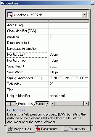
Using Check Boxes
Check boxes allow a user to select values from a list of values. Check box lists can allow the user to select single or multiple values at one time:
- A single select list allows the user to select only one value each time a request is run.
- A multi-select list allows the user to select multiple values. In order to provide multiple values, the procedure must be set up to accept multiple values.
Check box list values can be dynamic or static.
Add Check Boxes
- Add check boxes by doing one of the following:
The cursor changes to a crosshair.
- Click and drag the crosshair to create a check box list and adjust it to the size you want.
A check box is created in the layout and assigned the name checkboxn, where n is a number.
- To associate an existing parameter with the check box, click the Parameters tab of the Properties window, find the row with the name of the check box (checkboxn), click the Parameter field in that row,
click the down arrow to the right of Unassigned at the edge of the Parameter field, and select the parameter you want to associate with the check box.
- In the Control Values section of the Parameters tab, select static or dynamic values for the check boxes. For details, see Associating Form Controls With Parameters.
- Optionally, check box list's properties by adjusting the properties displayed in the Properties tab of the Properties window. For details, see Check Box Properties in the Properties Window.
Check Box Properties in the Properties Window
When a check box is selected, the Properties tab in the Properties window contains properties of your check box.
Click a property to display a description of the selected property at the bottom of the Properties window.
Using Radio Buttons
Radio buttons allow a user to select a single value from a list of supplied values. Radio button values can be static or dynamic.
Add Radio Buttons
- Add radio buttons by doing one of the following:
The cursor changes to a crosshair.
- Click and drag the crosshair to create a radio buttons list and adjust it to the size you want.
A radio button placeholder is created in the layout and assigned the name radion, where n is a number.
- To associate an existing parameter with the radio buttons, click the Parameters tab of the Properties window, find the row with the name of the radio buttons (radion), click the Parameter field in that row, click the down arrow that appears to the right of Unassigned at the edge of the Parameter field, and select the parameter you want to associate with the radio buttons.
- In the Control Values section of the Parameters tab, select static or dynamic values for the radio buttons. For details, see Associating Form Controls With Parameters.
- Optionally, change the radio buttons' properties by adjusting the properties displayed in the Properties tab of the Properties window. For details, see Radio Buttons Properties in the Properties Window.
Radio Buttons Properties in the Properties Window
When a radio button is selected, the Properties tab in the Properties window contains options that control the properties of your radio buttons.

Click a property to display a description of the selected property at the bottom of the Properties window.
Using Tree Controls
You can show hierarchical data from a multi-dimensional data source (for example, SAP BW), by using a tree structure in an HTML report. This feature is only available for hierarchies that use the parent/child model; level hierarchies are not supported.
The behavior of the tree control is integrated with the parameter definition. If a parameter is defined as a single value and that parameter is assigned to a tree control, the control uses option buttons for each node in the hierarchy. If the parameter is defined as MULTIPLE OR then the control uses check boxes for each node in the hierarchy, enabling the user to select multiple nodes.
The following image shows the HTML Layout Painter, where you can access the Tree Control option in the toolbar. It also shows the properties for the tree control.

Add a Tree Control to an HTML Page Using a Data Source
- In the HTML Layout Painter, click the Tree Control
 icon from the toolbar.
- Click and drag your cursor over the canvas to select the area for the tree control.
- Select the tree control and click the Parameters tab on the Properties window.
- In the Control Values field, select Dynamic.
- Select the Data Source option button and click the browse (...) button adjacent to the text box.
- Select a multi-dimensional data source and click OK.
- Expand the Dimensions folder, a Dimension,
and the Hierarchies folder.
- Select a field from the hierarchy and add it to the Value field text box and the Display field text box.
Add a Tree Control to an HTML Page Using an Existing Procedure
You can select an existing procedure to add to the tree control in an HTML report. When you select a procedure, it should use fields from the parent/child hierarchy and be set up as follows:
TABLE FILE file
SUM FST.dispfield
BY ParentUniqueField
BY UniqueField
BY datafield
ON TABLE PCHOLD FORMAT XML END
where:
- file
-
Is the name of the data source.
- dispfield
-
Is the field whose values display in the tree control.
- ParentUniqueField
-
Is the field that represents the parent for the parent/child hierarchy (PROPERTY = PARENT_OF).
- UniqueField
-
Is the field that represents the unique IDs for the hierarchy members (PROPERTY=UID).
- datafield
-
Is the field whose values are passed as the parameter value.
After the procedure is set up, follow these steps:
- In the HTML Layout Painter, click the Tree Control
icon from the toolbar.
- Click and drag your cursor over the canvas to select the area for the tree control.
- Select the tree control and then click the Parameters tab on the Properties window.
- In the Control Values field, select Dynamic.
- Select the Procedure option button and click the browse (...) button adjacent to the text box.
- Select a procedure and click Open.
Properties and Events for the Tree Control
The tree control has the following properties:
The tree control is associated with the following events:
- onclick
- ondblclick
- onkeydown
- onkeypress
- onkeyup
- onmousedown
- onmousemove
- onmouseout
- onmouseover
- onmouseup
Using a Slider Control
You may add a slider control for numeric range values in a report or graph. This enables you to use a slider bar to select from a range of values.
Add a Slider Control
- Add a slider control by doing one of the following.
The cursor changes to a crosshair.
- Click and drag the crosshair to create a slider control, and adjust it to the size you want.
A slider control is created in the layout and assigned the name slidern, where n is a number.
The Slider control is determined by the default slider control type selected from the Settings Dialog Box. For details about changing the slider bar, see How to Change the Default Slider Bar.
- To associate an existing parameter with the slider control, click the Parameters tab of the Properties window, find the row with the name of the slider control (slidern),
click the Parameter field in that row, click the down arrow to the right of Unassigned at the edge of the Parameter field, and select the parameter you want to associate with the slider control.
You may also add a slider control from the New Parameters dialog box that appears when creating a report or graph with numeric range values. Slider is automatically selected as the control type if a numeric range parameter is detected. For more information about the New Parameters dialog box, see Setting Form Controls for New Parameters.
- You may modify the static minimum and maximum values for the range by using the Parameters tab of the Properties window.

Step indicates how the numbers increment on the slider bar.
- In addition, you may change the range of values from static to dynamic by using the Parameters tab of the Properties window. Select a data file to retrieve values from.

Click Ctrl + Shift to add a value to the Display field.
- Optionally, change the slider control’s properties by adjusting the properties displayed in the Properties tab of the Properties window. For details, see Slider Control Properties in the Properties Window.
- Run the HTML page and use the slider bar to slide the parameter values up or down. You may also use the end arrows to increase or decrease the numbers in the range. The output is generated based on the selected number from the slider bar.

Change the Default Slider Bar
The default slider type is determined from the Settings dialog box.
- To change the default slider type, select Settings from the Tool menu. The Settings dialog box opens.
- Click the Form’s Settings button to open the Form settings dialog box.
- Use the drop-down list to change the default slider control type. You may select from:
- Horizontal or Vertical Slider Simple bar. The slider bar has no end arrows, just a bar with the slider.
- Horizontal or Vertical Slider with Color Bar and Arrows. Arrows appear at each end of the slider bar.
- Horizontal or Vertical Slider with Color Bar, Arrows, and Edit. Arrows and an edit box appear at the end of the slider bar, showing the current value.
Once a slider control is inserted into the HTML Layout, changing these options will not affect the existing sliders, the option is only applied to new slider controls. To change the existing slider bar type, delete the slider object and insert a new slider control.
- Horizontal or Vertical Slider Simple bar. The slider bar has no end arrows, just a bar with the slider.
Slider Control Properties in the Properties Window
When a slider control is selected, the Properties tab in the Properties window contains properties of your slider control.

Click a property to display a description of the selected property at the bottom of the Properties window.
Adding a Dynamic Calendar
Date parameters can utilize a built-in calendar control that allows users to select the desired date or range of dates in a pop-up dynamic calendar. A procedure that is added to or referenced in the HTML Layout Painter and contains date parameters will have a Calendar control type available in the Properties tab of the Properties window.
When the Calendar control type is selected, a text box with a calendar icon will display in the Design View of the Layout. The text box is the only control available for the calendar, and the icon will always display to the right of the text box. The icon cannot be positioned independently from the text box.
Note that when programmatically returning a date to the calendar, the date must be in a FOCUS date format that specifies the complete date from the list of supported data types in Calendar Properties.
Set Calendar Properties
- Right-click the calendar icon, and select Calendar Properties.
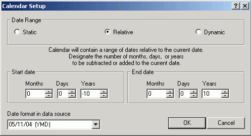
This menu allows the developer to set the range of dates available to the user at run time. Available dates will be represented as an active hyperlink (blue and underlined) and unavailable dates will be static (black without underlines).
- Select an option for setting the range of dates:
- Static. This option will set a static date range in which the developer will select a start date and an end date using a pop-up calendar or by clicking the month, day, or year from the controls.
This setting is the default.
By default, the current date is selected and circled in red. As you scroll through the calendar with the left/right arrows, the currently selected day will remain highlighted for each month. Clicking a date will add that date to the control. Dates can be selected by scrolling left to right, entering the month, day, and year as text, or by selecting the month, day, and year from the drop-down list and spin boxes.
- Relative. This option allows the developer to set a specific number of days, months, and years relative to the current date. The current date (at run time) will always be the reference or starting point and the calendar will show a number of days, months, and years relative to the current date. The range could be all in the past (for example, five years prior to the current date) or all in the future (for example, five years in the future).
- Dynamic. This option allows the developer to point to a procedure that returns a range of dates. Clicking the browse (...) button allows the developer to choose a preexisting procedure located in the current APP (data server) or Domain (MR). The procedure must return two date values on the same data line in XML format. The date values must be returned in a format that returns two digits for the month and day, and four digits for the year, for example MM/DD/YY.
- Static. This option will set a static date range in which the developer will select a start date and an end date using a pop-up calendar or by clicking the month, day, or year from the controls.
This setting is the default.
Calendar Properties in the Properties Window
When a calendar is selected in the HTML Layout Painter, the Properties tab in the Properties window contains properties of that calendar.
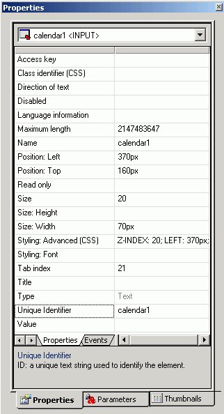
Click a property to display a description at the bottom of the Properties window.
Working With the Properties Window
The Properties window is a dockable window that consists of several tabs and components.
- A Properties tab consists of the following components:
- A drop-down list that contains a list of all objects currently in the layout. For the selected object, there are additional subtabs on the Properties tab.

- A Properties subtab that lists attributes for the selected object. The attributes appear on the left. Click in the right column to set the properties for the attribute.

- An Events subtab lists all events that can be assigned an action for an object.
To code an event for an object, select an event and click the ellipse button in the Events tab. The HTML Layout adds the event to the HTML code and switches from Design to HTML view. In the HTML view, you are prompted to define the event. Add the appropriate JavaScript code.
The following image is an example of the HTML code that appears when the Events tab is selected in the HTML Layout Painter.

- A Properties subtab that lists attributes for the selected object. The attributes appear on the left. Click in the right column to set the properties for the attribute.
- A drop-down list that contains a list of all objects currently in the layout. For the selected object, there are additional subtabs on the Properties tab.
- A Parameters tab enables you to assign parameters to controls. For details on the properties than can be set for an object, see the topic on that object.

- A Thumbnails tab enables you to view thumbnails of each page in the layout.
Thumbnails work similar to thumbnails in Adobe® PDF, and enable you to scroll to different pages. You may also refresh the Thumbnails tab, and enlarge or reduce the thumbnails.

Move the Properties Window
To undock the Properties window, double-click the Properties title bar, then move the window to the desired location in the layout.
To dock the Properties window, double-click the Properties title bar.
Setting Form Controls for New Parameters
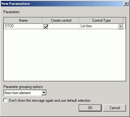
When a report contains one or more new amper variable parameters created in the Report Assistant, the New Parameters dialog box appears when you save the report. You can set the Control Type for each parameter prior to returning to the HTML Layout Painter. This eliminates the need to select each parameter individually to edit the associated Control Type setting using the Parameters tab of the Properties window.
The following image shows the New Parameters dialog box. For each parameter, you will find Name and Type fields, a Create control check box, and a drop-down menu to set the Control Type to either text box, calendar, list box, drop-down list, radio button, check box, hidden, text area, or tree control. The Type field is set to Unresolved unless the amper variable parameter is created with the Dialogue Manager using the ‑DEFAULT command (which sets the Type field to Default).

The Parameter grouping options menu in the New Parameters dialog box provides options for the placement of the form controls associated with new amper variable parameters created in the Report Assistant. Select Do not create a form to insert the form controls for each of the new parameters in separate locations on the HTML page. Select New form element to insert the form controls for all of the new parameters inside one form element you can position anywhere on the HTML page. This form element also contains submit (run) and reset buttons.
Working With the Parameters Tab in the Properties Window
The Parameters tab is a component of the Properties window. The Parameters tab consists of the following components:
- The top pane contains information on the controls in the layout.
- The bottom pane contains information on parameter values.
For more detailed information, see Associating Form Controls With Parameters.
Associating Form Controls With Parameters
When a parameter is created in the Report Assistant, a text box is automatically added to the layout and associated with the parameter. However, you can change the form control and form control type associated with the parameter.
Change the Type of Form Control Associated With a Parameter
- In the Parameters tab, select the parameter name listed in the Parameter column.
- Select the form control you want to use from the drop-down list in the Control Type column to the right, and your change is reflected in the report layout.
Unassign or Reassign a Parameter to an Existing Form Control
- In the Parameters tab, select the desired form control in the Control Name column.
- To the right of the desired form control,
click the Parameter field, then select the down arrow that appears at the right edge of the Parameter field.
All existing parameters are shown in the drop-down list, along with Unassigned.
- Select an existing data field to assign the parameter to, or select Unassigned to remove the association to the control.
Unassigned parameters may result in no data returned for the request. An unassigned parameter must have a default value assigned in the underlying DB2 Web Query code.
Creating a Static List of Parameters
When creating a list of static parameters, you can select from the following options:
- Add new value.
- Add ignore value.
- Add everything value.
- Use values from procedure.
- Use values from external file.
When the options are added to the Value list, the display text can be customized, but the value cannot be changed.
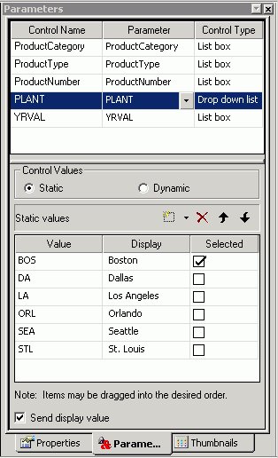
Parameters Tab in the Properties Window (Static Values)
The following image is the Parameters tab in the Properties window with Static control values.

The Parameters tab contains the following fields and options when Static is selected in the Control Values section:
- Control Name
-
Contains the name of the form control associated with each parameter.
- Parameter
-
Contains the name of each parameter in the current procedure.
Unassigned - Specifies the parameter is not associated with a form control.
- Control Type
-
Contains the type of form control associated with each parameter. The options are:
Text box
Calendar
List box
Drop-down list
Radio button
Check box
Hidden
Text Area
Tree Control
- Control Values
-
Determines whether parameter values are obtained from a static or dynamic list.
Static - Uses a static list of parameter values you supply. A list of static values can also be assigned in the Report Assistant.
- Static values
-
Is a list of supplied values for a static list.
Value - Is the value to be passed to the selected parameter.
Display - Is the text that represents the parameter value in the form control the user views.
Click Ctrl + Shift to add a value to the Display field.
Selected - Is the value to act as the default value. If the form control is multi-select, more than one value can be selected.
New - Creates a new parameter value.
Delete - Deletes a supplied parameter value from the list.
Move Up - Moves the selected value up in the list.
Move Down - Moves the selected value down in the list.
Add a New Static Value
To manually add new static values, do the following in the Parameters tab:
- In the Control Values section, select Static.
- Click the New icon,
and enter parameter value information in the Static values section:
- In the Value column, enter the value to be passed to the selected parameter.
- In the Display column, enter the text that represents the parameter value in the form control the user views.
- In the Selected column, check the box for the value you want to be selected by default. If the form control is multi-select, more than one value can be selected.
- In the Value column, enter the value to be passed to the selected parameter.
- Repeat Step 2 until the list contains all of the values you want to include.
- Optionally, click the Delete button to eliminate any values, and the up and down arrows to rearrange the order of the values.
Add an Ignore Value
The add ignore value option sends FOC_NONE to the server at run time and is intended for use with complex applications.
- From the HTML Layout Painter, use form controls to supply parameter values for a report.
A report with parameters requires that you to select values (at run time) in order to generate the output.
- Required: Click the Parameters tab in the Properties window.
The properties of a form control, as well as the parameters associated with each form control, can be controlled with the Properties tab and Parameters tab of the Properties window.
- Select Add ignore value from the Static values drop-down list.
- Run the HTML page and select the Ignore All value to ignore the parameter values.
Sending FOC_NONE to a compound WHERE statement will result in the entire WHERE criteria being ignored. Therefore, when working with multiple parameters that may be chained together, each parameter should be created in an individual WHERE statement as follows:
WHERE ( REGION EQ ®ION.(OR(Midwest,Northeast)).Region:. ); WHERE ( ST EQ &STATE.(OR(CA,CT)).State:. ); WHERE ( CITY EQ &CITY.(OR(Atlanta,Boston)).City:. );
Add an Everything Value
The add everything value option uses JavaScript to send every value present in the parameter list to the server at run time.
- From the HTML Layout Painter, use form controls to supply parameter values for a report.
- Click the Parameters tab in the Properties window.
- Select Add everything value from the Static values drop-down list.
The Add everything value option is only available with a Multiselect OR variable type.
- Run the HTML page and click the Select All parameter value to view all the parameter values.
Use Values from a Procedure
This is the default option which populates the static list with values predefined in the procedure.
- From the HTML Layout Painter, use form controls to supply parameter values for a report.
- Click the Parameters tab in the Properties window.
- Select Use values from procedure from the Static values drop-down list.
- Run the HTML page and select the parameter values from the procedure.
Import Values from an External File
This option enables you to use a local external file to provide a query limit for the selected data.
- From the HTML Layout Painter, use form controls to supply parameter values for a report.
- Required: Click the Parameters tab in the Properties window.
- Highlight the static parameter that you want to import external values for.

- Required: Select Use values from external file from the Static values drop-down list.

The Open dialog box appears.
- Select a text file from your local machine and click Open.

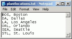
The external file can be a file with single values on each line, or two values per line, comma delimited.
For example, in the following text file, BOS is the return value and Boston is the display value.
The imported values are loaded into the Static values area of the Parameters tab.
If there is only one value, the value will populate both the return and the display values.
- Run the HTML page to see the imported values for the selected parameter.
Creating a Dynamic List of Parameters
Dynamic values are available by default if a data field used in the procedure is associated with the selected form control. The Parameter field at the top of the Parameters tab displays this data field (or displays Unassigned if there is no associated parameter).
Parameters Tab in Properties Window (Dynamic Values)
The following image is the Parameters tab in the Properties window with Dynamic control values.

The Parameters tab contains the following fields and options when Dynamic is selected in the Control Values section:
- Control Name
-
Contains the name of the form control associated with each parameter.
- Parameter
-
Contains the name of each parameter in the current procedure.
Unassigned - Specifies the parameter is not associated with a form control.
- Control Type
-
Contains the type of form control associated with each parameter. The options are:
Text box
Calendar
List box
Drop-down list
Radio button
Check box
Hidden - Hides the control type in the layout.
Text Area
Tree Control
- Control values
-
Determines whether parameter values are obtained from a static or dynamic list.
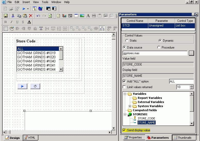
Dynamic - Uses a list of values retrieved from a selected data source when the request is executed. This is the default if you use an Accept clause in a Master File to create an amper variable parameter within a procedure. For more information, see Select a Dynamic List of Values.
- Data Source
-
Is the data source from which the values will be retrieved.
- Procedure
-
Is the procedure that will be called.
- Value field
-
Is the data source field from which the values will be retrieved.
- Display field
-
Is the text that represents the parameter value in the form control the user views.
Click Ctrl + Shift to add a value to the Display field.
- Add "ALL" Option
-
Adds the option to select ALL data source values to the control. Alternate text can be substituted for "ALL" using the text field to the right. For more information, see Parameter List Options.
- Limit values returned
-
Indicates that a specific number of field values will be retrieved from the data source. The specific number of fields is selected with the menu to the right.
Select a Dynamic List of Values
To add or select a different dynamic list of values to populate a form control, do the following in the Parameters tab of the Properties window:
- Select the Dynamic option in the Control Values section.
- To find the desired source file you want to retrieve values from, select the Data source option to retrieve values from a .mas file, or select the Procedure option to retrieve values from a .fex file. Click the browse (...) button,
select a source file from the Get source file dialog box that opens, and click Open.
For the Data source option only, select the data field that has the desired values from the tree structure displayed at the bottom of the Parameters tab. The data field you select will be populated in the Value field.
- Optionally, type a new name in the Display field for the data field populated in the Value field.
- Optionally, select Limit values returned, and select or type the number of field values you want to retrieve from the data source in the box to the right of this option.
Parameter List Options
When creating a static or dynamic list of parameters, you may add an all value to the list of parameter values and show the display value in the report output.
The ALL feature allows developers to automatically add an ALL value to a list of parameter values. An ALL value does the following:
- For dynamic parameters, the ALL feature sends a value of FOC_NONE to the reporting server alerting the server to bypass or ignore the parameter altogether. (Ignoring the parameter would return all values in the data source.)
- With static parameters, the ALL value typically uses JavaScript to return all of the values displayed in the list. This prevents the user having to select every value in the list manually. When using the ALL feature with static parameters, you can select from the following options:
- Add ignore value. This option sends FOC_NONE to the server at run time, alerting the server to bypass or ignore the parameter altogether. It is intended for complex applications.
- Add everything value. This option uses JavaScript to send every value present in the parameter list to the server at run time. The Add everything value option is only available with a Multiselect OR variable type.
- Add ignore value. This option sends FOC_NONE to the server at run time, alerting the server to bypass or ignore the parameter altogether. It is intended for complex applications.
Send the Display Value for Static and Dynamic Controls
From the HTML Layout Painter, you may show the display value, rather than the actual data, for headings and footings in the report output.
- From the HTML Layout Painter, import a report that contains a parameter.
When importing a report with parameters, the New Parameters dialog box appears prompting you to create the control type.
The report and control type is added to the HTML Layout Painter.

- To show the display value for the parameter selection, use the Parameters tab of the Properties window and choose Static or Dynamic as the type of control value.
- For a Static control type, use the Parameters tab to manually change the display value for the Static control.

You may also update the display values from the Variable Editor in the Report Assistant.
- Select the Send display value check box from the Parameters tab.
The display values are shown in the control type of the HTML Layout.

- For a Dynamic control type, use the Parameters tab to set both the Value Field and the Display Field.
Setting the display value for Dynamic controls is only applicable if you are using a Data source that contains both a code and description field.
- Double-click a field from the Fields list to add it as the Value Field.
- Select a field from the Fields list, click Ctrl + Shift to add it as the Display Field.
- Ensure that Send display value is checked.

The display values are shown in the control type of the HTML Layout.
- Double-click a field from the Fields list to add it as the Value Field.
- Add a heading to the report to show the display value. Double-click the report from the HTML layout to open and edit the report.
The report opens in the ReportAssistant.
- Manually add &Variable_TEXT to the report heading or footing.
Tip: This is different from adding the actual value from the datasource, where clicking the variable name would add <STCD to the report heading.
- Save and close the report to return the HTML Layout Painter.
When you create the Text variable (&Variable_TEXT), you are not prompted to set a control type for this variable when returning to the HTML Layout, as no control type is needed.
- Run the HTML page.
- Select the parameter for the report and run the report.
The display value is shown in the report heading.
For example, in the image below, Gotham 40 is selected as the Store Code and shows the display value in the report heading. The actual value, R1040, is shown in the Store ID column.

Filtering Dynamic Parameter Values
Use the chain feature to associate two or more related parameters. When you chain parameters together, chained dynamic values are filtered as selections are made to each parameter control. For example, if you chain the PLANT parameter to the STATE parameter, only PLANT values for the currently selected STATE parameter will be available instead of all the plants in the data source. Each time a selection is made, all chained parameters will be dynamically updated. The chain feature also allows you to add, remove, and reverse the order of parameters in the chain. See other topics in this section for details.
Dynamic parameters are processed with a caching mechanism that gathers all of the necessary values prior to loading the page. This method automatically combines all of the necessary requests into a single HTTP request and maps the result sets to the appropriate controls, greatly reducing the load time involved with sending multiple requests for data.
Filter Parameter Values
- In the Control Values section of the Parameters tab, click the Dynamic radio button.
- Press the Shift key and then click two or more parameters to select them simultaneously and activate the chain feature buttons on the positioning toolbar.
- Click the Add to chain
 button. The parameters you selected are labeled with numbers to indicate the order in which they will be chained when you run your report.

You can also reverse the order of parameters in the chain. See Reverse the Order of Chained Parameter Values for details.
Reverse the Order of Chained Parameter Values
- Click the Chain order
 button in the positioning toolbar.
- Click the parameter you want to display first in the chain.

You can continue to reverse the order in the chain by clicking the numeric labels on the chained parameters. If you would like to see the numeric labels on the chained parameters, select the Chain order button. Double-click a parameter to designate it as the first parameter in the chain.
Remove a Parameter from the Chain
- Click the parameter you want to remove from the chain.
- Click the Delete chain
 button in the positioning toolbar.
- Press the Shift key and click the remaining chained parameters.
- Click the Chain order
button in the positioning toolbar.
You will no longer see a numeric label on the parameter that you removed.
Enable Cached Processing for Chained Parameters
- Create a report with parameters in the HTML Layout Painter:
- From the HTML Layout Painter, select New Report from the Insert menu.
The cursor changes into a crosshair.
- Click and drag the crosshair to create a report object and adjust it to the size you want.
- Right-click the report object and select Import existing report.
Tip: You may create parameters directly in your report or add them later in the HTML Layout Painter.
- From the HTML Layout Painter, select New Report from the Insert menu.
- To create dynamic parameters for your report in the HTML Layout Painter, right-click the report object and select Add a filter from the context menu.

The Filter options dialog box opens.
- Select the field to be used for the parameter,
the Multiselect option, and click OK.

The New Parameters dialog box appears.

You may select a control type for the parameter from this dialog box, or adjust them later using the Parameters tab.
If the New Parameters dialog box does not appear, ensure that Show New Parameters dialog is selected from the Settings dialog box.
- Click OK to close the New Parameters dialog box.
- The filter appears above the report object.
Repeat this procedure for each additional parameter for the report.
- Select two or more controls from the parameters and click Add to chain

The parameters are chained together.
- To view the chained parameters in the Design View, select Chain order
from the Positioning toolbar.
The parameters are numbered in the logical order that they were chained.

- Select a numbered parameter, right-click and select Cache run time data.

When executing the document, data for the chained parameter is cached to improve performance.
Cache run time data is the default option.
Applying Chaining Logic Options in the HTML Layout Painter
Previously, parameters could only be chained together with an Equal logic scenario, mainly suited for hierarchical data filtering. For example, only seeing cities within the selected state.
Additional chaining logic scenarios include such options as Not Equal to, Greater than, Less than, and so on. This is useful when reusing existing code to populate parameters that may be used multiple times in the same layout, and in different locations of the hierarchy of the chain.
For example, a form offers two lists of dates so that you can select a FROM / TO date range. By chaining these parameters together and applying the Greater than chaining logic, this ensures that when a date is selected for the FROM parameter, only dates that follow the FROM date display in the TO date control, eliminating the possibility of selecting an invalid date range.
Apply Chaining Logic to a Parameter
- Create a report with parameters in the HTML Layout Painter.
- Select two or more controls from the parameters and click Add to chain
The parameters are chained together.
- Select a parameter, right-click, and select Chaining logic from the context menu.

- Select a chaining logic option from the submenu.
Equal is the default chaining logic option.
The chaining logic is applied to the parameter selected.
Customizing Dynamic Parameters
You have the option to allow customized retrieval of dynamic parameter values. By using a custom procedure, you can use the FOCUS language to utilize temporary HOLD files, filtering, etc. This allows the HTML Layout Painter to better integrate with a multitude of large and/or proprietary data sources that may require unique retrieval methods. The procedure must meet the following criteria:
- The procedure must return a name and value pair for each parameter value that will populate the list. The first value is the submission value which is passed to the form control when the user clicks the Submit button. The second value is the display value which is what the user will see in the control. These two values can be the same or different.
- The procedure must return the two data values on a single data line in XML format (PCHOLD FORMAT XML).
Different parameters in the same procedure can use both this option and the data source method.
For chained parameters, there are two options based on whether caching is enabled:
- By default, caching of parameter values in not enabled. Each parameter control must be mapped to its own procedure and the developer is responsible for writing filters or WHERE criteria to properly filter the hierarchy of controls.
- If caching is enabled for the chained parameters, a single procedure can be used to populate the controls of the chained variables. In this case, the HTML Layout Painter writes the WHERE criteria.
Hidden Parameters
You can select a HIDDEN control type in the HTML Layout Painter. This allows parameter name value pairs to be passed in the form control without the user seeing them. This option can be chosen in the Parameters tab in the Control Type column. When this control type is selected, the current control assigned to the parameter will be removed. The value of the parameter can be entered in the Value column of the Parameters tab.
Automatically Populating Fields With Parameter Values
When the name of a dynamic parameter matches a corresponding field name in a data source, the HTML Layout Painter automatically populates the field name for the parameter.
The data source is populated by a default based on the first data source specified by a TABLE FILE or GRAPH FILE command. The data source field is populated for the Value and Display field controls in the Parameters tab. This generates a "run ready" Layout report as long as the parameter names match the field names.
Supplying Parameter Values to External Reports
You can supply parameters to external reports the same way you apply them to reports created with the Report Assistant. The report layout can also contain multiple reports associated with a common set of parameters. Launch mechanisms such as a push button, hyperlink, or image can be associated to external reports that contain different sets of parameters. You can also update and target parameters for an external report to a frame or window directly within your report layout.
Before you can supply parameter values to an external report, create a hyperlink to the report and associate a launch mechanism to it. After you associate a launch mechanism, such as a push button, hyperlink, or image, to the external report, the report layout is populated with the parameters.
Supply Parameter Values to External Reports With a Push Button
In this procedure you will create a push button to launch an external report and target the output to a window.
- From the Insert menu, select Push Button.
The cursor changes into a crosshair.
- Click and drag the crosshair to create a push button and adjust it to the size you want.
- Right-click the button and select Create hyperlink.
The Hyperlink Properties dialog box opens.
- To set the action of the hyperlink to execute an external report, select the New icon,
then select External procedure from the Action drop-down list.
- Enter the external report's procedure name in the Source field, or click the browse (...) button to browse to the procedure.
- Optionally, direct the output to a specific location by selecting Window or Frame in the Target Type field.
- Specify the text you want to display as the hyperlink in the Target Name field, or select one of the default values from the Target Name drop-down list.
- Click OK.
The parameters for the report are automatically added to objects in the layout and displayed in the Parameters tab.
- From the File menu, click Run.
- Click the push button to view the external report.
The report opens in a separate window as you specified in the Hyperlink Properties dialog box for that push button.
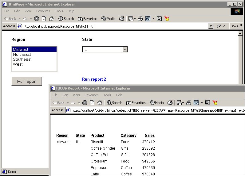
Supply Parameter Values to an External Report With an Image
In this procedure you will insert an image that will launch an external report when you click it. You will target the output to a window.
- From the Insert menu, select Image.
The cursor changes into a crosshair.
- Click and drag the crosshair to position the image.
The Get source file dialog box opens.
- Navigate to the image using the Look in menu, select the image, and click Open.
- Adjust the image to the desired size and location.
- Right-click the image and select Create hyperlink.
The Hyperlink Properties dialog box opens.
- To set the action of the hyperlink to execute an external report, select the New icon,
then select External procedure from the Action drop-down list.
- Enter the external report's procedure name in the Source field, or click the browse (...) button to browse to the procedure.
- Direct the output to a window by selecting Window in the Target Type field.
- Specify the text you want to display as the hyperlink in the Target Name field, or select one of the default values from the Target Name drop-down list.
- Click OK.
The parameters for the report are automatically added to objects in the layout and displayed in the Parameters tab.
- From the File menu, click Run.
- Click the image to view the external report.
The report opens in the window you specified in the Hyperlink Properties dialog box for that hyperlink.

Supply Parameter Values to an External Report With a Hyperlink
In this procedure, you will create a frame and target report output from an external report to it. You will also create a hyperlink to launch the external report.
- From the Insert menu, select Frame. Click and drag the crosshair to create a frame and adjust it to the size you want. Enter a name for the frame by double-clicking the Name field in the Properties tab of the Properties window.
- From the Insert menu, select Hyperlink. Click and drag the crosshair to create a hyperlink and adjust it to the size you want.
The Hyperlink Properties dialog box opens.
- To set the action of the hyperlink to execute an external report, select the New icon,
then select External procedure from the Action drop-down list.
- Enter the external report's procedure name in the Source field, or click the browse (...) button to browse to the procedure.
- Direct the output to the frame you inserted by selecting Frame in the Target Type field and entering the name of the frame you created.
- Specify the text you want to display as the hyperlink in the Target Name field, or select one of the default values from the Target Name drop-down list.
- Click OK.
The parameters for the report are automatically added to objects in the layout and displayed in the Parameters tab.
- From the File menu, click Run.
- Click the hyperlink to view the external report.
The report opens in the frame you specified in the Hyperlink Properties dialog box for that hyperlink.

Supplying Parameter Values to Multiple External Reports
In this example, you will add two reports to a layout. You will associate a push button to one report and target the output to a window. You will associate a hyperlink to the second report and target the output to a frame.
- From the Insert menu, select Push Button.
The cursor changes into a crosshair.
- Click and drag the crosshair to create a push button and adjust it to the size you want.
A push button is created in the layout and assigned the name buttonn, where n is a number.
- Right-click the button, and select Create hyperlink.
The Hyperlink Properties dialog box opens.
- Set the action of the hyperlink to execute a report by clicking the New icon and selecting External Report from the Action drop-down list.
- Enter the external report's procedure name in the Source field, or click the browse (...) button to browse to the procedure.
- In the Target Type field, select Window from the drop-down list.
- In the Target Name field, select _blank frames from the drop-down list.
- Click OK.
The parameters for the first report are automatically added to objects in the layout and displayed in the Parameters tab.
- From the Insert menu, select Frame.
Click and drag the crosshair to create a frame and adjust it to the size you want. Enter a name for the frame in the name field of the frame's Properties dialog box.
- From the Insert menu, select Hyperlink.
Click and drag the crosshair to create a hyperlink and adjust it to the size you want.
- Right-click the button, and select Create hyperlink.
The Hyperlink Properties dialog box opens.
- Set the action of the hyperlink to execute a report by clicking the New icon and selecting External Report from the Action drop-down list.
- Enter the external report's procedure name in the Source field, or click the browse (...) button to browse to the procedure.
- In the Target Type field, select Frame from the drop-down list.
- In the Target Name field, select the name of the frame you created.
- Click OK.
- From the File menu, select Run.
- Click the push button to view the first external report.
The report opens in a separate window as you specified in the Hyperlink Properties dialog box for that push button.
- Click the hyperlink to view the second external report. The report opens in the frame you specified in the Hyperlink Properties dialog box for that hyperlink.
Styling Your Layout
When you create an HTML page in the HTML Layout Painter, the objects in the layout will display in your browser using the browser's default styles. You can customize the appearance of your HTML page by adding a theme or template. A template can be any HTML file containing styling information and other elements.
Adding a CSS or Script to the Layout
Cascading Style Sheets (CSS) or scripts can be added to your layout to determine the look of the Web page. This is a good way to quickly apply corporate styling to your layout or to assign global styling to a layout. It is also an easy method of assigning default styling to all elements in the entire layout with one action. Styling included in a CSS or script will display only in Preview mode.
Add a CSS or Script to the Layout
- From the Insert menu, select CSS/Scripts.
The Insert Web Files dialog box opens.
- Click the New icon and navigate to the directory in which your CSS or script resides, select the file, and click Open.
- Add additional files if desired. Click OK to add the specified files.
Setting HTML Page Properties
You can set properties for the HTML page you create in the HTML Layout Painter in the Properties tab of the Properties window.
Properties set for the HTML page will be inherited by most objects added to the layout. Once a style has been changed for an object in the layout, it cannot be styled with a template or theme. IBM recommends that global styling of the HTML page be set before properties are set for individual objects.
HTML Page Properties in the Properties Window
When the background of a report is selected, the Properties tab in the Properties window contains options that control the body of the HTML page.

Click a property to display a description of the selected property at the bottom of the Properties window.
Specifying Browser Defaults with Style Composer
You can use the Style Composer to control default settings for font, background properties, position mode, flow control, margins, list styles, and visual effects.
On the following pages, the images of the Style Composer windows show many blank fields. You may actually see the words "Not Set" populated in these blank fields when viewing these Style Composer windows in Developer Workbench.
Access the Style Composer
To access the Style Composer, complete the following steps.
- Right-click the background of an HTML page in the HTML Layout Painter.
- From the pop-up menu, select Style.
The Style Composer window opens.
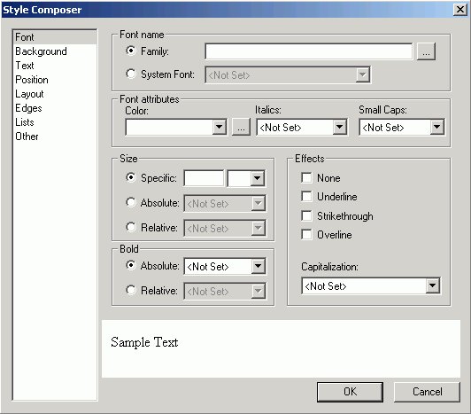
Specifying Font Styles Using the Style Composer
To specify the font styles that will be used in the browser for your HTML report, make your selections in the Font window of the Style Composer.
The Font window of the Style Composer is comprised of the following elements:
- Font name
-
Determines the font displayed in a browser. You can specify:
Family - launches the Font Picker dialog box
System Font
- Font attributes
-
Determines the attributes of the font displayed in a browser. The options include:
Color
Italics
Small Caps
- Size
-
Determines the size of the font displayed in a browser. The options include:
Specific
Absolute
Relative
- Bold
-
Determines whether the font is displayed as bold in a browser. The options include:
Absolute
Relative
- Effects
-
Determines whether the font effects displayed in a browser. The options include:
None
Underline
Strikethrough
Overline
Capitalization
Specifying Background Properties Using the Style Composer
To specify the background styles that will be used in the browser for your HTML report, make your selections in the Background window of the Style Composer.
The Background window of the Style Composer is comprised of the following elements:
- Background color
-
Determines the font displayed in a browser. You can specify:
Color
Transparent
- Background image
-
Determines the properties of the background image displayed in a browser. The options include:
Image
Tiling
Scrolling
Position (Horizontal and Vertical)
Do not use background image
Specifying Text Styles Using the Style Composer
To specify the text styles that will be used in the browser for your HTML report, make your selections in the Text window of the Style Composer.
The Text window of the Style Composer is comprised of the following elements:
- Alignment
-
Determines the alignment of a text. You can specify:
Horizontal
Vertical
Justification
- Spacing Between
-
Determines the spacing. You can specify spacing between the following text elements:
Letters
Lines
- Text Flow
-
Determines the flow of the text. You can specify:
Indentation
Text Direction
Specifying Position Mode Using the Style Composer
To specify the position mode that will be used in the browser for your HTML report, make your selections in the Position window of the Style Composer.

The Position window of the Style Composer is comprised of the following elements:
- Position Mode
-
From which you can specify:
Position in normal Flow
Offset from normal flow
Absolutely position
- HeightWidth
-
When Absolutely Position is selected, you can specify the following position indicators in the measurements you select:
Top
Left
Z-Index (optional). Sets or retrieves the stacking order for absolute or relatively positioned objects.
Specifying Layout Styles Using the Style Composer
To specify the layout styles that will be used in the browser for your HTML report, make your selections in the Layout window of the Style Composer.
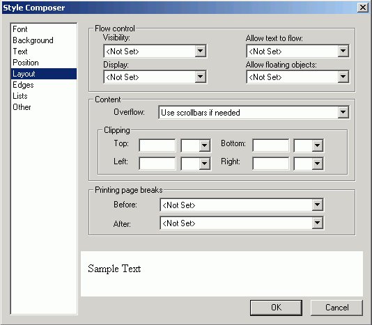
The Layout window of the Style Composer is comprised of the following elements:
- Flow Control
-
From which you can specify:
Visibility
Allow Text to Flow
Display
Allow Floating Objects
- Content
-
From which you can specify:
Overflow
- Clipping
-
From which you can specify whether or not to clip the layout from the following positions:
Top
Bottom
Left
Right
- Printing page breaks
-
From which you can specify:
Before
After
Specifying Margin Styles Using the Style Composer
To specify the margin styles that will be used in the browser for your HTML report, make your selections in the Margins window of the Style Composer, which is shown in the following image.
The Edges window of the Style Composer is comprised of the following elements:
- Margins
-
From which you can specify:
Top, Bottom, Left, Right margins
- Padding
-
From which you can specify:
Top, Bottom, Left, Right padding
- Borders
-
From which you can specify:
Select the edge to be changed
Style
Width
Color
Borders are displayed as a single solid line in the Style Composer preview window, regardless of whether you select a single or double line border. Borders are accurately displayed in the Style Composer Design View and in the HTML output of an application.
Specifying List Styles Using the Style Composer
To specify the list styles that will be used in the browser for your HTML report, make your selections in the Lists window of the Style Composer.
The Lists window of the Style Composer is comprised of the following elements:
- Lists
-
From which you can specify:
Bulleted
Unbulleted
- Bullets
-
From which you can specify:
Style
Position
Custom bullet
Specifying Interface Effects Using the Style Composer
To specify the interface styles and visual effects that will be used in the browser for your HTML report, make your selections in the Other window of the Style Composer.
The Other window of the Style Composer is comprised of the following elements:
- User Interface
-
From which you can specify:
Cursor
- Tables
-
From which you can specify:
Borders
Layout
Laying Out Objects With the HTML Layout Painter
You can change the size and position of objects in your layout in the following ways:
- Set relationships between objects. This is done by setting relationships between objects and a controlling, or dominant, object. The controlling object is the last object selected. For details, see Setting Relationships Between Objects.
- Click and drag with your mouse.
Setting Relationships Between Objects
You can set relationships between underlying objects and a controlling, or dominant, object. The controlling object is the last object or placeholder selected. You can use these relationships to set properties of the selected objects according to the controlling object. Any object on the HTML page layout can be the controlling object.
You can set the following types of relationships:
- Relationships that maintain a distance between objects. This is useful since a report or graph may take up more or less room when your procedure is run than is accounted for in the layout. When setting relationships between objects in this way,
you should select the corners of the objects that are closest to each other.
This will ensure that the reports do not overlap if either report takes up more room than anticipated.
- Relationships that affect the positioning of objects. This allows you to ensure that objects remain aligned regardless of a change in size or position of one of the objects and that objects remain the same size even when an object's size is changed.
Set Object Size
- Highlight multiple objects with your mouse by holding the Shift key to select items contiguously, or the Control key to select items non-contiguously. The controlling object is the last object selected.
The size buttons on the positioning toolbar are active.
- Click the button in the positioning toolbar that corresponds to what you want:
Make same width sets the width of the highlighted objects to the width of the controlling object.
Make same height sets the height of the highlighted objects to the current height of the controlling object.
Make same size sets the height and width of the highlighted objects to the height and width of the controlling object.
All selected objects change in size according to the size of the controlling object. If an image becomes distorted when you resize it, you can restore its original size. Right-click the image, select Image Properties, and then Restore Size.
Set the Distance Between Objects
- Highlight multiple elements with your mouse holding the Shift key to select items contiguously, or the Control key to select items non-contiguously. The controlling object is the last object selected.
- Click the button in the positioning toolbar that corresponds to the relationship you want. The selected objects' position will be set according to the controlling object, which is the last object selected. The options are:
Relate top left maintains the distance between the controlling object's top left corner and the highlighted objects' top left corners.
Relate top right maintains the distance between the controlling object's top right corner and the highlighted objects' top left corners.
Relate bottom right maintains the distance between the controlling object's bottom right corner and the highlighted objects' top left corners.
Relate bottom left maintains the distance between the controlling object's bottom left corner and the highlighted objects' top left corners.
For details on the buttons in the positioning toolbar, see Positioning Toolbar.
Break Relationships
Positioning Toolbar
The positioning toolbar contains the buttons listed in the following table.
For buttons that use relationships, the relationship is controlled by the controlling object, or dominant object, which is the last object or placeholder selected. These buttons are only highlighted when more than one object is selected.
|
Button |
Descriptions |
|---|---|
|
|
Toggles the grid on and off. Use the grid to assist in lining up objects in the layout. This button is recessed when the grids are enabled. |
|
|
Specifies Tab Order. |
|
|
Aligns the highlighted objects' left edge with the left edge of the controlling object. |
|
|
Aligns the highlighted objects' right edge with the right edge of the controlling object. |
|
|
Aligns the highlighted objects' top edge with the top edge of the controlling object. |
|
|
Aligns the highlighted objects' bottom edge with the bottom edge of the controlling object. |
|
|
Aligns objects at the horizontal center point of the canvas in Design View. |
|
|
Aligns objects at their vertical center (or middle) point of the canvas in Design View. |
|
|
Sets the width of the highlighted objects to the width of the controlling object. |
|
|
Sets the height of the highlighted objects to the current height of the controlling object. |
|
|
Sets the height and width of the highlighted objects to the height and width of the controlling object. |
|
|
Maintains the distance between the controlling object's top left corner and the highlighted objects' top left corners. |
|
|
Maintains the distance between the controlling object's top right corner and the highlighted objects' top left corners. |
|
|
Maintains the distance between the controlling object's bottom right corner and the highlighted objects' top left corners. |
|
|
Maintains the distance between the controlling object's bottom left corner and the highlighted objects' top left corners. |
|
|
Breaks the relationship set between highlighted objects. This button is only highlighted when selected objects have relationships set. |
|
|
Toggles the display of arrows illustrating the relationships between objects. This button is only highlighted when selected objects have relationships set. This button will stay highlighted when relationships are displayed. It will not be highlighted when relationships are not displayed. |
|
|
Adds a parameter to a chain. Chained dynamic values are filtered as selections are made to each parameter control. Each time a selection is made, all chained parameters will be dynamically updated. For details about chained parameters, see Filtering Dynamic Parameter Values. |
|
|
Removes a chained parameter from a chain. For details about chained parameters, see Filtering Dynamic Parameter Values. |
|
|
Activates chained parameters for viewing and editing. For details about chained parameters, see Filtering Dynamic Parameter Values. |


Customizing the Layout
All changes to your layout be can made in the Design mode of the HTML Layout Painter or the HTML editor. The changes made to a layout in an editor will be preserved when you re-enter the HTML Layout Painter.
Controlling the HTML Layout Painter Environment
You can set properties for the HTML Layout Painter with the Settings dialog box. This dialog box allows you to set page properties such as the location of reports and graphs, as well as the display of a grid in your layouts. The changes that are made in the Settings dialog box are saved to the registry. This allows a customized environment to be created for various users.
Set Page Properties
- Select Settings from the Tools menu. The Settings dialog box opens. For details, see Settings Dialog Box.
- Make your changes, and click OK.
Select Form Settings From the Settings Dialog Box
- From the HTML Layout Painter, select Settings from the Tools menu.
The Settings dialog box opens.
- Click the Form's Settings button.
The Form Setting dialog box opens.

- Select the orientation for the form object in the layout.
- Use the spin buttons to increase or decrease the distance between the prompt, horizontal and vertical controls of the form,
and the number of columns for the form.
or
Position the cursor in the input box and type a number.
- Use the slider control type options to select how the slider bar appears.
Slider bars are available when using numeric range value parameters in your report or graph.
- Click OK to close the Form settings dialog box.
The form settings are applied and shown in the HTML Layout Painter Design view.
- To reset the default form settings, right-click the form object and select AutoArrange from the context menu.

The form is auto arranged on the layout, using the default form settings.
Settings Dialog Box
The following options are available from the Settings dialog box of the HTML Layout Painter.

Grid Settings
- Show Grid
-
Displays a grid. If this is not selected, the grid is turned off for all layouts.
- Snap to Grid
-
Causes objects in the layout to snap to grid lines when being positioned. For detailed positioning, deselect this option.
- Width
-
The width of the grid in pixels.
- Height
-
The height of the grid in pixels.
- Change current layout only
-
Select this check box to apply the grid settings to the current layout.
Preview Settings
- Report and Graph Preview
-
Previews report and graph data in the Design View. If checked, additional options are available (Simulated Data or Live Data).
This option is selected by default.
If unchecked, icons are used to represent the area in the Design View for reports and graphs. This is the fastest method of loading reports since no request are made to the server.
- Simulated Data
-
Selecting to preview simulated data sends a request to the reporting server that gathers formatting information from the Master file. The database is not accessed, but rather mock data is used to visually represent the report.
This option is only available when previewing reports and graphs.
- Live Data
-
Selecting to preview live data sends a request to the reporting server, and to the database, to get a snapshot of the actual data in the report.
This option is only available when previewing reports and graphs.
- Record limit for reports
-
Enables you to limit the number of records used to gather data for previewing the report in live data mode. For example, if you set 500 as the record limit for the report, then 500 rows of data are gathered for the report results.
This option is only available if the Live Data option is selected.
- Record limit for input controls
-
Sets the number or records to be shown for the input controls when gathering data for reports and graphs.
This option is only available if the Live Data option is selected.
- Show New Parameters Dialog
-
Controls whether or not the New Parameters dialog box shows when adding parameters in the HTML Layout Painter.
The New Parameters dialog box is shown by default.
- Form's Settings button
-
Options are available so that you may customize how the forms are populated and arranged in the document.
Form's Settings Dialog Box
The following options are available from the Form's Settings dialog box of the HTML Layout Painter.
- Prompt orientation
- Prompt refers to the descriptive text used to label the control/parameter in the output.
- To the left of the input
-
Places the descriptive text used to label the control/parameter to the left of the input.
- Above the input
-
Places the descriptive text used to label the control/parameter above the input.
- Distance between the prompt and input
-
Sets the distance between the prompt and input.
- Horizontal distance between controls
-
Sets the horizontal distance between controls.
- Vertical distance between controls
-
Sets the vertical distance between controls.
- Number of columns
-
Determines when the form will wrap and start laying controls out in a new row.
- Default slider control type
-
Sets how the slider control appears. Select from the following types of slider bars:
Slider controls are available when using numeric range value parameters in your report or graph.
- Horizontal or Vertical Slider Simple bar. The slider bar has no end arrows, just a bar with the slider.
- Horizontal or Vertical Slider with Color Bar and Arrows. Arrows appear at each end of the slider bar.
- Horizontal or Vertical Slider with Color Bar, Arrows, and Edit. Arrows and an edit box appear at the end of the slider bar, showing the current value.
Once a slider control is inserted into the HTML Layout, changing these options will not affect the existing sliders, the option is only applied to new slider controls. To change the existing slider bar type, delete the slider object and insert a new slider control.
- Horizontal or Vertical Slider Simple bar. The slider bar has no end arrows, just a bar with the slider.