Creating a Graph With Graph Assistant
Describes how to use the HTML Graph Assistant to create graphical reports.
This chapter provides information on graphs and how to use the Graph Assistant.
Parent topic:
IBM DB2 Web Query for System i Overview
Graph Overview
Graphs often convey meaning more clearly than data listed in tabular format. Using the Graph Assistant, you can easily transform almost any type of data into an effective graph that you can customize to suit your needs.
You can link your graph to other resources. You may also select from a multitude of graph styles, which include the standard graph formats bar, line, pie, and scatter as well as many variations on these types.
You can also represent data graphically using data visualization. For details, see Visualizing Trends in Reports.
Content Analysis: Determining Graphing Objectives
DB2 Web Query offers a range of reporting tools that allow you to create reports that deliver critical information to your users. By selecting a tool that is well suited to your particular needs, you can design the information you deliver to users. One effective option with almost any type of data is a graphical presentation.
Graphs enable you to display multivariate or complex data efficiently, precisely, and in a way that a viewer can intuitively grasp. A graph is an effective presentation tool because it presents a visual idea, communicating meaningful changes in data to a user in a memorable way. By viewing your graph, a user can identify and track a change that you want them to notice.
Creating a meaningful graph is not simply a matter of applying aesthetics to your data. Instead, graphs allow you to design your presentation to capture the essential information in your data.
The first step in creating excellent graphs is determining your graphing objectives. You can break this process into several stages.
- Assess your data:
Look for meaningful patterns or changes in the data. Does your data change most dramatically over time or in relationship to some other value? Are there two sets of data that you would like to compare to each other?
Determine what movement or changes you would like to highlight. Which of the patterns in the data would you most want the viewer to picture?
- Select the graph type and style that best suits your argument and the overall shape of your data. Determine what will lead viewers to the cognitive task/connection that you want them to make.
- Begin developing your graph.
- Refine your graph:
Are the labels meaningful/useful?
How can the data be organized in a meaningful way? Consider customizing the scales you use with your graph.
Accessing the Graph Assistant
HTML Graph Assistant is accessible:
To use HTML Graph Assistant, have your web application server configured to include the IBIRPASSTBean.jar file and have JDK 1.3.1 or higher. JRE alone is not sufficient.
The HTML Graph Assistant is best viewed using a resolution of 1024 x 768.
You may be prompted for a DB2 Web Query Reporting Server ID.
If you are using the HTML Graph Assistant with a Firefox browser, the display may be slightly different than Internet Explorer. These differences do not effect functionality.
Options Available on All Tabs
The following options are available from any tab in the Graph Assistant:
- Save/Save As
-
Click Save to save your graph. Click Save As to open the Save New Standard Report dialog box.
- Run/Run Deferred
-
Click run to run your graph. Click run deferred to run your graph at a later time.
- Help
-
Click the icon to access help about the area of the tab in which you are working. Click About to open a window describing the version of Graph Assistant in which you are working.
- Quit
-
Click to quit the application.
Selecting a Graph Type and Style
When creating a graph, it is important to select the appropriate graph type with which to display your data. You may select from a number of basic graph types, as well as refinements on these types, known as graph styles. Basic graph types include line graphs (connected point plots), bar graphs, pie graphs, and scatter graphs. Use the brief descriptions (see Graph Types) to select a graph type that suits the data set you are displaying and the change you want to highlight. Keep in mind that the data are the sets of numbers that you are displaying, and the scales are the numbers or variable measures that appear along the axes of the graph.
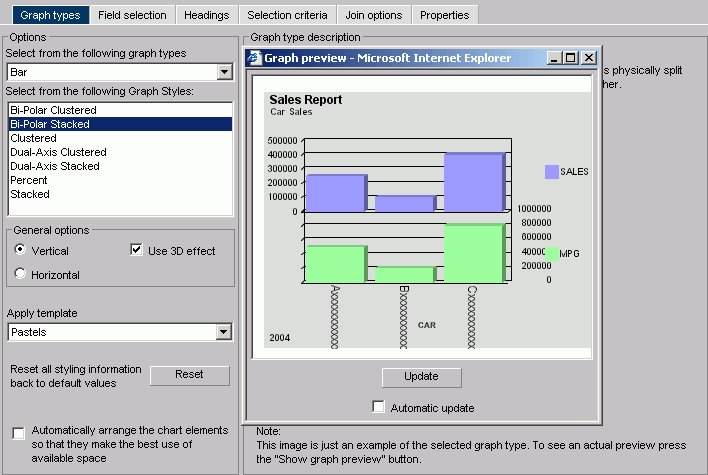
The Graph types tab of the Graph Assistant provides a list and brief descriptions of the many graph types and graph styles available in DB2 Web Query.
When using a stacked chart of any type at least 2 series are required. Negative values are not supported in stacked charts.
The following image shows the Graph types tab with a sample cluster bar chart.
Graph Types
Following are descriptions of the types of graphs you can create:
- Line graphs. Line graphs are useful for emphasizing the movement or trend of numerical data over time, since they allow a viewer to trace the evolution of a particular point by working backwards or interpolating. Highs and lows,
rapid or slow movement, or a tendency towards stability are all types of trends that are well suited to a line graph.
Line graphs can also be plotted with two or more scales to suggest a comparison of the same value, or set of values, in different time periods. The number of scales your graph has depends on the type of graph you select. There is a description of each available graph type on the Graph types tab of the Graph Assistant.
- Bar graphs. Bar graphs plot numerical data by displaying rectangular blocks against a scale. The length of a bar corresponds to a value or amount. Viewers can develop a clear mental image of comparisons among data series by distinguishing the relative heights of the bars. Use a bar graph to display numerical data when you want to present distributions of data. You can create horizontal as well as vertical bar graphs.
- Pie graphs. Pie graphs emphasize where your data fits in relation to a larger whole. Keep in mind that pie graphs work best when your data consists of several large sets. Too many variables divide the pie into small segments that are difficult to see. Use color or texture on individual segments to create visual contrast.
- Scatter graphs. Scatter graphs share many of the characteristics of basic line graphs. Data can be plotted using variable scales on both axes. When you use a scatter graph, your data is plotted using a basic line pattern. Use a scatter graph to visualize the density of individual data values around particular points or to demonstrate patterns in your data. A numeric X-axis, or sort field, will always yield a scatter graph by default.
It is important to note that scatter graphs and line graphs are distinguishable from one another only by virtue of their X-axis format. Line graphs can appear without connecting lines (making them look like scatter graphs) and scatter graphs can appear with connecting lines (making them look like line graphs).
- Area graphs. Area graphs are similar to line graphs except that the area between the data line and the zero line (or axis) is usually colored or textured.
Area graphs allow you to stack data on top of each other. Stacking enables you to highlight the relationship between data series, showing how some data series approach or shadow a second series.
- 3D graphs. 3D graphs add dimension to your graphing presentation. Dimensionality enables your viewers to recognize trends based on two or more data sets easily.
3D graphs also add impact to your presentation.
- Bubble charts. Bubble charts are used to display three dimensions, requiring only three COLUMN fields representing X, Y, and Z data values in that order.
The data points can be either opaque or transparent bubbles. If you want to visualize the precise data point, you can add a dot in the center of the bubble.
The size of the bubbles are proportional to the values they represent.
- Polar graphs. The Graph Assistant supports two styles of Polar graphs: an XY Polar Chart or a polar coordinate scatter chart and an XY Polar Dual-Axis Chart or a Dual-Y polar coordinate chart. In both styles, only one Column field is allowed in the following order: X (degree) for the Column field and Y (distance from the center) for the Across/By field.
- Radar graphs. Radar graphs are used to compare two or more data sets. You can use axes or polygons to represent values in a star or spider configuration.
They are essentially analogous to a line chart, except that the scale wraps around. Radar graphs work well with any data that are cyclical, such as the months of a year.
- Stock Chart. Stock charts are used to track the trend of a particular stock.
Stock charts show the stock's volume, opening and closing values as well as the stock's high and low values over a specific time period. The data is represented by sets of bars and/or lines.
- Histogram. Histograms depict the distribution of a data set by grouping all of the data together and assigning it to buckets based on their value. You only measure one variable in histograms. After the data is sorted by this variable, you count the number of instances of this data. This determines the height of each bar. For example,
if a company wanted to measure how many franchises there are in each class of annual revenue, a histogram would show the number of franchises that have 1,000,000 to 2,000,000; 2,000,000 to 5,000,000; 5,000,000 to 10,000,000; and 10,000,000 to 15,000,000.
- Multi-y. A Multi-y is a vertical, triple/quadruple/quintuple-Y-axis clustered bar chart.
Any series can be assigned to any of the triple/quadruple/quintuple axes.
- Waterfall. A Waterfall chart is a cumulative stacked chart. The waterfall chart will automatically perform the cumulative sum when using Subtotal or Total. Waterfall charts essentially require one data value for each series or group marker to be drawn in a chart.
- Miscellaneous. The Miscellaneous Graph Type includes a variety of Graph Styles:
- Default (Circular Gauge). A Gauge Chart usually indicates the current position of a value within a given spectrum.
- Funnel. A Funnel Chart is basically a pie chart displaying only one group of data at a time from the first series to the last series at the bottom of the funnel.
- Pareto. The X-axis scale is for the group members. The Y-axis scale is the percent of the total accumulation for each selected series.
- Product Position. A Product Position chart provides a visual representation of market share and growth versus revenue and measurement (past, present, and future). Product Position charts require a set of three display fields.
- Resource Return. Resource charts plot X- and Y-axis data cumulatively. They are useful for plotting two independent variables against each other, particularly in cases where one or both of the axes specify percentages and the user wants to examine issues such as capacity utilization.
- Spectral Map. This is a Spectral Map Chart. This is a chart with row or column matrix of markers that are colored according to data values.
- Default (Circular Gauge). A Gauge Chart usually indicates the current position of a value within a given spectrum.
Graph Styles
You can choose among several graph styles for each graph type. First you select the graph type with which you want to work in the Graph Type drop-down list box, and then you select the graph style from the Graph Styles drop-down list box. A thumbnail graph with a graph type and style definition appears to the right on the Graph types tab.
Previewing Styling Options for Your Graph
The graph in the Graph Preview window displays the graph type and style you chose as well as any styling information you specified from the template drop-down list or in the Properties tab. The Preview does not open by default for other resolutions. In this case, you have to click the Show Preview button.
The following image is of a bar graph that uses the 3DBAR graph style. This generic chart is a two-dimensional chart with three-dimensional type bars.
The data used for this Graph Preview is built with the selected data sources' field format types and lengths of the data. In this case, the X-axis field (country) is alphanumeric (A10) and will be displayed as Axxxxxxxxx as the series label
where:
- A
-
Represents the data type alphanumeric.
- xxxxxxxxx
-
Indicates the number of characters or digits allowed.
The Y-axis (dealer cost and retail cost) scale is based on a data range of selected Y-axis fields.
You can manually update the Graph Preview by clicking the Update button to see how your changes will look in a graph. You can choose to have the Graph Preview updated automatically any time you make changes by selecting the Automatic update check box.
- The graphical representation in the Graph Preview is based on an internal algorithm to help show the type and style of the graph. It is not a true representation of your particular data. However, legends and axis labels will reflect selected fields,
formats and positioning.
- An X11
Server is necessary when using Graph Preview on Unix installations.
- Merged graphs are not supported in the Preview panel.
Auto Arranging Graph Elements
The auto arrange feature enables the Graph Preview to arrange all the elements in a graph report efficiently. The auto arrange feature is checked by default.
Arrange the Elements of a Graph Efficiently
Check the Automatically arrange the chart elements so that they make the best use of the available space option.
This option is checked by default. If you uncheck this feature, DB2 Web Query will arrange the elements.
Comparing the Arrangement of the Elements of a Graph
- Uncheck the Automatically arrange the chart elements so that they make the best use of the available space option.
- Click Show Graph Preview.
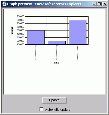
The Graph preview window opens. The following image shows the Graph types tab with a sample bi-polar stacked bar chart of a sales report with sales and mpg dimensions.
Note how the MPG symbol partially blocks the data along the right Y-axis.
- Now check the Automatically arrange the chart elements so that they make the best use of the available space option.
A new Graph preview window opens. The following image shows the same bi-polar stacked bar chart with the elements arranged automatically.

Note how the Y-axis and X-axis labels fit within the size of the report.
Select a Graph Type and Style
- Highlight a graph type from the Graph Type list on the Graph types tab of the Graph Assistant. Next, highlight a graph style from the Graph Styles drop-down list.
A thumbnail image and a brief description of the graph are provided when you highlight a graph type and style. Be sure to read the description of the graph before selecting a graph type and style. Certain graph types require a particular number and/or type of data values; therefore, if your data does not satisfy the requirements, your graph will not accurately represent your data.
- After you have found the graph type and style you desire, click the next tab to continue creating your graph.
Selecting Scales
After you have chosen a graph type, you should select an appropriate scale. A scale is a classification scheme or series of measures that you select for application to the axes of your graph. The scale provides the framework against which your data are plotted. When you choose an appropriate scale for your data, meaningful patterns can emerge, and when you modify a scale, the overall shape of your graph changes.
Steps or measures in the scale are represented along the axes of your graph by marks. The type of scale you choose determines the number of divisions along the scale. There are two general types of scales you can apply to the y-axis of your graph:
A linear scale is a scale in which the values increase arithmetically. Each measure along the scale is one unit higher than the one that precedes it. Linear scales are useful when the data you are plotting are relatively small in range.
A logarithmic scale is a scale in which the values increase logarithmically. Each measure along the scale represents an exponential increase in the data value. Logarithmic scales are useful when accommodate a large range of numbers.
Select Scales
- Click the Properties tab of the Graph Assistant.
- Click the Y axis subtab.
- Find the Log Scale check box. When this option is checked, the Y-axis scale uses logarithmic scaling. When unchecked, the Y-axis scale uses linear scaling.
Selecting Values for the X and Y Axes
The values you select for the X- and Y-axes determine what data is included in the graph you are creating, and how it appears.
You can also:
- Select a second horizontal category (X-axis), which will produce multiple graphs.
For details, see Creating Multiple Graphs.
- Temporarily hide the display of a Y-axis field. For details, see Hiding the Display of a Y-Axis Field.
- Interpolate X and Y-axis values using linear regression.
You can search fields lists. For details, see Searching Field Lists.
Field names that contain a hyphen "-" cannot be used in the HTML Graph Assistant.

Notes on the Fields List
- Key fields are represented with a key icon in all field lists (tree and list displays)
in the HTML Report and Graph Assistant.
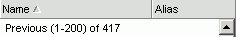
- The number of fields that are currently displayed shows at the bottom of the fields list.
If a field list contains more than 200 fields, the first 200 fields display initially. Additional fields are retrieved and displayed when you select the next set of fields.
To select the next set of fields, scroll to the bottom of the field list and select the Next option that appears. The Next option describes which fields will be returned, for example in the following image it shows that the next 201-400 fields of 417 will be retrieved:

To go back, scroll to the top of the field list and select the previous set of fields. For example, the following image shows the Previous option to select the previous 1-200 of 417 fields:
- If you are viewing a Fields List in the Dimension Tree mode and you create a recursive join (joining a file to itself), you will not be able to view the Dimensions in the Fields List after the join is created. This is due to duplication of field names in a recursive join. If you delete the join, you will be able to view dimensions again.
Select Values for the Y-axis
- Click the Field selection tab from the Graph Assistant.
- If available, click the List or Tree icon.
- Select the field from the Available fields window and click the Add icon to the Field value(s) plotted on Y-axis fields box.
or
Click and hold the left mouse button, and drag the field to the Field value(s) plotted on Y-axis fields box.
or
Press Alt+C to go the Field value(s) plotted on Y-axis fields box. Then press Alt+M to go to the Available Fields window, tab to the field and press Enter to add the chosen field.
To add more than one field name at a time:
- Ensure the List icon is selected.
- Click the field names you wish to include. The fields will highlight as you click on them.
- Drag and drop or use the Add icon to add all the selected fields to the Field value(s) plotted on Y-axis fields box.
The display field(s) determines the vertical Y-axis of the graph. When the number of Y-axis labels is greater than one, the labels do not appear along the Y-axis. Instead, they appear in a legend that provides the names of the fields being graphed.
Select Values for the X-axis
- Click the Field selection tab from the Graph Assistant.
- Select the field from the Available fields window and click the Add icon to the Field value(s) plotted on X-axis fields box.
or
Click and hold the left mouse button, and drag the field to the Field value(s) plotted on X-axis fields box.
or
Press Alt+S to go the Field value(s) plotted on X-axis fields box. Then press Alt+M to go to the Available Fields window, tab to the field and press Enter to add the chosen field.
Hiding the Display of a Y-axis Field
You can hide the display of a Y-axis field in a graph. This option is useful when you want to temporarily remove a particular Y-axis field while retaining all of the original graph properties.
To hide a Y-axis field temporarily, use the Make this field invisible check box located on the subtab of the Show graph field options of the Field Selection tab. By default, the check box is not selected for each Y-axis field. If there are no Y-axis fields, the Show graph field options subtab is disabled.
Hide the Display of a Y-axis Field
- From the Field value(s) plotted on Y-axis fields box, highlight the Y-axis field you want to hide.
- If hidden, click Show graph field options.
- Check the Make this field invisible check box.
Assigning Characteristics to Y-axis Values
You can assign a characteristic for each Y-axis field in your graph. In the following table, the first column lists the prefix operators or characteristics, and the second column lists their descriptions.
|
Summary Type |
Description |
|---|---|
|
Field_Name |
(Plain field value) |
|
ASQ |
Average Square |
|
AVE |
Average |
|
CNT |
Count |
|
FST |
Show first in group |
|
LST |
Show last in group |
|
MAX |
Maximum |
|
MIN |
Minimum |
|
PCT |
Percentage |
|
PCT.CNT |
Count Percentage |
|
RPCT |
Row Percentage |
|
TOT |
Total |
Assign Characteristics to Y-axis Values
- From the Field selection tab, select Summary Type under Y-axis values.
- From the Field value(s) plotted on Y-axis fields box, select the field you would like to assign a characteristic (or prefix operator) to.
- If hidden, click Show graph field options.
- Select the characteristic from the Summary Type list box.
The field name in the Field value(s) plotted on Y-axis fields box is updated with the appropriate prefix. For example, if you have a field named SEQ_NO, and you select the Average Square summary type, the field name changes to ASQ.SEQ_NO.
Selecting Records for a Graph
When generating a report and specifying which fields to display, you may not want to show every instance of a field. By including selection criteria, you can display only those field values that meet your needs. In effect, you can select a subset of the data, which you can easily redefine each time you issue the report request.
When developing a report request, you can define criteria to select records based on:
- The values of an individual field (using a Where statement).
- The aggregate value of a field, for example, the sum or average of a field's values (using a WHERE TOTAL statement).
The Selection criteria tab enables you to create Where or Where Total statements for record selection.
Creating a Where or Where Total Statement
Where and Where Total statements enable you to display only those records that pass your selection criteria. These statements select the data source records to be included in a report. The data is evaluated according to the selection criteria before it is retrieved from the data source. Use the Selection criteria tab to create a new Where or Where Total statement.
In the Graph Assistant, when you create a Where statement in the Selection Criteria tab for a range of dates using FROM - TO, you will not be alerted if the TO field is chronologically before the FROM field. For example, if you enter something like "from 12/31/05 to 1/1/05". There will be no records in the resulting report.
Select Records Based on Values, Parameters, Fields, or a Constant
- In the Graph Assistant, click the Selection criteria tab.
- Select a field from the Available fields window and drag the field to the Screening conditions pane.
or
Press Alt+M to go to the Available Fields window, tab to the field and press Enter to add the chosen field.
The field name and Equal to and Select values appear in the Screening conditions pane.
- Select WHERE or WHERE TOTAL.
- Select an operator from the drop-down list (for example, Equal to)
in the right pane.
- Click Select values to complete the expression.
- Required: Select one of the following compare type option buttons:
- Constant. Enter a value that will serve as a constant (a value that will not change). For example, enter vehicle.
After you click OK, the constant, vehicle, appears in the WHERE statement which reads BODYTYPE Equal to vehicle.

- Parameters. Enter the name of the variable. For example, moped as shown in the following image with the Parameter option button selected and the variable name entered as moped.
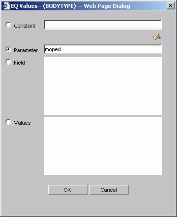
You can set parameter properties, for details see Setting Parameter Properties.
After you click OK, the parameter, &moped, appears in the WHERE statement which reads BODYTYPE Equal to &moped.

The ampersand is automatically added by DB2 Web Query.
- Fields. Select a field from the list.
After you click OK, the field BHP appears in the Where statement which reads CAR.COMP.CAR Equal to CAR.SPECS.BHP.

- Values. Select a value for the field you initially chose (in this case, car).
After you click OK, the value, Audi, appears in the Where statement which reads CAR.COMP.CAR Equal to AUDI.

- Constant. Enter a value that will serve as a constant (a value that will not change). For example, enter vehicle.
Create a Where Statement Using Date and Time Values
- Click the Selection criteria tab.
- Select a field from the Available fields window and drag the field to the Screening conditions pane.
or
Press Alt+M to go to the Available Fields window, tab to the field and press Enter to add the chosen field.
- Click Equal to in the right pane to display a list of operators. Click the operator of your choice.
- Click Select values to complete the expression.
- Click Field to access date and time values for that field. For example, EYEAR.
- Required: Click Values and click the value of your choice. For example, 1989/01/18.
After you click OK, the value, 1989/01/18, appears in the WHERE statement which reads START_DATE Equal to 19890118.

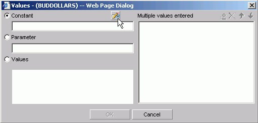
Importing Values From External Files for WHERE Statements
When developing a query, you can use a locally saved, external file as selection criteria to limit query results. This enables you to quickly build a query containing a large number of WHERE statement values without having to manually enter repetitive or readily available data.
Create a Value List From an External File
- Required: Navigate to the Selection criteria area.
- Required: Begin creating a WHERE statement by selecting a field from the list of available fields.
- Required: Select a data comparison option that can accept multiple values.
Valid options include EQUAL to, NOT EQUAL to, IN literal list, NOT IN literal list, EXCLUDES literal list, and INCLUDES literal list.
- Click Select values.
The Values dialog opens.
- Click the import button as shown in the following image.
A dialog box opens as shown in the following image.
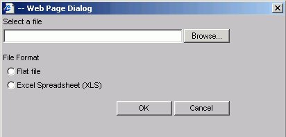
- Select either the Flat file or Excel Spreadsheet (XLS) File Format option.
- Click the Browse button.
A standard file selection dialog opens.
- Select an external file to import from your local machine or network.
The external file must only contain text with new line delimiters.
- Click OK.
The values contained in the file are displayed in the Multiple values entered list in the right pane of the dialog.
- Optionally,
you can remove specific values from the Multiple values entered list or move values up or down within the list.
- Click OK.
You can save the query for future use and reopen the query to append new or remove existing values.
Setting Parameter Properties
When you create parameters for Selection Criteria (WHERE statements) you can set the properties for the parameter. For example, you can create a dynamic or static list of values to choose from at run time.
Set Parameter Properties
- In the Graph Assistant, click the Selection criteria tab.
- Create a WHERE or WHERE TOTAL expression.
- Select an operator. Some operators are not supported with the Variable Editor, see Supported Operators for the Variable Editor for details.
- Click Select values.
- Select the Parameter option button.
- Click the Auto Prompt button.
The Parameter Properties dialog box opens.
- Required: Choose the Selection type, Dynamic or Static.
The Dynamic option is selected by default.
The Name and Description fields are automatically populated based on the field you are screening on, but you can edit the populated values.
The Description field cannot contain a period (.) because a period is the delimiter to specify the beginning and end of the description value.
- Required: Set the parameter values. For the:
- Dynamic selection type, the Data Source and Field are selected by default based on the field you are screening on. You may change these as necessary.
When working with a Reporting Object, you can select only fields from data sources that the Reporting Object is defined to access.
- Static selection type, select the Constant or Show field values option button. For constant, enter a value or values. For Show field values, all of the values for the selected field appear in the list box. Move the values you want in the selection list to the Prompt values list.
- Dynamic selection type, the Data Source and Field are selected by default based on the field you are screening on. You may change these as necessary.
- Click OK to exit the Parameter Properties dialog box.
Supported Operators for the Variable Editor
|
Operator |
Enabled for the Variable editor? |
|---|---|
|
Equal to |
Yes |
|
Not equal to |
Yes |
|
Equal to multiple |
No |
|
Not equal to multiple |
No |
|
Greater than |
Yes |
|
Less than |
Yes |
|
Greater than or equal to |
Yes |
|
Less than or equal to |
Yes |
|
In literal list |
No |
|
Not in literal list |
No |
|
Missing |
No |
|
Not missing |
No |
|
From - to |
No |
|
Not-from - to |
No |
|
Includes literal list |
No |
|
Excludes literal list |
No |
|
Contains characters |
Yes |
|
Omits characters |
Yes |
|
Like character mask |
Yes |
|
Not like character mask |
Yes |
Combining Expressions
Use the right pane of the Selection criteria tab to use or delete existing Where statements and to combine expressions.
Combine Expressions
- Create an expression.
- When you create additional expressions,
they are combined with the default operator AND as shown in the following image with two statements, the first a WHERE and the second an AND statement.
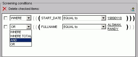
- Toggle between AND, OR, WHERE, and WHERE TOTAL by clicking the AND to make your choice.
Delete an Active Expression
- Select the check box next to the expression you want to delete. Click the Delete icon above the box.
- You are prompted to delete the expression. Click OK to delete.
Grouping Expressions Together With Parentheses
You can use parentheses to group expressions together to optimize the Where statement.
Group Where Statements Together Using Parentheses
Click the grayed out parentheses to activate the parentheses and group expressions together.
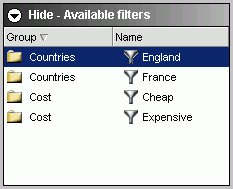
Limiting Data With Filters
Filters enable you to quickly select predefined criteria that limit data included in a graph. Filters are selection criteria (WHERE statements) that an Administrator creates for you to apply as needed, without having to create your own selection criteria.
DB2 Web Query displays filters in filter groups. Each filter group can contain multiple filters. Selecting a single filter within one group creates a report with simple filtering criteria. By selecting multiple filters within a group or combining filters from different groups, you can create complex filtering expressions.
Filters are only available when you are creating a graph using a Reporting Object as a template. If you don't see filters, this means they have not been developed for this Reporting Object. Filters are not available when building a Standard Report or a Custom Report.
The following image shows a few sample filters as they appear in the Selection Criteria tab of the HTML Graph Assistant. They are listed by Group and Name.
Creating Temporary Fields
You can create temporary fields from the HTML Graph Assistant. Temporary fields are created the same way in the HTML Report and Graph Assistant. For complete details, see Creating Temporary Fields.
Creating Multiple Graphs
You can create multiple graphs by selecting a second horizontal category (X-axis).
The number of graphs created depends on the number of values in the field you select. For example, if you select a field with two values, two graphs are generated. If you select a field with ten values, ten graphs are generated.
You can select the second horizontal category from the Field selection tab in the Graph Assistant.
Multiple graphs can appear in either merged format or in columns. For details, see Merging Multiple Graphs and Displaying Multiple Graphs in Columns.
Create Multiple Graphs
- Click the Field selection tab of the Graph Assistant.
- Select the field from the Available fields window and click the Add icon to the Create a separate graph for each value of this field box.
or
Click and hold the left mouse button, and drag the field to the Create a separate graph for each value of this field box.
or
Press Alt+A to go the Create a separate graph for each value of this field box. Then press Alt+M to go to the Available Fields window, tab to the field and press Enter to add the chosen field.
- If you want to change the title of the field name, click Show graph field option if hidden.
- In the Axis label text box located under the General subtab, type the new field title name.
Merging Multiple Graphs
When you create a graph with a second horizontal category, multiple graphs are generated. You can merge these graphs into a single graph.
You can do this from the Field selection tab in the Graph Assistant.
Merge Multiple Graphs
- Click the Field selection tab of the Graph Assistant.
- Add a field to the Create a separate graph for each value of this field box.
- If hidden, click Show graph field options.
- Click the Merge graphs into a single graph option button. When you run your graph, the display shows an X, Y, and Z axis to represent the dual X-axis and the Y-axis.
Merging Multiple Graphs
The following image illustrates a graph with two categories (Manufacturing Plant and Product Name) that have been merged.

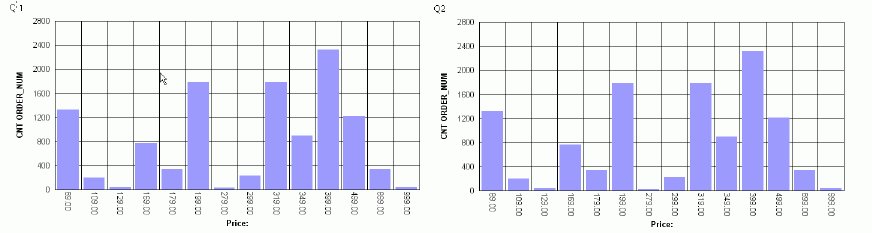
Displaying Multiple Graphs in Columns
When you create a graph with a second horizontal category, multiple graphs are generated. You can display these graphs in columns.
Display Multiple Graphs in Columns
- Click the Field selection tab of the Graph Assistant.
- Add a field to the Create a separate graph for each value of this field box.
- If hidden, click Show graph field options.
- Select the Display graphs in number of columns option button. This is the default selection.
- Select the number of columns to display the graphs. The default value of 1 displays all of the graphs in one single column, one underneath the other. Selecting a number greater than 1 places the graphs in an HTML table, with the number of cells across the table corresponding to the number of columns specified.
Displaying Multiple Graphs in Columns
The following image shows a graph that has a second horizontal category. The multiple graphs that are generated appear in 2 columns since the Display graphs in columns option button was selected when creating the graph.
Working With Joins
A join is a temporary connection between two or more data sources that share at least one common field. Once you join two data sources, each time DB2 Web Query retrieves a record from the first data source (host file), it also retrieves the matching records from the second data source (target file).
You use the Join tool to link data sources in both Report Assistant and Graph Assistant. The Join tool provides a graphical method for creating and manipulating joins. You can also create define-based joins and multi-field joins.
When you access the Join tool, the window displays a field list for the host data source (which you specified when you created the Standard Report or Reporting Object), and a field list for any target data source you add to the window.
The Join Options tab is not available in the HTML Report Assistant or Graph Assistant. You can only create joins using the Join tool available in Reporting Objects.
Create a Join
- Click the Join options tab in Report Assistant or Graph Assistant and click New.
The DB2 Web Query masters list dialog box opens where you select a target data source.
- Select a data source and click OK.
The following image shows the Join settings window where you select fields from the Host field and the Target field lists to create a join.
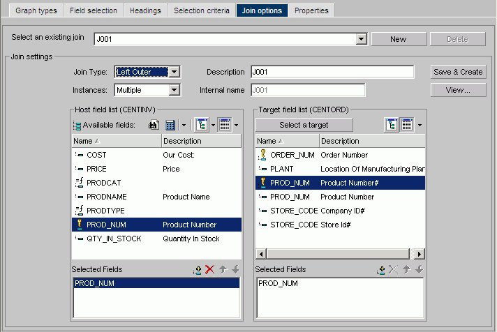
- Select the fields you want to join from the Host field list and the Target field list and add them to their respective Selected Fields boxes.
or
Press Alt+T to go to the Target Fields list. Tab to the field and press Enter to add the chosen field to the Selected Fields box.
Fields must have the same format and be indexed fields in order to use them to create joins.
- Select your join properties:
- Unspecified. This option is selected in the Join properties when a join that was created in a release earlier than Version 7, Release 1 is opened in the Join tool. In versions prior to Version 7 Release 1, the defaults for join type and other operators were assumed and not specified in the generated code. Since the Join tool cannot determine the type of join that was created and if there were other commands set to control the join, select the appropriate options (Inner Join,
Left Outer Join, Multiple Instances, Single Instances) from the Join tool to upgrade the generated code.
- Inner Join. A join that results when a report omits host rows that lack corresponding cross-referenced rows.
- Left Outer Join. Extends the results of an Inner Join and retrieves records from both host and cross-referenced tables, including all records from the left table (host) and any records from the right table (cross-referenced) where the condition values match. If there are no matching values in the cross-referenced table, the join still retrieves records from the host table.
- Multiple Instance (formerly Non Unique). A one-to-many join structure that matches one value in the host data source to multiple values in the cross-referenced field. Joining employee ID in a company's employee data source to employee ID in a data source that lists all the training classes offered by that company would result in a listing of all courses taken by each employee, or a joining of the one instance of each ID in the host file to the multiple instances of that ID in the cross-referenced file.
- Single Instance (formerly Unique). A one-to-one join structure that matches one value in the host data source to one value in the cross-referenced data source. Joining an employee ID in an employee data source to an employee ID in a salary data source is an example of a unique join.
- Unspecified. This option is selected in the Join properties when a join that was created in a release earlier than Version 7, Release 1 is opened in the Join tool. In versions prior to Version 7 Release 1, the defaults for join type and other operators were assumed and not specified in the generated code. Since the Join tool cannot determine the type of join that was created and if there were other commands set to control the join, select the appropriate options (Inner Join,
Left Outer Join, Multiple Instances, Single Instances) from the Join tool to upgrade the generated code.
- To see the join syntax, click View.
- Click OK.
- In the Description box, give the join a meaningful and unique name.
- Click Save &
Create.
The new join appears in the Joins list.
Create a Define-based Join
- Click the Join options tab in Report Assistant or Graph Assistant and click New.
The DB2 Web Query masters list dialog box opens where you select a target data source.
- Select a data source and click OK.
- Click the down arrow of the Define icon and then click New define field.
The following image shows the list of Define field options.

The following image shows the Define field creator dialog box where you create the Define expression.

- Create the defined field. The new define field appears in the Available fields list. The field is prefixed with the define symbol as shown in the following image.

- Add the defined field and the target field to their respective Selected Fields boxes.
Fields must have the same format and be indexed fields in order to use them to create joins.
- If you want to see the syntax, click View to display the define-based join syntax.
- Give the join a meaningful and unique name in the Description box.
- Click Save & Create. The new join appears in the Joins list.
Create Multi-field Joins
- Click the Join options tab in Report Assistant or Graph Assistant and click New.
The DB2 Web Query masters list dialog box opens where you select a target data source.
- Select a data source and click OK.
- Enter multiple fields in the Host field list box and one field in the Target field list box.
- If you want to see the syntax, click View to display the multi-field join syntax.
- In the Description box, give the join a meaningful and unique name.
- Click Save &
Create.
The new join appears in the Joins list.
Delete a Join
Edit a Join
- Select a join from the Select an existing join list box.
- Make your desired changes.
- Click Save & Create.
Displaying Missing Data Values in a Graph
You can display missing data values (in a bar graph, line graph, area graph, or any variation of these graph types) in one of the following formats:
- Graph as zero. In bar graphs, a bar appears on the zero line. In line graphs,
a solid line connects the missing value with the succeeding value. In area graphs, the area appears on the zero line.
- Graph as gap. In all graph types (bar, line, or area), missing values appear as a gap in the graph.
- Dotted line to zero. In line graphs, a dotted line connects the missing value with the succeeding value. In 3D bar graphs, solid lines outline the flat bar corresponding to the missing value. In 2D bar graphs, a gap appears in the graph. In area graphs, a transparent area extends down to the zero line and then up to the succeeding value.
- Interpolated dotted line. In a line graph, missing values appear as an interpolated dotted line that connects the plot points immediately preceding and succeeding the missing value. In bar and area graphs, missing values display as an interpolated (transparent) bar or area.
Display Missing Values in a Graph
- In the Graph Assistant, click the Properties tab.
- Click the Y-axis subtab.
- Required: From the Missing values display list box, select one of the following values:
Displaying Missing Values as Zero in a Graph
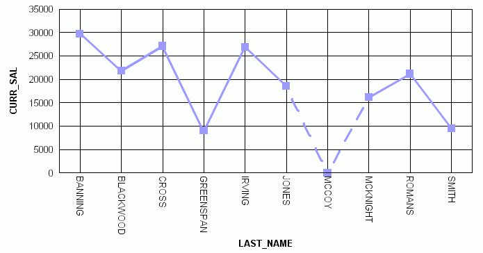
The following image illustrates how missing values are represented in a bar graph when designated to appear as zero. The CURR_SAL values for McCoy and Stevens are missing.

Displaying Missing Values as a Gap
The following image illustrates how missing values are represented in a bar graph when designated to appear as a gap. The CURR_SAL value for McCoy is missing.

Displaying Missing Values as a Dotted Line to Zero
The following image illustrates how missing values are represented in a line graph when designated to appear as a dotted line to zero. The CURR_SAL value for McCoy is missing.
Displaying Missing Values as an Interpolated Dotted Line
The following image illustrates how missing values are represented in a line graph when designated to appear as an interpolated dotted line. The CURR_SAL value for McCoy is missing.

Applying Conditional Styling to a Graph
You can add further value to your graph by using conditional styling to highlight certain defined data with specific styles and colors. Conditional styling, also referred to as stoplighting, enables you to define conditions that determine when to apply particular fonts, point size, text style, foreground and background color, and drill down procedures to your report's data when the report is run.
For example, you can apply the color red to all departments that did not reach their sales quotas and apply the color black to all departments that did reach their sales quotas. In this example, the user can view quickly which departments did or did not reach their quotas. To examine how the results of one department may impact the results of a second department, you may want to provide a drill-down to a report that examines this possibility.
You can apply color to the following graph types:
Conditional styling is only supported for Y-axis values.
Applying Conditional Styling to a Graph
The following illustrates how you can apply conditional styling to a graph. In this example:
- Blue is specified as the default color for all data in the graph.
- Firebrick is specified as the color for data in the DOLLARS column.
- Silver is specified as the color for data in the DOLLARS column when the value is greater than five million.
- Lime is specified as the color for data in the UNITS column when the value is less than two hundred thousand.
The output is shown in the following image.

Linking Graphs to Other Resources
To drill down to a more detailed level of information in a graph, you can link a procedure (FOCEXEC) or a URL to one or more values in your graph. When you run your graph, the selected values become "hot spots" that invoke the underlying procedure or URL.
Link a Graph to Other Resources
- Click the Field selection tab in the Graph Assistant.
- Select a field from the Field value(s) plotted on Y-axis list.
- If hidden, click Show graph field options.
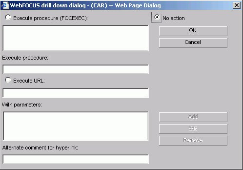
- Click the Drill down button. The Drill Down dialog box opens.
- Select either Execute Procedure (FOCEXEC) or Execute URL option button.
You can select the No action option button to disable a drill-down link.
- If you are linking your graph to a:
- URL,
type the URL in the URL text box. If you don't want the URL to appear when a user moves the mouse over a link in the graph, you can enter different text in the Alternate Comment for Hyperlink text box.
- Procedure, select the procedure from the hierarchy.
- URL,
type the URL in the URL text box. If you don't want the URL to appear when a user moves the mouse over a link in the graph, you can enter different text in the Alternate Comment for Hyperlink text box.
- Use the Add button to add any parameters. For details, see Creating Parameters.
- Click OK.
You can disable drill-down by following steps 1-3 and then selecting the No action option button from the Drill Down dialog box.
Creating Parameters
Parameters enable you to specify criteria and conditions for the associated (drill-down) report. By defining parameters, you can control the amount and type of information to retrieve when you click on a hot spot.
To avoid conflicts, do not name variables beginning with Date, IBI, or WF, as variables beginning with these values are reserved for IBM use.
Create a Parameter in the Main and Drill Down Procedures
- Click the Selection criteria tab.
- Create an expression (WHERE statement) that defines a parameter. For details on creating WHERE statements, see Selection Criteria Tab in HTML Graph Assistant.
- Select the Field selections tab.
- Select the Sort by field that you want to drill down on, for example, Product.
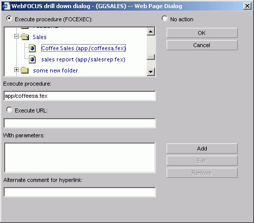
- Click Drill down. The DB2 Web Query Drill Down dialog box opens.
- Click Execute Procedure (FOCEXEC) or Execute URL.
The following image shows a sample drill down dialog box with Execute Procedure (FOCEXEC) option selected.
- Click Add.
The Drill Down Parameter dialog box opens as shown in the following image.

- Enter the name of the parameter you created in the drill down procedure in the Parameter Name text box, for example, Coffee.
When passing parameters to a drill-down procedure, use local variables (&variables). Global variables (&&variables) cannot be used as drill-down parameters. Also, it is not necessary to type an ampersand (&) before the parameter name. This will create a global variable that cannot be used as a drill-down parameter.
- When you pass the parameter to the drill down procedure, set a value for it in the Drill Down Parameter Dialog box. If you select:
- Field, the parameter will be set to the corresponding value of the object the user drills down on in the specified field.
- Constant value, the parameter is set to the specified value.
If the drill-down report contains a -DEFAULTS statement that sets a default value to the same variable passed from the main report, the variable value passed down overwrites the -DEFAULTS statement in the target procedure.
- Field, the parameter will be set to the corresponding value of the object the user drills down on in the specified field.
- Once a value has been supplied, click OK to return to the Drill Down Dialog box. The parameter is added to the With Parameters list box as shown in the following image.

Adding Labels to a Graph
Adding labels to your graph helps provide important information about what the data in your graph represents. You may choose to add headings and/or footings to your graph, as well as style legend text and horizontal (X) and vertical (Y) axis labels.
From the Headings tab of the Graph Assistant, you can add titles, headings, and footings and customize them. For details on customizing, see Customizing Fonts in a Graph.
- There is a 95-character limit for Graph Titles.
- Dragging and dropping items, including images, is not supported in the HTML Graph Assistant.
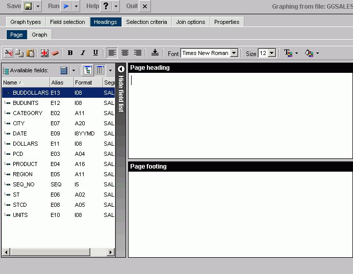
The following image shows the Headings tab with a list of available fields on the left and the Page Heading and Page Footing fields on the right.
If your graph labels or legends do not appear correctly when you run your graph, see Change Color Settings for details on correcting this.
Location of Headings and Footings in Graph Output
The following image illustrates where FOCUS Titles and Graph Titles appear in graph output. Note that none of the headings in this sample have been formatted and appear in their default format. Also note that the Graph Titles chart title will appear in the graph output as well as in your browser's title bar.

The graph preview reflects all display changes to the graph. FOCUS Titles are not shown in the graph preview.
When you use the Graph Assistant to create a graph and add it to a report in the PDF Layout Painter, if the graph contains FOCUS Titles (Page Heading, Page Footing), they are automatically removed from the graph. To utilize headings or footings in a graph you intend to add to the PDF Layout Painter, use the Graph Assistant to create Graph Titles (Chart Title, Chart Subtitle, Chart Footnote). You can also add Text objects to a graph in the PDF Layout Painter and position them to function as a heading or footing.
Add a Heading or Footing to Your Graph
- Click the Headings tab of the Graph Assistant.
- Click the Page subtab.
- Required: Click in the text box or press Alt+H to enter a page heading title.
or
Click in the text box or press Alt+F to enter a page footing title.
- If you change the font size of your heading (FOCUS titles), the code may not properly reflect the font size you specified when you open the procedure in a text editor. This does not affect functionality. You can edit the procedure manually to correct the size.
- If you run a graph procedure that was created prior to Version 5 Release 2.1, the default headings (large and bold) will be generated. However, after you access the procedure in the HTML Graph Assistant, the heading is generated exactly as it appears in the headings tab (normal size, no styling). (This happens because the HTML Graph Assistant adds the TYPE=HEADING,$ syntax to the StyleSheet.
This code does not generate any styling, but it tells the server not to use the old default styling. To use the old styling, the administrator must delete the TYPE=HEADING,$ syntax.)
- When selecting a font for the page heading or footing, be sure to click in the text box before you select the font name, otherwise the font may return to the original font selection.
Add a Field to a Graph Heading or Footing
- Click the Headings tab of the Graph Assistant.
- Click the Page subtab.
- Select a field from the Available fields window and drag the field to the Page heading or Page footing box.
or
Click and hold the left mouse button, and drag the field to the text box you chose.
The following table lists the shortcut keys you can use to quickly go to one of the text boxes. The first column specifies the text box you go to when using the shortcut keys and the second column shows the shortcut key combination.
Text Box
Shortcut Keys
Page Heading
Alt+H
Page Footing
Alt+F
Press Alt+M to go to the Available Fields window, tab to the field and press Enter to add the chosen field.
Add Titles, Subtitles, and Footnotes to a Graph
- Click the Headings tab of the Graph Assistant.
- Click the Page subtab.
- Enter the text for the Chart Title, Chart Subtitle, and Chart Footnote in the respective boxes.
There is a 95-character limit for Graph Titles.
Adding Vertical (Y-axis) and Horizontal (X-axis) Labels to a Graph
Vertical (Y-axis) and horizontal (X-axis) graph labels are placed on the graph according to the display fields and sort fields specified in the request. The titles that appear on the graph are the titles that appear in the Master File for that particular field.
The vertical (Y-axis) title of the graph is determined by the display field. Note that when the number of Y-axis labels is greater than one, the labels do not appear along the Y-axis. Instead, the labels appear in a legend that provides the names of the fields being graphed.
The horizontal (X-axis) title of the graph is determined by the sort field.
You can change the titles for the X and Y-axis from the Graph tab in the Headings tab in the Graph Assistant.
Applying Custom Styling to a Graph
Using the Graph Assistant, you may customize your graph using the subtabs (Options, Settings, X-axis, Y-axis, Pie) on the Properties tab. The customizations you can apply to your graph include customizing fonts, output destination, graph on server, label locations for all graph types, legend location, and much more.
You can also select the orientation of the X- and Y- axes and 3D effects as well as choose a predefined template using the Graph types tab.
Selecting Graph Orientation and 3D Effects
You can select either vertical or horizontal orientation for your graph on the Graph types tab. The default selection is vertical. If horizontal is selected, the X-axis appears along the side of the graph while the Y-axis appears along the bottom. You can choose vertical or horizontal orientation for Bar, Line, and Area graphs.
You can apply 3D effects to your graph, also on the Graph types tab. This option is not supported for histograms, spectral, stock, or radar graphs. To display bubble help when using 3D Effects, markers must be checked under Settings in the Properties tab.
Some graph types and graph styles require vertical and horizontal orientations, with and without 3D effects. In such cases, the relevant option buttons are selected and grayed out. You will only be able to make changes to orientation and 3D effects by changing the Graph Type and Graph Style. For example, if you select the 3D Graph Type and Bar Graph Style, the vertical option button is selected and grayed out.
Using Predefined Templates
When you check the Use a predefined template check box on the Graph types tab, you can choose one of the color and texture templates from the drop-down list: Pastels, Beveled on Tan, Color to White, Cylinder on Grey, Fade to Grey, Bumps, Greys, Plum On White, Red Accent, Speckled, and True colors.
Customizing Fonts in a Graph
You can change the font for the X and Y-axis data and labels, legend text, headings, footings, subheadings, and footnotes. From the text properties dialog box you can customize the:
- Font. Select the font type. Note that depending on what fonts you have installed on your machine, some fonts in the text properties dialog box may not be distinguishable from other fonts. In particular, Monospaced and Dialog Input may look the same as well as Dialog and San Serif.
- Style. Select the text style from normal, italic, bold, underline, or a combination of these.
- Size. Select the font size.
- Set Style for. Select either Title or Data to apply style changes.
- Text Color. Select the font color.
- Text Justification. Select left, center, or right justification.
- Autofit. Automatically adjusts the font size to fit the graph and disables the Size drop-down list.
To select a different font size, uncheck this box and select the font size in the Size drop-down list.
- Wrap. Check this box to wrap the text.
- Text Rotation. Select the data label to display horizontally, vertically (from top to bottom or from bottom to top), and at a 45-degree angle.
Arrange X-axis Property Data Styles
- Click the Properties tab and then the X axis subtab.
- Click the Style Labels button to open the X-axis properties dialog box.
- To enable the text rotation features, select the check box at the top of the X-axis properties dialog box as shown in the following image.

This option is grayed out if the Automatic Arrangement option is de-selected on the Graph Types tab.
- Required: Under Text rotation,
choose one of the following:
As you make changes to the text properties, sample text appears to the right and reflects all selections. If you leave the Autofit check box checked for a particular object, the font size will be automatically adjusted to fit your graph. You can also wrap the text by checking the Wrap check box. Note that when you select the Wrap option, text only wraps to the next line if there is not enough room to display the entire text in the chart.
The text properties dialog box can be invoked from many places in the Graph Assistant. Depending on where it is invoked from, different options are available.
You can choose Background and Frame colors in the Options tab in the Properties tab.
Change X-axis Label Fonts
- Click the Properties tab of the Graph Assistant.
- Click the X axis subtab.
- Click the Style Labels button. The X-Axis Properties dialog box opens.
- Select the font properties. You can change the fonts for the data text and for the x-axis title text by selecting either the Data or Title option button.
- Click OK.
Change Y-axis Label Fonts
- Click the Properties tab of the Graph Assistant.
- Click the Y axis subtab.
- Click the Style Labels button. The Y1 Axis Label Properties dialog box opens.
If you are selecting fonts for the Y2 axis, the Y2 Axis Label Properties dialog box opens; it contains the same style options.
- Select the font properties. You can change the fonts for the data text and for the y-axis title text by selecting either the Data or Title option button.
- Click OK.
Change Graph Legend Fonts
- Click the Properties tab of the Graph Assistant.
- Click the Settings subtab.
- Click the Style legend text button.
The Legend Properties dialog box opens.
- Select the font properties.
- Click OK.
Change Graph Title Fonts
- Click the Headings tab of the Graph Assistant.
- Click the Graph subtab.
- Click Style Title, Style Subtitle,
or Style Footnote for Chart title, Chart subtitle, or Chart footnote.
Depending on the option you select, the Heading Properties, Subheading Properties, or Footnote Properties dialog box opens.
- Select the font properties.
- Click OK.
Setting the Graph Height and Width
The width (or horizontal axis) of each graph, which includes any surrounding text, is automatically set to 770 pixels. When setting the graph width, you should allow for the inclusion of any text required for the vertical axis and its labels along the left margin.
The height (or vertical axis) of your graph is automatically set to 405 pixels.
The vertical axis is automatically set to cover the total range of plotted values. The height of the axis is set as high as possible (taking into consideration the presence of any headings or footings and the need to provide suitably rounded vertical class markers). The range is divided into intervals called "classes." The scale is normalized to provide class values rounded to the appropriate multiples and powers of 10 for the intervals plotted on the axis.
Set the Graph Height and Width
- Click the Properties tab of the Graph Assistant.
- Click the Options subtab.
- In the Graph Size field, select the Custom size option button.
- Enter the horizontal (width) value and the vertical (height) value, both in pixels.
The horizontal value can be any number between 20 and 985.
The vertical value can be any number between 20 and 518.
Running, Saving, and Printing Your Graph
When you run your graph, you may print the output directly from the browser.
If your graph labels or legends are not appearing correctly when you run your graph, see Change Color Settings for details on correcting this.
If you log off Managed Reporting without first closing the HTML Graph Assistant, manually close the tool.
Save Your Graph From the Graph Assistant
- Click Save or Save As from the Graph Assistant.
- From the Save New Standard Report dialog box, enter a name for the graph.
If you are editing an existing graph, clicking Save will automatically save the edits to the current graph file. You will not be prompted to name the file again.
Save Your Graph to a File
You must create a FileDef before you save a graph to a file. This is where the file will be saved to.
- Click the Properties tab of the Graph Assistant.
- Click the Options subtab.
- Select File from the Output to list box.
- Type the filename in the Name text box.
- Select either HPNG, JPEG, GIF, PDF/SVG, or PDF/GIF from the format list box. The default is PNG.
- Click Run. The output file is saved in the directory specified in the FileDef if the IBIJAVAPATH has been set as a system environmental variable. Otherwise, the output appears in the browser in the specified format. From the browser you can save the graph on your local system.
You may open your output file by selecting Open from the File menu in your browser.
When saving a graph as a GIF file, if the graph contains a second horizontal category (that is a horizontal field that produces multiple graphs), the value in the HEADING will not be saved as part of the GIF file. Instead, the horizontal field name will be embedded in the graph's page heading to identify the graph.
Saving Options
When you click the Save or Save As buttons you save your report (procedure). If you make changes in your report without subsequently saving them and then click Quit, you are prompted with the following options:
- Yes. Click to save your changes and exit the report.
- No. Click to discard your changes and exit the report.
- Cancel. Click to return to your report to continue working or use Save or Save As to save your changes and then click Quit to exit your report.
In the HTML Graph Assistant, if you close the window by clicking the X, your changes will not be saved.
Run Your Graph
After creating your graph in the Graph Assistant, click Run from any tab in the Graph Assistant to view your graph output.
When running graphs in GIF format on a UNIX® platform with the HEADLESS configuration, the graph may not appear properly. You may see a red X instead of your image. This is due to Sun's methodology of creating images without a head, which does not currently support GIF images.
Running applet graphs in the HTML Graph Assistant with the setting GRAPHENGINE=OLD works with both Sun's and Microsoft's VM. Applet graphs with the setting GRAPHENGINE=NEW work only with Sun's VM. If you have a graph with the setting GRAPHENGINE=NEW and you are using Microsoft® VM, you should either update your Java™ Plug-in or change your GRAPHENGINE setting.
GRAPHENGINE=NEW and GRAPHEDIT=ON are mutually exclusive. If you specify GRAPHEDIT=ON and GRAPHENGINE=NEW, you get an error message stating that GRAPHEDIT=ON is not supported with GRAPHENGINE=NEW.
Print Your Graph
Some older printers, such as the IBM model 6262, do no support graphical output.
Send Graph Output Directly to a Printer
- From the Properties tab, click the Options subtab.
- Select Printer from the Output list box.
You do not need to provide a name or select a format.
- Click Run.
The graph prints to your default printer setting.
Change Color Settings
- From the Windows® Control Panel, select Display.
- Click the Settings tab.
- In the Color palette box, click the drop-down arrow and select True Color (32 bit) or a higher color count.
- Click OK.
If you use different color settings from this recommended value, your graphs may appear in grayscale format.
Graph Display Formats
Following are descriptions of the graph display formats:
- PNG (Portable Network Graphics). PNG graphs are bitmapped and can support 16 million colors. In addition, PNG graphs have lossless compression (data is decompressed 100% back to the original). Therefore, saving, altering, and resaving a PNG does not degrade its overall quality. The PNG graph appears in the browser.
- GIF (Graphics Interchange Format). GIF compresses well but only supports 256 colors.
The GIF graph appears in the browser.
- JPEG (Joint Photographic Experts Group). A compressed file format.
- SVG (Scalable Vector Graphics). SVG is a text-based graph file format that enables Web application developers to design powerful, interactive graphs. SVG is compact and generates high quality images on any media regardless of resolution. The SVG is viewable with an Adobe® plug-in.
To include a graph in the PDF Layout Painter, the graph must be saved in .SVG or .jpg format.
- PDF/SVG (Portable Document Format/Scalable Vector Graphics). The SVG graph is automatically embedded into a PDF and shown only on the screen. Drill down is not available with this format.
- PDF/GIF (Portable Document Format/Graphics Interchange Format). The GIF graph is automatically embedded into a PDF and shown only on the screen. Drill down is not available with this format.
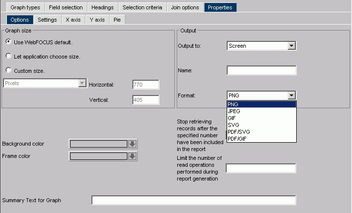
Choosing Formats for Output to the Screen, a File, or Printer
When you create or edit a graph in Graph Assistant, you can choose among these formats in the Output section in the Options tab. If you are designating Output To the Screen, all options listed in Graph Display Formats are available, as shown in the Format drop-down list.
The following image shows the Options subtab.
If you are designating Output to File, the PNG, JPEG, GIF, and SVG options are available.
The following image shows the Output section of the Options subtab with the Output to File option selected.

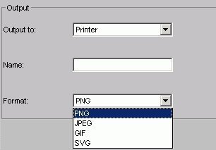
If you are designating Output to a Printer, the PNG, GIF, and SVG options also are available. Note that the printer must be able to print images.
The following image shows the Output section of the Options tab with the Output to Printer option selected.
Graph Types Tab
The Graph Types tab is used to create and view a graph type and style.
Graph Types Tab: Graph Types Window
The following image shows the Graph types tab with a sample cluster bar chart.

In the Graph types component:
- Select from the following graph types
-
Displays Line, Bar, Pie, Scatter, Area, 3D, Bubble, Polar, Radar, Spectral Map, Stock, Histogram, Multi-Y, Waterfall, and Miscellaneous graph types.
- Select from the following Graph Styles
-
Displays several graph styles customized for each graph type.
General options:
- Vertical
-
Displays the date vertically, along the Y-axis.
- Horizontal
-
Displays the data horizontally, along the X-axis.
- Use 3D effect
-
Applies a three-dimensional look to either the vertical or horizontal data.
- Apply template
-
Displays the Pastels, Beveled on Tan, Color to White, Cylinder on Grey, Fade to Grey, Bumps, Greys, Plum on White, Red Accent, Speckled templates, and True colors.
- Reset button
-
Resets all styling information back to the default values.
- Automatically arrange the chart elements so that they make the best use of available space
-
Specify this option with a check in the check box.
The Graph type description component of the Graph types subtab includes a description of the Graph type and style you have chosen, along with a sample graph. In addition, you have the following options:
- Show Graph Preview button
-
Displays the actual graph in a separate window with the options you specified.
- Update button
-
Updates a graph after you make changes.
- Automatic Update check box
-
Check to have your graph automatically updated each time a change is made.
Field Selection Tab in HTML Graph Assistant
The Field selection tab is used to choose the fields you want in a graph, as shown in the following image.

The Field selection tab has two main sections:
- Available fields window
-
Displays a list of field names from the selected data source.
- Graph fields
-
Provide name and sorting options for selected graph fields.
Field Selection Tab: Available Fields Window
The following image shows the Available Fields window of the Field selection tab.

- Available Fields Window
-
Displays a list of field names from the selected data source.
- Define icon
-
Click the Define icon to select: New define field, Edit define field, or Delete define field. If you select the New define field or Edit define field, the Define field creator dialog box opens where you can create or edit a defined field.
- Tree icon
-
Displays a tree structure of field names by segment with segment, alias, title, description, and format information below the tree. Individual field information appears when you click on the field.
- List icon
-
Displays a list of all field names with information that you select from the adjacent arrow that opens a drop-down list: name, alias, title, remarks, format, description, segment, and file name. You can also choose to sort by file order.
Field Selection Tab: Graph Fields Window
The following image shows the Graph Fields window of the Field selection tab.

- You can view the selected fields with the following options:
-
Prefix with the segment name - Prefixes the field name with the segment name.
Prefix with the filename - Prefixes the field name with the name of the data source.
Show the field's alias instead of name - Uses the alias defined in the Master File as the field name.
- Field value plotted on X axis
-
Lists the horizontal (X-axis) field that has been selected from the Available Fields window.
- Add button
-
Adds a field to the X-axis.
- Remove button
-
Removes a field from the X-axis.
- Create a separate graph for each value of this field
-
Displays the field you have selected for the second horizontal (X-axis) category. (This was formerly referred to as an Across field.)
- Add button
-
Adds a field to the X-axis.
- Remove button
-
Removes a field from the X-axis.
- Field value(s) plotted on Y axis
-
Sum indicates a graph that aggregates data by the Category (X) axis field. This is the default.
Print plots each Y-axis field value on a record-by-record basis. If the selected X-axis value is numeric, a scatter graph will be generated; if the selected X-axis value is alphanumeric, a line graph will be generated.
- New Computed Field button
-
Opens the Computed Field Creator dialog box where you can define the parameters for a new computed field.
- Add button
-
Adds a field to the Y-axis.
- Remove button
-
Removes a field from the Y-axis.
- Move Up or Move Down buttons
-
Moves the position of the field within the graph.
Field Selection Tab: Show Graph Field Options
The following image shows the Display subtab for the Y-axis field name in the Field selection tab.

For the Y-axis field name Display subtab:
- Make this field invisible
-
Check to temporarily hide the display of a Y-axis field.
- Conditional Styling
-
Click to open the conditional styling dialog box shown in the following image which you use to add conditional styling in a graph.

- Drill Down
-
Click to open the drill-down dialog box shown in the following image which you use to add drill down capability to a graph.
- Execute procedure (FOCEXEC)
-
Lists procedures contained with Standard Reports. Click the procedure you want to execute.
- No action
-
Is the default.
- Execute procedure
-
The procedure you selected appears in this text box.
- Execute URL
-
The URL you selected appears in this text box.
- With parameters
-
Once a parameter is created, it is automatically added to this list box.
- Alternate comment for hyperlink
-
You can place other comments here.
- Add button
-
Click to open the drill-down parameter dialog box shown in the following image.

- Parameter name
-
Enter the parameter name you created in the drill down procedure.
- Parameter value: Field
-
The parameter will be set to the corresponding value of the object the user drills down on in the specified field.
- Parameter value: Constant value
-
The parameter is set to the specified value.
- OK button
-
Returns to the drill down dialog box. The parameter is added to the With parameters list box.
- Y axis field label
-
Lists the highlighted field selected from the Y-axis.
- Summary type
-
Select a summary type for the Y-axis field selected in the Value (Y) Fields list. The choices are: Plain field value, Number of distinct values, Percentage, and Total.
- Field color
-
Select the display color for the field currently selected in the Value (Y) Fields list.
The following image shows the Visualize subtab for the Y-axis field name in the Field selection tab.

For the Y-axis field name Visualize subtab:
- Force the values of this field to be plotted in the following manner
-
Choose bar, line, or area.
- For dual axis graph types, place this field on the specified axis
-
Choose 1st axis or 2nd axis.
The following image shows the General subtab for the X-axis field name in the Field selection tab.

For the X-axis field name:
- Sorting order
-
Click ascending or descending.
- X axis field label
-
Field name is entered.
The following image shows the General subtab for Across field names in the Field selection tab.

For any additional Across field name(s):
- Sorting order
-
Click ascending or descending.
- Display graphs in number of columns
-
Enter a number in the text box.
- Merge graphs into a single 3D graph
-
Click this option button to activate.
- Axis label
-
The field name is automatically entered in this text box.
Field Selection Tab: Field Creator Dialog Box
Use the Field Creator Dialog Box to create or edit Defined and Computed fields, as shown in the following image.
Note that Defined fields are not available for queries that originated in IBM Query/400; defines can be used only with queries that are created in the Web Query product.
- Field
-
Enter a name for the computed or defined field.
Click to display the Change Format Dialog box, as shown in the following image.
- Tree or List mode buttons
-
Opens the field list in either tree or list mode.
- Fields window
-
Double-click a field in to include a field name in an expression.
- Functions
-
Displays a list of pre-defined functions shown in the following image.

- Operator on the computer keypad
-
Click to include arithmetic operations in an expression.
- Boolean operator on the computer keypad
-
Click to include a Boolean operator in an expression.
- Conditional operator on the computer keypad
-
Click to include a conditional operator in an expression.
Headings Tab
The Headings tab is used to create headings and footings. It has Page and Graph subtabs.
Headings Tab: Page
The Page subtab of the Headings tab shown in the following image is used to create report headings and footings.

- Formatting tool bar
-
- Cut, copy, paste. Cut or copy and paste a selection.
- Select all. Select all highlighted text.
- Remove formatting. Remove formatting from selection.
- Font styles. Select from bold, italic, and underline.
- Alignment. Select left, center, right, or bottom alignment.
- Font. Select a different font from the drop-down list.
- Font size. Select a font size from the drop-down list.
- Text color. Select the text color from the color menu.
- Background color. Select the background color from the color menu.
- Cut, copy, paste. Cut or copy and paste a selection.
- Show/Hide Fields list
-
Insert a field in your heading or footing from the fields list.
- Page Heading
-
Enter the text for the heading in the Page Heading box.
- Page Footing
-
Enter the text for the footing in the Page Footing box.
Headings Tab: Graph
The Graph subtab of the Headings tab shown in the following image is used to create chart titles, subtitles, and footings.
- Show/Hide Fields list
-
Insert a field in your heading or footing from the fields list.
- Chart Title
-
Enter text for the chart title here. The chart title will appear in the graph output as well as in your browser's title bar.
- Chart Subtitle
-
Enter text for the chart subtitle here.
- Chart Footnote
-
Enter text for the chart footnote here.
- Style Title, Style Subtitle, Style Footnote
-
To change the properties, click Style Title, Style Subtitle, or Style Footnote button for the respective text box (Chart Title, Chart Subtitle, Chart Footnote). For details, see Chart Title, Subtitle, and Footnote Properties Dialog Box.
Chart Title, Subtitle, and Footnote Properties Dialog Box
In the Headings tab, click Set style button in the Graph subtab in the Chart Title, Chart Subtitle, and Footnote areas to open the Heading properties dialog box as shown in the following image.

- Font
-
Select the font type.
- Style
-
Select the font style.
- Size
-
Select the text size.
- Text Color
-
Select a text color from the drop-down list.
- Text Rotation
-
Horizontal. Displays text in a horizontal orientation that reads left to right.
Vertical - Bottom to top. Displays text in a vertical orientation that reads from bottom to top.
Vertical - Top to bottom. Displays text in a vertical orientation that reads from top to bottom.
- Text Justification
-
Indicate whether the text will be left, center, or right justified.
- Autofit
-
Checked. Automatically adjusts the heading font size to fit the graph and disables the Size drop-down list.
Unchecked. This is the default. To select a different heading font size, select the font size in the Size drop-down list.
- Wrap
-
Check this box to wrap the text.
Selection Criteria Tab in HTML Graph Assistant
You can create WHERE and WHERE TOTAL statements from the Selection criteria tab in the Graph Assistant.
Selection Criteria Tab - Screen Conditions Window
The Screening conditions window shown in the following image allows you to drag and drop a field from the Available fields window.

- WHERE/WHERE TOTAL
-
Use WHERE to select records based on the values of an individual field.
Use WHERE TOTAL to select records based on the aggregate value of a field, for example, the sum or average of a field's values.
- Fieldname
-
Is the fieldname you initially chose.
- Expression
-
Select an expression from the drop-down list, for example, equals.
- Select Values
-
Click to open the Values dialog box.
- Constant
-
Enter a constant.
- Parameter
-
Enter the name of the &variable.
- Field
-
Select a field from the Field list box.
- Values
-
Select a field from the Values list box.
Join Options Tab
The Join options tab is used to create joins.
Join Options Tab: Add or New
The following image shows the Join options tab where you create joins for a graph.

- Select an existing join
-
Enter the name of a join you have previously created.
- New
-
Press the New button to create a new join.
- Delete
-
Click to delete the join.
- OK button
-
Click to select a Master File.
- Cancel
-
Click to return to the Add/New Join window.
When you select a target data source you have multiple join related settings and options, as shown in the following image.
The Join Settings section provides the following fields and buttons for creating joins:
- Description
-
Enter a description for your join.
- Internal name
-
DB2 Web Query assigns an alphanumeric name for the join, for example J001.
- Save & Create
-
Once you have selected your host and target fields, click Save & Create to create the join.
- View
-
Click to view the syntax of your join, which displays the code sent to the DB2 Web Query Reporting Server to validate the join, but may not be the same code required to run the report. This is the case for a DEFINE based JOIN where only the JOIN statement is displayed for validation, but both the JOIN and DEFINE statements are needed when the report is run.
The Join Type drop-down list provides the following join type options:
- Unspecified
-
This option is selected in the Join properties when a join that was created in an earlier release is opened. In prior versions, the defaults for join type and other operators were assumed and not specified in the generated code. Since the HTML Graph Assistant cannot determine the type of join that was created and if there were other commands set to control the join, select the appropriate options from the Join Type drop-down list (Inner Join, Left Outer Join) and the Instances drop-down list (Multiple Instances, Single Instances) to upgrade the generated code.
- Inner Join
-
Select from the Join Types drop-down list for a join that results when a report omits host rows that lack corresponding cross-referenced rows.
- Left Outer Join
-
Select from the Join Types drop-down list to extend the results of an Inner Join and retrieve records from both host and cross-referenced tables, including all records from the left table (host) and any records from the right table (cross-referenced) where the condition values match. If there are no matching values in the cross-referenced table, the join still retrieves records from the host table.
The Instances drop-down list provides the following join instance options:
- Multiple Instance (formerly Non Unique)
-
Select from the Instances drop-down list for a one-to-many join structure that matches one value in the host data source to multiple values in the cross-referenced field. Joining employee ID in a company's employee data source to employee ID in a data source that lists all the training classes offered by that company would result in a listing of all courses taken by each employee, or a joining of the one instance of each ID in the host file to the multiple instances of that ID in the cross-referenced file.
- Single Instance (formerly Unique)
-
Select from the Instances drop-down list for a one-to-one join structure that matches one value in the host data source to one value in the cross-referenced data source. Joining an employee ID in an employee data source to an employee ID in a salary data source is an example of a unique join.
Host Field List:
- Search (binoculars) icon
-
Opens the Field List Searching dialog box. See Searching Field Lists for details.
- Define icon
-
Click the Define icon to select: New define field, Edit define field, or Delete define field. If you select the New define field or Edit define field, the Define field creator dialog box opens where you can create or edit a defined field.
- Tree icon
-
Displays a tree structure of field names by segment with segment, alias, title, description, and format information below the tree. Individual field information appears when you click on the field.
- List icon
-
Displays a list of all field names with information that you select from the adjacent arrow that opens a drop-down list: name, alias, title, remarks, format, description, segment, and file name. You can also choose to sort by file order.
- Add button
-
Adds a field.
- Remove button
-
Removes a field.
- Move Up or Move Down buttons
-
Moves the position of the field within the join.
Target Field List:
- Select a target button
-
Click to select a target Master File.
- Tree icon
-
Displays a tree structure of field names by segment with segment, alias, title, description, and format information below the tree. Individual field information appears when you click on the field.
- List icon
-
Displays a list of all field names with information that you select from the adjacent arrow that opens a drop-down list: name, alias, title, remarks, format, description, segment, and file name. You can also choose to sort by file order.
- Add button
-
Adds a field.
- Remove button
-
Removes a field.
- Move Up or Move Down buttons
-
Moves the position of the field within the join.
Properties Tab
The Properties tab is used to set properties options for one or more components of a graph.
Legend Properties Dialog Box
Click the Style Legend Text button on the Settings subtab in the Properties tab to open the Legend properties dialog box as shown in the following image.
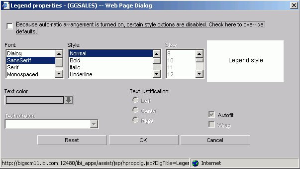
- Font
-
Select the font type.
- Style
-
Select the font style.
- Size
-
Select the text size.
- Text Color
-
Select a text color from the drop-down list.
- Text Rotation
-
Horizontal. Displays legend text in a horizontal orientation that reads left to right.
Vertical - Bottom to top. Displays legend text in a vertical orientation that reads from bottom to top.
Vertical - Top to bottom. Displays legend text in a vertical orientation that reads from top to bottom.
- Text Justification
-
Indicate whether the text will be left, center, or right justified.
- Autofit
-
Checked. This is the default. Automatically adjusts the legend font size to fit the graph and disables the Size drop-down list.
Unchecked. To select a different legend font size, uncheck this box and select the font size in the Size drop-down list.
- Wrap
-
Checked to enable wrapping the text.
X-axis Label Properties Dialog Box
Click the Style Labels button on the X axis subtab of the Properties tab to open the X-axis properties dialog box as shown in the following image.

- Font
-
Select the font type.
- Style
-
Select the font style.
- Size
-
Select the text size.
- Set Style For
-
Select to style Title or Data.
- Text Color
-
Select a text color from the drop-down list.
- Text Rotation
-
Horizontal. Displays text in a horizontal orientation that reads left to right.
Vertical - Bottom to top. Displays text in a vertical orientation that reads from bottom to top.
Vertical - Top to bottom. Displays text in a vertical orientation that reads from top to bottom.
45-degree bottom to top. Displays text in a diagonal that reads from bottom to top.
- Text Justification
-
Indicate whether the text will be left, center, or right justified.
- Autofit
-
Checked. This is the default. Automatically adjusts the X-axis font size to fit the graph and disables the Size drop-down list.
Unchecked. To select a different X-axis font size, uncheck this box and select the font size in the Size drop-down list.
- Wrap
-
Check this box to wrap the text.
Y-axis Label Properties Dialog Box
Click the Style Labels button on the Y axis subtab of the Properties tab to open the Y-axis properties dialog box as shown in the following image.

- Font
-
Select the font type.
- Style
-
Select the font style.
- Size
-
Select the text size.
- Set Style For
-
Select to style Title or Data.
If you have selected more than one Y-axis field, the Title option will not be available in the Label Properties dialog box. The Data option will be selected by default.
- Text Color
-
Select a text color from the drop-down list.
- Text Rotation
-
Horizontal. Displays text in a horizontal orientation that reads left to right.
Vertical - Bottom to top. Displays text in a vertical orientation that reads from bottom to top.
Vertical - Top to bottom. Displays text in a vertical orientation that reads from top to bottom.
45-degree bottom to top. Displays text in a diagonal that reads from bottom to top.
- Text Justification
-
Indicate whether the text will be left, center, or right justified.
- Autofit
-
Checked. Automatically adjusts the Y-axis font size to fit the graph and disables the Size drop-down list.
Unchecked. This is the default. To select a different Y-axis font size, select the font size in the Size drop-down list.
- Wrap
-
Check this box to wrap the text.
Graph Assistant Properties Tab: Options
The following image shows the Options subtab of the Properties tab.

- Graph Size
-
Select the DB2 Web Query default size, let the applet application choose the size, or set a custom size for horizontal and vertical, both in pixels. For more information about graph size, see Set the Graph Height and Width.
- Output
-
Select Screen, File, or Printer from the list box. If you select:
Screen, the output appears in the browser. Choose: PNG, SVG, GIF, JPEG, PDF/SVG, PDF/GIF.
File, enter a file name and select a file type: PNG, SVG, GIF, or JPEG.
Printer, graph output is sent directly to your browser's default printer. Choose: PNG, SVG, GIF, JPEG.
To include a graph in the PDF Layout Painter, the graph must be saved in .SVG format.
- Background Color
-
Select a background color from the color picker for the current graph.
- Frame Color
-
Select a frame color from the color picker for the current graph.
- Stop retrieving records after the specified number have been included in the report.
-
Record limits are used to limit the amount of data that appears or is used in your graph.
- Limit the number of read operations performed during report generation.
-
Read limits are used to limit the amount of records retrieved (or read) from the data source. The Read Limit option is not available with FOCUS data sources.
- Summary Text for Graph
-
Provides a SUMMARY attribute for reports and graphs that maps to the HTML <TABLE SUMMARY> tag. A description of the graph is placed into a summary object inside the HTML table in the source code. This complies with section 508 accessibility.
The description of the graph can be no longer than 500 characters.
Graph Assistant Properties Tab: Settings
The following image shows the Settings subtab of the Properties tab.
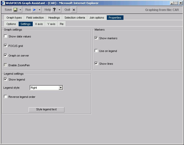
Graph Settings
- Show Data Values
-
Check this box to display data values in your graph. If this box is unchecked, data values will not be included.
- FOCUS Grid
-
Grids are parallel lines drawn across a graph at the vertical and horizontal class marks on the axes. Check this box if you wish grid lines displayed. This option is only available on connected point plots, histograms, bar charts, and scatter diagrams.
- Graph on Server
-
Runs the graph on a server (rather than your local machine) and produces the graph as an HTML file with a GIF image. Graph on Server cannot be used when the Enable Zoom/Pan box is checked.
This option is only available if the server was configured for server side graphics.
- Enable Zoom/Pan
-
Enables you to zoom on a graph. This feature is available for all graphs except radar, polar, 3D, pie, spectral, and stock graphs. Enable Zoom/Pan cannot be used when the Graph on Server box is checked.
Legend Settings
- Show Legend
-
Check this to display the legend in your graph.
- Legend Style
-
Select the position of the legend's text. You may select to have the legend's text on the right or left side, above or below the legend marker, or inside the legend marker.
- Reverse Legend Order
-
Enables the display of the graph legend in reverse order. This is generally most helpful when Reverse Order of Groups is selected.
- Style Legend Text
-
Opens the Legend properties dialog box where you can select and style the font for the legend text.
- Markers
- Select how you want markers (shapes that represent data points) to appear on your graph.
- Show Markers
-
Will show marker shapes at the data points on line graphs. You must have this option set to on in order for values to appear when you hover your cursor over an area or line graph.
- Use on Legend
-
Will show marker shapes on the graph legend.
- Show Lines
-
Is the default in the Markers group. When this check box is deselected, marker shapes show on a line graph, but connecting lines are not drawn.
Graph Assistant Properties Tab: X axis
The following image shows the X axis subtab of the Properties tab.

- Show axis labels
-
Top - X-axis labels appear above vertically oriented graphs and to the right of horizontally oriented graphs.
Bottom - X-axis labels appear below vertically oriented graphs and to the left of horizontally oriented graphs. (This is the default.)
Top and Bottom - X-axis labels appear both above and below vertically oriented graphs and to both the left and right of horizontally oriented graphs.
Stagger Labels - When this box is checked, X-axis labels will be staggered.
Hide first label - When this box is checked, the first X-axis label will not appear.
Hide last label - When this box is checked, the last X-axis label will not appear.
- Value Format
-
Enables you to select a format for the display of X-axis values. You can only change the display format if your x-axis values are numeric and the graph style is bubble, histogram (bar), or scatter.
- Style Labels
-
Opens the X-axis properties dialog box where you can select and style the fonts for the X-axis.
- Reverse order of groups
-
When checked, enables the display of the groups (X-axis) data in reverse order. When unchecked, the graph will display groups in natural order.
- Major grid lines
-
Divide a graph at regular intervals according to the scale. Major grid lines cross their axis line at the exact location of the scale label. Styles include:
Regular Grids - Normal grid lines that are the height of the frame.
Grids and Ticks - Normal grid lines that extend outside the frame.
Inner Ticks - Small tick marks from the frame edge inward.
Outer Ticks - Small tick marks from the frame edge outward.
Spanning Ticks - Small tick marks that span the frame edge.
- Minor grid lines
-
Divide a graph at regular intervals according to the scale. Minor grid lines cross their axis line at equal intervals between major grids/ticks; they never align directly with a scale label. Styles include:
Regular Grids - Normal grid lines that are the height of the frame.
Grids and Ticks - Normal grid lines that extend outside the frame.
Inner Ticks - Small tick marks from the frame edge inward.
Outer Ticks - Small tick marks from the frame edge outward.
Spanning Ticks - Small tick marks that span the frame edge.
Graph Assistant Properties Tab: Y axis
The following image shows the Y axis subtab of the Properties tab.

- Axis Selection List Box
-
If you have more than one Y-axis, select which axis you would like to apply properties to here, either Y1 Axis or Y2 Axis.
- Show axis labels
-
Left Side - Y-axis labels will appear on the low (bottom or left) side of the graph.
Right Side - Y-axis labels will appear on the high (top or right) side of the graph.
Both Sides - Y-axis labels will appear on both the low and high sides of the graph.
Hide Maximum Value - When checked, the largest Y-axis label will not appear.
Hide Minimum Value - When checked, the smallest Y-axis label will not appear.
Always include Zero on Scale - Includes zero on the Y-axis scale when checked. If you have manually set your scale range to exclude zero, this property will be ignored.
Log Scale - When checked, the Y-axis scale will use logarithmic scaling. When unchecked, the Y-axis scale will use linear scaling.
- Value Format
-
Enables you to select a format for the display of Y-axis series values. Value Format cannot be used in combination with Slice Label.
- Style Labels
-
Opens the Y-axis properties dialog box where you can select and style the fonts for the Y-axis.
- Reverse order of series
-
When checked, enables the display of the series (Y-axis) data in reverse order. When unchecked, the graph will display its series in natural order.
- Descending Axis
-
Inverts the direction of the Y-axis so values of zero or less appear at the top of the graph, while values greater than zero appear at the bottom of the graph.
- Axis Line
-
Enables the display of the Y-axis base line.
- Zero Line
-
Enables the display of the Y-axis Zero line when zero is within the Y-axis range.
- Missing Values Display
-
Displays missing data values (in a bar graph, line graph, area graph, or any variation of these graph types) in one of the following formats:
- Major Grid Lines
-
Divide a graph at regular intervals according to the scale. Major grid lines cross their axis line at the exact location of the scale label. Styles include:
Regular Grids - Normal grid lines that are the height of the frame.
Grids and Ticks - Normal grid lines that extend outside the frame.
Inner Ticks - Small tick marks from the frame edge inward.
Outer Ticks - Small tick marks from the frame edge outward.
Spanning Ticks - Small tick marks that span the frame edge.
- Minor Grid Lines
-
Divide a graph at regular intervals according to the scale. Minor grid lines cross their axis line at equal intervals between major grids/ticks; they never align directly with a scale label. Styles include:
Regular Grids - Normal grid lines that are the height of the frame.
Grids and Ticks - Normal grid lines that extend outside the frame.
Inner Ticks - Small tick marks from the frame edge inward.
Outer Ticks - Small tick marks from the frame edge outward.
Spanning Ticks - Small tick marks that span the frame edge.
Graph Assistant Properties Tab: Pie
The following image shows the Pie subtab of the Properties tab.
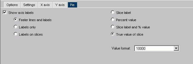
- Show Axis Labels
-
When checked, enables the display of feelers and data text in a pie graph.
Feeler Lines and Labels - Shows both feelers and data text.
Labels Only - Shows only data text.
Labels on Slices - Shows data text on slices.
A feeler is a line or set of lines that stretch from a pie slice label to its pie slice. Feelers are visual aids that help you know that a particular number belongs to a particular pie slice.
- Slice Label
-
When this option button is selected, the Y-axis label will appear at the end of the feeler.
- Percent Value
-
When this option button is selected, the Y-axis value expressed as a percentage appears at the end of the feeler.
- Slice Label and % Value
-
When this option button is selected, the Y-axis label, and its value expressed as a percentage, appear at the end of the feeler.
- True Value of Slice
-
When this option button is selected, the Y-axis value appears at the end of the feeler.
- Value Format
-
Enables you to select a format for the display of Y-axis series values. Value Format cannot be used in combination with Slice Label.