Define authoring tools
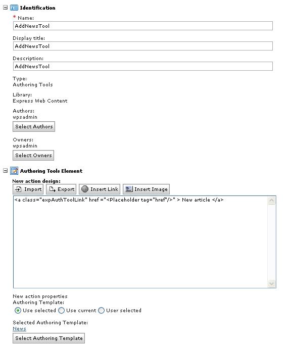
We can format an authoring tool element's look and feel in different ways, including displaying authoring tools as text-based links, or image based links.
Authoring tool options
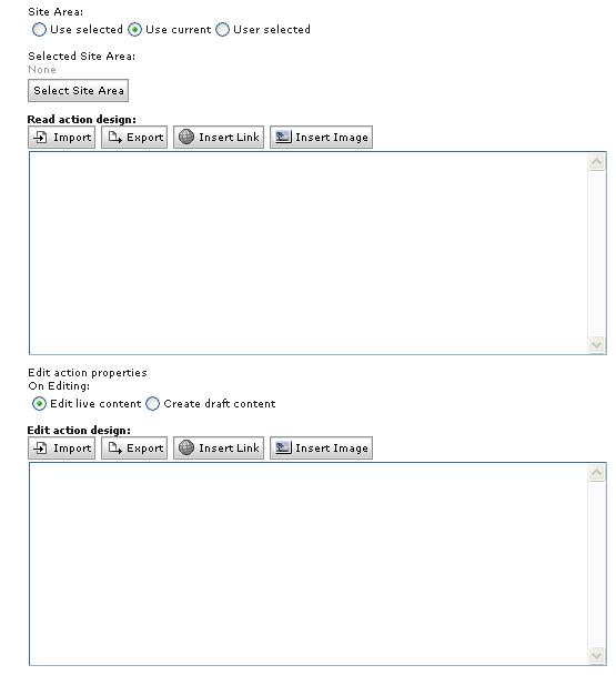
- When creating a "new" action, we can either select an authoring template and site area to use with the new content item, use the same authoring template and site area as the current content item, user or portlet, or allow users to select an authoring template and site area.
- When creating an "edit" action we select either to create a draft item, or allow users to edit the rendered content.
Authoring tool designs
We use placeholder tags to display authoring tools. We can only use these placeholder tags in authoring tool designs:- name
- href
- namelink


Text-based authoring tool
This example describes the element designs used to display a text-based authoring tool. Each design includes placeholder tags used to generate the text and link for each authoring tool.
- New action design:
- <a href="[Placeholder tag="#ref">href"]" > [Placeholder tag="#ref">name"]</a>
- Read action design:
- <a href="[Placeholder tag="href"]" > [Placeholder tag="name"]</a>
- Edit action design:
- <a href="[Placeholder tag="href"]" > [Placeholder tag="name"]</a>
- Delete action design:
- <a href="[Placeholder tag="href"]" > [Placeholder tag="name"]</a>
- Approve action design:
- <a href="[Placeholder tag="href"]" > [Placeholder tag="name"]</a>
- Reject action design:
- <a href="[Placeholder tag="href"]" > [Placeholder tag="name"]</a>
- Header:
-
- <div><span>
- Separator:
-
- </span><span>
- Footer:
-
- </span></div>
Image-based authoring tool
This example describes the element designs used to display an image-based authoring tool. In this example, the [Placeholder tag="name"] tag is replaced with a component tag referencing an image component. Before creating these element designs, create an image component for each image used in the design. In this example, the following image components are required:
- new-image
- read-image
- edit-image
- delete-image
- approve-image
- reject-image
- New action design:
- <a href="[Placeholder tag="href"]" > [component name="new-image" ]</a>
- Read action design:
- <a href="[Placeholder tag="href"]" > [component name="read-image" ]</a>
- Edit action design:
- <a href="[Placeholder tag="href"]" > [component name="edit-image" ]</a>
- Delete action design:
- <a href="[Placeholder tag="href"]" > [component name="delete-image" ]</a>
- Approve action design:
- <a href="[Placeholder tag="href"]" > [component name="approve-image" ]</a>
- Reject action design:
- <a href="[Placeholder tag="href"]" > [component name="reject-image" ]</a>
- Header:
-
- <div><span>
- Separator:
-
- </span><span>
- Footer:
-
- </span></div>
Use authoring tools components when launching a pop-up window
When using a pop-up window to perform an authoring task, the pop-up window opens and can be moved within the boundaries of the browser window while still showing the portal page underneath. After completing the task triggered by the authoring tools element, the pop-up window closes automatically, and the portal page refreshes, updating the view in the JSR 286 web content viewer. We can cancel the authoring task by clicking the close icon in the pop-up window's title bar. When canceling the task, no web content information is saved, unless you explicitly save changes before manually closing the window.
The default value of the format attribute for a placeholder tag is tag, so to use pop-up windows for inline editing, it is not necessary to specify a value for the format attribute. Either of the following design examples creates a URL that opens a pop-up window for authoring tasks:
[Placeholder tag="namelink"]
[Placeholder tag="namelink" format="tag"]
 <a href="[Placeholder tag="href"]">
  [Placeholder tag="name"]
</a>
<a href="[Placeholder tag="href" format="tag"]">
  [Placeholder tag="name"]
</a>
It is not possible to launch the pop-up window in a separate browser window by adding target="_blank" to the HTML anchor tag in the design. To use an authoring tool component with a pop-up dialog design within a static page, the HTML of the static page has to include the IBM Dojo Toolkit. To include Dojo in the page we can add the following to the header section of the page:
- <script type="text/javascript" djConfig="parseOnLoad:false,isDebug:false" src="/portal_dojo/dojo/dojo.js">
Use authoring tools components when navigating to another page
Instead of performing tasks from authoring tools elements in a pop-up window, we can perform authoring tasks by navigating to a hidden portal page containing a JSR 286 web content viewer containing the reserved authoring portlet. Clicking a link for an authoring tools element automatically redirects us to the other page, but after after completing the authoring task, manually navigate back to the original page. If the page with the reserved authoring portlet was opened in a new browser window or tab, we must close the window or tab and manually refresh the original page to see any changes.
To redirect users to another page for authoring tasks, specify a value of url for the format attribute in the placeholder tag in the authoring tools element design. Either of the following design examples creates a URL that redirects users to another portal page for authoring tasks:
[Placeholder tag="namelink" format="url"]
 <a href="[Placeholder tag="href" format="url"]">
  [Placeholder tag="name"]
</a>
<a href="[Placeholder tag="href" format="url"]" target="_blank">
  [Placeholder tag="name"]
</a>
We can open the portal page in a separate browser window by adding target="_blank" to the HTML anchor tag in the design.
Parent Create an authoring tools component
Previous topic: Set a location for the authoring tools component
Next topic: Authoring tools component properties
Related tasks:
Insert an image in an element
Insert a link in an element
Insert element tags
Create web content tags