Layout of the portal page
Portal pages are composed of JSP files that reside in...
was_profile_root/installedApps/cellname/wps.ear/wps.war/screens was_profile_root/installedApps/cellname/wps.ear/wps.war/themes was_profile_root/installedApps/cellname/wps.ear/wps.war/skins
Subdirectories exist for markup, locale, and client types used to support portal aggregation.
- Themes
- Navigation, appearance, and layout of the portal, including colors, fonts, and images outside of the portlet content area (Home screen).
- Screens
- Area of the portal that typically displays portlets (Home screen), but can also display other content in its place, for example, a login form or error message. Screens are selected from navigation icons in the theme.
- Skins
- Border rendering around components, such as row containers, column containers, or portlets. Skins are installed independently from themes. However, the administrator can set a default skin for a theme.
The starting place for building the portal page is Default.jsp in the /themes directory. The screen and skin are called by the corresponding <portal-core:screenRender/> and <portal-core:pageRender/> tags from the portal-core tag library. The following example is shown to illustrate the underlying code in themes, screens, and skins as they are used in the portal. The code example is followed by an illustration of how this code would render in the portal.
<style>
    div.theme, div.screen, div.skin
    {
        border: 3px solid;
        width: 75%;
        padding: 5px;
    }

    div.theme { color: blue;}
    div.screen, p.screen { color: green;}
    div.skin, p.skin {color: red;}

</style>

<div class="theme">

    <p>Theme (Default.jsp)</p>
    <p>...</p>
    <p class="screen"><portal-core:screenRender/></p>
    <div class="screen">
        <p>Screen (Home.jsp)</p>
        <p>...</p>
        <p class="skin"><portal-core:pageRender/></p>
        <div class="skin">Skin</div>
    </div>

</div>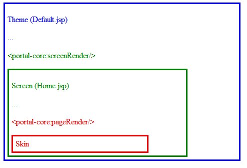
Related information