For up-to-date product documentation, see the IBM MobileFirst Foundation Developer Center.
Default Usage and Devices charts
Default charts are displayed in the IBM MobileFirst™ Analytics Console.
In the Usage and Devices page of the Apps section in the IBM MobileFirst Analytics Console, a number of default charts are provided to help you manage your app usage.
Total Devices
The Total Devices chart shows the number of total devices.
Total App Sessions
The Total App Sessions chart shows the number of total app sessions. An app session is recorded when an app is brought to the foreground of a device.
Active Users
The Active Users chart shows an interactive multi-line graph of the following data:
- Active Users - unique users for the displayed time frame.
- New Users - new users for the displayed time frame.
The default displayed time frame is one day with a data point for each hour. If you change the displayed time frame to greater than one day, the data points reflect each day. We can click the corresponding key in the legend to toggle whether to display the line. By default, all keys are displayed, and we cannot toggle all keys to not display any lines.
To see the most accurate data in the line graph, we must instrument your app code to provide the userID by calling the setUserContext(WLAnalytics) API. If we want to provide anonymity for the userID values, we must hash the value first. If the userID is not provided, the ID of the device is used by default. If one device is used by multiple users and the userID is not provided, the line graph does not reflect accurate data because the ID of the device counts as one user.
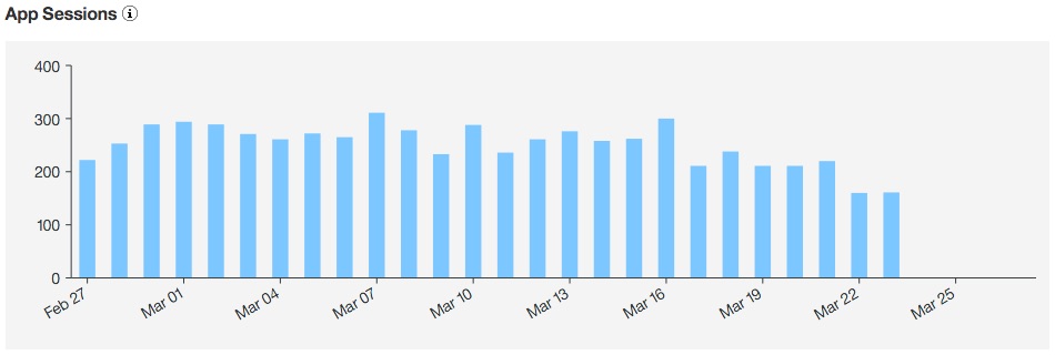
App Sessions
The App Sessions chart shows a bar graph of app sessions over time.
The following image shows a sample App Sessions chart.
For more information about how to populate this chart, see Initializing your app to capture app usage.
App Usage
The App Usage chart shows a pie chart of the percentage of app sessions for each app.
New Devices
The New Devices chart shows a bar graph of new devices over time.
Model Usage
The Model Usage chart shows a pie chart of the percentage of app sessions for each device model.
Operating System Usage
The Operating System Usage chart shows a pie chart of the percentage of app sessions for each device operating system.
Parent topic: App usage analytics